Privacy-First ERP Comparison Table Landing Page
Ledger is a comparison table landing page template built for a privacy-first, on-premises enterprise resource planning platform. It targets CFOs, IT directors, and operations leads who demand full data sovereignty. The template combines an animated telemetry header, an interactive vendor comparison table, and a staged trial conversion flow into one authoritative, data-command experience.
by Rocket studio
Quick summary
Ledger is a single-page, comparison-table template designed for a privacy-first enterprise resource planning platform. It leads with a live stats header, guides visitors through an interactive vendor comparison, and ends with a staged trial sign-up form. Every section reinforces one idea: your data stays inside your walls, always.
Who this template is for
This template is built for teams selling a security-critical, on-premises enterprise resource planning solution to highly regulated buyers. If your buyers scrutinize audit logs before signing contracts, this template speaks their language.
- CFOs at mid-market manufacturers who have experienced vendor data breaches and need a trustworthy alternative
- IT directors at defense contractors requiring workflows that meet International Traffic in Arms Regulations (ITAR) compliance standards
- Operations leads at healthcare networks who track audit logs and need verifiable data residency proof
What problem this template solves
Most enterprise software landing pages lean on feature lists and pricing grids. They rarely address the specific fear driving security-conscious buyers: the question of where data actually goes. Ledger solves the trust gap before the sales call happens.
- Buyers arrive skeptical after a breach notification from a previous vendor and need immediate proof, not promises
- Procurement and legal teams need architecture evidence they can present at a security review meeting
- A generic template cannot hold the attention of a technical evaluator long enough to build confidence
What you get with this template
This template delivers a full comparison-table landing page that is purpose-built for a privacy-first enterprise resource planning audience. It is structured to educate, engage, and convert in a single scrolling session.
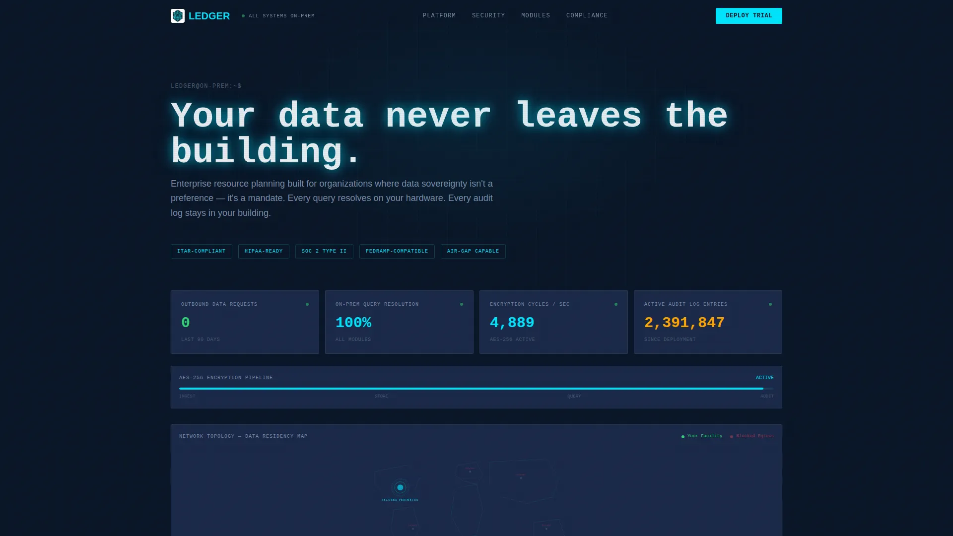
- An animated telemetry header showing live operational metrics, including zero outbound data requests and 100% on-premises query resolution
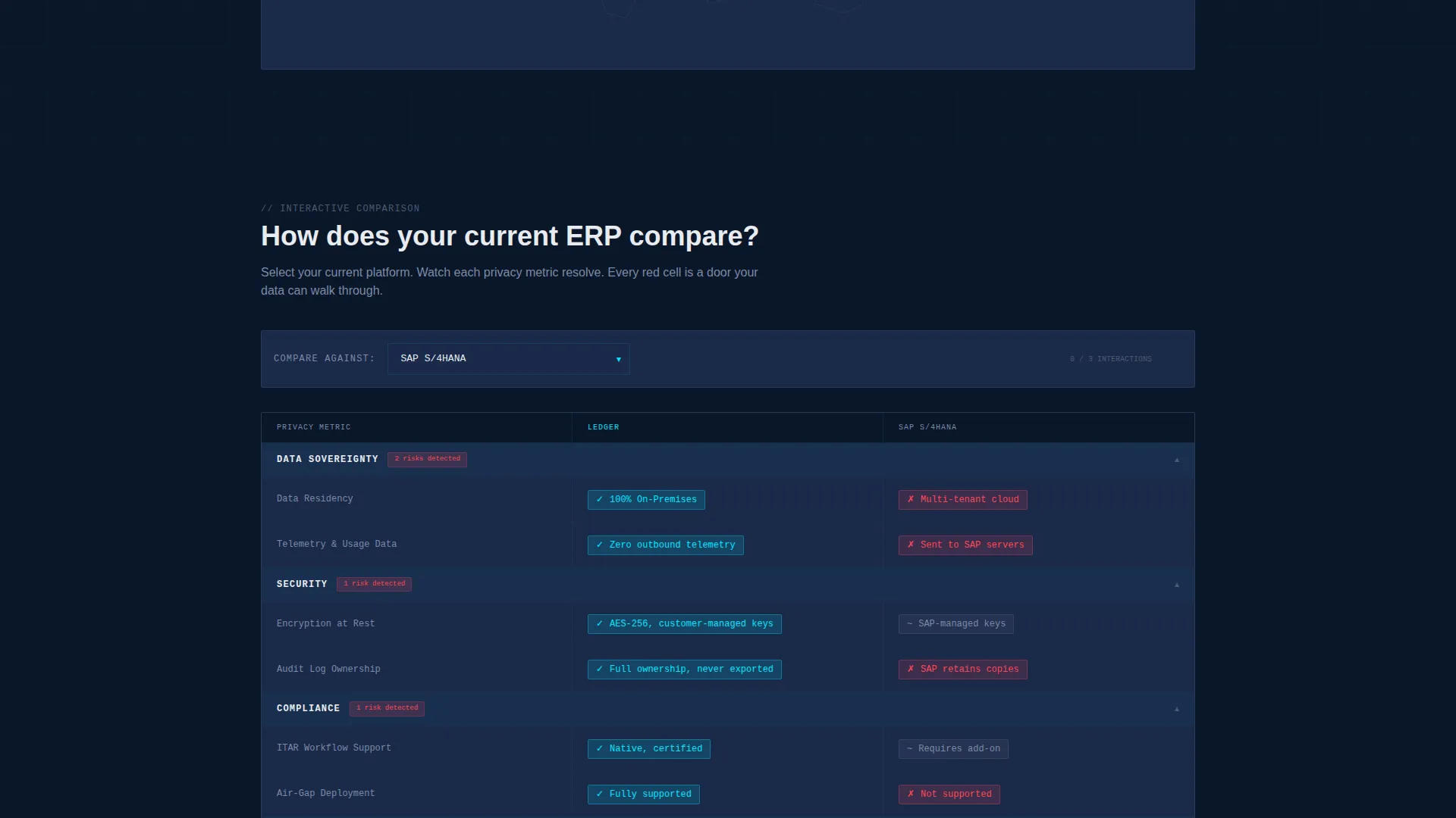
- An interactive comparison table where visitors select their current ERP vendor from a ten-platform dropdown and watch privacy metrics resolve side by side
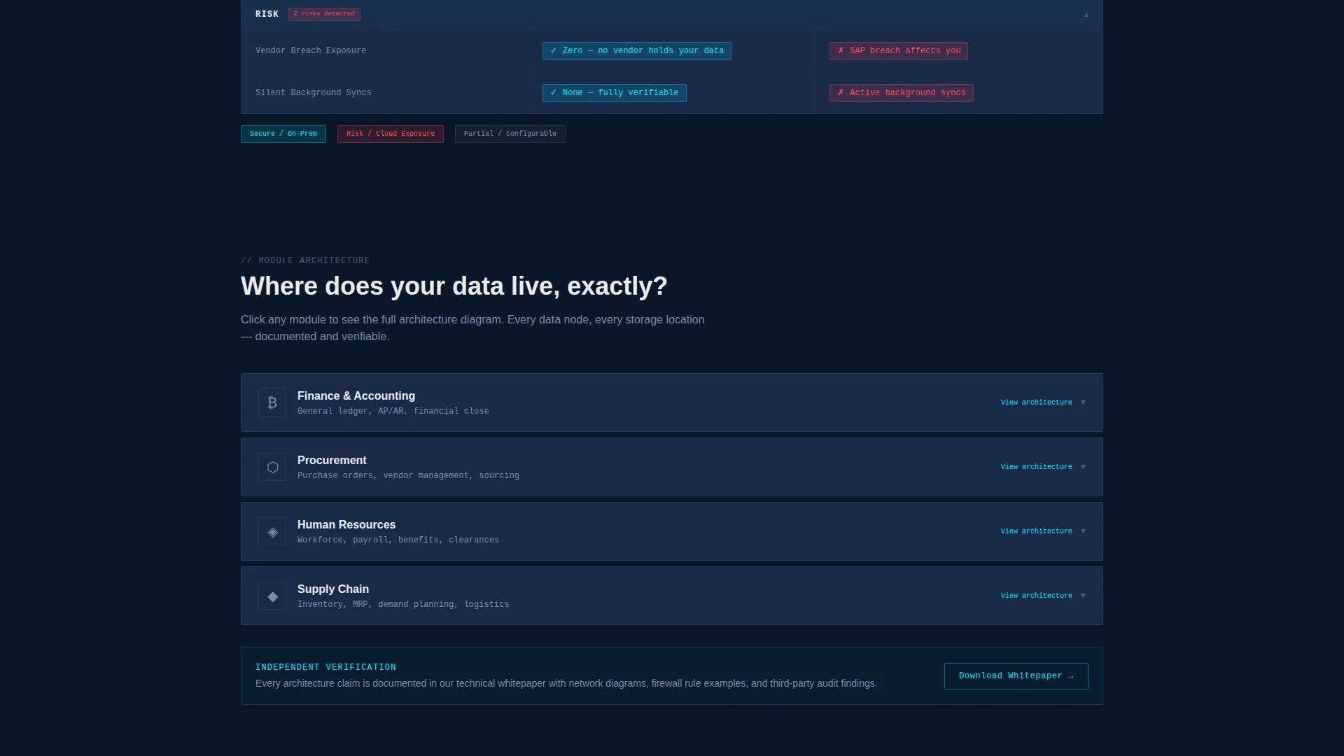
- Expandable module rows covering finance, procurement, human resources, and supply chain, each opening to show architecture diagrams
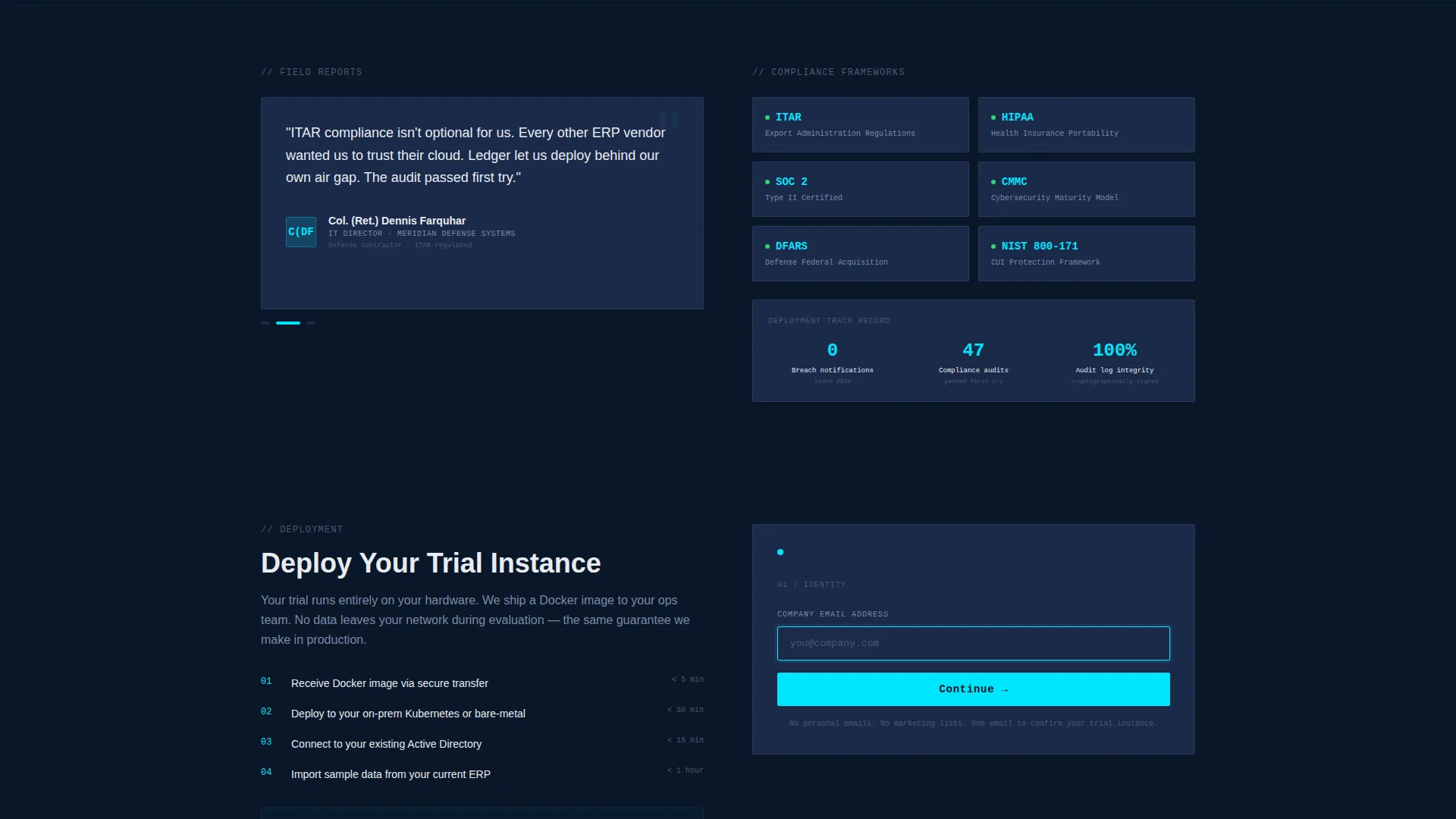
- A staged conversion form pinned at the table footer, triggered after three comparison row interactions, asking for company email, employee count, and primary module needed
- A secondary lead capture path offering an architecture whitepaper download for top-of-funnel visitors preparing for a security review
Feature list
This template is built around features that reflect the discipline and precision its target buyers expect. Every component earns its place.
Animated Telemetry Header
The header renders as a live stats dashboard, not a static screenshot. Counters tick in real time showing zero outbound data requests over 90 days, 100% on-premises query resolution, and active encryption cycles. A world map pulses all nodes inside a single facility perimeter.
Interactive Vendor Comparison Table
Visitors select their current enterprise resource planning vendor from a dropdown of ten major platforms. Comparison cells shift from red to cyan as each privacy metric resolves in favor of Ledger. The visual feedback makes the data advantage impossible to miss.
Expandable Module Architecture Rows
Each ERP module row, covering finance, procurement, human resources, and supply chain, expands on click. Inside each row, architecture diagrams show exactly where data lives at every step of the workflow. This rewards technical evaluators who need proof, not just claims.
Staged Trial Conversion Form
The primary call to action, labeled "Deploy Your Trial Instance," appears pinned at the table footer only after a visitor has interacted with at least three comparison rows. The form collects company email first, then employee count range, then primary module needed, reducing friction by staging each ask.
Whitepaper Secondary Lead Path
A second conversion path labeled "Download the Architecture Whitepaper" captures visitors who are not ready to install but need documented evidence for an internal security review. This keeps top-of-funnel leads in the pipeline without forcing a premature commitment.
Terminal Headline Animation
A single headline types itself across the top of the page like a terminal prompt, reading "Your data never leaves the building." The animation sets the tone immediately and signals technical credibility to a security-literate audience.
Page sections overview
| Section | Purpose |
|---|---|
| Telemetry Stats Header | Display live operational metrics and set the data-sovereignty tone |
| Terminal Headline Block | Deliver the core message with a typed-prompt animation effect |
| Vendor Comparison Table | Let visitors compare their current ERP against Ledger interactively |
| Module Architecture Rows | Expand per-module diagrams proving on-premises data residency |
| Pinned Trial Form | Capture trial intent after meaningful comparison engagement |
| Whitepaper Download Path | Convert top-of-funnel visitors preparing for a security review |
Design & branding system
The visual identity follows a Data Command theme built around the Midnight Blue color system. The palette reads like the glow of a network operations center reflected in polished concrete: authoritative, unblinking, and built for technical trust.
- Deep terminal navy (#0A1628) covers full-bleed backgrounds, creating an immersive, sealed-room atmosphere
- Tactical slate (#1B2A4A) surfaces card elements and table rows, separating data layers with deliberate contrast
- Cold-signal cyan (#00E5FF) activates on live data points and hover states, signaling resolved metrics and interactive triggers
- Vault white (#E8ECF1) carries all body text and column headers, ensuring readability against dark backgrounds
Mobile & speed optimization
The template is designed to deliver a coherent experience across screen sizes without sacrificing the visual density that technical buyers expect. Interactive elements are built to function cleanly on both desktop and mobile viewports.
- The animated telemetry header and comparison table scale responsively so key metrics remain visible on smaller screens
- The pinned trial form and expandable module rows adapt their layout to touch-friendly interaction patterns on mobile devices
How this template helps you convert
Every structural decision in this template exists to move a skeptical, technical buyer toward a confident commitment. The flow is deliberate and progressive.
- The animated telemetry header establishes credibility immediately, before a visitor reads a single word of body copy, by showing live operational proof rather than marketing claims
- The interactive comparison table creates personal investment by letting visitors bring their own vendor into the evaluation, making the privacy gap feel concrete and specific to their situation
- The staged conversion form reduces drop-off by asking for only one piece of information at a time, and the whitepaper path ensures that visitors who leave without trialing still enter the pipeline
Other information about this template
This template is categorized under Technology, specifically within the Privacy-First Enterprise Software subcategory, targeting the Privacy-First ERP niche. It is designed as a single landing page with a section-led scrolling flow.
- The template style is a Comparison Table, meaning the core interactive element is the side-by-side vendor evaluation grid
- The header concept is Stats and Metrics, expressed through an animated dashboard rather than a traditional hero image
- The creative direction is Interactive Explorer, rewarding visitor curiosity with deeper architecture detail at every click
- The conversion direction is Freemium and Trial, structured to lower the barrier to a first deployment rather than driving a direct purchase
- The theme is Data Command, a visual and tonal identity built for buyers who associate clean data governance with operational safety
Theme
Data Command
Creative direction
Interactive Explorer
Color system
Midnight Blue
Style
Comparison Table
Direction
Freemium/Trial
Page Sections
Animated Telemetry Stats Header
Interactive Vendor Comparison Table
Expandable Module Architecture Rows
Staged Progressive Conversion Form
Whitepaper Secondary Lead Path
Terminal Headline Typing Animation
Related questions
Who is the primary audience for this template?
What makes the comparison table interactive?
How does the staged conversion form work?
Is there a lead capture option for visitors not ready to trial?
Can this template support a defense or healthcare industry positioning?



