Manage — Community Volunteer Landing Page Template
Roster is a Bold Brutalist landing page template built for education volunteer management platforms. It pairs a Feature Tab Switcher header with a head-to-head comparison table, showing district coordinators exactly how purpose-built volunteer scheduling, background check tracking, and Title I hour reporting stack up against spreadsheets and generic tools.
by Rocket studio
Quick summary
Roster is a single-page landing page template designed for education volunteer management platforms. It leads with a three-tab header that previews scheduling, compliance, and reporting views. The centerpiece is a brutal feature-by-feature comparison table that makes the case for switching before the primary call-to-action ever appears.
Who this template is for
This template is built for teams marketing a volunteer coordination platform to district-level buyers. It speaks directly to the people who feel the daily weight of manual sign-ups and missing audit trails.
- Volunteer coordinators managing multiple schools on a part-time schedule
- Principals running sign-up logistics through reply-all email chains after losing their coordinator
- District administrators who need auditable hour logs for Title I federal compliance reports
What problem this template solves
Most education volunteer programs are held together with spreadsheets, email threads, and tools that were never built for school districts. The result is missed shifts, incomplete background check records, and compliance reports assembled by hand under deadline. This template gives a platform the visual language to show those buyers exactly what they are missing.
- Coordinators cannot quickly compare what purpose-built software actually does versus what they patch together today
- Compliance and reporting gaps are invisible until an audit makes them very visible
- Generic software pages never acknowledge the specific pain of multi-school district management
What you get with this template
You get a complete single-page layout focused entirely on winning the comparison. Every section is designed to accumulate evidence row by row until the case for switching feels inevitable.
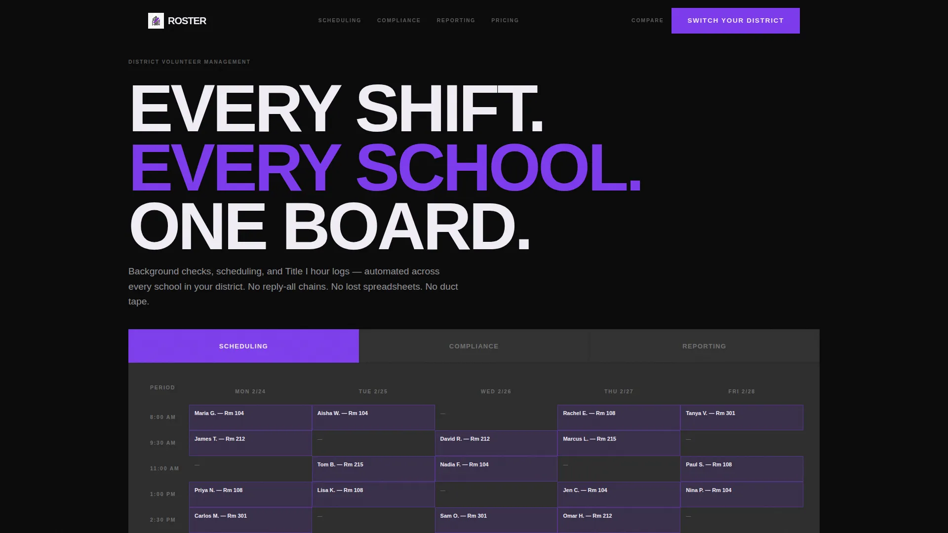
- A three-tab interactive header previewing scheduling, compliance, and reporting in hard-cut view switches
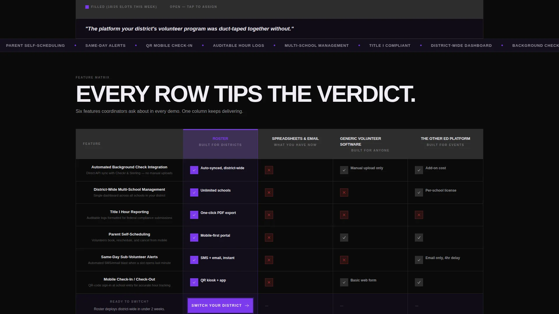
- A full feature matrix comparing your platform against spreadsheets, generic volunteer tools, and a named competitor column
- Two distinct calls-to-action: a full-width primary button and a qualifier-driven secondary flow that delivers a personalized comparison document
Feature list
This template delivers a focused set of purpose-built components. Each one is drawn directly from the design brief and built around the decision-making needs of district buyers.
Feature Tab Switcher Header
Three concrete-textured tabs sit across the top of the viewport like monolith slabs. Clicking "Scheduling" snaps to a week-view grid with volunteer names filling shift slots. "Compliance" reveals a background check status checklist with green and red indicators. "Reporting" shows a district-wide hours dashboard with exportable graph layouts. All transitions are hard cuts with no easing.
Head-to-Head Comparison Matrix
The core of the page is a feature matrix that puts your platform against three competitor columns: spreadsheets and email, generic volunteer software, and a direct ed-platform rival. Rows cover automated background check integration, district-wide multi-school management, Title I hour reporting, parent self-scheduling, same-day sub-volunteer alerts, and mobile check-in and check-out. Roster's column is stacked with violet checkmarks while competitors collect gray dashes and red marks.
Primary Call-to-Action Block
A full-width violet "Switch Your District" button anchors the bottom of the Roster comparison column. It appears exactly when the last feature row finishes loading, so the ask follows naturally from the evidence the reader just reviewed.
Personalized Comparison Qualifier
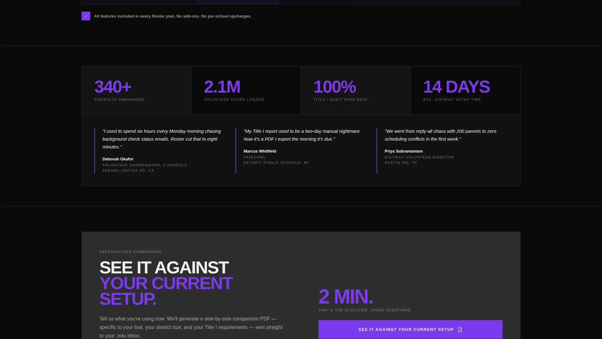
A secondary call-to-action labeled "See It Against Your Current Setup" opens a short qualifier form. Visitors select their current tool from a dropdown, enter their number of schools, and provide their district name. The flow then generates a personalized comparison document sent to their institutional email address.
Bold Brutalist Visual Framework
The layout uses absolute black as the dominant background, electric violet for every interactive element, raw slab gray for table grid lines and secondary containers, and chalk white for large condensed type. The visual system is designed to feel monolithic and impossible to scroll past without reading.
Comparison-First Page Architecture
The page is structured so that a visitor moves from curiosity to conviction before they ever see a sign-up prompt. The tab switcher earns attention, the matrix builds the case, and the call-to-action arrives only after the gap between options is already clear.
Page sections overview
| Section | Purpose |
|---|---|
| Feature Tab Switcher | Previews scheduling, compliance, and reporting views instantly |
| Tagline Text Bar | Delivers the platform's core positioning in one direct line |
| Feature Comparison Matrix | Stacks Roster against three competitor types row by row |
| Primary call to action Block | Anchors the switch prompt at the close of the evidence table |
| Qualifier call to action Flow | Captures current-tool context and delivers a personalized comparison |
Design & branding system
The visual identity follows a Bold Brutalist direction built on a Void and Violet color system. The palette reads like a freshly poured concrete wall tagged with ultraviolet spray paint: monolithic, unapologetic, and built to stop scrolling.
- Absolute black (#0A0A0A) dominates all background slabs; electric violet (#7C3AED) owns every interactive state including toggles, hover effects, selected columns, and active tabs; raw slab gray (#2D2D2D) builds the table grid and secondary containers; chalk white (#F0EDF5) carries all headline and body text
- Typography uses condensed sans-serif faces set large and heavy, styled to look stamped onto the surface rather than typed
- Violet checkmarks visually dominate the Roster column in the matrix, while gray dashes and red marks populate the competitor columns to make the contrast unmissable
Mobile & speed optimization
The template is structured for clarity at every viewport size. The comparison matrix and tab switcher are designed to remain legible and usable on smaller screens without losing visual impact.
- The Feature Tab Switcher is built for tap interaction on mobile, with hard-cut content switching that works as well on a phone screen as on a desktop monitor
- The comparison matrix is laid out so that the Roster column stays prominently visible as the reference column when the table scrolls horizontally on narrow viewports
How this template helps you convert
This template is engineered around a single conversion logic: make the gap between your platform and every alternative undeniable before you ask for anything.
- The tab switcher opens with an immediate product preview, letting visitors see scheduling, compliance, and reporting before they read a single sentence of copy, which lowers resistance and builds product confidence early.
- The comparison matrix accumulates row-by-row evidence across six feature categories, so by the time the primary call-to-action appears at the bottom of the Roster column, the decision already feels made.
- The personalized comparison qualifier turns the secondary call-to-action into a lead-capture tool that also delivers value, giving hesitant buyers a reason to share their contact details and current-tool context without feeling sold to.
Other information about this template
This template was designed specifically for the education volunteer management niche, where buyers often manage volunteer programs with limited staff and strict federal reporting requirements. The comparison-driven layout works especially well when the platform being marketed has clear, demonstrable feature advantages over the tools its buyers currently use.
- The qualifier flow supports dropdown options for tools commonly used in this space, including spreadsheet-based tracking, event sign-up platforms, and dedicated volunteer management software such as SignUpGenius and Better Impact
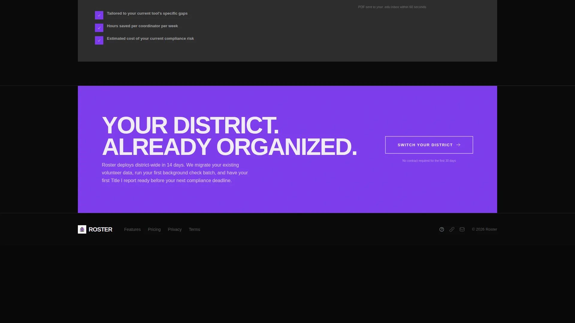
- The "Switch Your District" call-to-action language is written for district-level decision-makers, not individual users, reflecting the actual procurement context in K-12 education
- The page direction is Comparison/Versus, meaning the template is optimized for buyers who are already aware they have a problem and are actively evaluating options
- The template style is a Comparison Table layout built on a Feature Matrix creative direction, making it reusable for any platform that competes against legacy tools or general-purpose software in a specialized vertical
Theme
Bold Brutalist
Creative direction
Feature Matrix
Color system
Void & Violet
Style
Comparison Table
Direction
Comparison/Versus
Page Sections
Feature Tab Switcher Header
Head-to-head Comparison Matrix
Full-width Primary Call to Action Block
Personalized Comparison Qualifier
Bold Brutalist Visual System
Related questions
Who is this landing page template designed for?
What sections are included in this template?
Can I customize the competitor columns in the comparison table?
How does the personalized comparison qualifier flow work?
Does this template work for volunteer platforms outside K-12 education?



