Transparent Energy Billing Landing Page Template
Meter is a modular landing page template built for energy billing and invoicing platforms. It opens with a live-coded JSON invoice snippet and unfolds into an interactive card grid where visitors toggle rate schedules, drag through demand timelines, and see solar offsets in real time. The design uses a high-contrast Dashboard Pro aesthetic to make complex utility data feel readable and trustworthy.
by Rocket studio
Quick summary
Meter is a single-page landing page template designed for energy billing and invoicing platforms. It leads with an animated code snippet that parses a real utility bill, then delivers a modular card grid where visitors interact with live data before they ever tap a download button. The dark Dashboard Pro visual system makes dense energy data feel sharp, navigable, and credible.
Who this template is for
This template is built for teams that need to communicate complex energy billing concepts clearly and convert technically literate visitors. It works especially well when the product itself is the proof of value.
- Facility managers overseeing multi-site utility portfolios who need to show stakeholders where charges originate
- Chief Financial Officers and finance leads who suspect demand charge errors but need a tool that can surface and dispute them
- Sustainability leads who require granular consumption breakdowns for ESG reporting and need to demonstrate data depth to internal audiences
What problem this template solves
Utility bills are dense, inconsistently formatted, and nearly impossible to audit without specialized knowledge. This template addresses the trust gap between a prospective user and an unfamiliar energy software product.
- Visitors arrive skeptical and leave educated, because the page lets them interact with real billing data before asking for a commitment
- The template removes the "explain it to me" friction by showing parsed invoice logic, demand charge breakdowns, and time-of-use tier recalculations directly on screen
- It replaces generic feature lists with hands-on card modules that train users on the product while they browse
What you get with this template
You get a complete, ready-to-customize landing page built around interactive data exploration. Every section is designed to move a technically cautious visitor from curiosity to confident action.
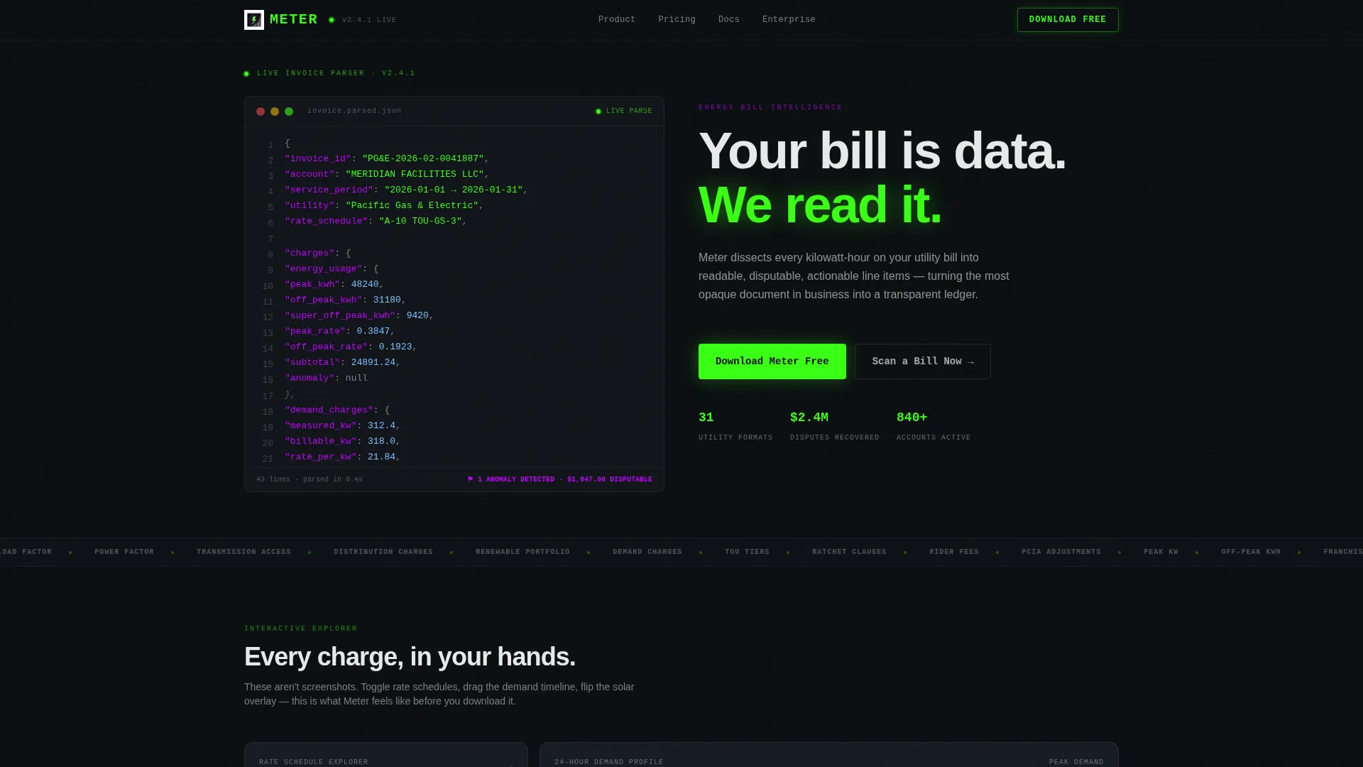
- An animated header with a syntax-highlighted JSON code block that simulates live invoice parsing, complete with nested fields for demand charges, rider fees, and tax line items
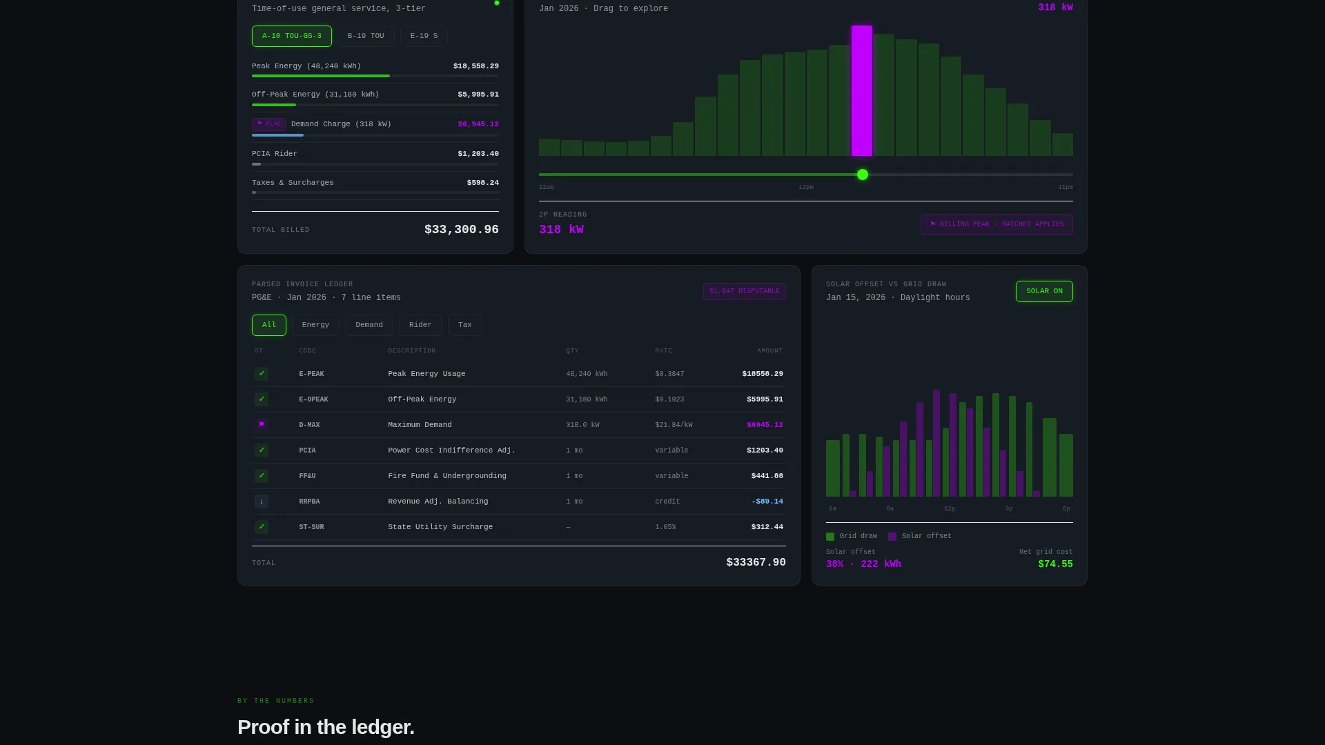
- A modular card grid with interactive modules including a rate schedule toggle with live charge recalculation, a draggable 24-hour peak-demand timeline, and a solar offset overlay
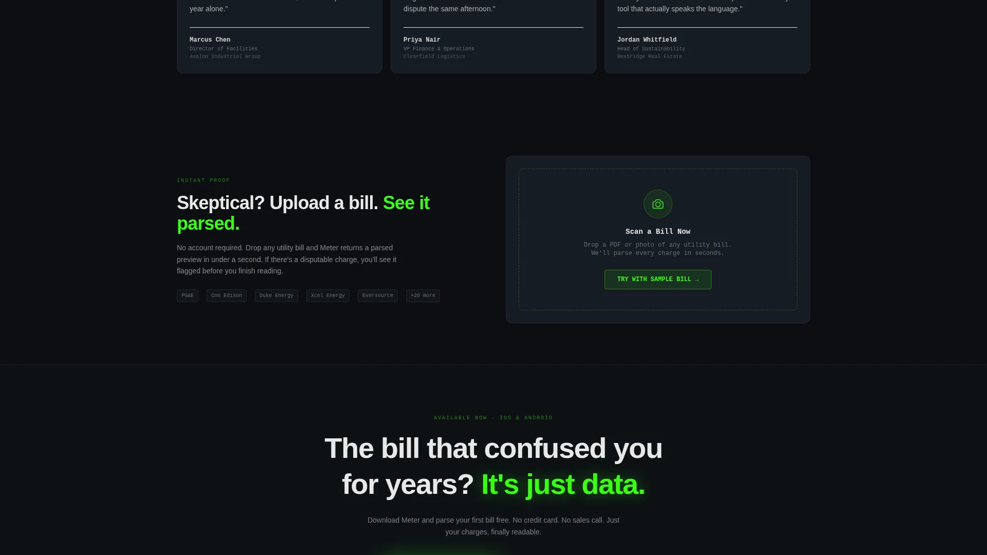
- A floating download call-to-action bar that appears after the first card interaction, plus a secondary camera-upload field that returns a parsed bill preview
Feature list
This template packs prompt-backed, interaction-first features into every section. Each one is grounded in the source brief and designed to do real conversion work.
Animated JSON Invoice Header
The header opens with a styled code block that simulates an invoice being parsed in real time. Cursor blink, syntax highlighting in phosphor green and electric violet, and auto-populating nested values give visitors an immediate sense of what the platform actually does when it reads a bill.
Rate Schedule Toggle Card
One card in the grid lets visitors switch between rate schedules and watch line-item charges recalculate on screen. This live feedback loop demonstrates billing transparency without a single word of explanation.
Draggable Peak-Demand Timeline
A 24-hour timeline card lets visitors drag through consumption data and observe peak-demand spikes as they move. It converts an abstract billing concept into something tangible and navigable.
Solar Offset Overlay Card
A dedicated card overlays solar generation against grid draw, giving sustainability-focused visitors a direct view of how offsets affect charges. This module speaks directly to ESG reporting needs without requiring extra copy.
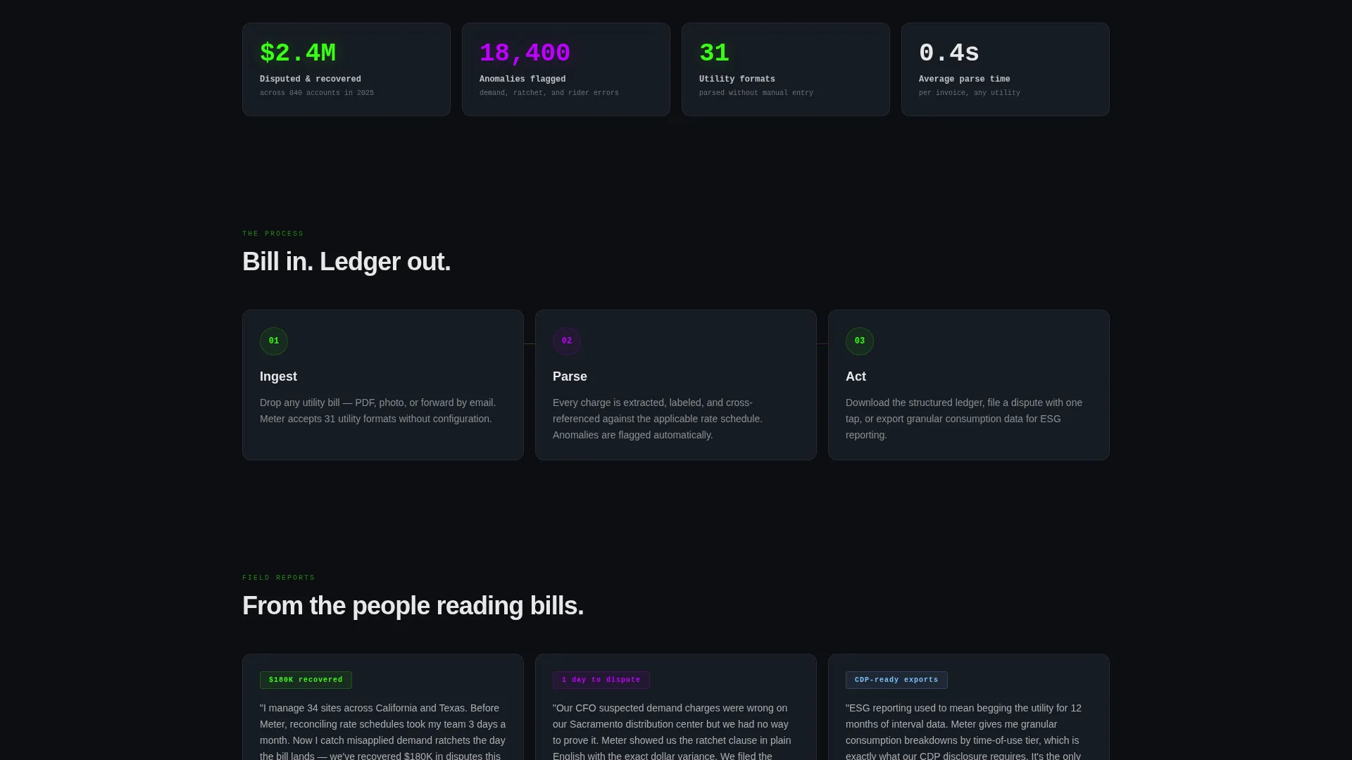
Progressive Scroll Data Layers
Scrolling through the page unlocks deeper data views within the same dataset. Visitors move from summary-level figures into granular breakdowns naturally, building product familiarity as they go.
Floating App Download Bar
A sticky download bar appears after the visitor engages with their first card. Its timing is tied to demonstrated product interaction, making the call to action feel earned rather than pushy.
Page sections overview
| Section | Purpose |
|---|---|
| Animated Code Header | Parses a live invoice object to establish platform credibility immediately |
| Headline Fade-In | Delivers the core value proposition after the code animation completes |
| Interactive Card Grid | Hosts all self-contained data modules for hands-on product exploration |
| Rate Schedule Card | Lets visitors toggle billing rates and see charges recalculate in real time |
| Peak Demand Timeline | Shows draggable 24-hour consumption data with demand spike visualization |
| Solar Offset Card | Overlays renewable generation against grid draw for sustainability context |
| Progressive Scroll Layers | Reveals granular data breakdowns as the visitor scrolls deeper |
| Floating Download Bar | Surfaces the primary call to action after first card interaction |
| Bill Scan Upload | Camera-upload field that returns a parsed bill preview as proof of value |
Design & branding system
The visual identity follows a Dashboard Pro theme built on the Acid Digital color system. Every color choice reinforces the power grid control room feeling described in the brief, where every pixel carries signal and nothing decorates for its own sake.
- Void black (#0B0E11) dominates all backgrounds, keeping the visual weight on data rather than chrome
- Terminal phosphor green (#39FF14) marks live data states, active values, and success indicators throughout the card grid
- Electric violet (#BF00FF) highlights interactive hotspots, anomaly flags, and clickable elements to guide visitor attention
- Interface white (#E8E8E8) keeps body typography clinical and readable across every dark card surface
Mobile & speed optimization
The modular card grid layout is structured to adapt cleanly across screen sizes. Interactive elements are designed with touch-friendly targets in mind, keeping the exploration experience usable on smaller displays.
- Individual card modules stack vertically on narrower screens without losing their self-contained interaction logic
- The floating download bar remains pinned and accessible regardless of scroll depth or viewport size
- The camera-upload bill scan field functions as a compact, tap-friendly input on mobile
How this template helps you convert
This template earns the download before it asks for it. The conversion path is built into the product exploration experience itself, not bolted on at the end.
- The animated code header establishes immediate technical credibility, signaling to facility managers and finance leads that this platform understands the structure of a real utility bill
- Interactive card modules train visitors on product behavior in real time, so by the time the floating download bar appears, they already have hands-on context for what the app does
- The bill scan upload field converts skeptics through instant proof, returning a parsed preview that makes the platform's value concrete before any account is created
Other information about this template
This template is built as a single-page, section-led landing page using a Card Grid modular structure. It is categorized under Technology, specifically within the Energy Software and SaaS subcategory, with a niche focus on energy billing and invoicing.
- The creative direction is Interactive Explorer, meaning each card is a self-contained module the visitor can manipulate rather than a static content block
- The header concept is Code Snippet, a deliberate choice that positions the platform as data-native and technically serious from the first second of the visit
- The primary call-to-action direction is App Download, supported by a secondary conversion path through the bill scan upload field
- The template style is Card Grid modular, which makes it straightforward to add, remove, or reorder cards to match different product emphasis needs
- The Dashboard Pro theme and Acid Digital color system are matched to the Intersection Match Score context for this niche, making the visual language consistent with energy software category expectations
Theme
Dashboard Pro
Creative direction
Interactive Explorer
Color system
Acid Digital
Style
Card Grid (Modular)
Direction
App Download
Page Sections
Animated JSON Invoice Header
Interactive Rate Schedule Toggle
Draggable 24-hour Demand Timeline
Solar Offset Overlay Module
Progressive Scroll Data Layers
Floating App Download Bar
Related questions
Who is the ideal user for this landing page template?
Can I customize the card modules to match my platform's features?
What makes the floating download bar different from a standard call-to-action button?
Is this template suitable for a B2B audience?
What is the secondary conversion path on this landing page?



