Nexus — Managed Technology Services Landing Page Template
Uptime is a dashboard-style landing page template built for managed IT service providers. It pairs a NOC-inspired visual identity with a live-readout aesthetic, a scrollable feature matrix, and a multi-step free assessment funnel. The result is a page that earns prospect trust by showing operational depth before asking for a single contact detail.
by Rocket studio
Quick summary
Uptime is a single-page template designed for IT services companies that need to turn skeptical buyers into booked calls. It opens with live-style performance metrics, flows through a scrollable service matrix, and closes with a progressive lead-capture form. Every section is built to look like a working dashboard, not a brochure.
Who this template is for
This template speaks directly to managed IT providers who serve small-to-mid-sized businesses. It is built for teams whose prospects are stressed, not curious, people who need to see proof before they book a call.
- Operations directors at growing firms who recently lost their internal IT person
- Chief financial officers tired of unpredictable break-fix costs
- Office managers who became the default "tech person" and need structured rescue
What problem this template solves
Most IT services pages describe capabilities without proving them. Prospects arrive skeptical, scan for a pricing page that does not exist, and leave. This template solves that trust gap by leading with real operational data instead of feature lists alone.
- Visitors see uptime, response time, and endpoint counts before reading a single paragraph
- The feature matrix lets prospects self-qualify by service pillar rather than guessing what is covered
- The progressive form reduces friction by asking for company details first, contact details second
What you get with this template
You get a fully structured landing page that moves a visitor from first impression to booked assessment in one scroll. The layout is dense with proof points but never cluttered, because each section follows a dashboard logic that readers find familiar.
- A logo bar header, three live-style stat cards, and a scrollable service capability matrix
- A two-path conversion system: a free network assessment form and a gated IT health scorecard download
- A Dashboard Pro visual theme using a terminal-black and iridescent color palette with cyan-and-violet accents
Feature list
This template includes a focused set of components drawn directly from the brief. Each one serves a specific job in moving a visitor toward a conversion.
Live-Style Metric Header Cards
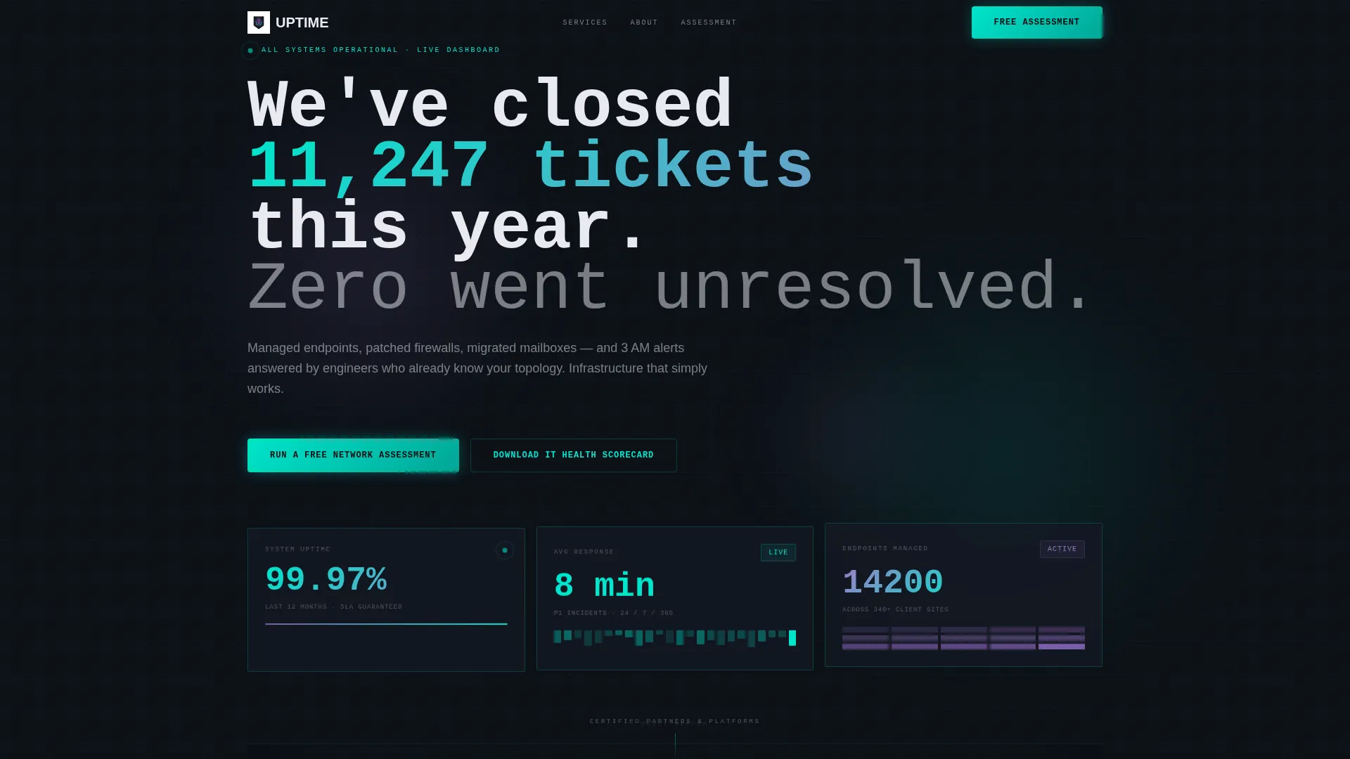
Three dashboard cards sit below the logo bar and display uptime percentage, average response time, and total endpoints managed. The numbers are styled to look like live readouts, with digit-tick animation, giving the impression that the data is streaming in real time.
Scrollable Service Feature Matrix
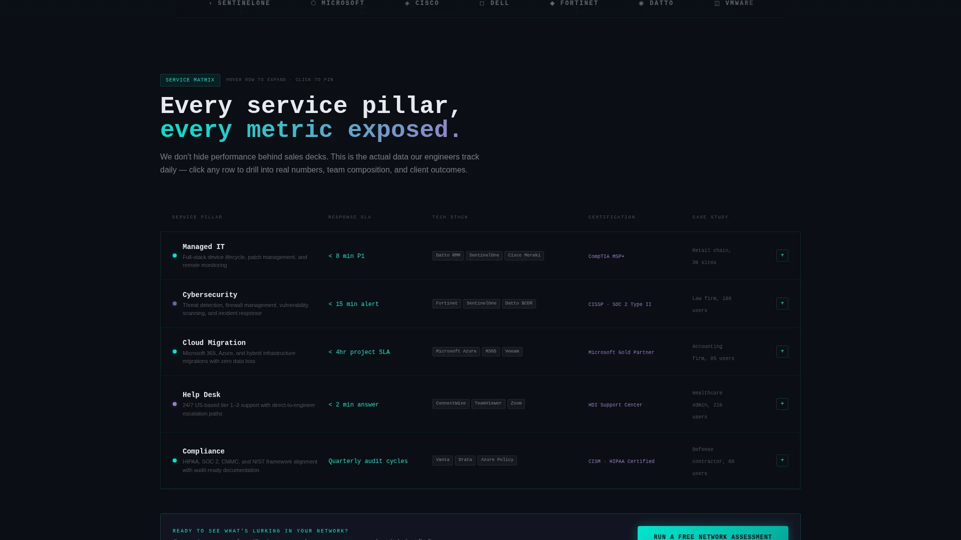
A data grid organizes five service pillars, managed IT, cybersecurity, cloud migration, help desk, and compliance, across columns covering response SLA, tech stack, certification, and case study links. Hovering any row expands it into a mini-dashboard with service metrics, team size, and a short client testimonial.
Partner and Client Logo Bar
A horizontal strip of partner and client logos scrolls on an infinite loop against a terminal-black background. Logos render in monochrome phosphor white, keeping the visual tone consistent while establishing credibility at the top of the page.
Progressive Three-Step Lead Form
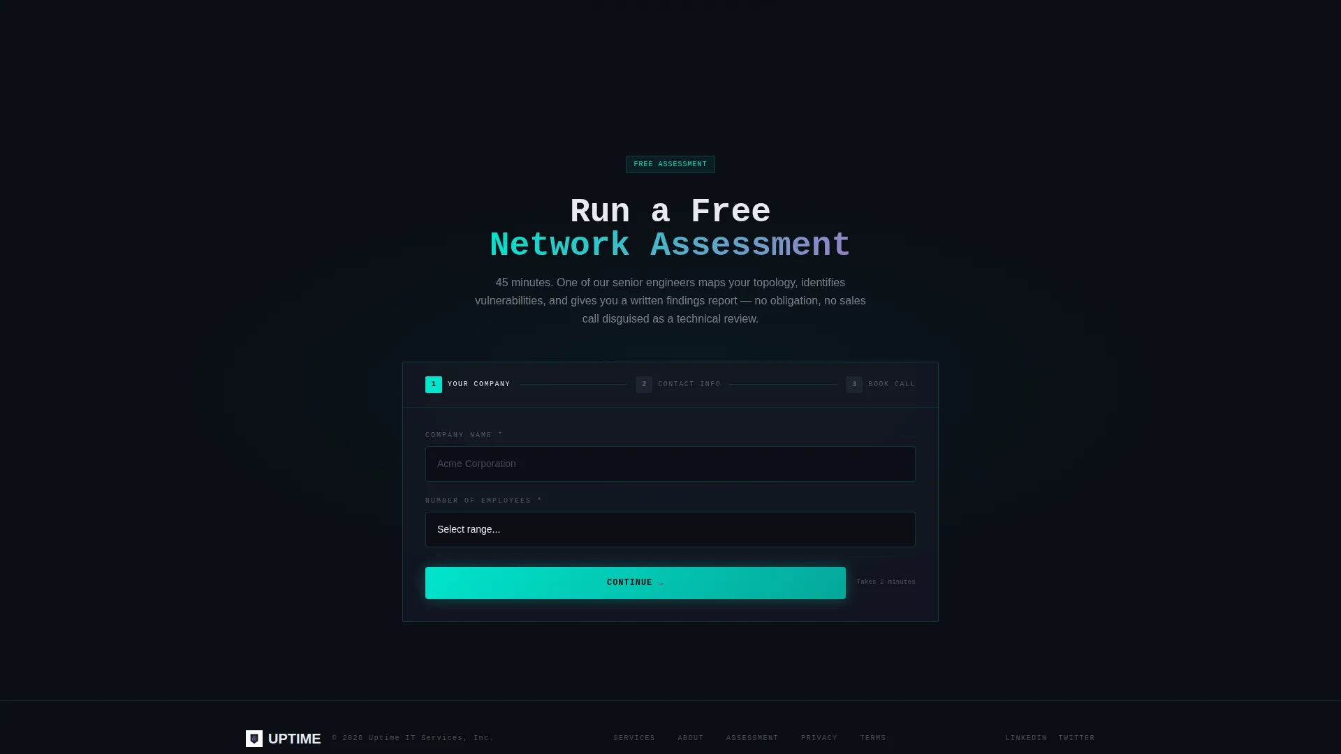
The primary call to action is a "Run a Free Network Assessment" form built in three steps. Step one collects company name and employee count. Step two reveals email and phone. Step three presents a calendar embed for booking the assessment call, reducing drop-off at each stage.
Gated IT Health Scorecard
A secondary conversion path offers a downloadable IT Health Scorecard PDF gated behind an email address only. This lower-commitment offer captures prospects who are not ready to book a call but are willing to share a contact detail for useful content.
Sticky Call-to-Action Bar
The free network assessment call to action also appears as a sticky bar element that persists as the visitor scrolls. This keeps the primary conversion action visible throughout the feature matrix section, where most prospect engagement happens.
Page sections overview
| Section | Purpose |
|---|---|
| Partner Logo Bar | Builds instant credibility with recognizable technology partners |
| Headline Stat Block | Shows uptime, response time, and endpoint volume as live-style metrics |
| Service Feature Matrix | Maps five service pillars against capability dimensions in an expandable grid |
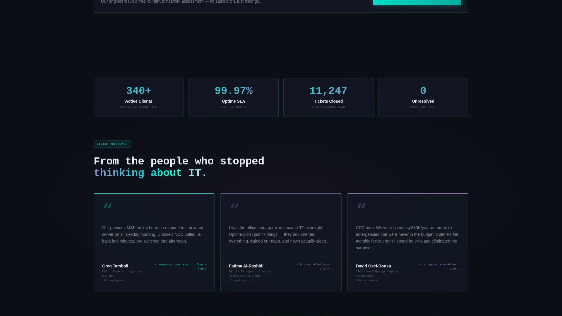
| Row Expansion Panel | Reveals service-level metrics, team size, and a short client testimonial on hover |
| Free Assessment call to action | Primary conversion form with three progressive steps toward a booked call |
| IT Scorecard Gate | Secondary email-only download for prospects earlier in the decision process |
| Sticky call to action Bar | Persistent assessment offer visible throughout the full page scroll |
Design & branding system
The visual identity follows a Dashboard Pro theme with an AI Iridescent color system. The palette is built around a Network Operations Center aesthetic, dark backgrounds, glowing accents, and data-readout typography.
- Background colors stay in the deep terminal black (#0B0E14) to charcoal range; cards use subtle 1px cyan (#00E5CC) borders to float off the background
- Body text uses soft phosphor white (#E8EAF0) so numbers and copy feel like live screen output, not print
- Accent gradients shift between holographic violet (#7B5EA7) and signal cyan on hover states and active elements, with a monospaced typeface used for headlines and metric displays
Mobile & speed optimization
The dashboard-grid layout is structured to reflow cleanly on smaller screens. Dense data sections like the feature matrix are built to remain readable and interactive on mobile viewports without losing their layered information architecture.
- The three stat cards stack vertically on mobile while preserving the live-readout visual style
- The progressive form steps are touch-friendly and load one field group at a time to reduce cognitive load on small screens
How this template helps you convert
The conversion strategy is built on a simple principle: show your own operational data so transparently that prospects start wondering what you would find in their environment.
- The live-metric header cards establish credibility in the first five seconds, before any copy is read, priming the visitor to trust the claims that follow
- The feature matrix lets prospects drill into the specific service they need, expanding row by row, so they arrive at the call-to-action already informed and self-qualified
- The two-path conversion system captures both ready buyers via the booked assessment and early-stage prospects via the scorecard download, widening the top of the funnel without adding page complexity
Other information about this template
This template is designed specifically for the IT services company about us page use case, where the goal is equal parts brand introduction and lead generation. It fits naturally within IT services company website template collections aimed at managed service providers.
- The template style is classified as Dashboard and Data Grid, suited for technology-forward service businesses that want to lead with proof over persuasion
- The header concept is a Logo Bar referencing partner ecosystems that include names like Microsoft, Cisco, Dell, Fortinet, and Datto, as described in the brief
- The Freemium and Trial landing page direction means the primary offer is free and low-risk, which aligns well with prospects evaluating managed IT providers for the first time
- The creative direction is Feature Matrix, a grid-based structure that scales well if a provider wants to add service rows or capability columns over time
Theme
Dashboard Pro
Creative direction
Feature Matrix
Color system
AI Iridescent
Style
Dashboard/Data Grid
Direction
Freemium/Trial
Page Sections
Live-style Metric Header Cards
Scrollable Service Feature Matrix
Progressive Three-step Lead Form
Gated IT Health Scorecard
Infinite-loop Partner Logo Bar
Sticky Call-to-action Bar
Related questions
Can I customize the metric numbers in the header cards?
Does the feature matrix work for providers with fewer than five service pillars?
What if a visitor is not ready to book a call?
Is the three-step form connected to a scheduling tool out of the box?
Who is the ideal business for this template?



