Optometry Job Board Landing Page Template
Optic is a card grid landing page template built for optometry job boards. It pairs a Dynamic Motion theme with a deep Void & Violet color system to create an environment that feels clinical yet visually striking. An interactive header previews live job cards, a Problem-to-Solution scroll arc builds conviction, and a persistent app download call to action closes the loop.
by Rocket studio
Quick summary
Optic is a single-page, modular card grid template designed specifically for optometry job boards. It uses a Dynamic Motion theme, a Void & Violet palette, and a Problem-to-Solution scroll structure to move both job-seeking optometrists and practice owners toward one clear action: downloading the app or posting a position.
Who this template is for
This template was designed for a very specific corner of healthcare recruiting. It speaks directly to people who live and work inside optometry practices, not general job seekers or generic HR platforms.
- New optometry graduates searching for their first associate position
- Experienced, therapeutically-certified optometrists pursuing private practice buy-ins
- Practice owners and office managers who need to fill clinical or pre-testing roles quickly
What problem this template solves
Optometry professionals face a frustrating job search experience on general platforms. Listings go stale, salary data is hidden, and filters built for other industries never quite fit the needs of someone searching by therapeutic license or specialty area.
- No salary transparency or OD-specific filters on generic job sites
- Endless recruiter emails and outdated listings with no practice culture context
- No fast path for practice owners to post a role and capture qualified candidates
What you get with this template
You get a fully structured, single-page layout purpose-built for an optometry job board product. Every section is designed to demonstrate value before asking for a commitment.
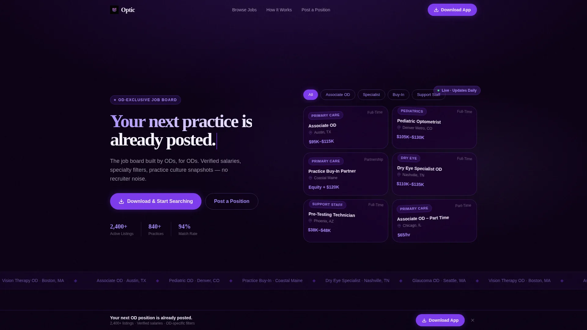
- An interactive header card grid showing real, filterable job titles with spring-loaded motion
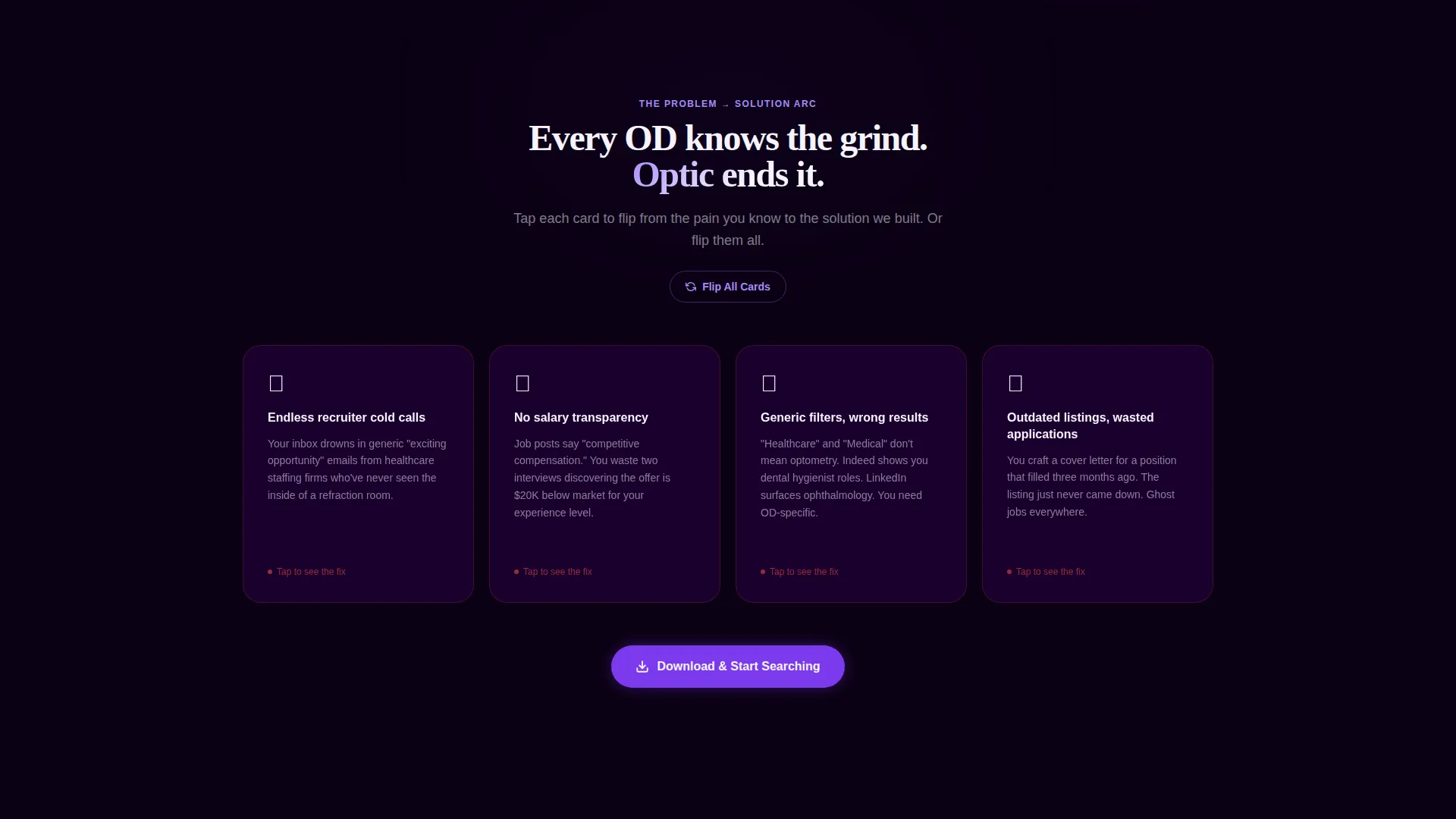
- A Problem-to-Solution scroll arc using 3D card-flip animations to reveal each solution
- A persistent app download call to action with App Store and Google Play badge placements
- A secondary "Post a Position" form capturing practice owner email and zip code
Feature list
This template's features are grounded directly in the source brief. Each one plays a specific role in the page flow.
Interactive Job Card Header
The header renders as a functioning mini-app interface. Actual job titles float and drift against the void background, and visitors can tap filters for location, salary range, and specialty to watch cards shuffle and restack with spring-loaded physics. The motion signals immediately that the board is live and responsive.
3D Problem-to-Solution Card Flip Arc
Below the fold, each pain point appears on a dark card with a dim red pulse. As the visitor scrolls, each card rotates with a full 3D transform to reveal its violet-lit solution side. The arc moves from individual frustrations to systemic relief, ending in a mosaic of placed candidates that assembles tile by tile.
Persistent App Download Call to Action
The primary call to action, "Download & Start Searching," first appears after the third problem-flip card. It then pins to the bottom of the viewport for the rest of the scroll. Paired App Store and Google Play badges glow in electric violet against the void background.
Dual Conversion Paths
The template serves two distinct audiences at once. Job seekers follow the app download path, while practice owners have a dedicated secondary flow with a two-field form capturing email address and practice zip code, giving both groups a clear next step.
Modular Card Grid Layout
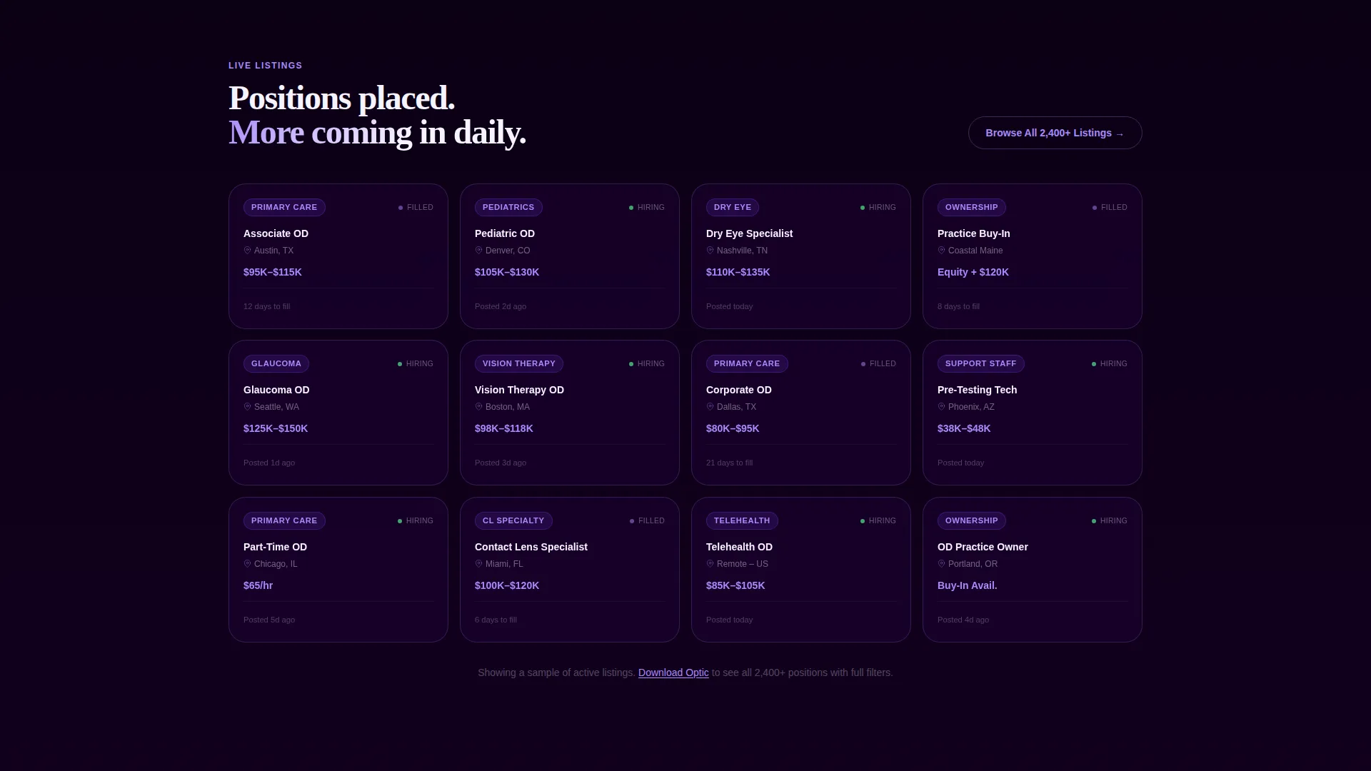
The page is built on a modular card system. Cards resize, restack, and rearrange based on filter interactions. The grid structure makes it straightforward to represent job listings at varying levels of detail without breaking the visual rhythm.
Void & Violet Color System
The palette uses four defined values: deep void black (#0B0014), electric violet (#7C3AED), soft iris (#A78BFA), and retinal white (#F5F3FF). Each color has a designated role, from background surfaces to card faces to interactive accents, creating a consistent visual language throughout the page.
Page sections overview
| Section | Purpose |
|---|---|
| Interactive Header | Previews live job cards with filterable, animated card grid |
| Headline Phase-In | Introduces core value proposition as text fades in above cards |
| Problem Cards Row | Presents recruiter and listing pain points on dark, pulsing cards |
| Solution Card Flips | Reveals OD-specific solutions via 3D card rotation on scroll |
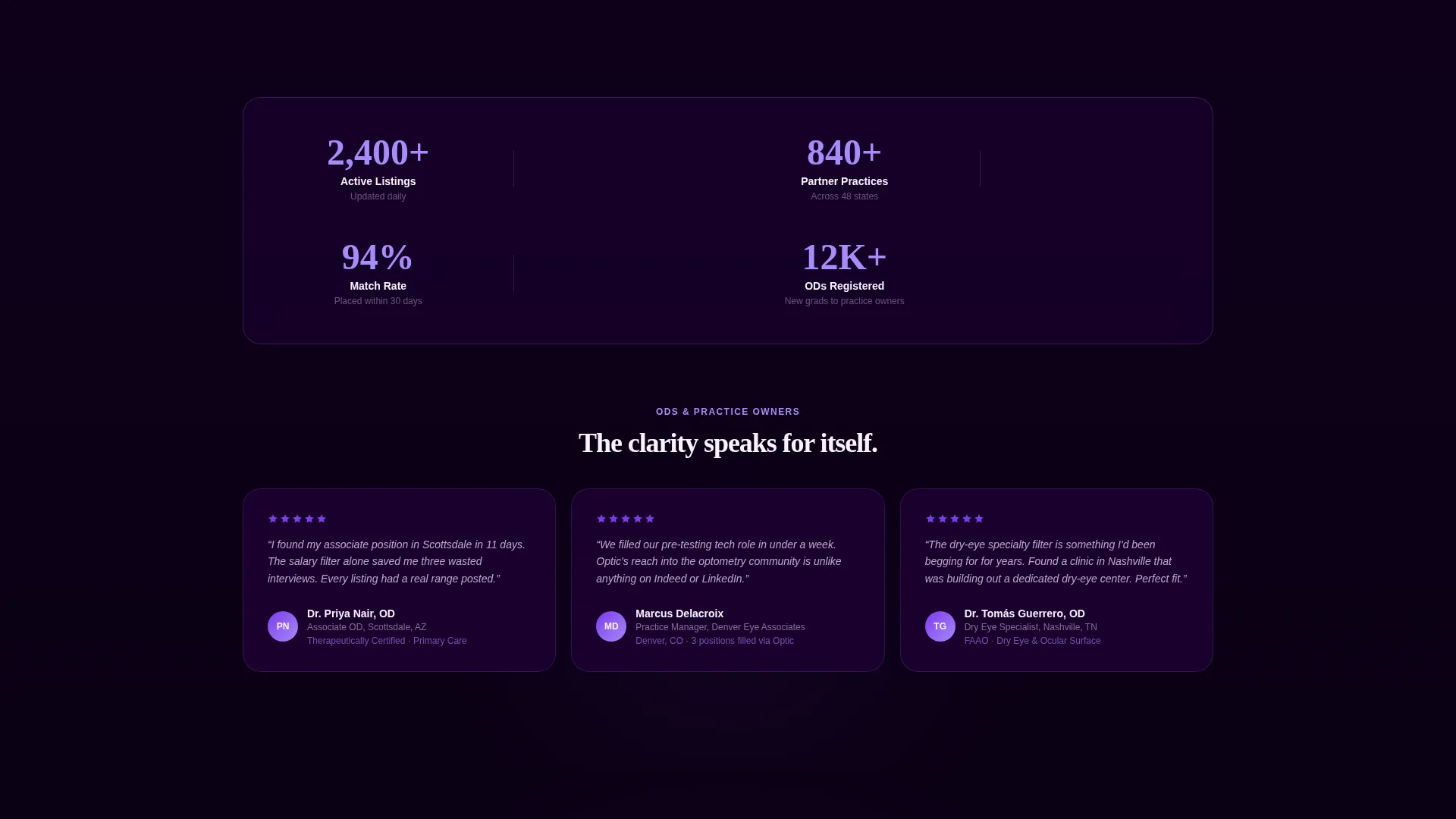
| Candidate Mosaic | Assembles a tile-by-tile visual of filled positions and placements |
| App Download call to action | Drives primary conversion with pinned badge buttons |
| Post a Position Form | Captures practice owner email and zip code for secondary conversion |
Design & branding system
The Void & Violet color system creates a darkened exam room atmosphere. Each color is assigned a precise role, and the overall effect is clinical precision with quiet visual drama.
- Deep void black (#0B0014) as the primary background, electric violet (#7C3AED) as the main interactive accent, soft iris (#A78BFA) for secondary surfaces, and retinal white (#F5F3FF) for card faces and text fields
- Dynamic Motion theme with spring-loaded card physics, gentle drift animations in the header, and 3D transform flips on scroll throughout the problem arc
- Accent colors float forward against the dark background, each element behaving like a fixation target in a visual field test
Mobile & speed optimization
The modular card grid is built to flex across screen sizes. The spring-loaded filter interactions and 3D card flips are designed to respond to touch input as naturally as they do to mouse or trackpad.
- Card grid reflows and restacks at smaller viewport widths without breaking the visual hierarchy
- Persistent pinned call-to-action bar stays anchored at the bottom of the viewport on mobile devices
- Filter tap interactions in the header are designed for thumb-friendly use on smaller screens
How this template helps you convert
Every design and structural decision in Optic is aimed at reducing hesitation and making the next step obvious for both audience groups.
- The interactive header lets visitors filter and explore real job listings before they are ever asked to download the app, demonstrating value through direct experience rather than a promise.
- The Problem-to-Solution card flip arc builds emotional conviction by naming specific frustrations and then visually resolving each one, so visitors arrive at the call to action already persuaded.
- The dual conversion structure ensures practice owners are never left without a clear path. The two-field "Post a Position" form gives them an immediate, low-friction action that matches their intent.
Other information about this template
Optic was built at the intersection of technology and optometry digital presence, making it a focused tool rather than a general-purpose job board template. A few additional details are worth noting.
- Template style is Card Grid (Modular), suited for content that needs to be browsed and filtered rather than read linearly
- The creative direction follows a Problem-to-Solution Arc, a structure that works especially well when the audience has a specific, recurring frustration to resolve
- The header concept is classified as Interactive Preview, meaning the primary engagement mechanism is demonstration rather than description
- The landing page direction is App Download, so the entire scroll sequence is built around earning that final tap on the badge button
- The Dynamic Motion theme is a deliberate niche choice, reinforcing the message that the job board itself is alive and current, not a static directory
Theme
Dynamic Motion
Creative direction
Problem→Solution Arc
Color system
Void & Violet
Style
Card Grid (Modular)
Direction
App Download
Page Sections
Interactive Filterable Job Card Header
3D Problem-to-solution Scroll Arc
Persistent Pinned App Download Call to Action
Dual-audience Conversion Structure
Modular Void & Violet Card Grid
Related questions
Who is this template designed for?
What makes this different from a general job board template?
How does the dual conversion path work?
Is the interactive header part of the included template design?
Can the app download call to action be adapted for a web platform?



