Passage - Streamlined Funeralcrm Landing Page Template
Passage is a funeral customer relationship management landing page template built for software platforms serving funeral professionals. It uses a hub-and-spoke anchor navigation layout with five spoke sections, stats-first impact headers, a competitor comparison grid, and two distinct conversion paths. The design follows a Tech Glass visual theme in a composed Slate and Sky color system.
by Rocket studio
Quick summary
Passage is a single-page, anchor-navigated landing page template designed for a funeral customer relationship management platform. It opens with three frosted glass stat panels, flows through five spoke sections covering core workflows, and closes with a feature-by-feature competitor comparison grid. The design is calm, modern, and built to earn trust from funeral professionals.
Who this template is for
This template is built for funeral technology companies and vertical software-as-a-service platforms that need to communicate their product clearly to a skeptical, process-driven audience. It works especially well when the product replaces legacy tools or spreadsheet-based workflows.
- Independent funeral home owners managing many active cases at once
- Regional chain operations directors who need consistent workflows across locations
- Preneed counselors losing follow-ups to disorganized spreadsheet systems
What problem this template solves
Funeral professionals are hard to convince with vague promises. They have seen too many tools that look polished but add friction. This template is designed to remove that skepticism by leading every section with a hard number before any explanation.
- Generic software landing pages fail to speak to the specific pain of case-load management
- Legacy tool comparisons are usually buried or avoided, leaving buyers guessing
- Most funeral software pages lead with emotion rather than operational proof
What you get with this template
You get a complete, single-page layout structured around five anchor-navigated workflow sections, a persistent comparison bar, and two carefully designed conversion paths. Every section follows the same rhythm: metric first, then visual, then explanation, then comparison.
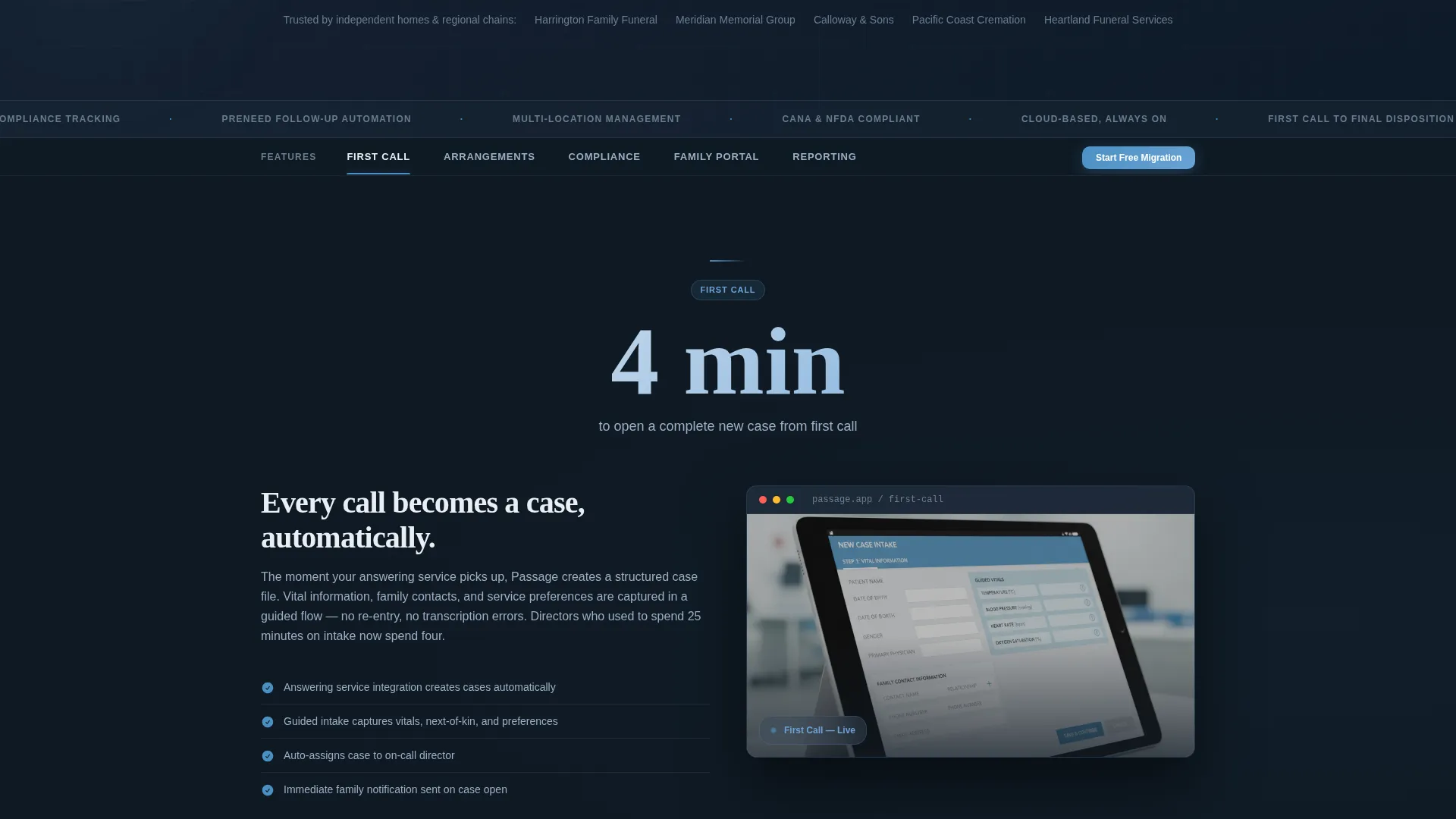
- A fixed hub navigation with five labeled spokes: First Call, Arrangements, Compliance, Family Portal, and Reporting
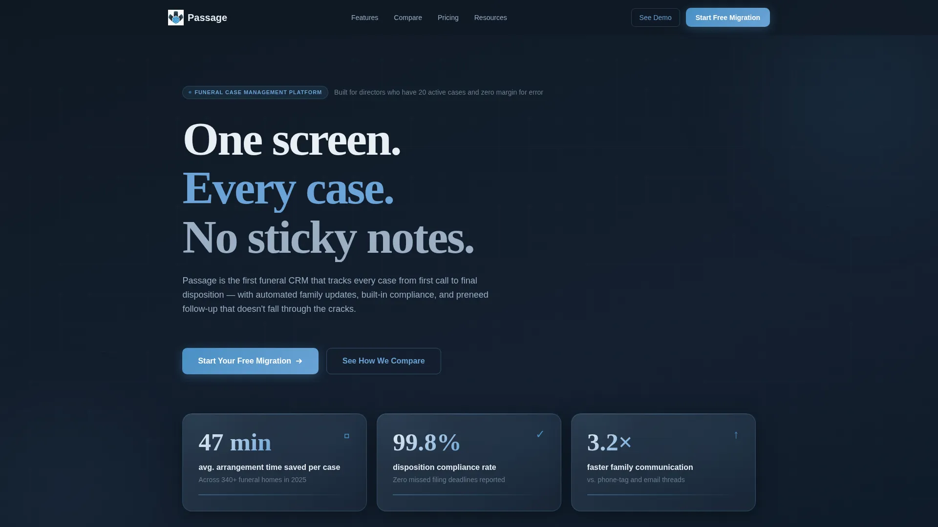
- A stats-first header block with three translucent glass panels displaying live-style performance figures
- A competitor comparison grid and dual call-to-action setup with a primary migration form and a secondary guide download
Feature list
This template includes purpose-built components that reflect how funeral operations professionals actually evaluate software.
Stats-First Glass Header
Three frosted glass panels sit against a deep charcoal background, each displaying a single bold performance metric. The panels use a translucent depth effect with light refraction at the edges, creating a dashboard-like sense of authority without relying on stock imagery.
Fixed Hub Anchor Navigation
A persistent navigation bar with five spoke labels stays visible as users scroll. Each label links directly to its corresponding section, allowing funeral directors to jump immediately to the workflow area most relevant to their role.
Stat-Led Spoke Sections
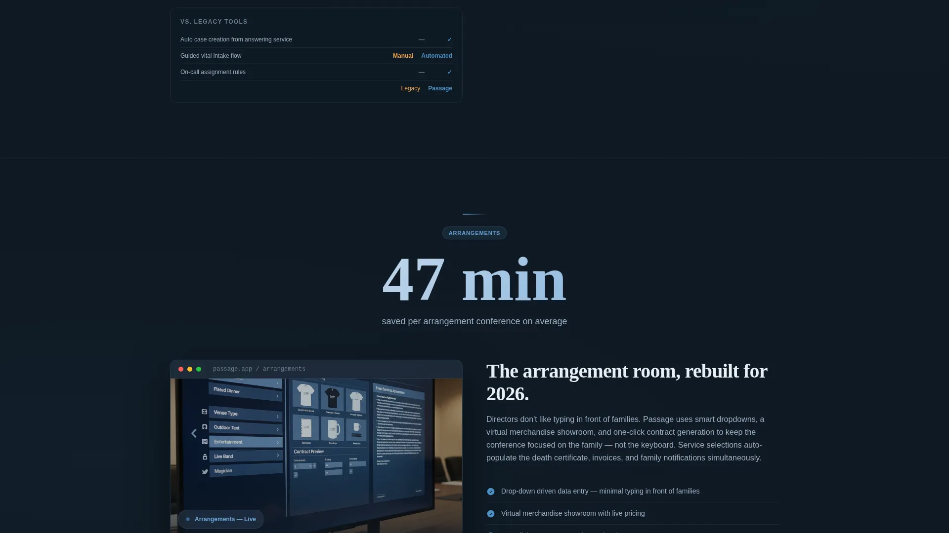
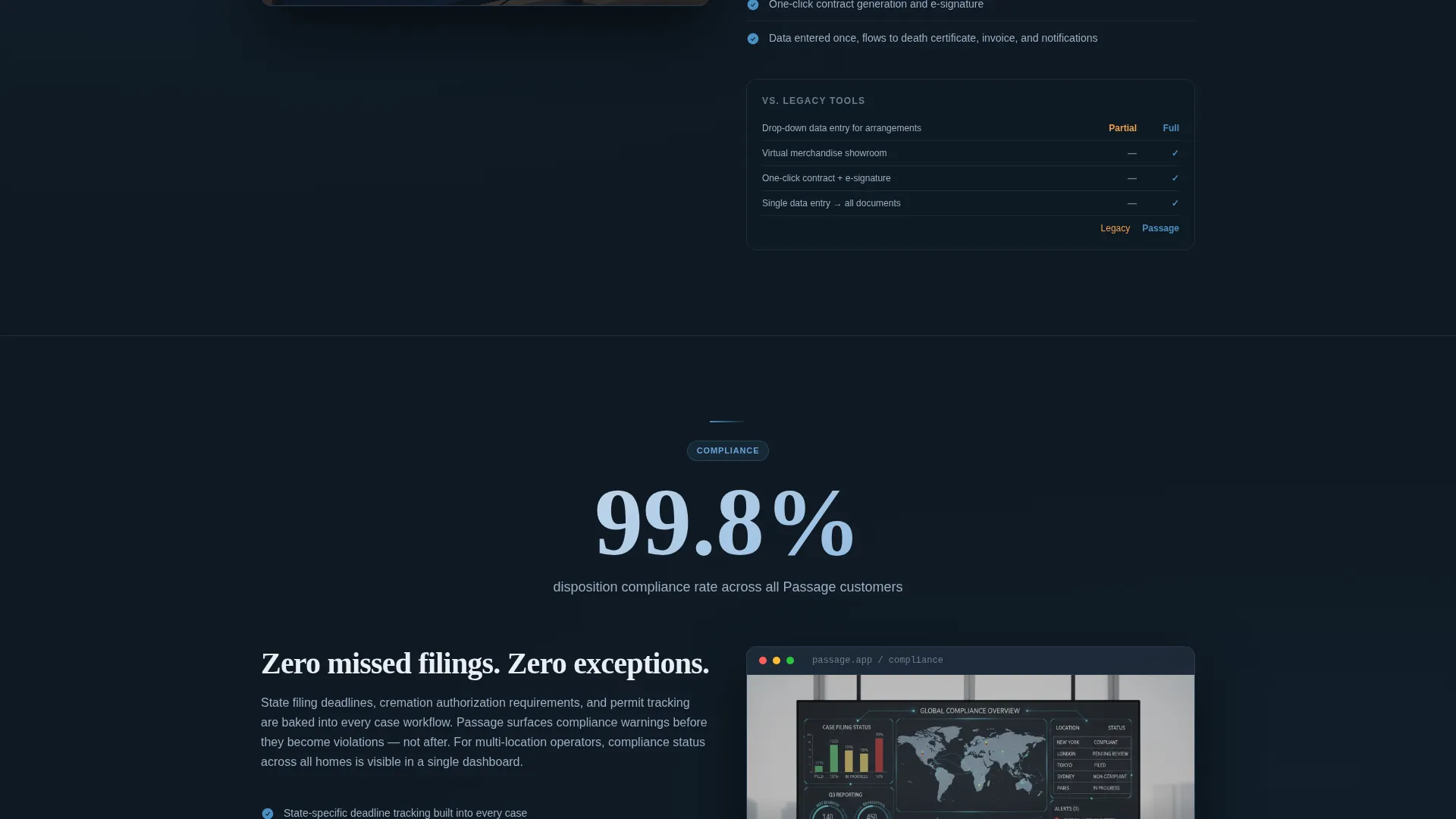
Each of the five spoke sections opens with a bold metric, followed by a screenshot placeholder, a single explanatory paragraph, and a comparison column. This rhythm escalates from operational efficiency at the top to emotional payoff at the bottom.
Competitor Comparison Grid
A detailed feature-by-feature grid compares the platform against legacy tools and spreadsheet workflows. Columns show where competitors leave gaps and where the platform delivers, using a clear checkmark and dash visual language.
Dual Conversion Path Setup
The primary call to action is a single-field form asking only for the funeral home name. A secondary path offers a downloadable switching guide for directors who are not yet ready to commit. Both paths are positioned to reduce friction and capture different stages of readiness.
Persistent Floating Comparison Bar
A floating bar anchored to the bottom of the viewport reads "See How We Compare" and scrolls users directly to the comparison grid. It stays visible throughout the page experience without interrupting reading flow.
Page sections overview
| Section | Purpose |
|---|---|
| Glass Stats Header | Open with three live-metric panels to establish credibility immediately |
| Fixed Hub Nav | Anchor navigation bar linking to all five spoke sections |
| First Call Spoke | Lead with a case intake metric, then explain first-call workflow features |
| Arrangements Spoke | Show arrangement time savings before describing the arrangement tools |
| Compliance Spoke | Open with a compliance rate stat, then detail disposition tracking |
| Family Portal Spoke | Lead with a family communication figure, then explain the portal |
| Reporting Spoke | Anchor reporting section to efficiency or volume metrics |
| Comparison Grid | Feature-by-feature table contrasting platform against legacy tools |
| Primary call to action Form | Single-field form to trigger a personalized demo environment |
| Secondary call to action Path | Email capture for the downloadable switching guide |
| Floating Compare Bar | Persistent bottom bar anchoring to the comparison section |
Design & branding system
The visual identity uses a Tech Glass theme built on a Slate and Sky color system. The palette is composed and professional, drawing on the quiet atmosphere of a well-organized arrangement room rather than the clinical brightness of typical software marketing.
- Core colors: deep charcoal slate (#1E2A38), polished graphite (#3B4856), open-sky blue (#6BA3D6), and pale frost (#E8EEF4) for card surfaces
- Accent interactions use a soft cerulean (#4A90C4) that pulses like a notification light on a quiet dashboard
- Glass panel components use translucent frosted surfaces with subtle depth-of-field blur and light refraction at edges
Mobile & speed optimization
The template is structured for clean rendering across screen sizes. The anchor navigation and floating comparison bar are designed to remain functional and unobtrusive on smaller viewports.
- Fixed hub navigation collapses cleanly so spoke labels remain tappable on mobile screens
- Floating comparison bar is positioned to avoid blocking primary reading content on touch devices
- Glass panel components use layered styling that scales without requiring image-heavy assets
How this template helps you convert
The page architecture is designed around a single idea: prove the value numerically before asking for any commitment. Every structural choice moves a skeptical buyer one step closer to acting.
- Stats-first sections reduce the cognitive load of evaluating claims by replacing adjectives with figures, making the value case immediately tangible for directors who distrust marketing language.
- The dual conversion path captures both decision-ready buyers through the single-field demo form and research-stage buyers through the guide download, so no qualified visitor leaves without a next step.
Other information about this template
This template is part of a Funeral Vertical SaaS category designed specifically for case and arrangement management platforms. It is well suited for products that compete directly with established tools in the funeral software space.
- The comparison grid layout is designed to reference competitor workflows honestly, making it suitable for platforms positioning against tools like legacy case management systems and manual spreadsheet processes
- The template style is Hub and Spoke with Anchor Navigation, which works well for platforms with multiple distinct workflow modules that need equal visibility
- The Stats-First Impact creative direction is especially effective in regulated or trust-sensitive industries where credibility must be earned before features are introduced
- The single-field primary form is intentionally minimal to reduce drop-off at the moment of highest intent
Theme
Tech Glass
Creative direction
Stats-First Impact
Color system
Slate & Sky
Style
Hub & Spoke (Anchor Nav)
Direction
Comparison/Versus
Page Sections
Stats-first Frosted Glass Header
Fixed Hub Anchor Navigation
Stat-led Spoke Sections
Feature-by-feature Comparison Grid
Dual Conversion Path Layout
Persistent Floating Comparison Bar
Related questions
Can I customize the five spoke section labels?
Does this template work for a platform with fewer than five modules?
Is the competitor comparison grid editable?
What is the primary call to action on this template?
Can the floating comparison bar be removed if I do not need it?



