Bold Travel Course Landing Page Template
Passport is a bold, split-screen landing page template built for travel course and training platforms. It combines a Bold Brutalist visual theme with a Glassmorphic color system to create an electric, high-conviction page flow. An interactive header preview, data-driven scroll sections, and strategically placed calls-to-action guide visitors from curiosity straight to enrollment.
by Rocket studio
Quick summary
Passport is a split-screen landing page template designed for travel course and training platforms. It pairs a Bold Brutalist aesthetic with a Glassmorphic palette to deliver an industry-report style scroll experience. Every section escalates the case for enrollment using salary data, market figures, and curriculum proof, ending with a clear path to sign up.
Who this template is for
This template is built for educators and entrepreneurs who teach people how to build travel businesses. It speaks directly to a bold, action-oriented audience and matches the energy of a career-changing decision.
- Travel course creators who teach booking, supplier negotiation, and agency building
- Training platform founders targeting career-changers, stay-at-home parents, and legacy travel agents going digital
- Digital entrepreneurs selling high-ticket online programs in the travel industry niche
What problem this template solves
Most course landing pages bury the proof and lead with hype. Visitors leave before they trust the offer. This template flips that sequence by front-loading real data, graduate income proof, and market benchmarks so conviction builds before the call-to-action ever appears.
- Weak landing pages lose buyers who need evidence before they commit
- Generic templates cannot convey the urgency of a now-or-never career pivot
- Static pages miss the chance to let visitors explore the curriculum before enrolling
What you get with this template
You get a fully structured, single-page layout with every section designed to move a skeptical visitor toward enrollment. The template delivers a complete visual and structural system out of the box.
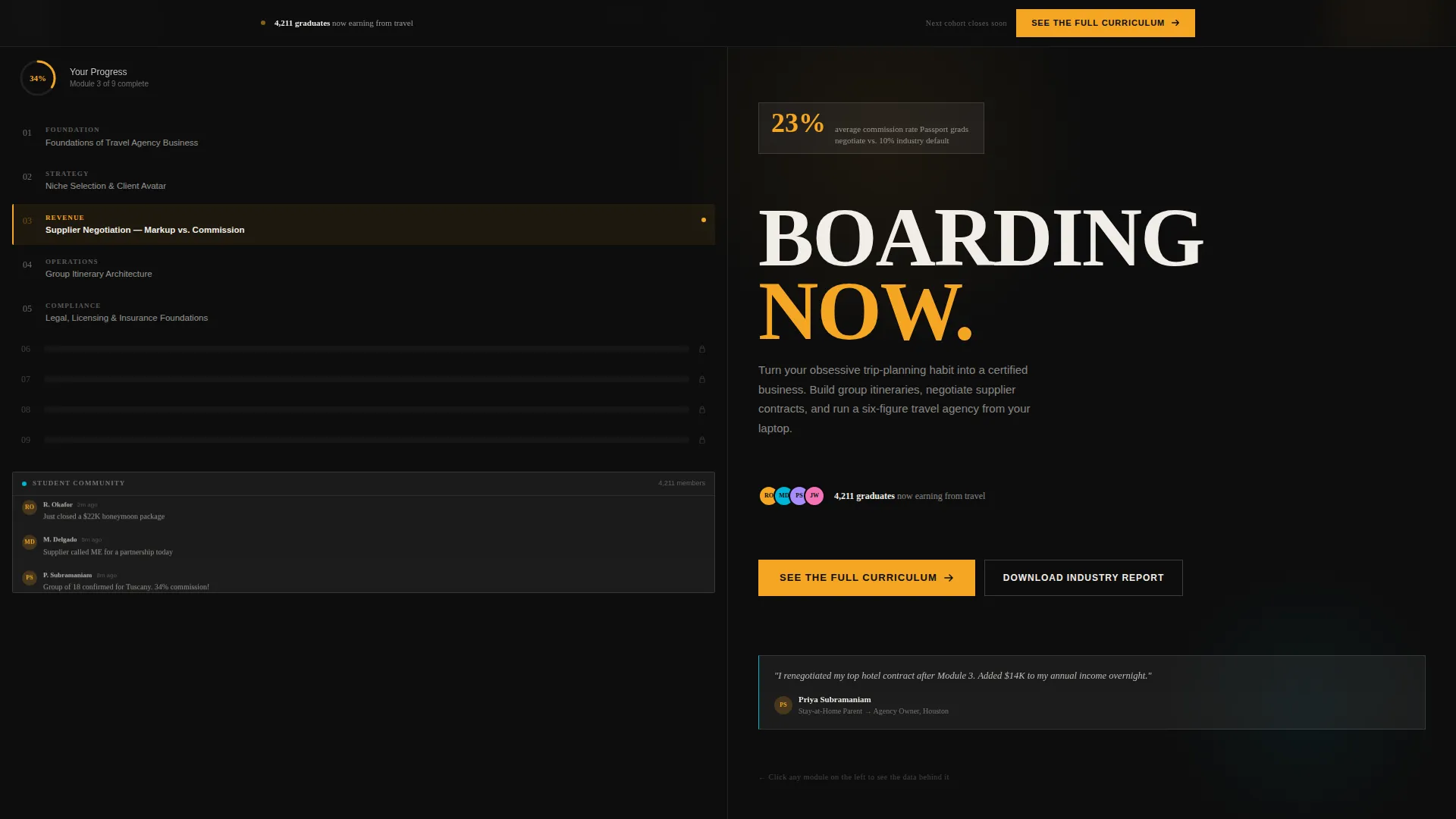
- An interactive split-screen header with a live course dashboard preview on the left and a brutalist type stack with a dynamic stat panel on the right
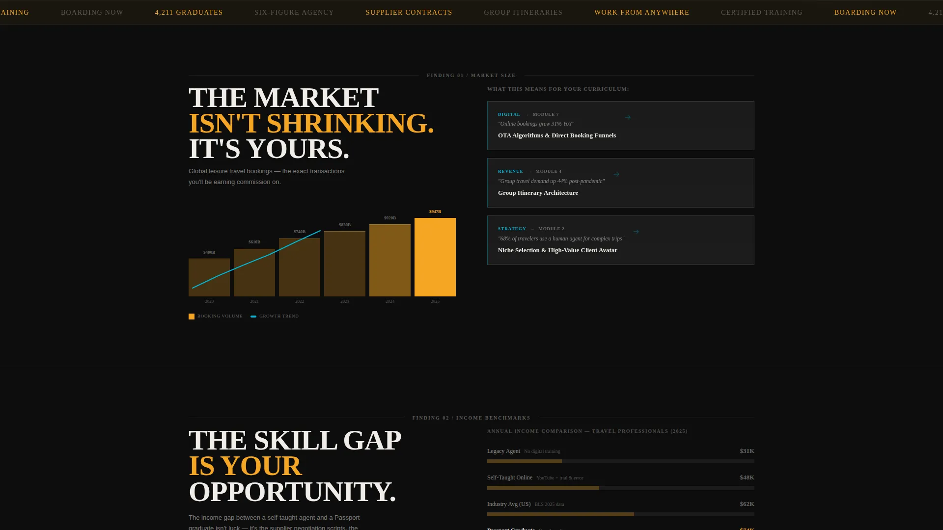
- An industry-report scroll flow where each section pairs a market data chart with the corresponding course module that solves it
- Two conversion paths: a primary curriculum call-to-action and a secondary email-capture form for visitors who need more time
Feature list
This template ships with a focused set of purposeful components. Each one serves a specific role in building trust and driving action.
Interactive Split-Screen Header
The left panel displays a clickable course dashboard snippet. It shows a module tree with Module 3 partially expanded, a progress ring fixed at 34%, and a slowly scrolling mock student chat thread. Clicking any module swaps the right panel's stat and testimonial, turning the header into an explorable preview.
Data-Driven Scroll Sections
Each scroll section is styled as a page from a proprietary industry white paper. Left panels render brutalist-style charts with thick amber bars and teal trend lines showing salary benchmarks and market-size figures. Right panels map each data point directly to the course module that addresses it.
Sticky Call-to-Action Bar
After the third scroll section, a frosted-glass sticky bar locks to the top of the viewport. It carries the primary call-to-action, "See the Full Curriculum," and stays visible throughout the rest of the scroll journey without interrupting content.
Dual Conversion Path Design
The page supports two distinct conversion goals simultaneously. The primary call-to-action routes visitors to the enrollment and pricing page. The secondary inline email-capture form, embedded in the final data section, collects a first name and email address for visitors who are not yet ready to buy.
Glassmorphic Frosted Panel System
Content sections float on frosted glass panels at 60% opacity with 1-pixel white borders and blurred backdrops. This layering system creates visual depth without losing readability, keeping text sharp against the deep tarmac black backgrounds.
Brutalist Typography Stack
The headline uses condensed uppercase type at 120 pixels. It anchors the right panel of the header with immediate visual authority. Supporting stat lines and call-to-action labels use runway signal amber to direct the eye to the most important numbers on the page.
Page sections overview
| Section | Purpose |
|---|---|
| Interactive Header Panel | Introduces the course with a clickable dashboard preview and dynamic stat display |
| Market Opportunity Section | Opens the industry-report scroll with market-size data and growth figures |
| Skill Gap Section | Highlights the gap between industry demand and available trained professionals |
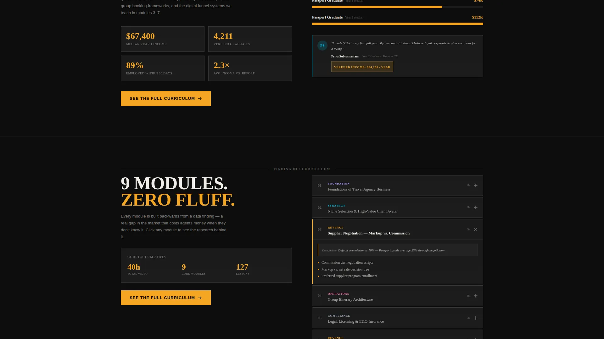
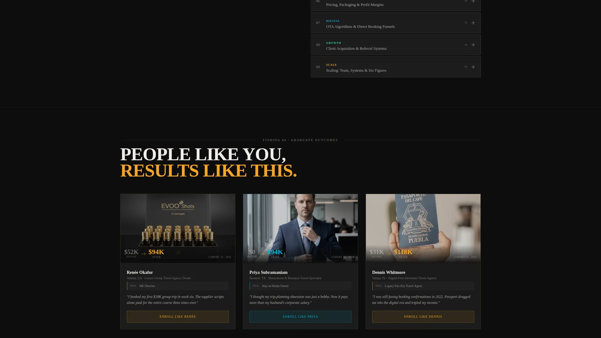
| Income Proof Section | Presents graduate salary benchmarks and real income screenshots |
| Curriculum Breakdown Section | Maps course modules to specific market findings and skill outcomes |
| Sticky call to action Bar | Keeps the primary enrollment call-to-action visible after the third scroll section |
| Email Capture Section | Embeds the two-field inline form for the secondary lead-generation path |
Design & branding system
The visual identity runs on a four-color Glassmorphic palette applied through a Bold Brutalist structural framework. Every color carries a specific functional role across the layout.
- Tarmac black (#0D0D0D) dominates all backgrounds, creating the dark airport-terminal atmosphere that the frosted panels float against
- Runway signal amber (#F5A623) marks every call-to-action, price figure, and data callout to direct attention precisely
- Passport-stamp teal (#00B4D8) appears on progress indicators, chart trend lines, and hover states throughout the scroll sections
Mobile & speed optimization
The layout is built with a mobile-first structure that adapts the split-screen format cleanly across screen sizes. The heavy visual components are balanced to maintain usability on smaller devices.
- The 50/50 split-screen header stacks vertically on mobile, keeping both panels fully readable without horizontal scrolling
- Frosted glass panels and brutalist chart elements scale proportionally so the visual hierarchy stays intact on tablet and phone viewports
How this template helps you convert
This template earns the click by building conviction through evidence before the visitor ever sees a price. The layout sequence is deliberate and escalating.
- The interactive header lets visitors explore the course content before they scroll, creating genuine curiosity and early investment in the material
- Each data section adds a layer of proof, moving from market opportunity to skill gap to income evidence, so by the time the call-to-action appears the rational case for enrolling is already complete
Other information about this template
This template is designed to work as a standalone single-page conversion asset. It is built for the travel course and training platform niche but its structure translates to any high-ticket online education offer that relies on data-driven trust-building.
- The template style is Split Screen (50/50) with a Bold Brutalist theme and Glassmorphic color system
- The header concept is an Interactive Preview and the landing page direction is Click-Through
- The creative direction follows an Industry Report scroll pattern, where each section functions as a sequential data finding
- This template sits within the Technology category under the Travel Digital Presence subcategory
Theme
Bold Brutalist
Creative direction
Industry Report
Color system
Glassmorphic
Style
Split Screen (50/50)
Direction
Click-Through
Page Sections
Interactive Split-screen Header
Industry Report Scroll Flow
Sticky Frosted-glass Call to Action Bar
Dual Conversion Path Layout
Glassmorphic Panel System
Brutalist Typography Stack
Related questions
Who is this landing page template designed for?
What makes the header different from a standard course page?
How does the template handle visitors who are not ready to enroll?
Can this template work for a different type of online course?
What colors and visual style does this template use?



