Ping - Intelligent Appointment Landing Page Template
Ping is a hub-and-spoke landing page template built for travel appointment reminder services. It leads with a live-style API code snippet, walks visitors through a sticky-nav feature matrix, and drives sign-ups through a persistent call-to-action. The design uses a deep graphite and iridescent violet-teal palette that feels intelligent, calm, and unmistakably modern.
by Rocket studio
Quick summary
Ping is a single-page landing page template designed for a travel appointment reminder service. It opens with a terminal-style code snippet, flows through a structured feature matrix with sticky navigation, and closes every scroll depth with a clear sign-up prompt. The palette is dark, iridescent, and dashboard-sharp.
Who this template is for
This template is built for teams and individuals who manage high-stakes travel appointments on behalf of others. If a missed slot costs a client real money, this landing page speaks directly to that pressure.
- Immigration consultants managing dozens of active visa and embassy cases at once
- Boutique travel agencies coordinating group pilgrimages and multi-traveler itineraries
- Solo relocation specialists who bill by the hour and cannot absorb a single missed window
What problem this template solves
Booking a visa interview or consulate biometrics scan is hard enough. Remembering it across time zones, for multiple clients, without a dedicated reminder system is where things fall apart. This template gives the service a landing page that frames that exact problem and shows the fix immediately.
- Travelers miss non-refundable appointments because no one sent a timely, channel-appropriate nudge
- Consultants waste hours manually tracking upcoming slots across disconnected spreadsheets and inboxes
- Agencies lack a single professional page that explains their reminder workflow clearly to prospective clients
What you get with this template
You get a fully structured, single-page landing page built around a hub-and-spoke anchor navigation system. Every section is purpose-built and visually distinct, so visitors can jump straight to the information that matters to them.
- A styled terminal header block with a live-feel API code snippet and animated response output
- A sticky left-rail spoke navigation linking to five capability cluster sections inside a feature matrix
- A persistent call-to-action bar and a secondary developer-focused path built into the page flow
Feature list
This template is built around a small set of intentional, high-impact components. Each one earns its place on the page.
Terminal-Style API Header Block
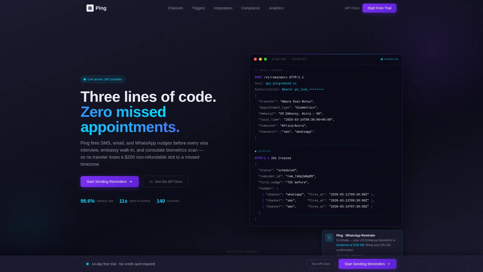
The header opens with a syntax-highlighted code snippet showing a real POST request to a reminders endpoint. The JSON payload includes a traveler name, appointment type, embassy location, local time, and a channel array. A simulated response blinks in below, confirming a scheduled status and a first nudge timing. The headline fades in beside it, making the product feel immediately real and developer-credible.
Hub and Spoke Anchor Navigation
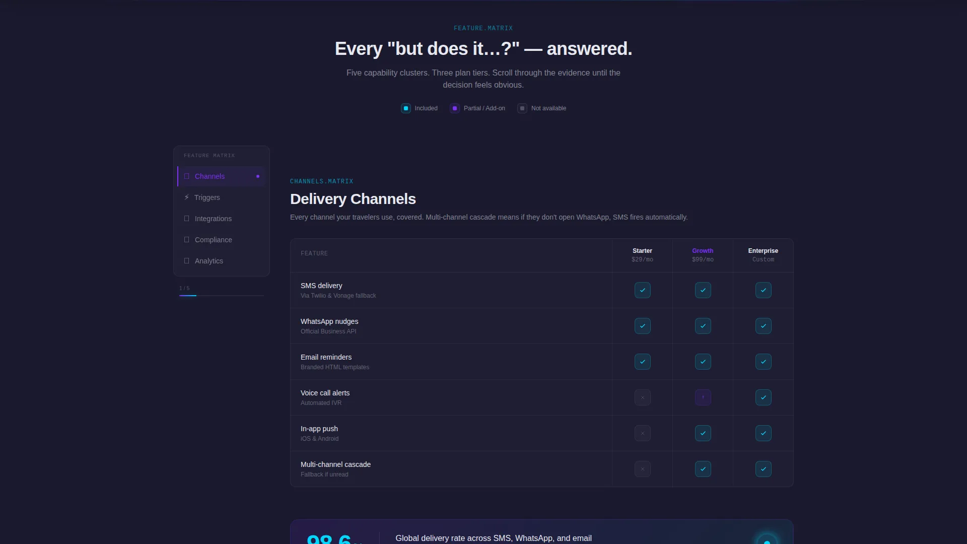
A sticky left-rail navigation anchors the page and links to five named capability clusters: Channels, Triggers, Integrations, Compliance, and Analytics. Clicking any spoke smooth-scrolls the visitor to the matching section without a full page reload. This keeps technical evaluators oriented and lets decision-makers skip directly to the section that answers their specific question.
Tiered Feature Matrix Grid
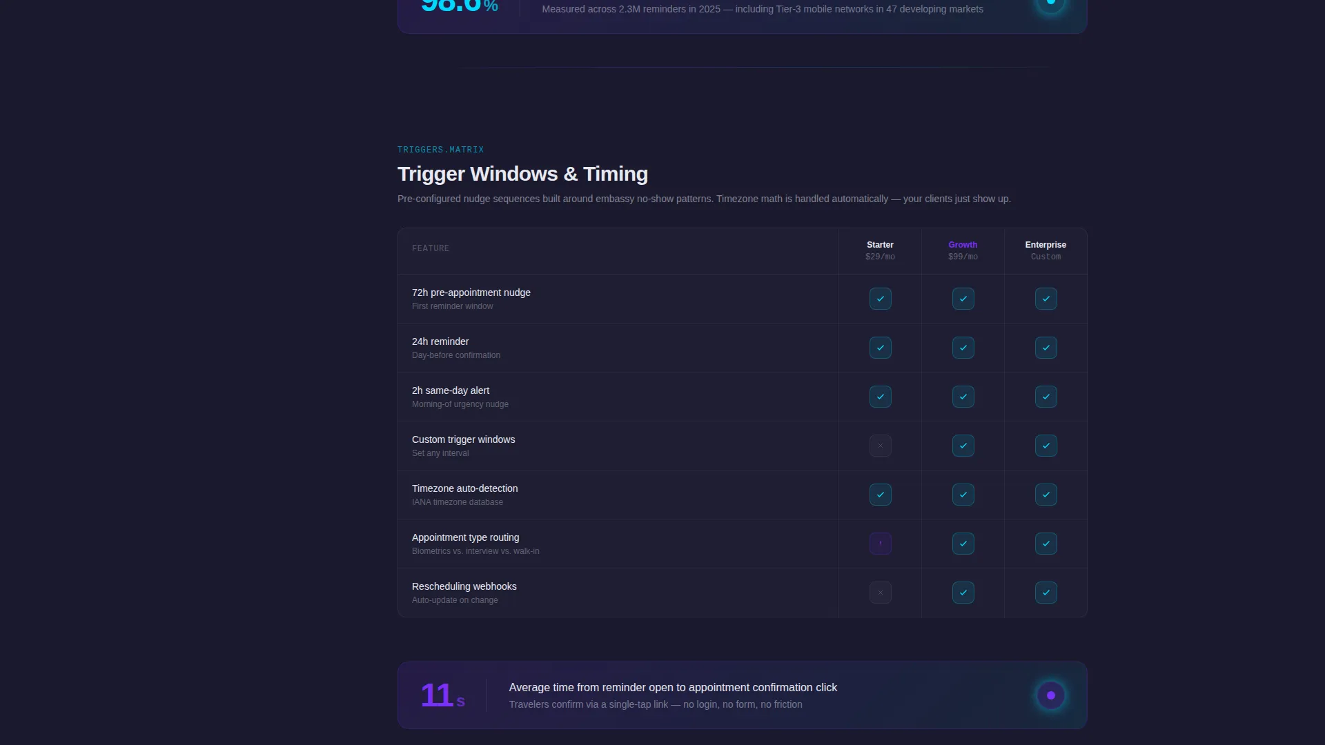
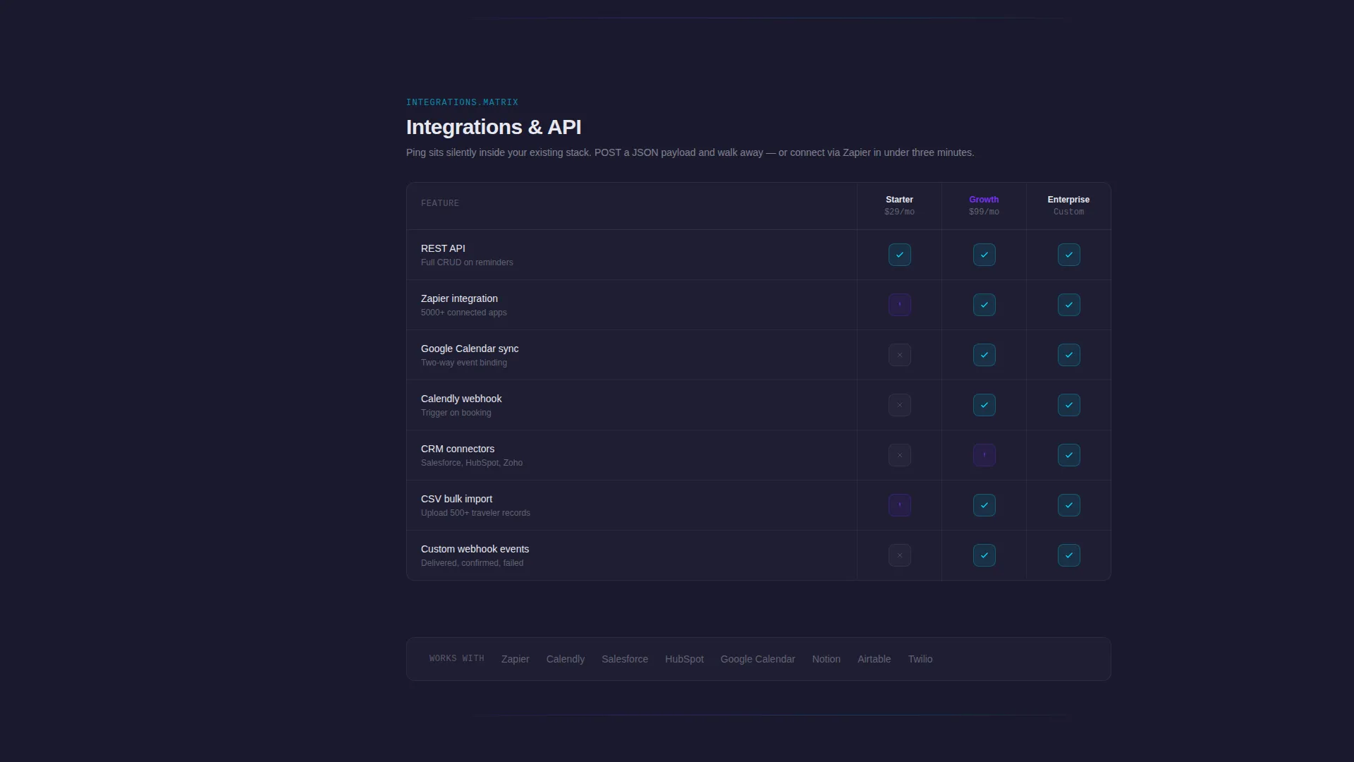
Each spoke section renders as a structured comparison grid. Rows represent individual features; columns represent plan tiers. Teal cells signal included features; dimmed pearl cells mark unavailable ones. The visual logic is consistent across all five matrix sections, so visitors build a mental model quickly as they scroll.
Single-Stat Callout Cards
Between matrix sections, full-width callout cards break the scroll rhythm with one bold number each. Stats like a delivery rate across 140 countries and an average open-to-confirm time give the page credibility without requiring a case study. Each card resets the reader's attention before the next matrix section begins.
Dual Call-to-Action Architecture
The primary call-to-action, "Start Sending Reminders," appears first in the header alongside the code snippet. It reappears as a sticky bottom bar after the second spoke section. A secondary path, "See the API Docs," runs in parallel for technical evaluators who need proof before commitment. Both paths route away from the landing page to dedicated destinations, keeping the page itself form-free.
Dashboard Pro Visual System
The AI Iridescent color palette is applied consistently across every component. Deep graphite anchors backgrounds. Holographic violet marks active navigation states and primary buttons. Shimmer teal traces progress indicators, confirmation checkmarks, and live-status signals. Soft pearl carries body text and card surfaces. The result feels like a real product dashboard, not a marketing mock-up.
Page sections overview
| Section | Purpose |
|---|---|
| Terminal Header Block | Introduces the product via a live-feel API code snippet and headline |
| Primary call to action Strip | Places the first sign-up prompt directly beside the code snippet |
| Channels Matrix | Compares SMS, email, and WhatsApp reminder delivery across plan tiers |
| Triggers Matrix | Shows scheduling logic and nudge timing rules per tier |
| Integrations Matrix | Details compatible booking and calendar connection options by plan |
| Compliance Matrix | Outlines message delivery and consent handling features per tier |
| Analytics Matrix | Displays delivery rate and engagement tracking features by plan |
| Stat Callout Cards | Breaks scroll with bold delivery and confirmation performance figures |
| Sticky Bottom Bar | Resurfaces the primary call to action after the second spoke for persistent reach |
| API Docs Secondary Path | Captures technical evaluators with a direct link to documentation |
Design & branding system
The visual identity is built on a Dashboard Pro theme using the AI Iridescent color system. Every color has a defined role, and that consistency makes the page feel like a real product interface rather than a promotional template.
- Deep graphite (#1A1A2E) anchors every background; holographic violet (#7B2FF7) marks active nav states and primary buttons
- Shimmer teal (#00D9FF) traces progress bars, confirmation checkmarks, and live-status indicators throughout the matrix sections
- Soft pearl (#E8E8F0) carries body text, card surfaces, and inactive text field labels for clean contrast against graphite
Mobile & speed optimization
The layout is structured for clean rendering across screen sizes. The hub-and-spoke navigation and matrix grid adapt to narrower viewports without losing their visual logic.
- The sticky left-rail navigation collapses gracefully on smaller screens so the spoke links remain accessible
- Single-stat callout cards stack vertically on mobile, preserving their full visual impact at any width
- The terminal code block is scrollable on touch screens, keeping the syntax-highlighted snippet readable without horizontal overflow
How this template helps you convert
Every layout decision on this page is aimed at reducing friction and building confidence before the visitor reaches a sign-up prompt.
- The API code snippet in the header shows the product working before any marketing copy makes a claim, building immediate credibility with both technical and non-technical visitors.
- The feature matrix eliminates objection loops by answering capability questions inside the scroll, so visitors arrive at the call-to-action already informed rather than uncertain.
- The dual call-to-action architecture captures two distinct buyer types: operators ready to start a trial and developers who need documentation before they commit.
Other information about this template
This template is categorized under Technology and the Travel Email Templates subcategory, with a niche focus on travel appointment reminder use cases. It is designed as a hub-and-spoke anchor navigation landing page, meaning all content lives on a single scrollable page with section-level deep links.
- The template style is Hub and Spoke with Anchor Nav, making it well suited for services with multiple distinct feature clusters that buyers evaluate independently
- The creative direction is a Feature Matrix, which works especially well for scheduling and reminder tools where plan-tier comparisons drive purchasing decisions
- The header concept is a Code Snippet, positioning the service toward developer-aware buyers and technical decision-makers alongside business operators
- The landing page direction is Click-Through, meaning the page itself carries no form; all conversion happens on a linked sign-up or documentation page
Theme
Dashboard Pro
Creative direction
Feature Matrix
Color system
AI Iridescent
Style
Hub & Spoke (Anchor Nav)
Direction
Click-Through
Page Sections
Terminal-style API Header Block
Hub and Spoke Anchor Navigation
Tiered Feature Matrix Grid
Single-stat Callout Cards
Dual Call-to-action Architecture
Dashboard Pro Visual System
Related questions
Who is this landing page template designed for?
Does this template include a sign-up form?
What reminder channels does the template cover in the feature matrix?
Can the color palette be updated to match a different brand?
Is the API code snippet in the header a live integration?



