Bento Grid Developer Portal Landing Page Template
Portal is a bento grid landing page template built for developer portal products. It combines a Bold Brutalist aesthetic with a Glassmorphic dark color system to create a page that feels as sharp as the tools it promotes. Designed for platform teams and DevRel leads, it drives demo requests through interactive bento cells, spec-sheet copy, and a frictionless lead capture flow.
by Rocket studio
Quick summary
Portal is a single-page bento grid landing page template for developer portal builders. It pairs a dark IDE visual identity with a spec-sheet content structure, letting the product demonstrate itself through living user interface fragments. Every section is engineered to convert platform engineers and DevRel leads into qualified demo requests.
Who this template is for
This template is built for teams that ship developer tooling and need a landing page that speaks to a technical audience without losing credibility. It is not a generic SaaS template dressed up in dark mode.
- Platform teams at mid-stage SaaS companies that have outgrown treating documentation as an afterthought
- DevRel leads who need to present a unified developer portal product without relying on multiple stitched-together tools
- CTOs and engineering leaders who understand that a weak developer portal quietly drives developer churn
What problem this template solves
Most landing pages for developer tools rely on persuasive prose and stock visuals. Technical buyers do not trust that approach. They want to see the product working before they fill out a form.
- Generic landing page templates lack the visual credibility to speak to engineers who evaluate tools by looking at interfaces, not taglines
- Building a custom spec-sheet page from scratch requires design, copy, and front-end work that slows go-to-market timelines
- Disconnected docs tools and patchwork presentation undermine confidence in the product being sold
What you get with this template
You get a complete, ready-to-customise bento grid landing page with a technical spec-sheet structure and a dark Glassmorphic visual system. The layout is designed to function as proof of product, not just a description of it.
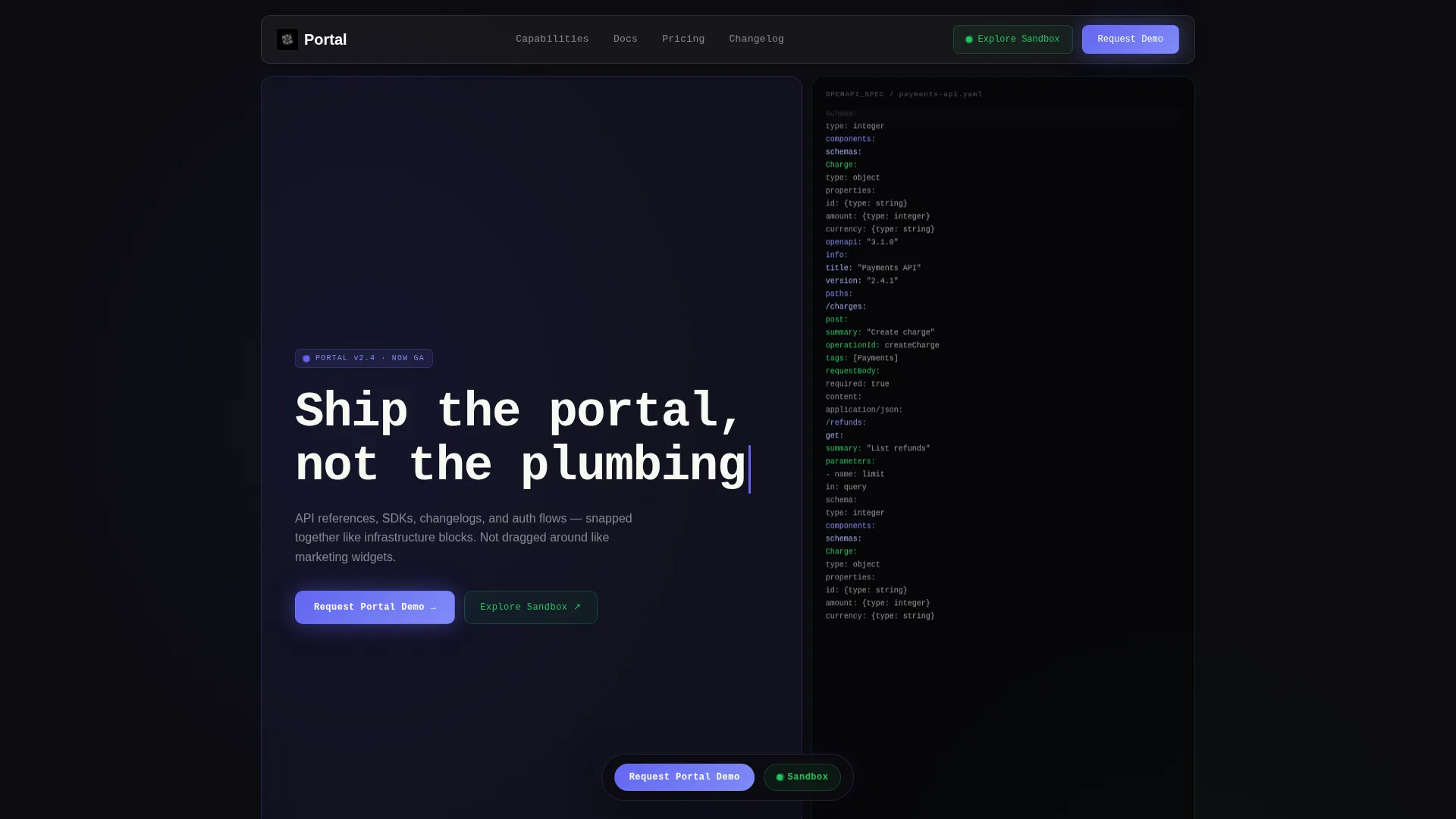
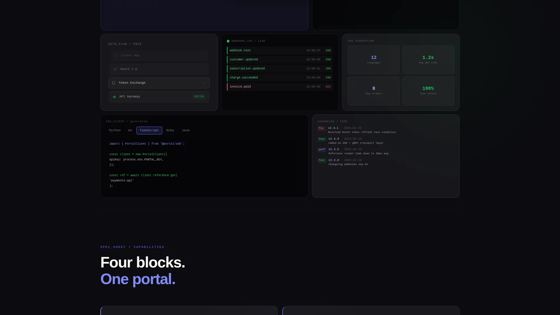
- A header section with six to eight frosted bento cells showing live portal fragments: a scrolling OpenAPI spec, an animating auth token flow, a real-time webhook event log, and a language-selector dropdown
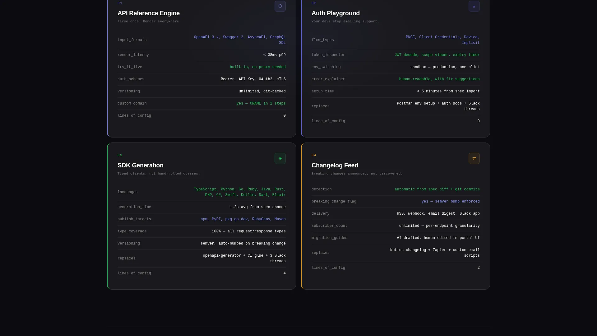
- Four numbered capability sections (01 API Reference Engine, 02 Auth Playground, 03 SDK Generation, 04 Changelog Feed) with key-value spec cards inside glass panels
- A lead generation flow featuring a "Request Portal Demo" frosted glass modal and a secondary "Explore the Sandbox" path with GitHub OAuth to reduce commitment friction
Feature list
This template ships with a set of purpose-built layout and interaction components grounded in the source brief.
Dark Glass Panel Header
Six to eight frosted bento cells of varying sizes fill the above-the-fold area. Each cell contains a living fragment of a developer portal interface, including a syntax-highlighted OpenAPI spec, an animating auth token flow diagram, a real-time webhook event log, and a frozen language-selector showing Python, Go, and TypeScript tabs.
Headline with Blinking Cursor
The primary headline "Ship the portal, not the plumbing" sits in the largest bento cell at 72-pixel monospaced type. A blinking cursor after the period reinforces the terminal aesthetic and signals that the product is alive and ready.
Numbered Spec-Sheet Sections
Four numbered capability blocks scroll the reader from what the product renders to what it replaces to what it costs them not to have it. Each block uses key-value pair cards inside glass panels rather than persuasive paragraphs.
Frosted Glass Demo Modal
The primary call to action triggers a frosted glass modal with a three-step lead capture form: work email with company domain auto-detection, current docs tool dropdown, and a monthly active developer range selector.
Sandbox Secondary Path
A secondary conversion path labelled "Explore the Sandbox" links to a live interactive demo. It requires only a GitHub OAuth login, lowering the barrier to entry while still capturing an authenticated lead.
Build-versus-Buy Comparison Grid
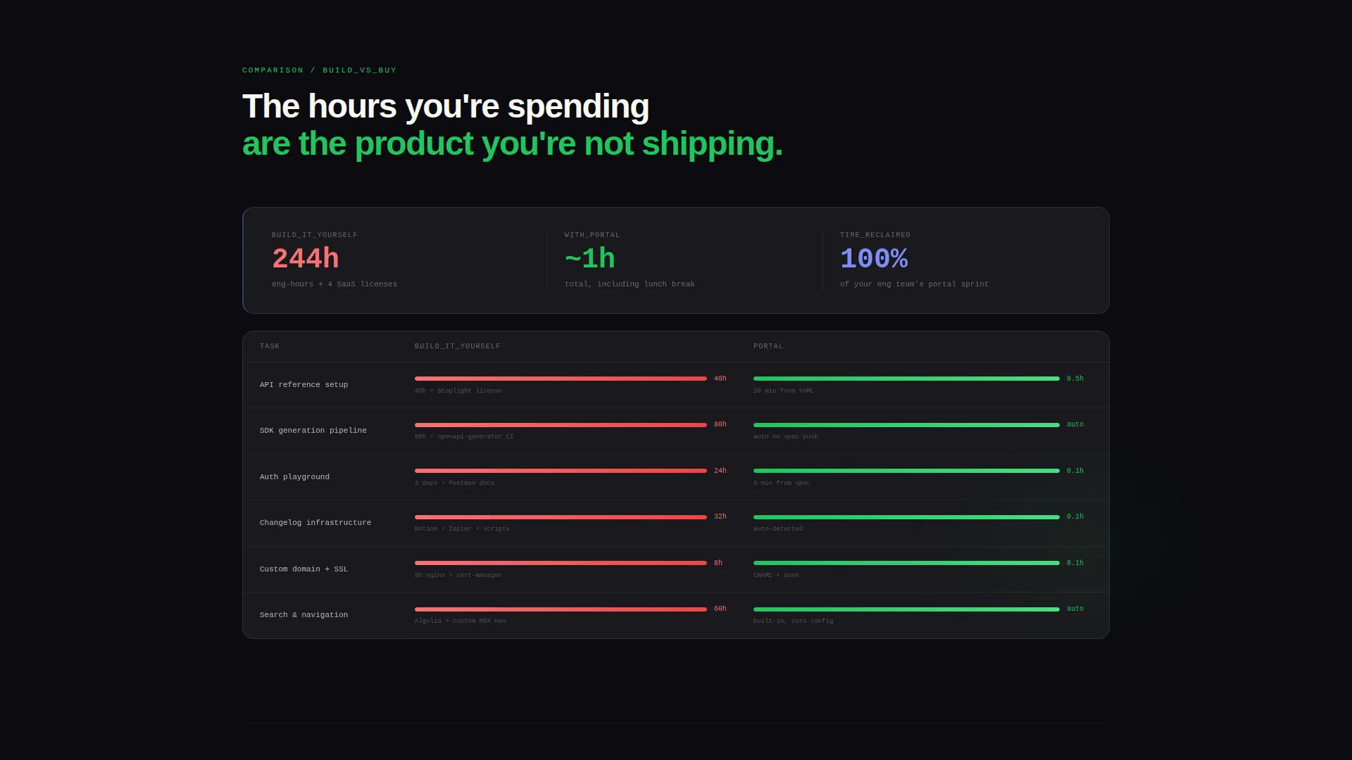
The page closes with a comparison grid contrasting build-it-yourself hours against one-click deployment. This section reframes the cost of inaction and anchors the value of the product at the moment of decision.
Page sections overview
| Section | Purpose |
|---|---|
| Dark Glass Header | Displays living portal fragments in bento cells above the fold |
| Headline Cell | Anchors the value proposition with bold monospaced type |
| 01 API Reference Engine | Spec card block for API reference rendering capabilities |
| 02 Auth Playground | Spec card block for authentication flow tooling |
| 03 SDK Generation | Spec card block for software development kit output |
| 04 Changelog Feed | Spec card block for versioned release communication |
| Comparison Grid | Contrasts custom build hours with one-click deployment |
| Demo Request Modal | Frosted glass form for primary lead capture |
| Sandbox call to action | Secondary path using GitHub OAuth for lower-friction entry |
Design & branding system
The visual identity runs on a Bold Brutalist framework expressed through a Glassmorphic color system. Every design decision reinforces the feeling of opening a sharp, dark terminal environment built for people who read code for a living.
- Color palette: void black (#0B0B0F) as the primary background, frosted panel white (#FFFFFF at 6% opacity with 12-pixel blur) for bento cells, electric indigo (#6366F1) for interactive states and live accents, and raw terminal green (#22C55E) for success signals and code syntax highlights
- Typography: monospaced fonts for all spec content and code references, oversized tight-tracked grotesque sans for headlines, keeping the page unapologetic and scannable
- Bento cell borders are rendered at 1-pixel with #FFFFFF at 10% opacity, giving each card the appearance of beveled smoked glass hovering over a deep dark surface
Mobile & speed optimization
The bento grid layout is structured to reflow and remain readable at smaller viewport sizes. The dense above-the-fold cell arrangement adapts without breaking the dark visual hierarchy.
- Bento cells resize and restack on smaller screens, keeping key portal fragments visible without horizontal overflow
- The frosted glass modal and lead capture form are designed for touch-friendly interaction on mobile viewports
- Typography scales from oversized desktop headline sizes down to readable proportions without sacrificing the monospaced spec-sheet feel
How this template helps you convert
Every design and copy decision on this page is oriented toward capturing qualified leads from a technical audience that does not respond to traditional marketing pressure.
- The above-the-fold bento grid acts as a working product preview. Visitors interact with miniature portal fragments before reading a single line of persuasive copy, building trust before the ask arrives.
- The spec-sheet structure replaces benefit paragraphs with key-value data cards. Engineers read specifications the way other buyers read testimonials, so the format itself signals credibility.
- Two conversion paths reduce drop-off. The "Request Portal Demo" modal captures high-intent leads with a short personalised form, while "Explore the Sandbox" captures curious visitors who are not yet ready to commit to a sales conversation.
Other information about this template
This section covers additional context about the template's design intent, build philosophy, and practical use considerations.
- The template is categorised under Technology, specifically Developer Tools and Application Programming Interface tooling, making it directly relevant to teams building or marketing developer portal products
- The Spec Sheet creative direction means copy is structured as technical documentation, not a sales brochure, which aligns with how developer audiences evaluate tools
- The bento grid template style is intentionally modular, allowing teams to reorder, resize, or remove cells to match their actual product capabilities without restructuring the whole page
- The intersection of Bold Brutalist theme, Glassmorphic color system, and Dark Glass Panel header concept is rare in off-the-shelf templates and positions the product as serious infrastructure, not a marketing website
- Teams currently using tools such as Readme, GitBook, Docusaurus, or custom MDX setups will find the docs-tool dropdown in the lead form directly relevant, as it mirrors the fragmented toolchain many platform teams are trying to escape
Theme
Bold Brutalist
Creative direction
Spec Sheet
Color system
Glassmorphic
Style
Bento Grid
Direction
Lead Generation
Page Sections
Dark Glass Bento Header
Numbered Spec-sheet Capability Blocks
Frosted Glass Demo Request Modal
Github Oauth Sandbox Entry
Build-versus-buy Comparison Grid
Blinking Cursor Headline Cell
Related questions
Can I customise the bento cell content to match my actual product?
Is the Explore the Sandbox path ready to connect to a real demo environment?
Does the comparison grid content come pre-filled?
Who is the primary target audience for this landing page template?
Can the lead capture form be connected to a customer relationship management tool?



