Restaurant Client Portal Landing Page Template
Portal is a dark, data-driven restaurant client portal landing page built for operators who manage multiple locations. It leads with a bold comparison table, animated data points, and scroll-driven feature reveals. The layout is designed to replace scattered tools with one clear, confident pitch that converts multi-unit operators and independent restaurant owners fast.
by Rocket studio
Quick summary
Portal is a single-page restaurant client portal landing page template built around a stark comparison table and cinematic scroll momentum. It targets restaurant operators juggling reservations, reviews, vendor invoices, and staff schedules across multiple locations. The design runs on a dark Monochrome Steel palette with electric cyan reserved for live data highlights and primary calls to action.
Who this template is for
This template is built for restaurant professionals who need to consolidate operations, not just promote a dining experience. It speaks directly to operators who feel the pain of scattered systems every service.
- Multi-unit restaurant operators running four to twelve locations who need a single command view
- Independent owners who still handle their own ordering and scheduling late at night
- Restaurant groups whose general managers each use different tools that never share data
What problem this template solves
Most restaurant operators are managing their business across a web of browser tabs, group chats, and disconnected spreadsheets. During a dinner rush, that fragmentation costs real time and real money.
- No single screen shows reservations, reviews, invoices, and staff schedules together
- Comparison tools and generic project apps were never designed for restaurant operations
- GMs at different locations have no shared view, so decisions get delayed or duplicated
What you get with this template
You get a fully structured, dark-theme landing page that leads with a powerful comparison table and builds conviction through scroll-driven feature sections. Every layout decision is made to move an operator from skepticism to action.
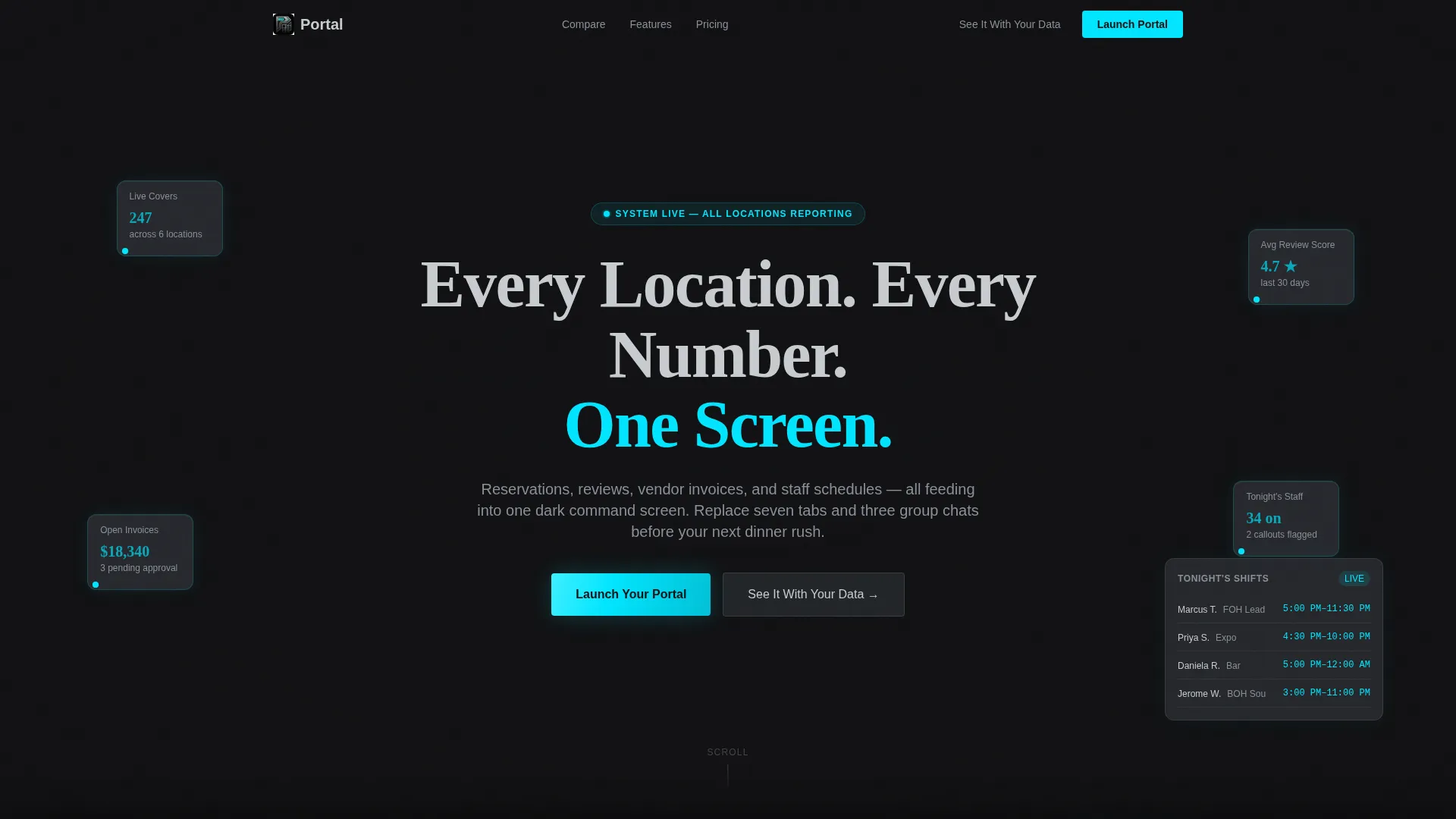
- A full-bleed dark header with animated data points that boot up like a live system
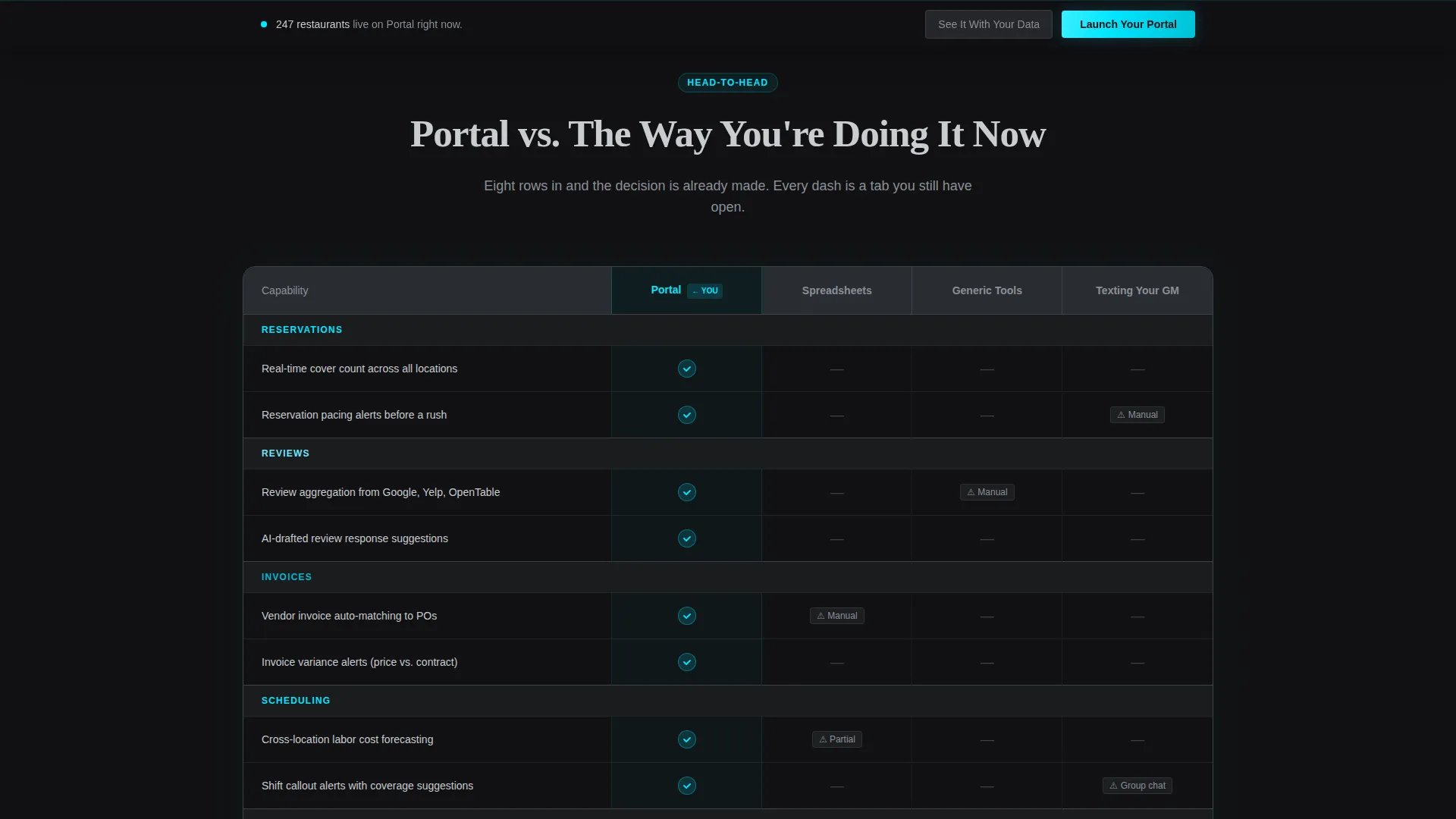
- A stark comparison table placing your portal against spreadsheets, generic tools, and informal methods
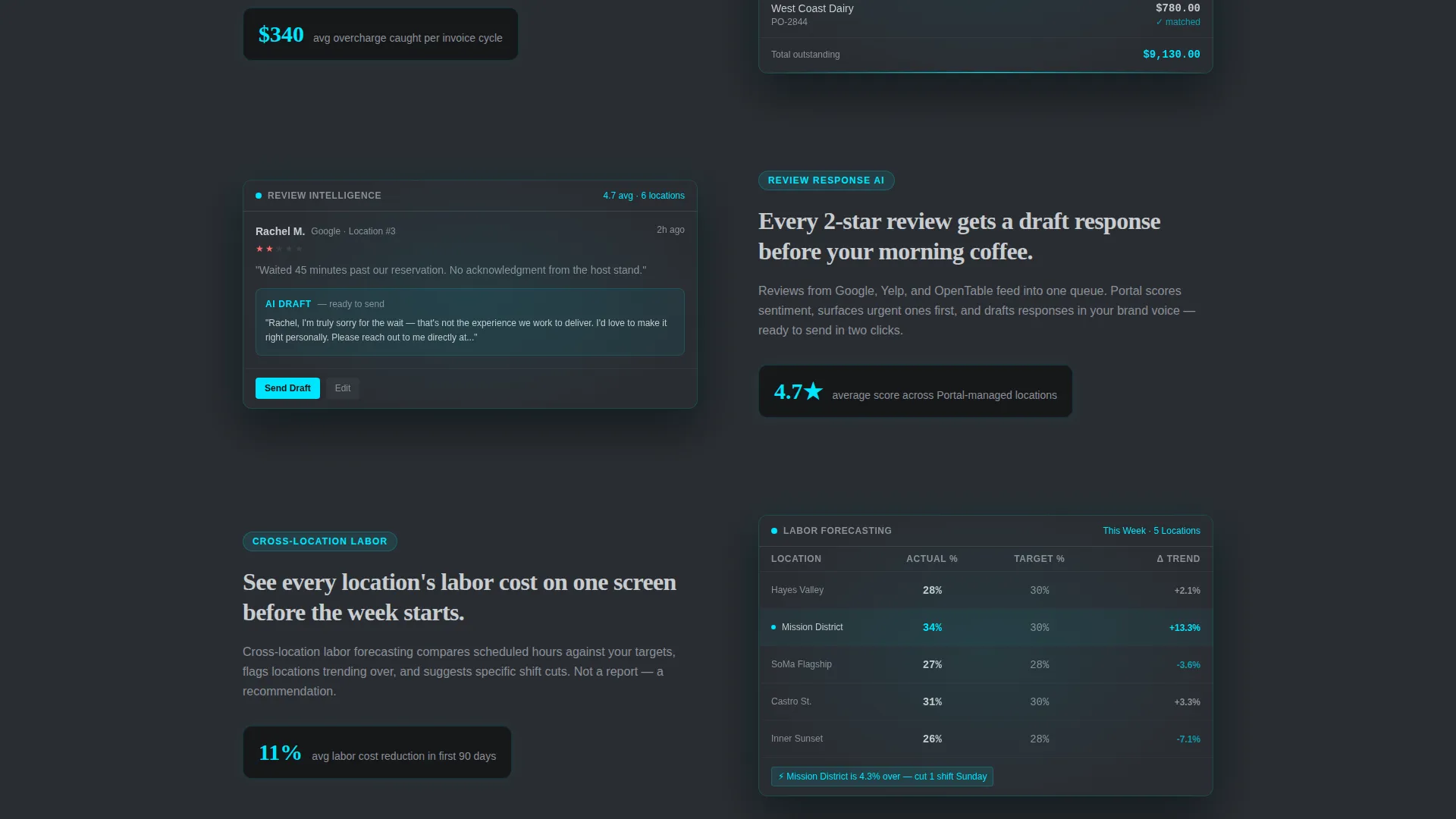
- Scroll-snapped feature reveal sections, each spotlighting one core portal capability with a dark user interface screenshot
Feature list
This template ships with a set of purposeful, ops-focused design components. Each one is built to communicate value to a technically informed, time-pressured audience.
Animated System-Boot Header
The header opens on a pure forge-black viewport with a faint isometric restaurant floor plan beneath the surface. Data points ignite in sequence: a reservation count ticks up, a review score animates to 4.7, an invoice total resolves, and a staff shift grid populates. The headline lands last, heavy and silver, once the system feels live.
Comparison Table Block
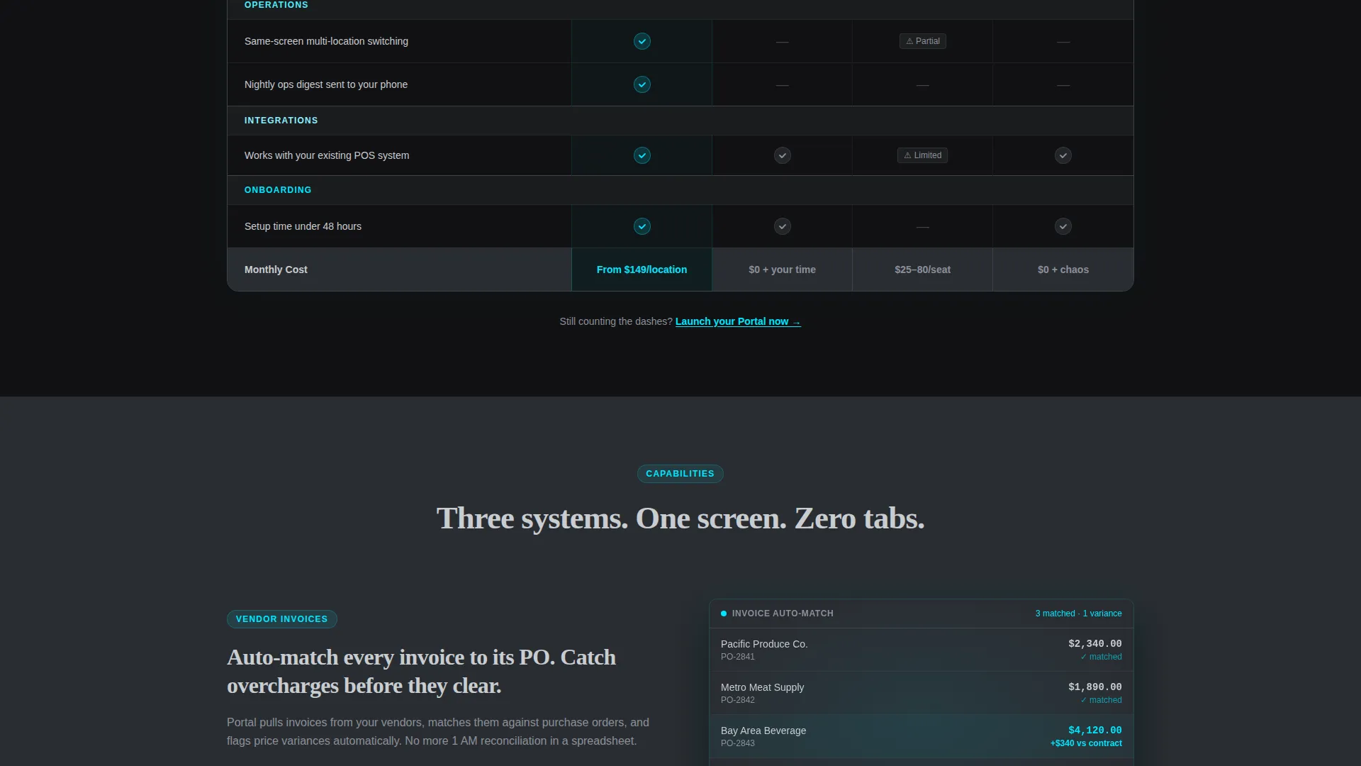
The comparison table is the page's core conversion engine. It stacks your portal against spreadsheets, generic project tools, and the informal "texting your GM" method across eight specific rows. Cyan checkmarks signal portal advantages; dashes mark the gaps in every alternative.
Scroll-Snapped Feature Detonations
Past the comparison table, each scroll snap reveals one capability in full focus. Vendor invoice auto-matching, review response AI, and cross-location labor forecasting each get their own section with a dark-edged user interface screenshot and sharp headline. Momentum never stalls between sections.
Pinned Bottom call to action Bar
A slim, persistent call-to-action bar appears after the visitor scrolls past the comparison table. The primary action, "Launch Your Portal," is typeset in cyan on dark. It stays visible without interrupting the reading flow.
"See It With Your Data" Modal
The secondary conversion path opens a short qualification modal. Visitors select their number of locations, current point-of-sale system, and biggest operational pain point from a multi-select list. It captures intent without friction.
Monochrome Steel Design System
Every layout element follows a strict four-color palette: forge black, brushed gunmetal, status-light silver, and a single electric cyan. Typography is heavy silver for headlines, standard silver for body text, and cyan appears only where it signals action or live data.
Page sections overview
| Section | Purpose |
|---|---|
| Full-Bleed Header | Boot-sequence animation introduces the portal concept and sets the dark command-center tone |
| Comparison Table | Side-by-side rows prove portal superiority over spreadsheets, generic tools, and informal methods |
| Feature Reveal Sections | Scroll-snapped panels each expose one portal capability with a glowing user interface screenshot |
| Pinned call to action Bar | Persistent bottom bar keeps the primary action visible after the comparison table |
| Qualification Modal | Short form captures operator context before connecting them to a personalized demo |
Design & branding system
The visual identity is built around a Data Command theme. The palette is intentionally industrial: dark metals everywhere, then one precise accent that carries all meaning.
- Colors run from forge black (#111113) and brushed gunmetal (#2A2D32) through status-light silver (#C8CCD0), with electric cyan (#00E5FF) reserved for live data points, toggle states, and primary calls to action
- Typography uses heavy silver for display headlines and standard silver for body copy, keeping the hierarchy clear without relying on color contrast alone
- No stock photography or food imagery appears anywhere in the template; every visual element reinforces the operational, data-forward identity
Mobile & speed optimization
The template is structured so its core conversion argument, the comparison table, remains legible and scannable at every screen size. The dark palette and minimal asset count keep the visual load lean.
- The comparison table is built to reflow cleanly on smaller screens so rows stay readable without horizontal scrolling
- Scroll-snapped feature sections maintain their individual focus and impact on mobile viewports
- The pinned call to action bar and modal are sized and spaced for touch interaction without redesign
How this template helps you convert
The page is engineered around a Comparison/Versus conversion strategy. Every section is sequenced to build the decision in the visitor's mind before the call to action appears.
- The animated header establishes the portal as a live, intelligent system from the first second, creating immediate credibility with an operator audience.
- The comparison table does the persuasion work row by row, so by the time visitors reach the pinned call to action bar, they have already built their own case for switching.
- The qualification modal on the secondary path converts curious visitors into qualified leads by capturing location count and operational context before any sales conversation begins.
Other information about this template
This template is designed specifically for the restaurant client portal niche within the broader restaurant digital presence category. It sits at the intersection of technology and hospitality operations.
- The template style is a Comparison Table layout, which is particularly effective for operator audiences who evaluate tools analytically
- The creative direction follows a Launch Energy approach, giving the page the pacing and confidence of a product keynote rather than a standard service page
- The header concept uses a Dark Full-Bleed and Glow treatment, a deliberate choice to signal sophistication and operational seriousness to multi-unit buyers
- The landing page is built for restaurant groups and independent operators alike, making it versatile across business sizes within the four-to-twelve location range
Theme
Data Command
Creative direction
Launch Energy
Color system
Monochrome Steel
Style
Comparison Table
Direction
Comparison/Versus
Page Sections
Animated System-boot Header
Stark Comparison Table
Scroll-snapped Feature Reveals
Pinned Bottom Call to Action Bar
Qualification Modal Path
Monochrome Steel Visual System
Related questions
Who is this landing page template designed for?
Does this template include food photography or dining imagery?
Can I customize the comparison table rows for my own portal features?
How does the secondary call to action modal work?
Is this template suitable for a restaurant software company promoting an operations portal?



