Pulse - Conversion-Driven Ecommerce Landing Page Template
Pulse is a conversion-driven landing page template built for e-commerce AI voice assistant products. It uses a bold 50/50 split-screen layout to contrast the old shopping experience against the Pulse-powered one. Designed with a Startup Velocity theme and AI Iridescent color system, it drives visitors toward a live demo call to action through real metrics, side-by-side comparisons, and escalating scroll energy.
by Rocket studio
Quick summary
Pulse is a single-page, split-screen landing page template built to sell an AI voice assistant for online stores. It pairs a visceral before-and-after visual structure with live-feel metrics and a primary call to action that triggers a personalized demo. The design is dark, electric, and engineered to make the revenue gap feel personal.
Who this template is for
This template is built for founders, product marketers, and growth teams launching or scaling an AI voice assistant product in the e-commerce space. It speaks directly to high-revenue store operators who already understand conversion and want to see real proof fast.
- Teams marketing an AI voice assistant to seven-figure online store operators
- Founders who need a high-impact landing page that closes skeptical, data-driven buyers
- Product marketers replacing legacy chatbot positioning with a live-demo-led funnel
What problem this template solves
Most AI product landing pages describe features in generic terms. They fail to make the visitor feel the cost of not acting. Pulse flips that dynamic by building the entire page around contrast, showing the revenue lost on the static side before making any ask.
- Visitors leave without understanding what the product actually does in practice
- Generic layouts fail to communicate urgency for high-ticket AI tools
- No clear demo path means interested buyers drift away without converting
What you get with this template
You get a fully structured, single-page layout that carries a visitor from first impression to demo request using escalating proof and zero ambiguity. Every section is pre-built and intentional, with no filler sections to remove.
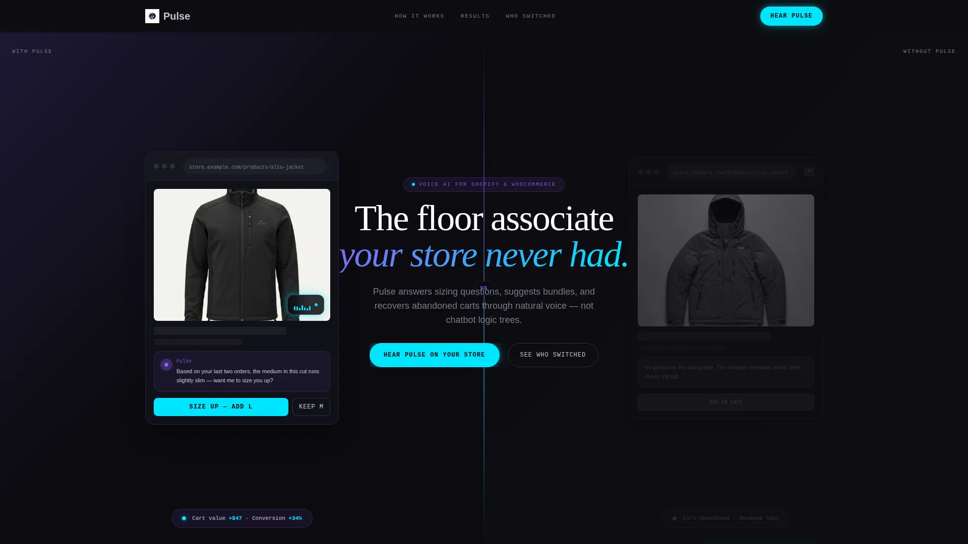
- A 50/50 split-screen header showing the Pulse-powered storefront versus the static, guidanceless page
- A live-feel metrics bar, three strategically placed primary calls to action, and a sticky bottom bar
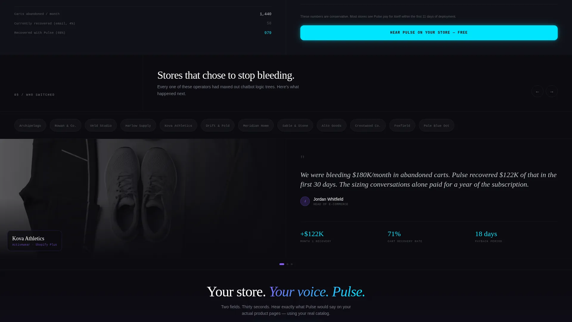
- A two-field demo form, a logo wall, and a case study carousel as a secondary conversion path
Feature list
This section covers the core built-in components and structural capabilities included in the Pulse landing page template.
Split-Screen Header with Live Contrast
The header divides the viewport evenly. The left side shows a Shopify storefront mid-session with the Pulse voice widget active and a contextual sizing recommendation visible. The right side shows the same store without the assistant, a static page with a cursor near the exit tab. The contrast communicates the product's value before a single word of body copy is read.
Animated Real-Time Metrics Bar
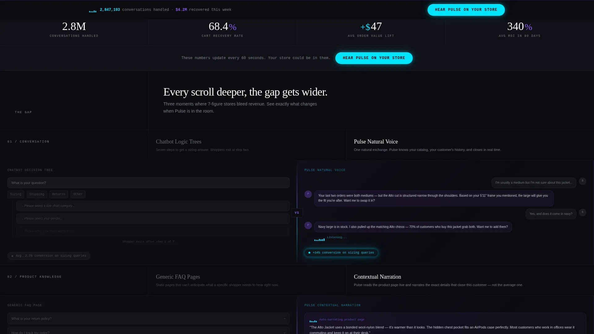
Directly below the header, a metrics bar displays three key performance figures: conversations handled, carts recovered, and average order value lifted. The numbers animate in as the visitor scrolls into view, creating a sense of live, ongoing activity rather than static claims.
Scrolling Comparison Section Architecture
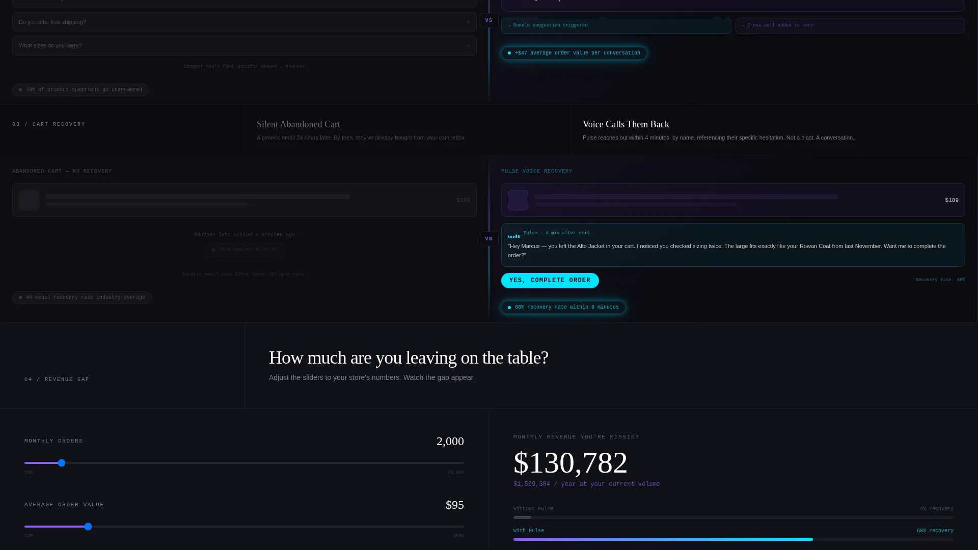
Each scroll depth pairs the old approach against the Pulse approach in the same split-screen format. Logic-tree chatbot versus natural voice conversation. Generic FAQ page versus contextual product narration. Silent abandoned cart versus a personalized voice recovery. The stakes rise with every section, widening the perceived gap between the two paths.
Three-Point call to action Placement with Demo Form
The primary call to action, "Hear Pulse on Your Store," appears after the header split, after the metrics bar, and in a sticky bottom bar that activates on scroll. Each call to action triggers a two-field form collecting store URL and monthly order volume, which then generates a simulated voice interaction using the visitor's own product catalog.
Secondary Conversion Path with Social Proof
A logo wall and case study carousel serve as the secondary conversion route for visitors who need more reassurance before submitting the demo form. This path is accessible directly from the "See Who Switched" link, allowing trust-building without interrupting the primary funnel flow.
AI Iridescent Visual System with Interactive States
Every button, progress bar, and interactive edge uses the iridescent accent color to signal activity and draw attention to actionable elements. Hover states and active elements shift across the color spectrum, making the interface feel alive without relying on heavy animation frameworks.
Page sections overview
| Section | Purpose |
|---|---|
| Split-screen header | Shows Pulse active versus static store side by side |
| Animated metrics bar | Quantifies recovered carts, conversations, and order value |
| Voice versus chatbot | Contrasts natural voice with legacy logic-tree chatbots |
| FAQ versus narration | Replaces generic FAQ with contextual product voice guidance |
| Abandoned cart recovery | Shows silent exit versus a personalized voice recovery call |
| Primary call to action block | Prompts demo form after header and after metrics bar |
| Sticky bottom bar | Keeps primary call to action visible throughout the entire scroll |
| Demo request form | Collects store URL and order volume to trigger live simulation |
| Logo wall | Displays brand recognition for social proof |
| Case study carousel | Delivers deeper proof for visitors who need it before converting |
Design & branding system
The visual identity follows a Startup Velocity theme powered by an AI Iridescent color system. The palette is built around four values: void black (#0B0B0F) as the base, holographic violet (#8B5CF6) for headlines and section transitions, liquid chrome (#C4C7D0) for body text, and iridescent accent (#00E5FF) on every interactive element. The effect is precise: each color appears to emit its own light rather than reflect it, like staring into the back of a prism in a dark room.
- Void black backgrounds keep the focus on content and prevent visual noise
- Holographic violet headlines and section breaks create rhythm and hierarchy across the scroll
- Iridescent cyan fires on every button, progress bar, and interactive edge to guide the eye toward action
Mobile & speed optimization
The template is structured with a lean, single-page layout that avoids heavy dependencies. The split-screen architecture adapts for smaller viewports without losing the core contrast between the two sides, so the primary message survives on any screen size.
- Split-screen sections reflow cleanly for mobile without losing the with-versus-without comparison
- Sticky bottom bar remains accessible on mobile, keeping the primary call to action within thumb reach throughout the scroll
- Minimal layout layers keep the page structure light and straightforward to load
How this template helps you convert
Pulse is built around a single conversion principle: make the visitor feel the revenue gap before asking for anything. Every structural decision serves that goal.
- The split-screen header delivers immediate, zero-explanation contrast between the Pulse-powered and static store experience, priming the visitor emotionally before they read a word of body copy.
- The escalating comparison scroll raises the stakes with each section, so the cost of inaction grows larger the deeper the visitor goes, making the demo request feel like the obvious next step rather than a commitment.
- Three call to action placements and a sticky bar ensure the "Hear Pulse on Your Store" action is always within one tap or click, so no interested visitor has to search for the conversion point.
Other information about this template
This template was designed specifically for the AI for e-commerce category and aligns with the product positioning needs of voice AI tools competing in a market where chatbot fatigue is high. It is a strong fit for teams pitching to Shopify and WooCommerce operators at scale.
- The template style is Split Screen (50/50) and the landing page direction is Comparison/Versus
- The header concept is Product Screenshot, showing real in-session storefront behavior rather than abstract user interface mockups
- Creative direction follows Launch Energy, designed to feel like the moment raw thrust becomes undeniable forward motion
- The Comparison/Versus structure works especially well when the buyer already uses a competing solution and needs a clear reason to switch
- This template is suitable for product launches, paid traffic landing pages, and direct outreach follow-up pages where a fast, high-trust impression is critical
Theme
Startup Velocity
Creative direction
Launch Energy
Color system
AI Iridescent
Style
Split Screen (50/50)
Direction
Comparison/Versus
Page Sections
Split-screen Header with Store Contrast
Live-feel Animated Metrics Bar
Escalating Comparison Scroll Sections
Three-point Call to Action with Personalized Demo Form
Logo Wall and Case Study Carousel
Interactive AI Iridescent Color System
Related questions
Who is this landing page template designed for?
Can I customize the colors and copy in this template?
What does the demo form collect and what does it trigger?
Does this template work for a product that has not launched yet?
Is the sticky bottom bar visible on mobile devices?



