Fitness Directory Landing Page Template
Pulse is a single-page fitness landing page template built around a searchable directory of classes, trainers, and studios. It uses a Hub and Spoke anchor navigation structure, a glassmorphic dark design system, and a stats-first layout to drive app downloads. It is ideal for fitness platforms targeting urban users who need fast, filterable discovery.
by Rocket studio
Quick summary
Pulse is a fitness landing page template designed for directory-style discovery platforms. It combines a Feature Tab Switcher header, animated live-count stats, and a sticky anchor navigation rail to guide visitors from first impression to app download. The glassmorphic visual system makes every section feel premium, focused, and built for fast decisions.
Who this template is for
This template is built for founders and fitness professionals who need to present a high-volume directory in a credible, compelling way. It works best when the product has real scale to showcase and a clear path to a mobile app download.
- City-based fitness platforms connecting users to local classes, trainers, and studios
- Boutique studio owners and personal trainers who want a polished digital presence that fills slots fast
- Product teams launching a fitness discovery app and needing a landing page that converts on first impression
What problem this template solves
Most fitness landing pages either bury the product in generic lifestyle copy or lead with a sign-up form before earning any trust. Pulse solves both problems at once. It leads with proof, then asks for the download.
- Visitors get no immediate sense of scale or quality, so they leave before scrolling
- Studio owners and trainers have no single place to show availability, ratings, and specialty at a glance
- App download pages often feel like placeholder sites rather than confident product showcases
What you get with this template
You get a fully structured single-page layout that mirrors a real fitness directory product. Every section is already sequenced to build trust, demonstrate speed, and earn the download tap.
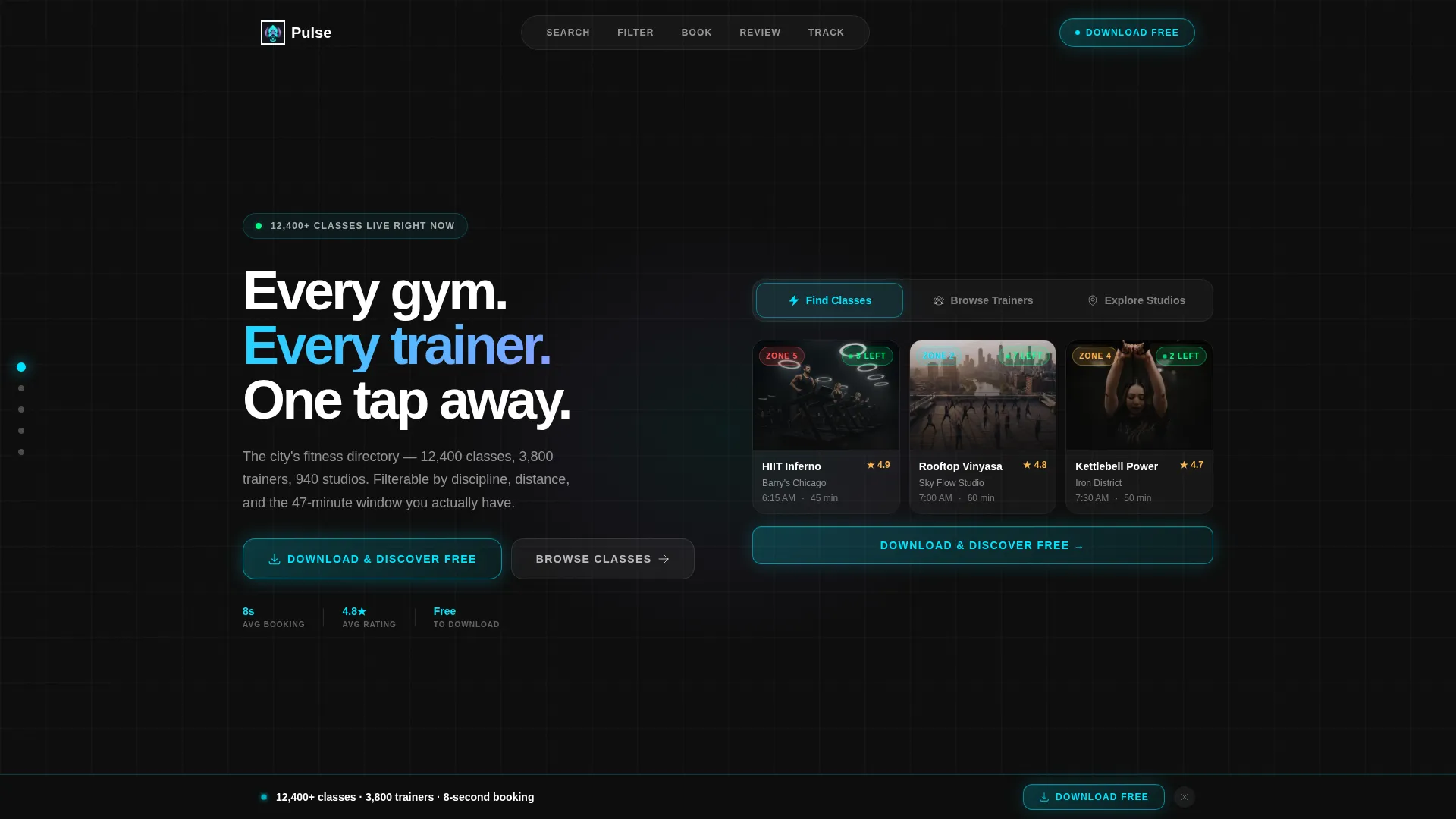
- A Feature Tab Switcher header showing class, trainer, and studio views with live user interface previews
- A sticky vertical anchor navigation rail with five labeled dot stops: Search, Filter, Book, Review, and Track
- A full-width sticky download bar, a phone-number input field, and App Store and Google Play badge placements
Feature list
This template ships with six purpose-built components that work together to make a fitness directory feel real, fast, and ready to use.
Feature Tab Switcher Header
Three frosted-glass tabs sit across the top of the viewport. Each tab, labeled "Find Classes," "Browse Trainers," and "Explore Studios," reveals a different live user interface preview on selection. The default tab shows a mock class result grid with heart-rate zone badges, star ratings, and a pulsing availability indicator.
Animated Stats Counter Bar
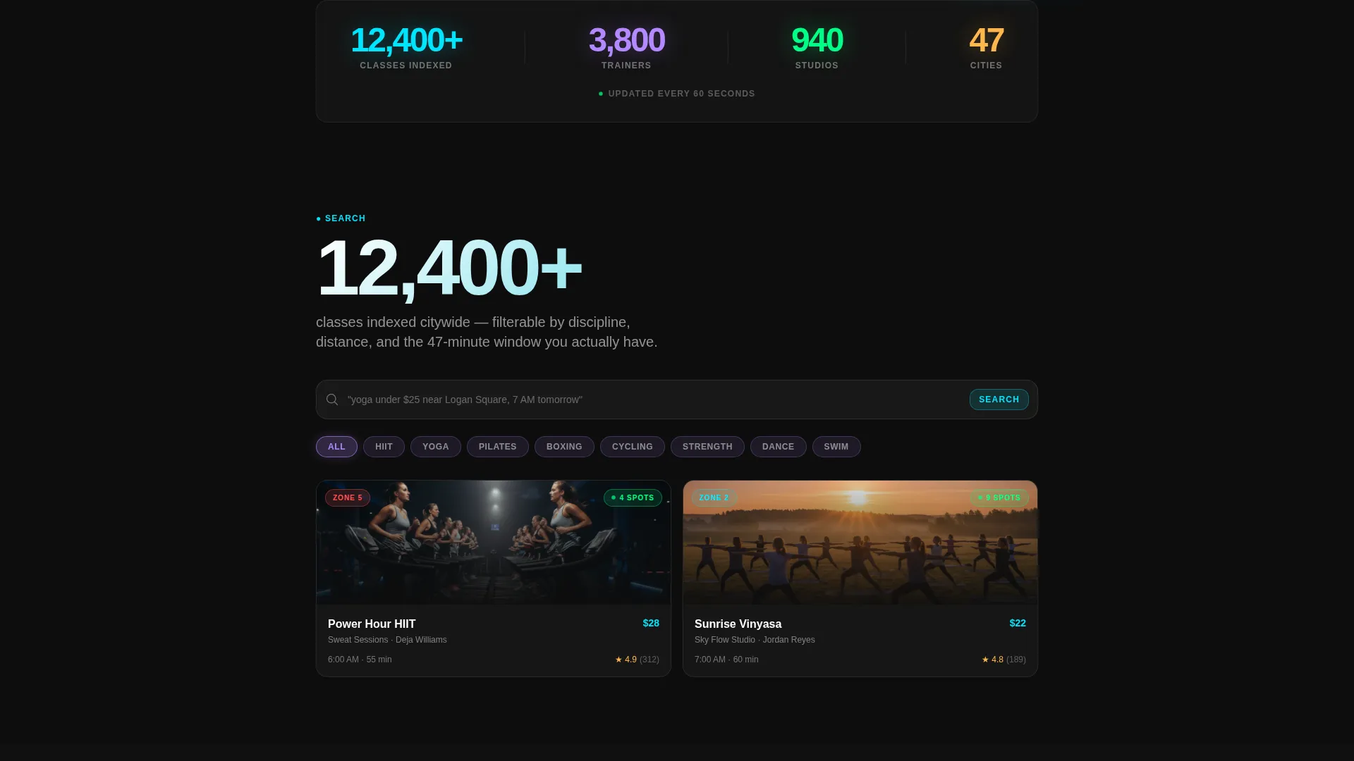
The page opens with a large animated counter row showing indexed class counts, trainer numbers, studio totals, and a live refresh note. Numbers tick upward in real time, establishing platform scale before any copy asks for trust.
Hub and Spoke Anchor Navigation
A sticky vertical dot rail sits on the left edge of the viewport throughout the scroll. Each dot reveals its label on hover, covering Search, Filter, Book, Review, and Track. Visitors always know where they are and where the next section leads.
Stats-First Spoke Sections
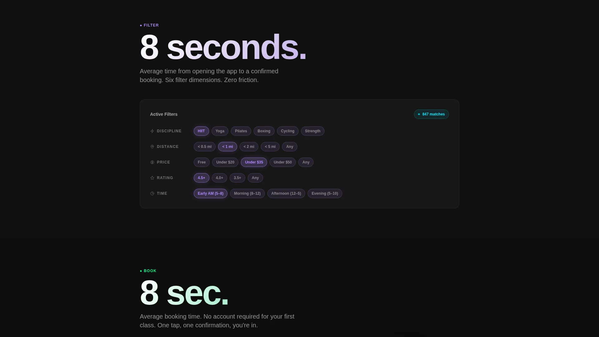
Each spoke section leads with a single bold metric before the supporting feature explanation appears beneath it. This number-then-narrative rhythm repeats across all five sections, building an evidence wall rather than a feature list.
Glassmorphic Card System
Every content card uses frosted translucent backgrounds that blur whatever sits behind them. Class cards carry heart-rate zone badges and spot-count indicators. Trainer tiles show headshots, specialty tags, and session counts. Studio map views display pin clusters with distance rings.
Friction-Minimized Download call to action
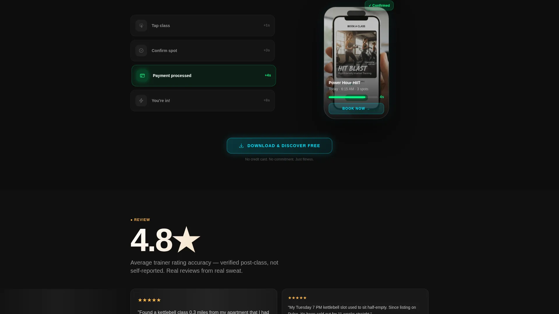
The primary call to action appears three times: inside the header tab preview, after the booking-speed stat midpage, and as a full-width sticky bar after 60 percent scroll depth. The download prompt uses a single phone-number input field that texts the link, keeping the conversion path as short as possible.
Page sections overview
| Section | Purpose |
|---|---|
| Feature Tab Switcher | Introduces the three core directory views with animated tab selection |
| Animated Stats Bar | Establishes platform scale with live-updating class, trainer, and studio counts |
| Search Spoke | Anchors the searchability feature with a bold metric and supporting context |
| Filter Spoke | Highlights discipline, location, rating, and availability filtering capability |
| Book Spoke | Demonstrates booking speed with a single stat leading the explanation |
| Review Spoke | Builds credibility through trainer rating accuracy and social proof framing |
| Track Spoke | Shows the personal progress or session tracking angle of the platform |
| Midpage Download call to action | Converts momentum into action after the booking-speed proof point |
| Full-Width Sticky Bar | Slides into view at 60 percent scroll depth as a persistent download prompt |
Design & branding system
The visual identity is built on a glassmorphic color system that pairs a deep obsidian base with frosted translucent cards. Electric cyan handles active states and live badges, while soft lavender washes over selected filter chips and hover states. The result is a dark, luminous palette that feels native to a premium mobile product.
- Core palette: deep obsidian base (#0D0D0D), frosted card white (rgba 255, 255, 255, 0.08), electric cyan (#00E5FF), and soft lavender (#B388FF)
- Card style: pure black backgrounds with frosted-glass cards that blur content layers behind them, giving depth without clutter
- Interactive feedback: cyan pulses on active navigation dots and live-count badges; lavender transitions across selected filter chips on hover
Mobile & speed optimization
The layout is designed with a mobile-first interaction model in mind. The sticky anchor rail, tab switcher, and download call to action are all structured for one-thumb navigation and fast tap targets.
- The sticky download bar and phone-number input are built for minimal friction on small screens
- Tab switching and card grid layouts reflow cleanly for narrower viewports without losing the glassmorphic visual layer
- The animated stats counter and pulsing availability indicators are lightweight enough to remain readable at any scroll speed
How this template helps you convert
The page is sequenced to earn trust before it ever asks for a commitment. Scale comes first, proof follows, and the download request appears only after the visitor has seen the evidence.
- The animated stats bar hits immediately, showing indexed classes, trainers, and studios at a glance before a visitor reads a single word of copy
- Each spoke section pairs a specific metric with its feature explanation, so every scroll step adds a new credible reason to download rather than a generic promise
Other information about this template
Pulse is built as a Hub and Spoke landing page, meaning all navigation stays within a single scrollable page anchored by the dot rail. No multi-page routing is needed. The template style suits founders who want a focused, linear persuasion flow with no dead ends.
- Template style: Hub and Spoke with anchor navigation, single-page layout
- Creative direction: Stats-First Impact, designed to lead with evidence before narrative
- Theme: Directory and Discovery, suited to platforms with large searchable inventories
- The three-tab header concept works well for any platform that has distinct user modes or browsing contexts
- The phone-number input call to action pattern is particularly effective for app download pages where removing friction directly lifts conversion
Theme
Directory & Discovery
Creative direction
Stats-First Impact
Color system
Glassmorphic
Style
Hub & Spoke (Anchor Nav)
Direction
App Download
Page Sections
Feature Tab Switcher Header
Animated Live Stats Counter
Hub and Spoke Anchor Nav Rail
Stats-first Spoke Sections
Glassmorphic Card Components
Friction-minimized Download Call to Action
Related questions
Who is the Pulse template designed for?
Can I customize the color system and card styles?
How does the anchor navigation work on this template?
What is the primary call to action on this landing page?
Does this template include real data or live directory content?



