Fitness Booking & Scheduling Landing Page Template
Pulse is a fitness booking and scheduling landing page template built for trainers, studios, and gym owners who want every time slot filled without chasing messages. It combines a dark Tech Glass visual identity, an interactive comparison table, and frictionless call-to-action placement to turn visitors into trial sign-ups in a single tap.
by Rocket studio
Quick summary
Pulse is a single-page fitness booking and scheduling landing page template. It pairs a deep void-black visual identity with frosted glass panels, electric indigo accents, and an interactive plan comparison table. The design is built to communicate speed and control, so gym owners, studio managers, and independent trainers immediately see how the product solves their calendar chaos.
Who this template is for
This template is built for fitness professionals who need bookings to run on autopilot. If your current system involves spreadsheets, DM threads, or a whiteboard near the door, this page was made for you.
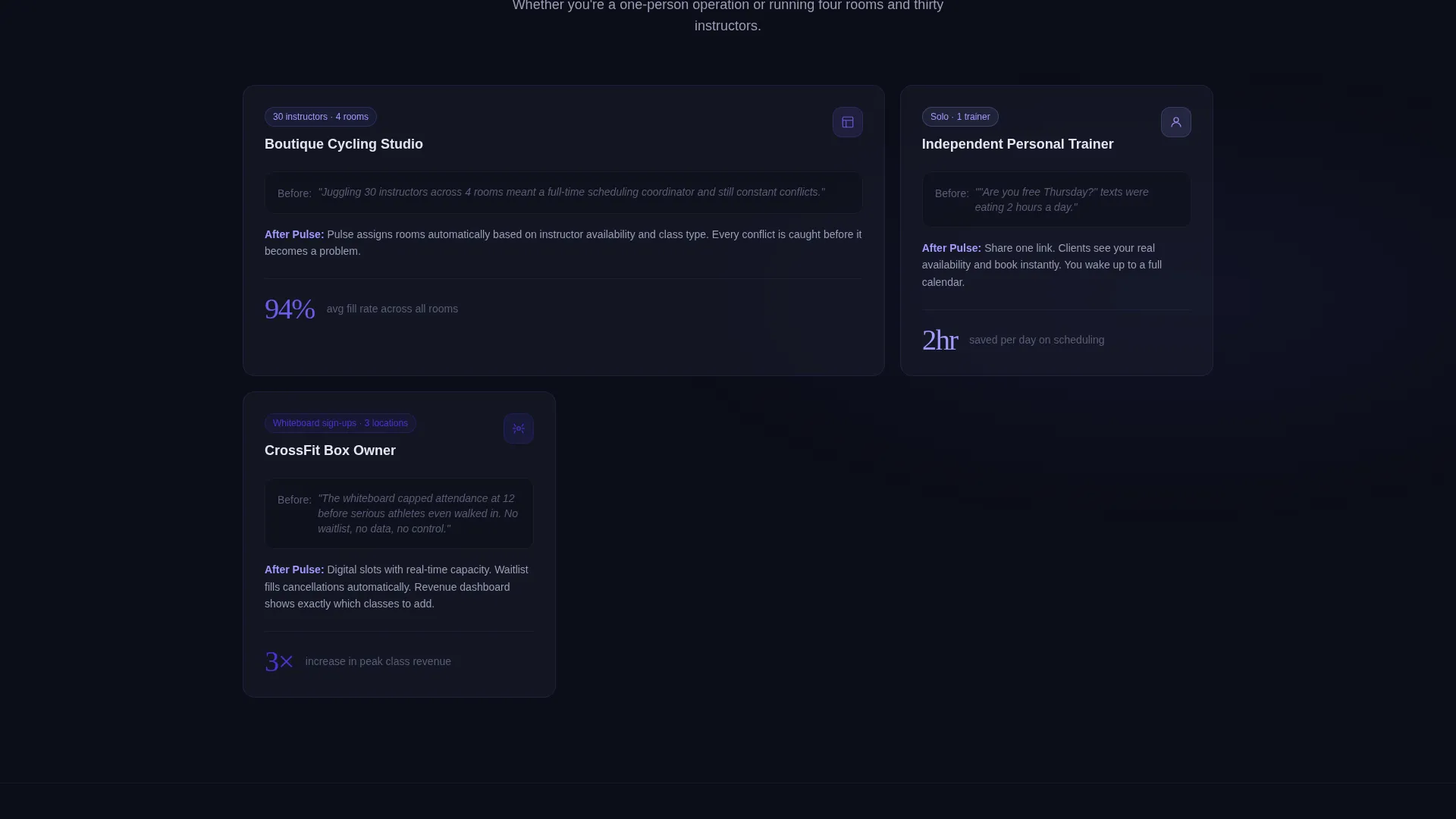
- Boutique cycling studio managers coordinating multiple instructors across several rooms
- Independent personal trainers losing potential clients to slow response times in direct messages
- CrossFit-style gym owners whose manual sign-up sheets cap class attendance before demand is met
What problem this template solves
Fitness professionals lose revenue every week because their booking process creates unnecessary friction. Clients abandon slow systems. Instructors get double-booked. Owners spend time answering scheduling questions instead of running their business.
- No clear way to show available slots without back-and-forth communication
- Comparison pages that list features but never let a visitor experience the product's logic
- High drop-off caused by requiring account creation before a visitor understands the value
What you get with this template
You get a complete, ready-to-deploy fitness booking landing page that guides every visitor from curiosity to commitment. The layout is designed around conversion, clarity, and the feeling of a product that is already working.
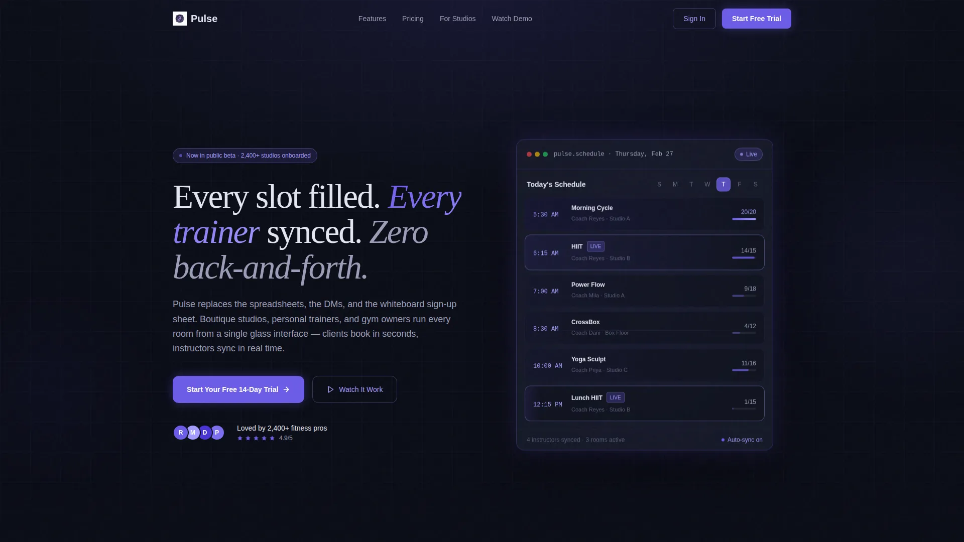
- A full-bleed dark header with a glowing, animated calendar interface as the hero element
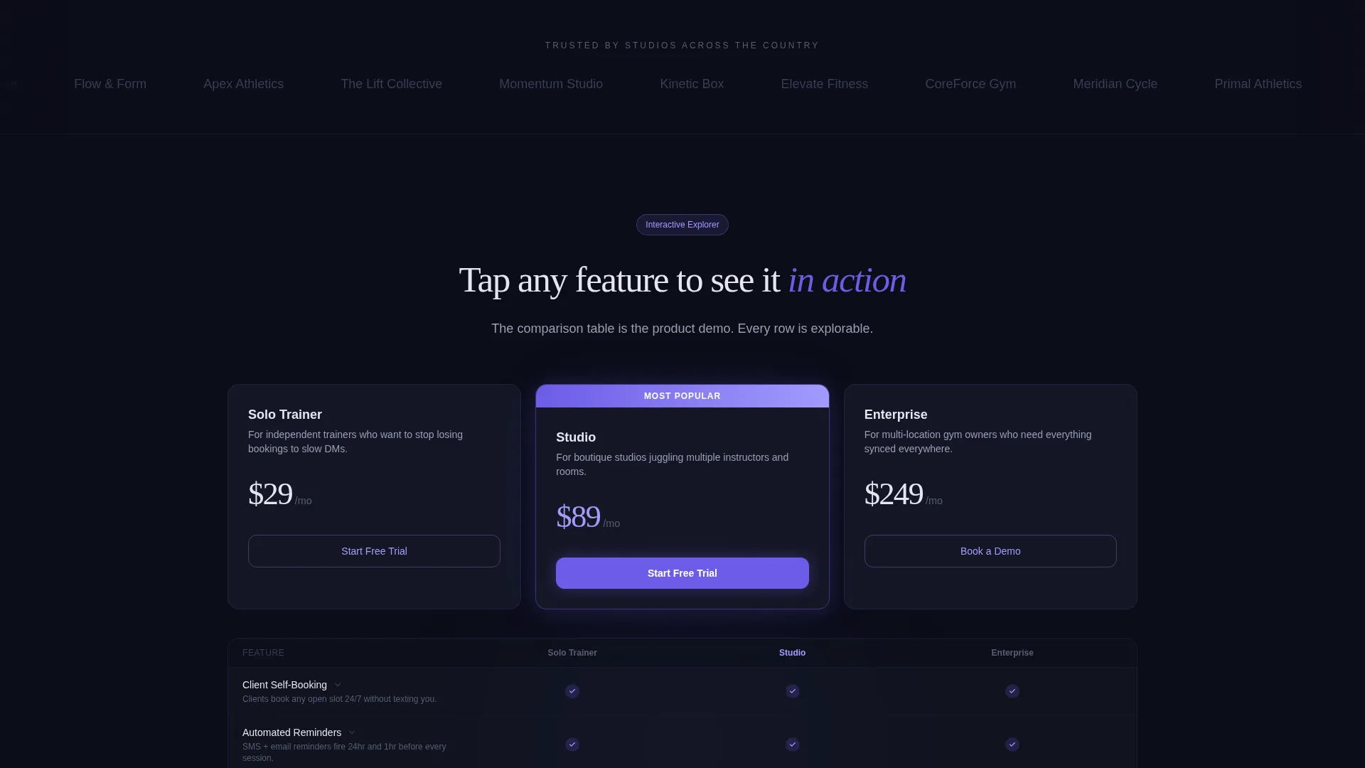
- An interactive comparison table with three plan tiers rendered as frosted glass cards
- Dual call-to-action placement, a secondary inline demo trigger, and URL-parameter-ready plan selection buttons
Feature list
This template includes purposefully designed components that go beyond a static feature checklist. Each element is built to reflect the scheduling product's speed and intelligence.
Animated Hero Calendar Interface
The header places a frosted glass calendar user interface at center frame, edge-lit in electric indigo. A time slot fills in real time, complete with a class name and coach label, while a soft indigo bloom radiates outward from the booked slot. No stock imagery is used. The product itself is the visual.
Interactive Comparison Table
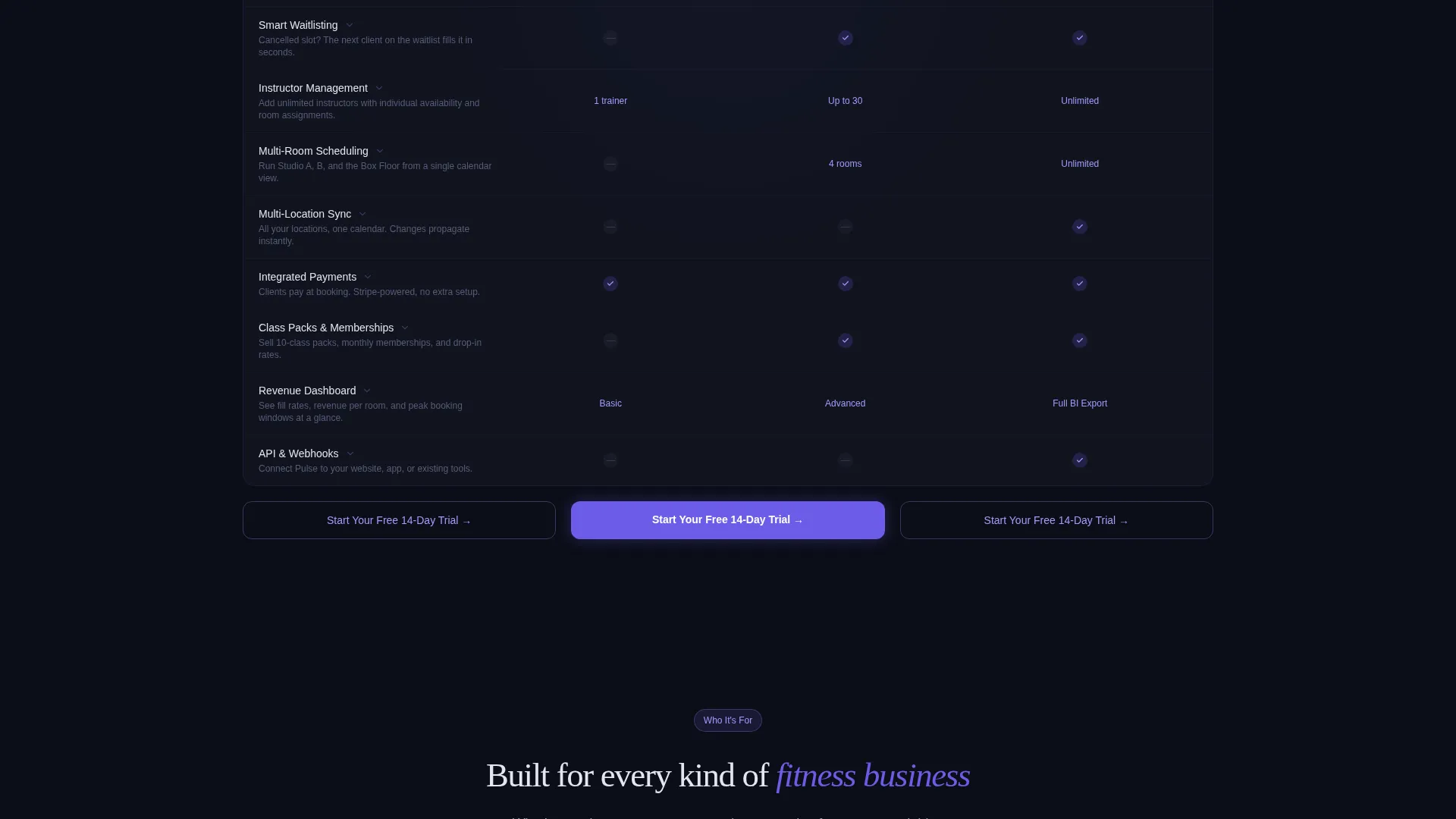
Three plan columns, Solo Trainer, Studio, and Enterprise, are displayed as hoverable frosted glass cards over a dark canvas. Each row is explorable. Tapping a feature like "Smart Waitlisting" triggers a micro-animation showing a cancelled slot refilling automatically from a waitlist queue.
Escalating Scroll Architecture
The page builds complexity as the visitor scrolls. Simple booking features appear at the top for solo trainers. Revenue dashboards and multi-location sync appear lower, rewarding studio owners and enterprise users who explore further. Each section transition uses a subtle parallax shift of the glass panels.
Frictionless call to action System
The primary call-to-action button, "Start Your Free 14-Day Trial", is anchored in the header and repeated at the base of every comparison column. No form is required on this page. Each button carries the selected plan tier as a URL parameter to the external sign-up flow.
Inline Demo Video Trigger
A secondary call-to-action labeled "Watch It Work" triggers an inline demo video. The video auto-plays a 45-second screen recording of a real booking flow, letting visitors experience the product before creating an account.
Tech Glass Design System
Every component uses a consistent design language built on deep void black, frosted glass panels with backdrop blur, and electric indigo button states. Active elements glow with a lighter indigo wash. The palette is cohesive and intentional, not decorative.
Page sections overview
| Section | Purpose |
|---|---|
| Full-Bleed Header | Anchors the hero calendar, headline, and primary call to action |
| Headline Copy Block | Delivers the core value proposition in silver-white text |
| Plan Comparison Table | Lets visitors explore and compare three pricing tiers |
| Feature Row Explorer | Shows micro-animations tied to individual feature rows |
| Scroll Depth Sections | Escalates from basic booking to advanced studio features |
| Inline Demo Trigger | Surfaces the "Watch It Work" secondary call to action and video |
| Column Footer calls to action | Repeats the trial button at the base of each plan card |
Design & branding system
The visual identity uses a Tech Glass theme built entirely on an Electric Indigo color system. Every color choice reinforces the feeling of a lit screen in a dark room, focused, modern, and energized.
- Core palette: deep void black (#0B0D17) for backgrounds, frosted glass panel (#1A1D2E) at 60% backdrop blur for cards, electric indigo (#6C5CE7) for buttons and hover states, and cool silver-white (#E4E6F1) for all body text
- Accent layer: a lighter indigo wash (#A29BFE) powers notification badges, active-state halos, and the soft glow radiating from booked calendar slots
Mobile & speed optimization
The template is structured for clean rendering on any screen size. The dark full-bleed layout and glass card system translate naturally to narrower viewports without losing the electric visual tone.
- Frosted glass cards and the comparison table columns reflow for mobile-width displays
- call to action buttons remain persistently accessible, and the inline demo trigger stays functional on touch-based devices
How this template helps you convert
This page earns the click by letting visitors interact with the product's logic before they ever create an account. The entire layout is engineered to reduce the distance between "I'm curious" and "I'm in."
- The hero animation demonstrates the scheduling product live, so visitors understand the value proposition within the first five seconds of landing on the page.
- The interactive comparison table replaces passive reading with active exploration, making the decision to select a plan feel natural rather than pressured.
- The no-form call to action system removes every barrier between the visitor's chosen plan and the sign-up flow, cutting friction to a single tap.
Other information about this template
Pulse is a landing page template built specifically for the fitness booking and scheduling site niche. It sits at the intersection of technology and fitness digital presence, and it reflects how modern scheduling tools should present themselves to serious buyers.
- The template style is a Comparison Table layout, making it well suited for fitness scheduling products that offer multiple service tiers
- The creative direction follows an Interactive Explorer approach, which is ideal for products whose value becomes clearer the more a visitor engages with the interface
- The header concept is a Dark Full-Bleed with Glow treatment, a deliberate choice that positions the product user interface as the sole light source on the page
- The landing page direction is Click-Through, meaning the page is optimized for a single outbound action with no form-fill barrier on the page itself
Theme
Tech Glass
Creative direction
Interactive Explorer
Color system
Electric Indigo
Style
Comparison Table
Direction
Click-Through
Page Sections
Animated Hero Calendar Interface
Interactive Plan Comparison Table
Escalating Scroll Architecture
Frictionless Click-through Call to Action System
Inline Demo Video Trigger
Related questions
Can I customize the plan names and feature rows in the comparison table?
Does this template include the booking or scheduling functionality itself?
How does the URL parameter system work for plan selection?
Is the inline demo video included with the template?
Who is this landing page template best suited for?



