Pulse - Intelligent Ecommerce Landing Page Template
Pulse is an eCommerce AI analytics landing page template built for direct-to-consumer brand operators who need clarity, not more noise. The design follows a Problem→Solution arc with a Feature Tab Switcher header, mission-control color palette, and interactive-looking data grid cards. Every section earns the visitor's click by showing the product in action.
by Rocket studio
Quick summary
Pulse is a single-page landing page template designed for eCommerce AI analytics platforms. It opens with a three-tab dashboard header, moves through a Problem→Solution arc, and closes every section with a phosphor mint call to action driving visitors into a live demo. The visual identity feels like mission control at night: dense, signal-rich, and purposeful.
Who this template is for
This template is built for founders, growth operators, and product marketers who sell AI-powered analytics tools to eCommerce businesses. If your buyer is a seven-figure direct-to-consumer brand owner who currently stitches together data from multiple platforms every Sunday night, this page speaks their language directly.
- Direct-to-consumer brand operators running high-volume Shopify or WooCommerce stores
- eCommerce AI analytics platform teams who need a high-converting demo entry point
- Growth and performance marketers positioning an intelligent data platform to skeptical, technical buyers
What problem this template solves
Most analytics tool landing pages describe features without showing them. The visitor reads bullet points about "unified attribution" but never feels the product. Pulse fixes that by making the template itself the proof, every section is a functioning-looking preview that creates the sensation of already using the tool.
- Disconnected dashboards and conflicting metrics leave buyers unconvinced; this template recreates that pain visually before resolving it
- Skeptical technical buyers need a methodology path, not just a headline; a secondary text link routes them to an attribution deep-dive
- Generic SaaS landing page layouts do not resonate with data-literate operators; this template uses monospace numbers and dense data grids to match their world
What you get with this template
You get a fully structured single-page layout built around a clear demo-driven conversion path. There are no forms on the page. The entire experience is designed to earn the click to a sandboxed demo environment preloaded with sample store data.
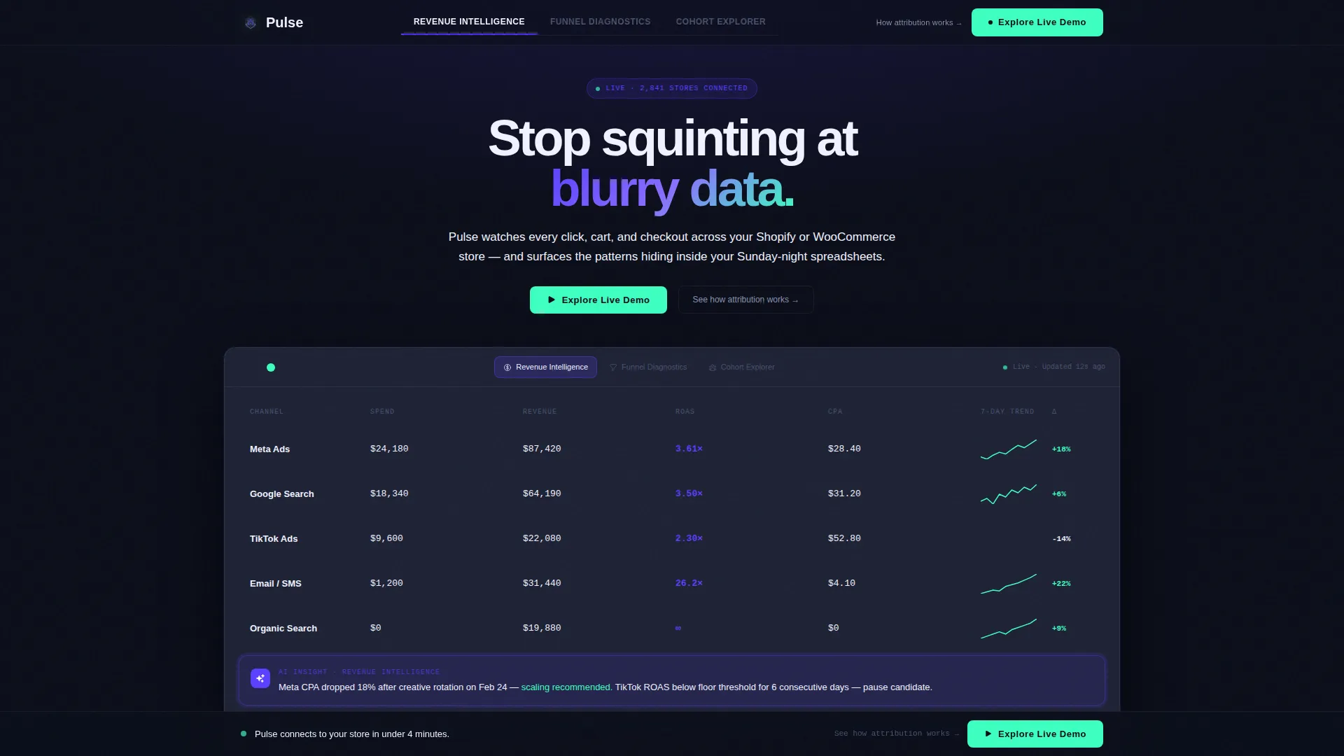
- A Feature Tab Switcher header with three tabs: "Revenue Intelligence," "Funnel Diagnostics," and "Cohort Explorer," each revealing a live-style dashboard mockup
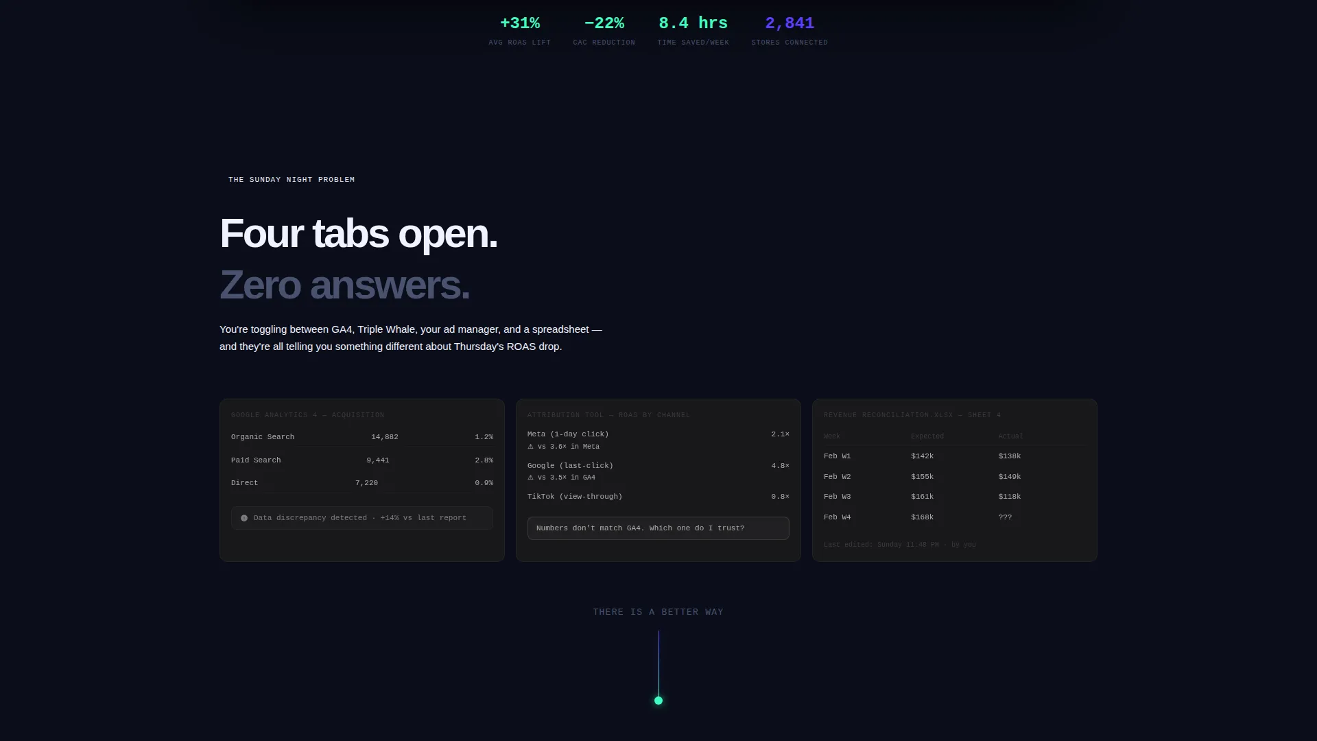
- A Problem→Solution arc that moves visitors from a chaotic, desaturated collage of broken dashboards to sharp, connected, indigo-lit solution cards
- A sticky bottom call-to-action bar that appears after the second scroll section, keeping the primary conversion action always visible
Feature list
This template covers the full narrative arc a technical eCommerce buyer needs to move from skepticism to action. Each built-in component reinforces a specific moment in that journey.
Feature Tab Switcher Header
The header includes three clickable tabs labeled "Revenue Intelligence," "Funnel Diagnostics," and "Cohort Explorer." Each tab swaps in a live-style dashboard mockup below it. The default view displays a revenue attribution grid with channel columns, sparkline trends, and an AI insight card glowing in electric indigo.
Problem Visualisation Section
The first below-the-fold section drops visitors into a recreated pain state: a chaotic collage of disconnected dashboards, conflicting metrics, and a blinking data discrepancy alert. Everything is rendered in desaturated gray to signal disorder before the solution is introduced.
Indigo Power-Surge Transition
A single indigo line draws down the page like a power surge, visually separating the problem from the solution arc. This transition resets the visual register and signals that every section that follows presents one solved problem.
Interactive Data Grid Cards
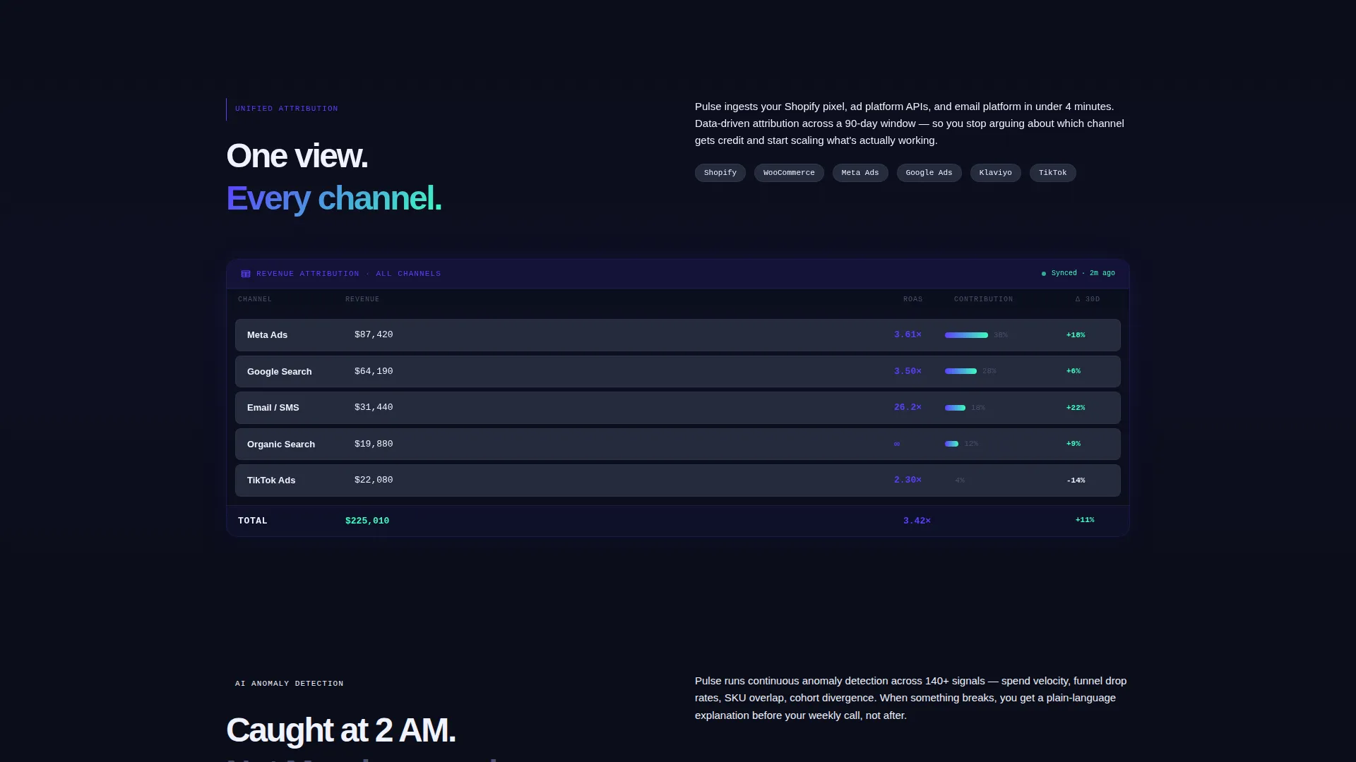
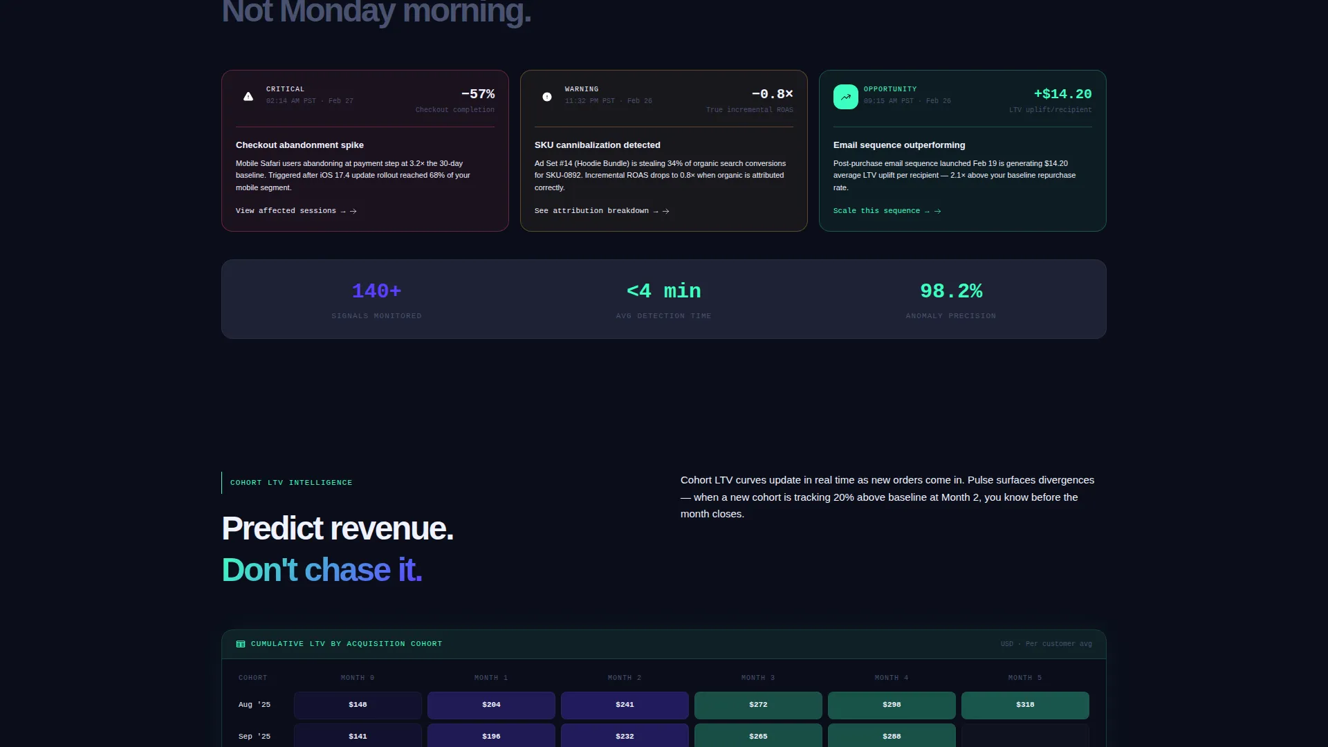
Each solution section is a data grid card designed to look and feel almost interactive. Cards cover unified attribution in one view, AI anomaly detection, and cohort lifetime value curves. Numbers are rendered in monospace type to match the operator's mental model.
Dual Call-to-Action System
The primary call to action, "Explore the Live Demo," appears first inside the header tab switcher and again as a sticky bottom bar after the second scroll section. A secondary text link, "See how we calculate attribution →," gives technical buyers a low-friction path to a methodology deep-dive without leaving the conversion flow.
AI Insight Card
One highlighted card inside the default header view glows in electric indigo and displays a sample AI-generated insight. The sample reads: "Meta CPA dropped 18% after creative rotation, scaling recommended." This demonstrates the platform's intelligence layer before the visitor scrolls past the first section.
Page sections overview
| Section | Purpose |
|---|---|
| Tab Switcher Header | Introduce three core modules with swappable dashboard mockups |
| AI Insight Card | Show a sample AI-generated revenue recommendation in context |
| Problem Collage | Recreate the pain of fragmented, conflicting analytics visually |
| Indigo Surge Divider | Signal the shift from problem state to solution arc |
| Unified Attribution Card | Present channel-level attribution clarity as a solved problem |
| Anomaly Detection Card | Demonstrate AI flagging of issues before the weekly review |
| Cohort LTV Card | Show lifetime value curves updating in real time |
| Sticky Demo Bar | Keep the primary call to action visible throughout the scroll |
Design & branding system
The visual identity follows a Directory and Discovery theme with an Electric Indigo color system. The palette is built to feel like a mission control room late at night, where every glowing element carries meaning and the eye is trained to hunt for signal.
- Core colors: deep void black (#0B0E1A) for the background, electric indigo (#5B3FFF) for active states and data highlights, cool slate (#1E2235) for card surfaces, and phosphor mint (#3DFFC0) reserved exclusively for positive metrics and primary calls to action
- Typography: monospace rendering for all numerical data to reinforce the data-platform context and help operators scan dense grids quickly
- No stock photography or lifestyle imagery; the product interface itself is the entire visual language of the page
Mobile & speed optimization
The template is designed with a dense data-grid layout that scales responsibly across screen sizes. Chart cards and tab switchers are structured to remain readable and navigable on smaller viewports without losing the mission-control aesthetic.
- Dashboard mockup sections are built as structured visual components, keeping the layout intact across device widths
- The sticky bottom call-to-action bar is optimized for thumb-reach on mobile, ensuring the primary conversion action stays accessible during scroll
How this template helps you convert
Pulse is built around a single conversion goal: get the visitor into the live demo environment. Every design decision supports that goal rather than diluting it.
- The Feature Tab Switcher creates immediate product immersion, letting visitors explore three distinct use cases before they decide whether to click, which builds intent organically rather than forcing it
- The Problem→Solution arc mirrors the exact emotional journey of the target buyer, moving from recognized pain to visible resolution, so the call to action arrives at the moment of highest motivation
- The no-form conversion path removes friction entirely; the click lands visitors directly inside a sandboxed dashboard preloaded with sample store data, lowering the commitment barrier to almost zero
Other information about this template
Pulse is categorized under Technology, specifically AI for eCommerce, and sits within the eCommerce AI analytics dashboard niche. The template style is Dashboard and Data Grid, making it well suited for platforms that want their marketing page to function as a live product preview rather than a traditional feature list.
- The template niche aligns with platforms that compete in the eCommerce intelligence space alongside tools like Triple Whale, Northbeam, and similar attribution and analytics products
- The intersection match score for this template is 13, indicating strong alignment between the template style, creative direction, and target niche
- The creative direction is a Problem→Solution Arc, the header concept is a Feature Tab Switcher, and the landing page direction is Click-Through, all of which are reflected in the built-in structure
Theme
Directory & Discovery
Creative direction
Problem→Solution Arc
Color system
Electric Indigo
Style
Dashboard/Data Grid
Direction
Click-Through
Page Sections
Feature Tab Switcher Header
Problem Visualisation Section
Problem to Solution Arc Layout
Interactive-style Data Grid Cards
Dual Call-to-action System
AI Insight Card Component
Related questions
Does this template include an actual working dashboard?
Can I customize the tab labels and AI insight card copy?
Is there a form on this landing page?
Who is the ideal buyer for this template?
Can the Electric Indigo color system be changed to a different brand palette?



