Real-Time Analytics Newsletter Landing Page Template
Pulse is a split-screen landing page template built for a real-time analytics newsletter and community. It opens with an interactive diagnostic tool, walks visitors through weekly briefing content in a left-right data-versus-insight layout, and converts on a freemium model. The design uses a Monochrome Steel palette with a single electric accent to keep every element purposeful and sharp.
by Rocket studio
Quick summary
Pulse is a single-page landing page template for a weekly analytics briefing and community. It leads with a free diagnostic calculator, reveals newsletter content in split-screen sections, and converts visitors through two clear calls to action. The Monochrome Steel color system and Feature Tab Switcher header make the page feel like a live analytics tool from the first scroll.
Who this template is for
This template is built for newsletter creators and community builders working in the analytics space. If your audience lives inside dashboards for a living, this layout speaks their language immediately.
- Growth engineers who debug funnel drop-offs and need a page that earns trust fast
- Product managers and data team leads looking to build a subscriber base around practical analytics insight
- Founders or operators launching a real-time analytics briefing with a freemium signup model
What problem this template solves
Most newsletter landing pages rely on persuasion copy alone. Analytics-focused audiences are skeptical by habit. They want proof of value before they give you their email address.
- Visitors bounce when a page leads with marketing claims instead of demonstrable utility
- A generic template cannot communicate the gap between raw data noise and actionable signal
- Freemium conversion flows often feel disconnected from the actual product value
What you get with this template
You get a fully structured, single-page layout designed around the calculator-first creative direction. Every section earns the next click rather than demanding it.
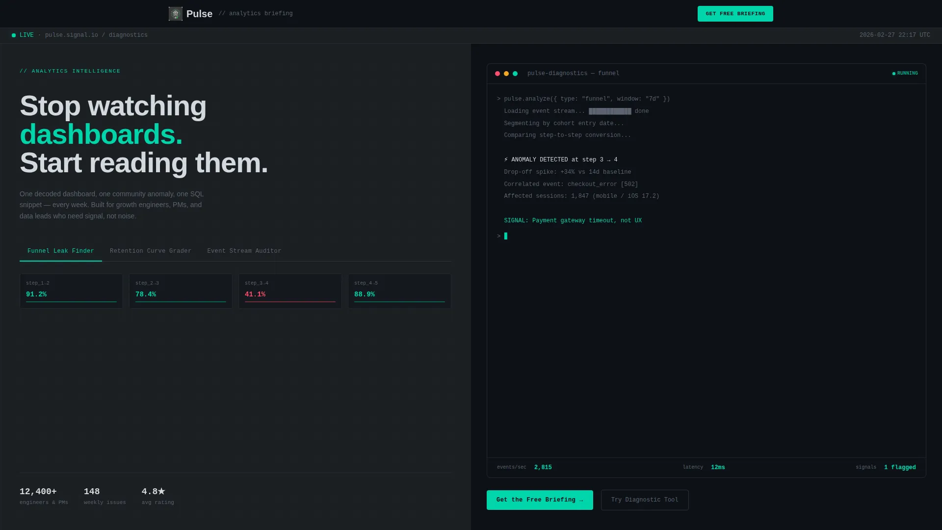
- A Feature Tab Switcher header with three interactive tabs, each swapping in a live-feeling analytics calculator panel
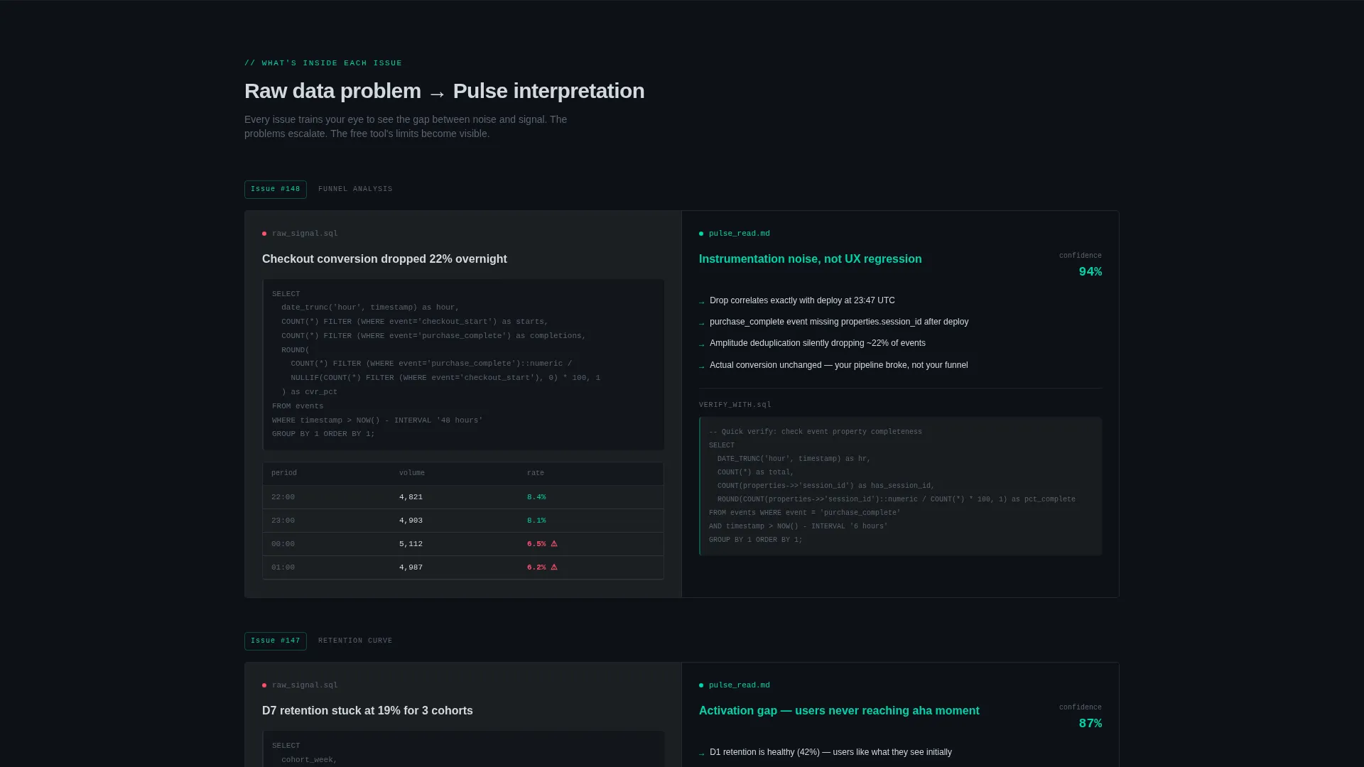
- A scrolling split-screen content flow that pairs raw data problems on the left with interpreted insights on the right
- Two conversion points: a free briefing signup and a full-access trial form asking only for email and primary analytics platform
Feature list
This template ships with a set of tightly scoped, purpose-built components drawn directly from the brief.
Feature Tab Switcher Header
The header holds three clickable tabs labeled "Funnel Leak Finder," "Retention Curve Grader," and "Event Stream Auditor." The active tab glows in electric accent. Each tab swaps the right panel with a simulated analytics interface that includes a blinking cursor and streaming numbers, making the tool feel live before the visitor interacts with anything.
Free Diagnostic Calculator
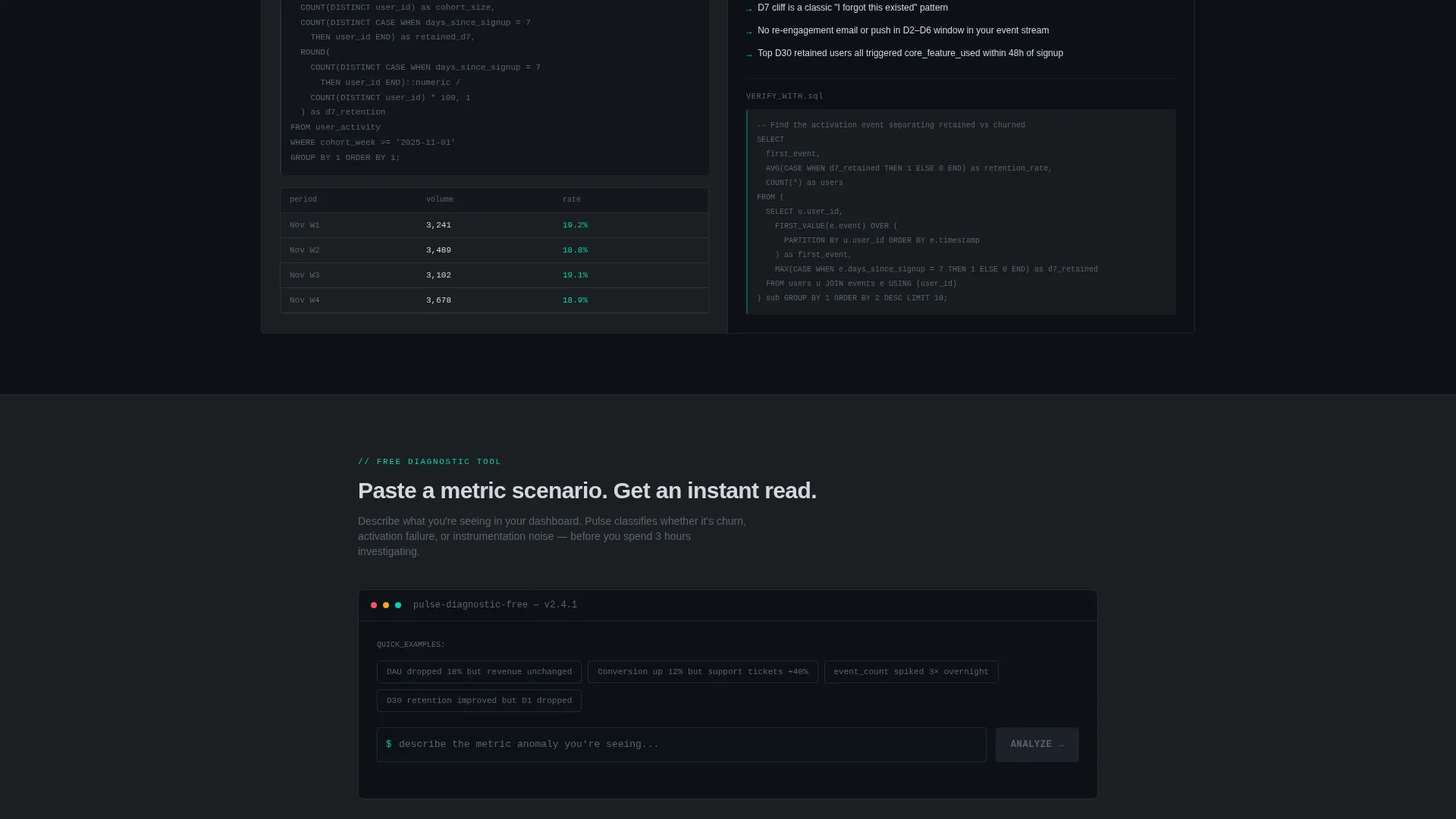
The page opens with a utility-first tool. Visitors paste a metric scenario and receive an instant read on whether the pattern signals churn, activation failure, or instrumentation noise. The tool delivers a real, usable insight before asking for any contact details, establishing trust through action rather than copy.
Split-Screen Content Sections
Below the calculator, the page reveals weekly newsletter content in a 50/50 left-right layout. The left side presents the raw data problem; the right side shows the Pulse interpretation. This repeating structure trains the visitor's eye and escalates tension as the problems grow harder and the value of full access becomes clear.
Dual Conversion Flow
The primary call to action, "Get the Free Briefing," uses a single email field with ghost-text placeholder reading "your-work@company.com." A secondary call to action, "Start 14-Day Full Access," sits below the fold and collects email plus analytics platform preference. No credit card is required for either offer.
Monochrome Steel Visual System
The color system uses deep gunmetal, brushed steel mid-tone, cool silver, and a single electric accent reserved for interactive states and live-data indicators. Backgrounds alternate between gunmetal and near-black. Body text sits in silver. Section dividers are single-pixel steel lines. Every visual decision removes decoration and adds clarity.
Community Thread Previews
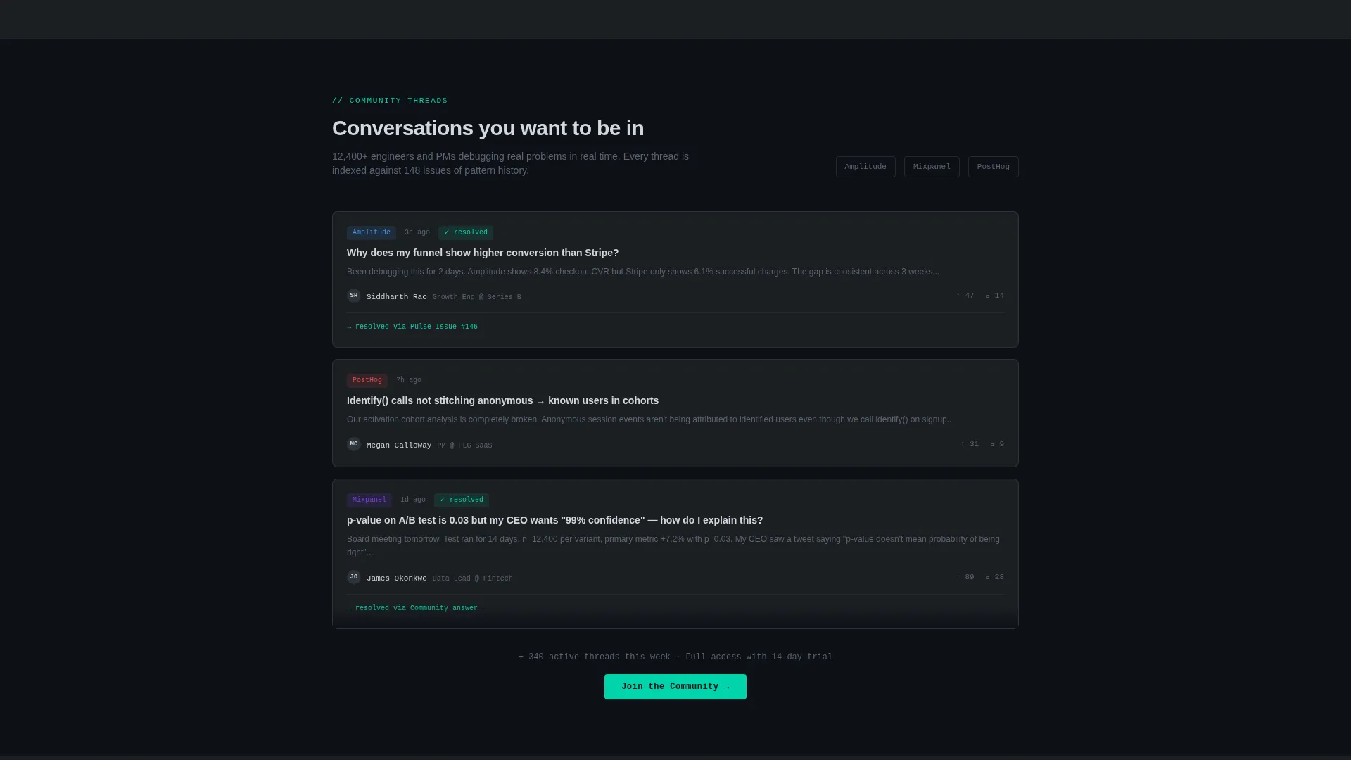
The template includes preview sections showing community-sourced anomaly threads. These previews surface conversations the visitor wants to join, creating social proof that is functional rather than cosmetic. The tension between free access and full community access becomes visible as visitors scroll.
Page sections overview
| Section | Purpose |
|---|---|
| Tab Switcher Header | Introduce three diagnostic tools with an interactive left-right split |
| Free Diagnostic Tool | Deliver instant metric insight before asking for signup |
| Weekly Briefing Preview | Show decoded dashboard content in split-screen left-right format |
| Community Anomaly Thread | Preview community-sourced data discussions to create pull |
| SQL Snippet Section | Demonstrate one practical code resource included each week |
| Primary call to action Block | Collect email for free briefing with a single low-friction field |
| Secondary call to action Block | Offer 14-day full access with email and analytics platform input |
Design & branding system
The visual identity follows a Directory and Discovery theme executed through the Monochrome Steel color system. The aesthetic is deliberately industrial, referencing the chrome bezel of a server rack under fluorescent light.
- Core palette: deep gunmetal (#1B1F23), brushed steel mid-tone (#5C6370), cool silver (#D3D8DE), and electric accent (#00D4AA) used only for interactive states and live-data indicators
- Backgrounds alternate between gunmetal and near-black; body text is silver; section dividers are single-pixel steel lines; zero decorative elements
Mobile & speed optimization
The 50/50 split-screen layout is structured to reflow cleanly for smaller viewports. The tab switcher and calculator panels are designed to stack predictably without losing their live-data visual cues.
- Stacked column behavior on mobile preserves the left-problem, right-insight reading pattern
- Simulated calculator animations and blinking cursor states are scoped to keep the interface responsive at any screen size
How this template helps you convert
The conversion strategy is built into the page structure itself. Every scroll earns the next ask rather than leading with it.
- The free diagnostic tool provides a real, usable output before the visitor sees any signup form, making the first conversion point feel like a reward rather than a request.
- The escalating split-screen sections make the limits of free access naturally visible, creating genuine pull toward the secondary "Start 14-Day Full Access" call to action without any hard-sell copy.
Other information about this template
This template was designed specifically for the real-time analytics niche, where audiences are data-literate and resistant to vague value propositions. The layout reflects that context at every level.
- The three tab labels ("Funnel Leak Finder," "Retention Curve Grader," "Event Stream Auditor") are written for the exact vocabulary of growth engineers, product managers, and data team leads
- The secondary conversion form includes a platform preference field with options for Amplitude, Mixpanel, PostHog, and Other, allowing the newsletter to personalize follow-up from the first signup
- The template fits the Freemium/Trial landing page direction, making it reusable for any analytics tool or briefing that converts on a no-credit-card trial offer
Theme
Directory & Discovery
Creative direction
Calculator/Tool First
Color system
Monochrome Steel
Style
Split Screen (50/50)
Direction
Freemium/Trial
Page Sections
Feature Tab Switcher Header
Free Diagnostic Calculator
Split-screen Content Flow
Dual Freemium Conversion Points
Community Thread Preview Sections
Monochrome Steel Design System
Related questions
Can I change the tab labels in the header?
Does the calculator tool connect to a real analytics backend?
How many conversion forms does this landing page include?
Is this template suitable for a paid newsletter or subscription product?
Can the split-screen layout be adapted for a different niche?



