Complete Restaurant Software Professional Website Template
Pulse is a split-screen landing page template built for restaurant survey and feedback platforms. It pairs a live code snippet panel with a real-time sentiment dashboard to show operators exactly what they gain from five lines of setup. The design runs on a Monochrome Steel palette and a Data Command theme, converting visitors through a no-friction freemium signup.
by Rocket studio
Quick summary
Pulse is a single-page template designed for restaurant feedback and sentiment platforms. It uses a 50/50 split-screen layout to contrast technical simplicity against analytical power. The dark, steel-toned visual identity and signal-green accent system keep the experience focused. The page drives conversions through a freemium call to action with no credit card required.
Who this template is for
This template is built for SaaS products and platforms operating in the restaurant software space. It speaks directly to operators and the teams who support them.
- Independent restaurateurs managing single venues of around 80 covers who want fast, actionable guest feedback
- Multi-unit operators who need side-by-side location score comparisons from a single dashboard view
- Food and beverage directors at boutique hotel groups tracking the gap between cover counts and review performance
What problem this template solves
Many feedback tools look either too clinical or too generic to earn trust from restaurant professionals. Pulse closes that gap by building a landing page that speaks the language of the kitchen and the numbers floor.
- Operators struggle to see how quickly a feedback tool can be set up, so the code snippet header removes all ambiguity
- Decision-makers need proof of analytical depth before they commit, so the multi-location dashboard and sentiment heatmaps deliver that proof mid-scroll
- Freemium hesitation is real, so the two-field signup form and interactive demo sandbox eliminate every common friction point
What you get with this template
You get a fully structured, single-page layout with four distinct content sections, a sticky conversion bar, and a dual call-to-action system. Every element is grounded in the Data Command theme and ready to represent a restaurant feedback platform.
- A split-screen header with a live code snippet panel on the left and an animated sentiment dashboard widget on the right
- Three progressive scroll sections covering survey builder setup, multi-location analytics, and social proof with real operator results
- A sticky bottom conversion bar that appears after the third scroll, paired with a secondary interactive demo path labeled "See Live Demo"
Feature list
This template includes a focused set of built-in design and layout components drawn directly from the source brief.
Split-Screen Header with Code Panel
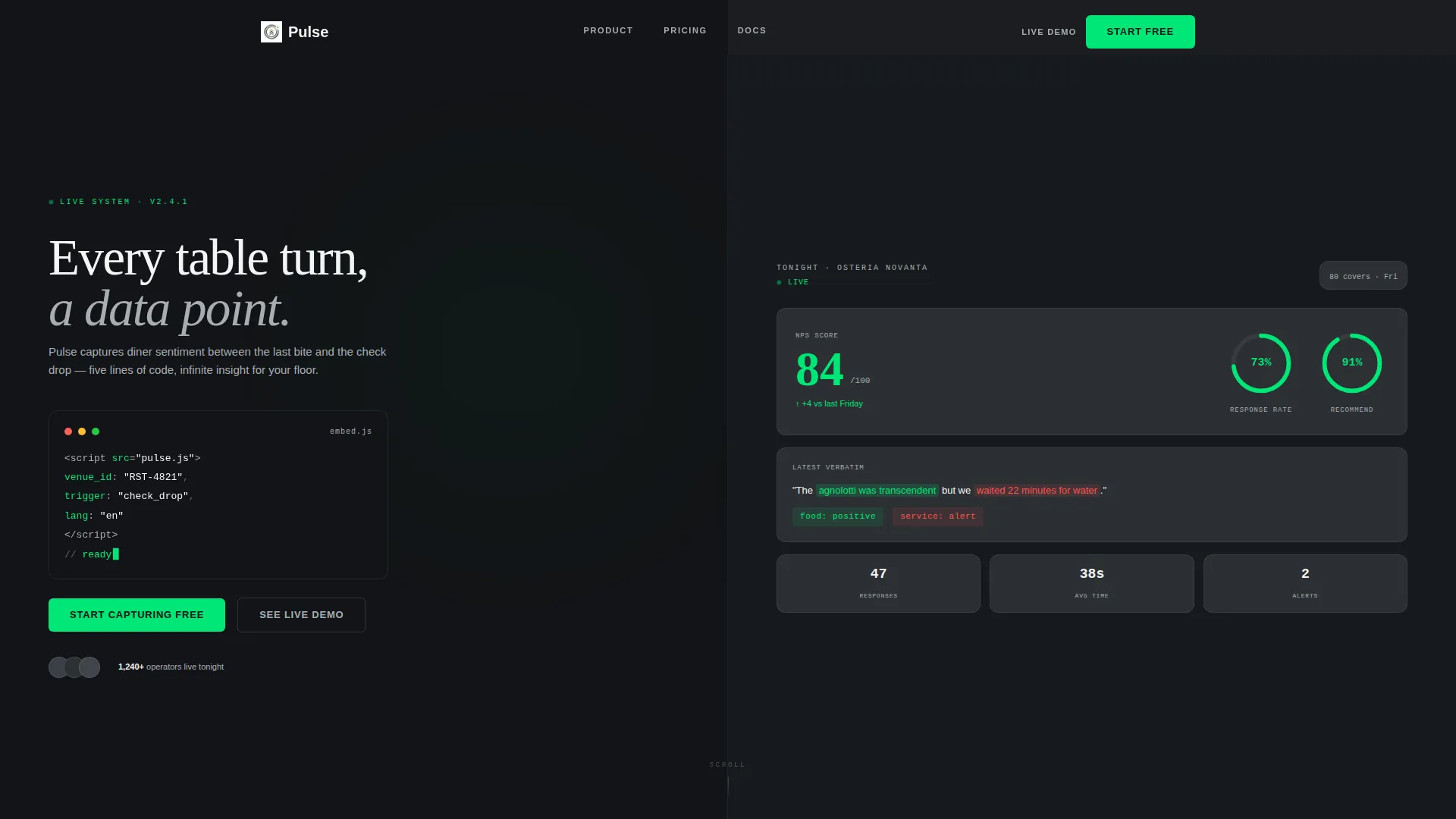
The header divides the viewport evenly. The left side displays a working embed snippet in a monospaced terminal font with syntax highlighting in signal green and steel gray. The right side shows a live-updating dashboard widget with a sentiment score, a response-rate ring chart, and a single verbatim guest quote with auto-highlighted sentiment tags.
Survey Builder Preview Section
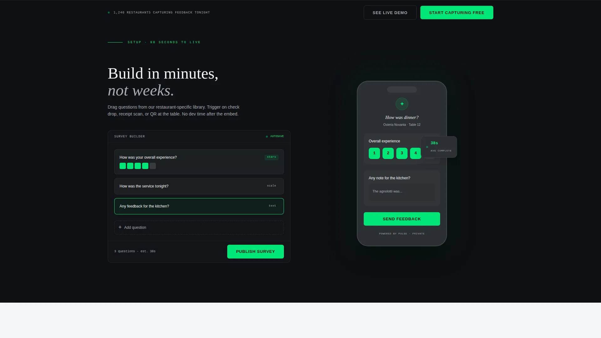
Section two mirrors the split-screen format. The left half shows a blank survey builder interface. The right half shows the guest-facing mobile experience. The pairing communicates that setup takes roughly ninety seconds, without needing a single word of explanation.
Multi-Location Analytics Section
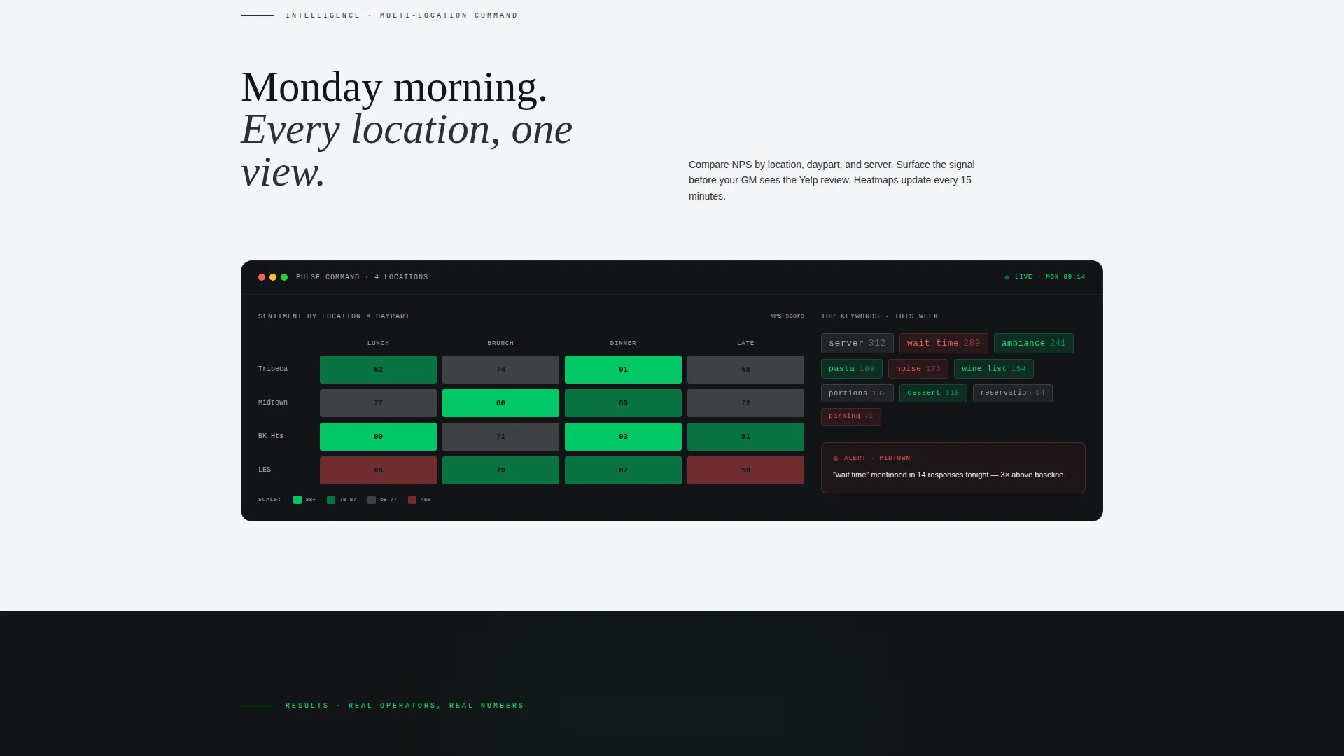
Section three escalates the data story. It presents multi-location dashboards, daypart sentiment heatmaps, and keyword clouds surfacing terms like "server," "wait," and "noise" from aggregated guest responses. This section is designed to land the analytical depth of the platform in a single scroll.
Social Proof Section
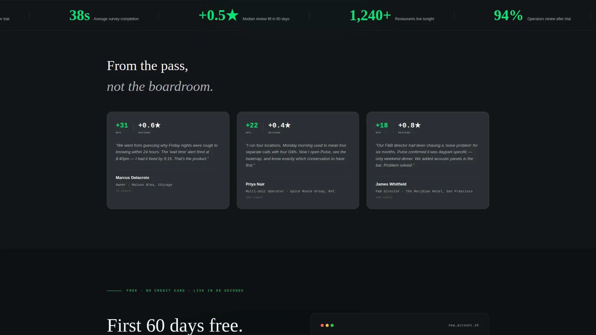
Section four grounds the product in real-world outcomes. It includes operator quotes, net promoter score lifts, and review-score recovery metrics. The content is structured to show that the platform has already delivered measurable results for operators similar to the target buyer.
Dual Call-to-Action System
The primary call to action, "Start Capturing Free," appears first inside the header code panel and again in a sticky bottom bar after the third scroll. The secondary path, "See Live Demo," opens an interactive sandbox loaded with realistic data from a fictional venue called "Mare." The two-field signup form asks only for restaurant name and email.
Data Command Color and Typography System
Signal green is reserved exclusively for live data states, active interface elements, and primary call-to-action buttons. It never appears as decoration. Dark and light backgrounds alternate across sections, with clinical white typography on dark fields and gunmetal type on lighter surfaces.
Page sections overview
| Section | Purpose |
|---|---|
| Split-Screen Header | Pairs code snippet with live sentiment dashboard to establish value immediately |
| Survey Builder Preview | Shows setup speed by contrasting the builder interface with the guest mobile view |
| Multi-Location Analytics | Demonstrates analytical depth through dashboards, heatmaps, and keyword clouds |
| Social Proof Section | Builds trust with operator quotes, score lifts, and review recovery results |
| Sticky Conversion Bar | Captures signups after the third scroll with a two-field freemium form |
Design & branding system
The visual identity follows a Data Command theme built around a Monochrome Steel color system. Every color choice is functional, not decorative.
- Four-color steel palette: forge black (#121417), brushed gunmetal (#2C2F33), stainless surface (#A8ADB3), and clinical white (#F4F5F6), with signal green (#00E676) reserved for live states and primary calls to action only
- Monospaced terminal typography in the code panel; alternating clinical white on dark and gunmetal on light across body sections
- Backgrounds rotate between forge black and stainless surface to create visual rhythm and keep scroll momentum moving forward
Mobile & speed optimization
The template is structured to maintain layout integrity and readability across screen sizes. The split-screen sections are designed with responsiveness as a core layout consideration.
- Split-screen columns restack vertically on smaller viewports so both panels remain legible without zooming
- The sticky conversion bar and two-field form are sized for easy thumb interaction on mobile devices
- Signal-green interactive states remain visually distinct on both light and dark backgrounds at all screen widths
How this template helps you convert
The page is engineered as a sequential confidence-building sequence, not a standard feature list. Each scroll builds on the last to reduce buyer hesitation.
- The header does the heaviest lifting first: the code snippet proves simplicity and the live dashboard proves power before the visitor reads a single headline
- The progressive section flow mirrors the adrenaline of a restaurant filling up, rewarding each scroll with a denser layer of capability until the social proof section removes the last objection
- The freemium signup removes every practical barrier: no credit card, no phone number, no meeting required, just a restaurant name and an email address
Other information about this template
This template is built specifically for the restaurant software category and the restaurant survey and feedback niche. It is a strong fit for teams launching or repositioning a feedback platform in a competitive space.
- The interactive "See Live Demo" sandbox uses data from a fictional venue called "Mare," giving prospects a hands-on product experience without requiring account creation
- The verbatim guest quote embedded in the header ("The agnolotti was transcendent but we waited 22 minutes for water") models the kind of specific, actionable feedback the platform is designed to surface
- The template style is classified as Split Screen (50/50) with a Launch Energy creative direction, making it well suited for product launches where speed-to-value communication is the priority
Theme
Data Command
Creative direction
Launch Energy
Color system
Monochrome Steel
Style
Split Screen (50/50)
Direction
Freemium/Trial
Page Sections
Split-screen Header with Code Panel
Survey Builder and Guest Preview Section
Multi-location Analytics Dashboard
Social Proof and Operator Results
Dual Call-to-action Conversion System
Monochrome Steel Visual Identity
Related questions
What type of business is this template designed for?
Do I need coding knowledge to customize this template?
What does the secondary 'See Live Demo' path include?
How many sections does this landing page include?
Can this template support a freemium signup model?



