Salon & Spa Feedback Platform Landing Page Template
Pulse is a split-screen landing page template built for salon and spa feedback platforms. It pairs a persistent product dashboard on the left with scrolling spec comparisons on the right, using a cool Tech Glass visual identity. The design targets multi-location salon owners, independent spa managers, and franchise directors who need a sharper alternative to comment cards and review noise.
by Rocket studio
Quick summary
Pulse is a single-page, split-screen landing page template designed for salon and spa survey and feedback platforms. The left panel holds a fixed product dashboard screenshot while the right panel scrolls through versus-style specification comparisons. Built on a Tech Glass aesthetic with a Slate and Sky color palette, the template moves visitors from skepticism to conversion through sharp visual contrast and a two-step audit form.
Who this template is for
This template speaks directly to people running feedback-heavy businesses in the salon and spa space. It is built for operators who already know their current method is falling short.
- Multi-location salon owners who need structured data instead of scattered online reviews
- Independent spa managers who lose returning clients without knowing the real reason why
- Franchise directors benchmarking Net Promoter Score (NPS) results across dozens of locations
What problem this template solves
Most salon and spa businesses collect feedback in ways that produce noise, not insight. Comment cards get left blank, online reviews arrive weeks late, and manual read-throughs take time no manager has.
- No clear way to compare performance across multiple locations in real time
- Generic survey tools that do not reflect the branded, tactile feel of a premium salon experience
- Visitors arriving on a platform page who cannot immediately see why it beats what they already use
What you get with this template
You get a fully structured, single-page layout designed to position a salon and spa feedback platform as the obvious upgrade. Every section is purpose-built to move a skeptical operator toward clicking the primary call to action.
- A 50/50 split-screen layout with a locked left panel and a scrolling right panel for specification rows
- A horizontal logo bar header with an infinite-scroll ribbon of monochrome salon brand logos on frosted glass
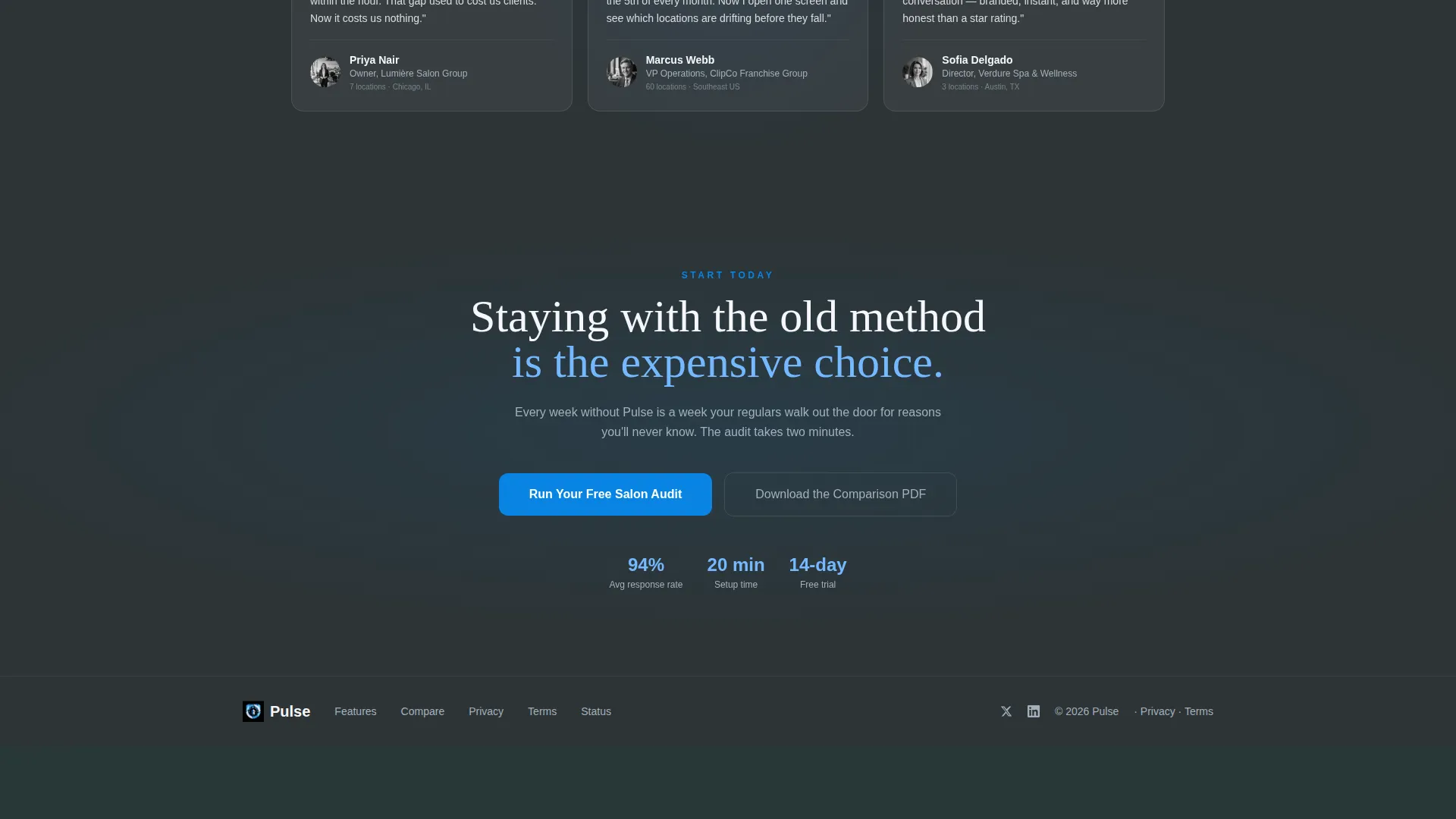
- Two conversion paths: a two-step audit form and a secondary email-capture offer for a downloadable comparison document
Feature list
This template bundles focused design decisions and conversion components into one cohesive layout. Each element earns its place by serving a specific job on the page.
Split-Screen Specification Layout
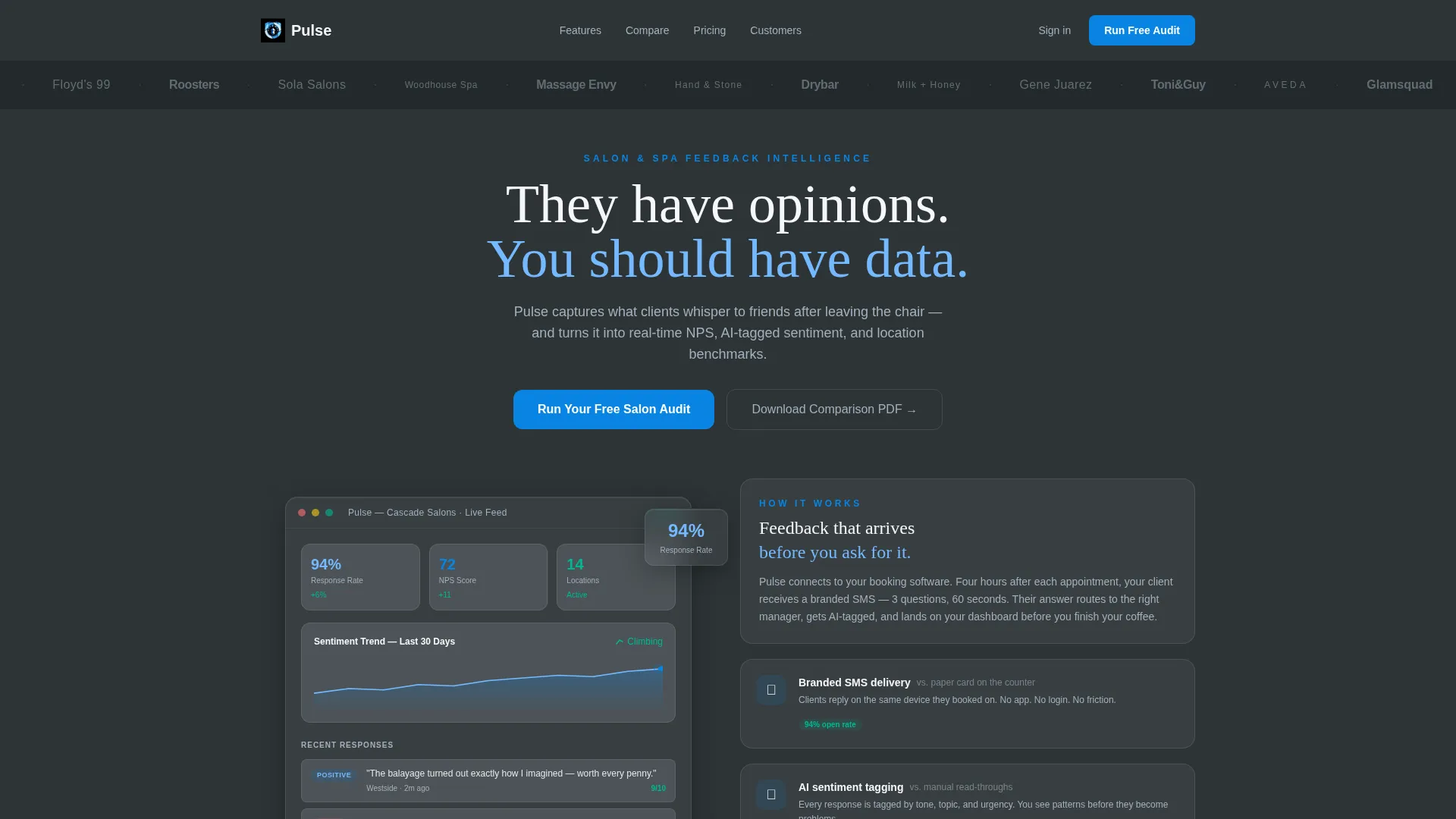
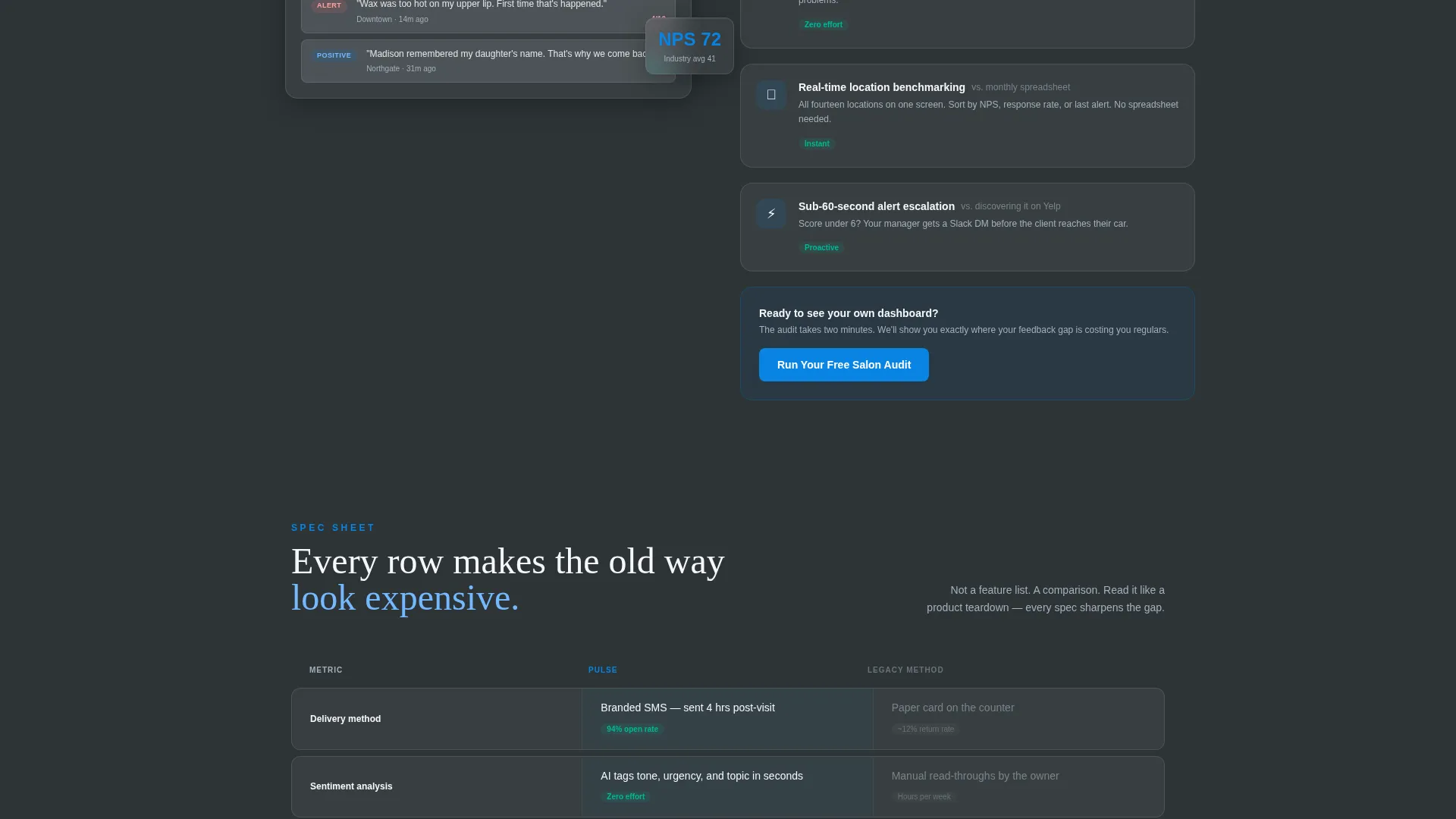
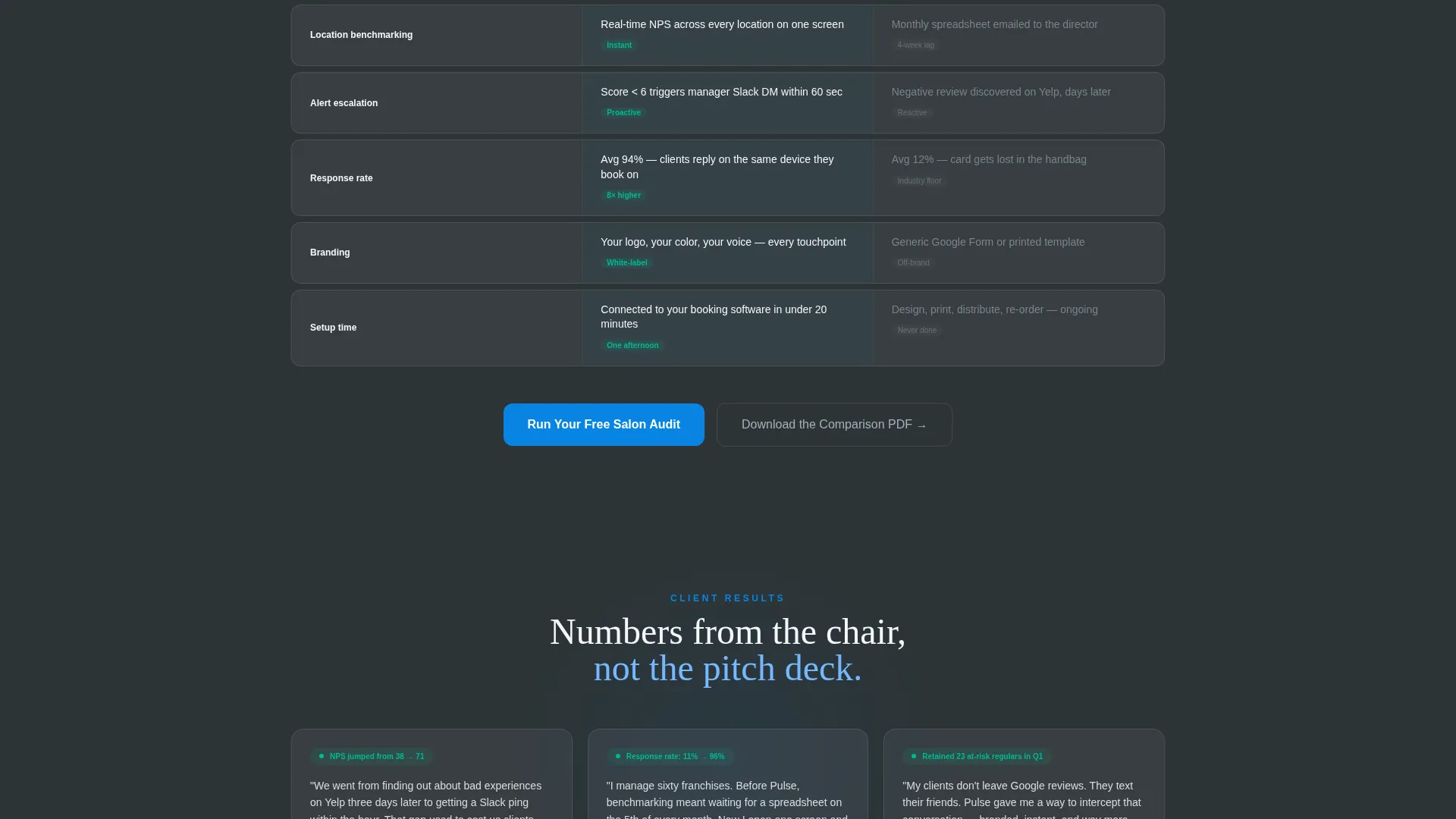
The left panel locks a product dashboard screenshot in place while the right panel scrolls independently. Each row in the right panel presents a direct versus comparison, such as branded SMS delivery against a paper card, making the platform's advantages immediately legible.
Persistent Product Dashboard Visual
The left panel displays a live-style dashboard showing real metrics: a 94 percent response rate, an NPS of 72, and a rising sentiment trend arrow. Locking this panel in view means the product evidence stays on screen throughout the entire scroll.
Logo Bar Header with Infinite Scroll
A horizontal ribbon of recognizable salon and spa brand logos drifts in a slow, continuous loop. Each logo renders in monochrome slate against a frosted glass surface, establishing credibility before the first feature row appears.
Two-Step Audit Conversion Form
The primary call to action, "Run Your Free Salon Audit," opens a two-step form. Step one captures salon name and number of locations. Step two asks for the visitor's current feedback method via a dropdown, giving the platform immediate qualification data.
Secondary Email-Capture Path
A secondary conversion option offers a downloadable comparison document in exchange for an email address. This path serves visitors who are still comparing options and not yet ready for the full audit flow.
Sticky Mobile Call-to-Action Bar
On mobile, the primary call to action reappears as a sticky bottom bar. This ensures the conversion entry point stays accessible no matter how far down the page a visitor scrolls.
Page sections overview
| Section | Purpose |
|---|---|
| Logo Bar Header | Builds instant credibility with a scrolling ribbon of salon brand logos before any feature is described |
| Hero Headline Block | Delivers the core reframe: client opinions become actionable data |
| Split-Screen Dashboard | Locks product metrics in view while right panel scrolls through spec comparisons |
| Versus Specification Rows | Contrasts platform features against comment cards, generic surveys, and manual processes row by row |
| Midpage call to action Block | Resurfaces the primary audit call to action at the page's strongest persuasion point |
| Secondary PDF Offer | Captures email addresses from visitors still in a comparison or research phase |
| Sticky Mobile Bar | Keeps the primary call to action reachable throughout the full mobile scroll |
Design & branding system
The visual identity follows a Tech Glass theme built on a Slate and Sky color system. The palette is designed to feel cool, frictionless, and precise, like a freshly cleaned screen against a clear morning sky.
- Core colors: deep charcoal slate (#2D3436) for text and navigation, polished aluminum (#A4B0BD) for secondary surfaces, open-sky blue (#74B9FF) for data points and calls to action, and frosted white (#F5F6FA) for card surfaces
- Accent interactions glow in electric cerulean (#0984E3), drawing the eye to clickable moments and dashboard highlights
- Frosted white panels float above the charcoal background, giving the layout a layered, translucent depth that reinforces the premium salon aesthetic
Mobile & speed optimization
The template is structured with mobile salon and spa operators in mind. Key conversion elements are repositioned for smaller screens without losing the layout's overall clarity.
- The sticky bottom bar keeps "Run Your Free Salon Audit" visible throughout the full mobile scroll
- The split-screen layout adapts so the dashboard visual and spec rows stack cleanly on narrower viewports
- Typography remains legible at all sizes, with the light sans-serif typeface preserving the minimal, airy feel of the Tech Glass theme
How this template helps you convert
The page is designed as a comparison and versus experience, not a generic feature list. Every structural decision pushes a qualified visitor closer to the audit form.
- The logo bar establishes platform credibility before any claim is made, reducing early skepticism the moment the page loads
- Each versus specification row makes the visitor's current feedback method feel progressively more outdated, so the primary call to action arrives when switching already feels overdue
- The secondary PDF download captures undecided visitors with a lower-commitment ask, keeping them in the conversion funnel even if they are not yet ready for the audit
Other information about this template
This template is designed to serve a specific intersection of technology and the salon and spa software niche. A few practical details are worth noting before you publish.
- The template is built for a single-page, section-led flow with no multi-page navigation required
- The Slate and Sky color system is fully defined with hex values, making it straightforward to apply or adapt to an existing brand guide
- The two-step form structure supports basic lead qualification by collecting location count and current feedback method upfront
- The creative direction follows a Spec Sheet approach, which works well for salon and spa software platforms competing against legacy tools or low-tech alternatives
- The template style and theme align with a Tech Glass aesthetic that feels appropriate for premium, data-forward salon and spa survey platforms
Theme
Tech Glass
Creative direction
Spec Sheet
Color system
Slate & Sky
Style
Split Screen (50/50)
Direction
Comparison/Versus
Page Sections
Split-screen Specification Layout
Persistent Live Dashboard Panel
Logo Bar with Infinite Scroll
Two-step Audit Conversion Form
Secondary Email-capture Offer
Sticky Mobile Call-to-action Bar
Related questions
Who is this landing page template designed for?
What does the split-screen layout actually do?
How many conversion paths does this template include?
Can this template work for a single-location spa?
Is the color system easy to customize?



