Expert Data & Analytics Comparison Website Template
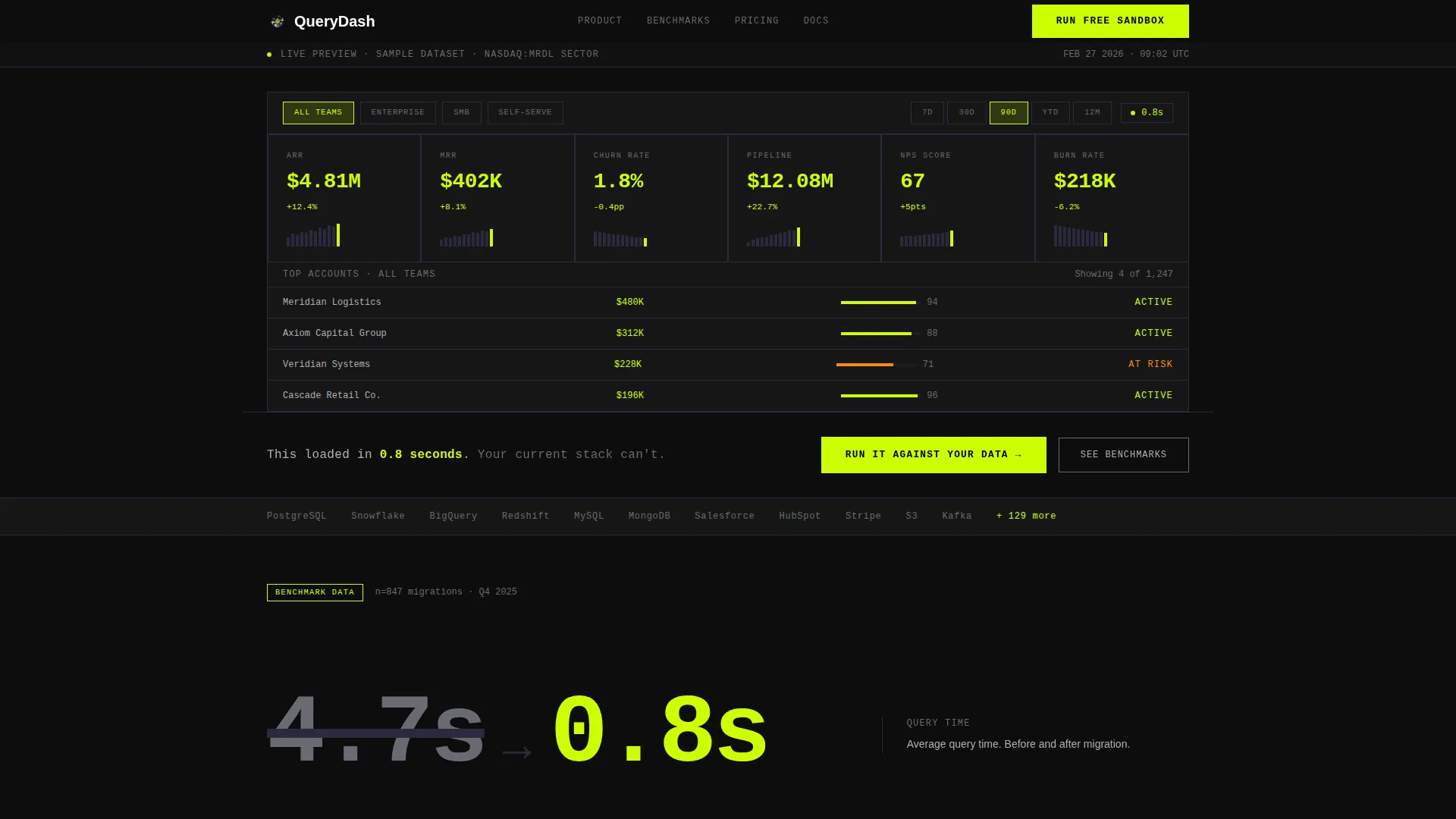
Query is a bold brutalist business intelligence landing page template built for data-driven teams. It features an interactive dashboard mockup above the fold, a head-to-head comparison section, and stats-first scroll design. The carbon fiber color system and monospaced typography create a cockpit-like experience that speaks directly to ops directors, BI analysts, and CFOs.
by Rocket studio
Quick summary
Query is a single-page business intelligence landing page template with a dashboard-first layout. It opens with a fully interactive data grid, stacks oversized benchmark numbers as you scroll, and closes the deal with a side-by-side stack comparison. The design is Bold Brutalist: no gradients, no rounded corners, just engineered precision in carbon fiber black and chartreuse.
Who this template is for
This template is built for teams and founders launching a business intelligence or data analytics product. It speaks the language of people who live inside dashboards and distrust marketing fluff.
- Ops directors who field too many weekly report requests and need to show a faster path
- Business intelligence analysts tired of rebuilding the same dashboards after every schema change
- CFOs and revenue leaders who want one clear number at a glance, not a presentation deck
What problem this template solves
Most software landing pages bury the product behind headlines and hero images. For a business intelligence tool, that approach kills credibility instantly. Decision-makers want proof, not promises.
- Scattered spreadsheets and siloed databases make it hard to demonstrate unified, real-time data value at a glance
- Buyers comparing tools need a direct, line-by-line cost and capability breakdown before they commit
- Abstract feature lists fail to show speed and clarity, which are the two things data teams care about most
What you get with this template
You get a complete, conversion-focused landing page layout built around hard data and interactive demonstration. Every section is designed to remove doubt and accelerate a decision.
- A fully functional dashboard mockup embedded above the fold with animated KPI tiles and interactive filters
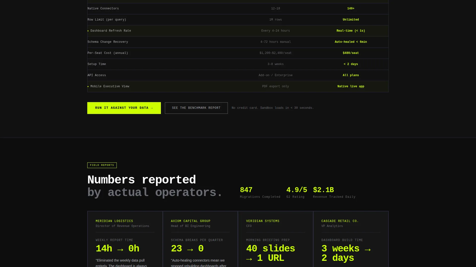
- A persistent two-column comparison section that puts your product directly against legacy stacks
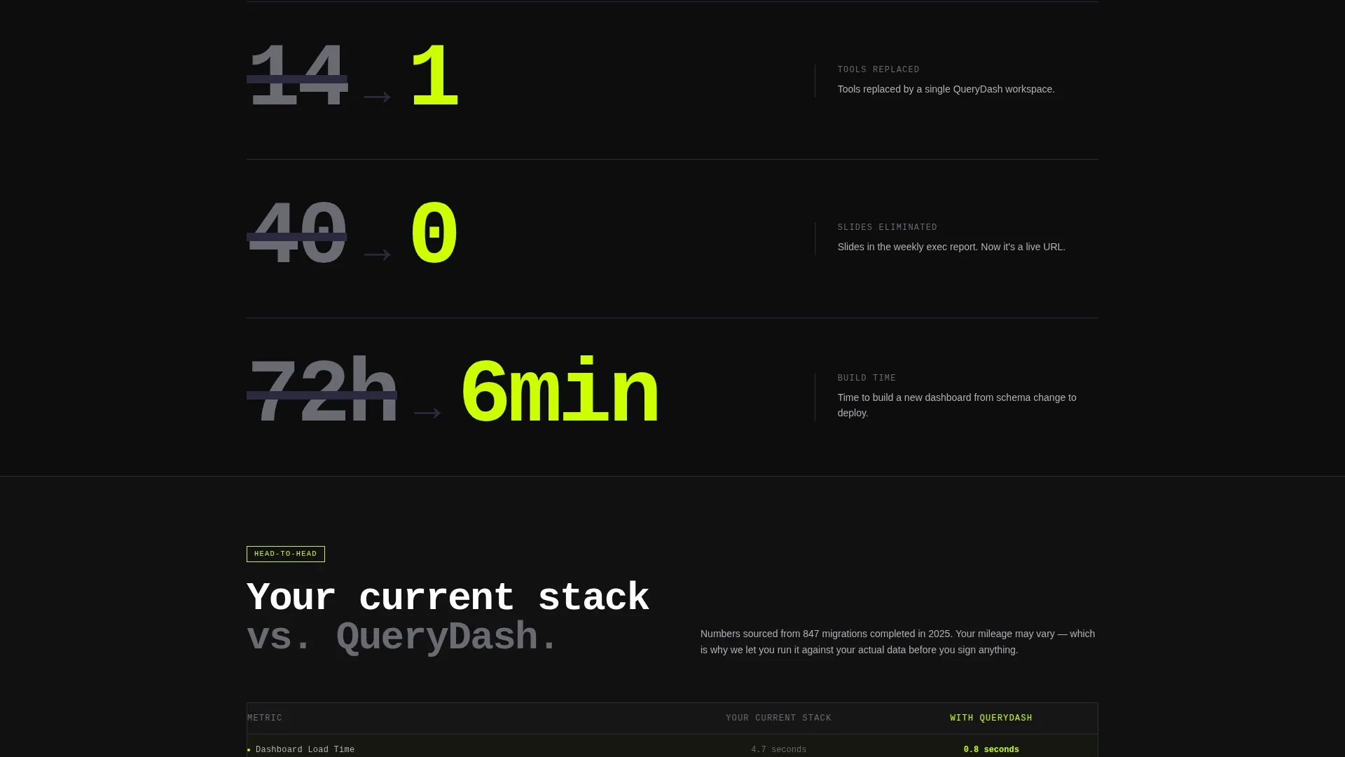
- Stats-first scroll sections with oversized benchmark numbers, minimal bar charts, and monospaced customer metrics
Feature list
This template includes six tightly scoped features, each grounded in the brief and designed to work together as a single persuasive system.
Interactive Dashboard Header
The header is not a screenshot or a video. It is a live, functional dashboard mockup with six KPI tiles covering revenue, churn, monthly recurring revenue, pipeline, net promoter score, and burn rate. Sample data animates in real time. Visitors can click filters and toggle date ranges, watching numbers recalculate in chartreuse as they explore.
Stats-First Scroll Design
Every scroll increment leads with an oversized number before any explanation arrives. Benchmark comparisons like query time before and after migration appear in 120-pixel type, followed by a single caption line. This brutalist cadence keeps technical buyers reading and creates immediate, credible impact without relying on copywriting alone.
Head-to-Head Comparison Section
A persistent two-column layout pins your current stack on the left in aluminum gray and Query on the right in chartreuse. It compares load times, connector count, row limits, dashboard refresh rates, and per-seat cost line by line. The table does the selling so the call to action just removes the last excuse.
Dual Call-to-Action System
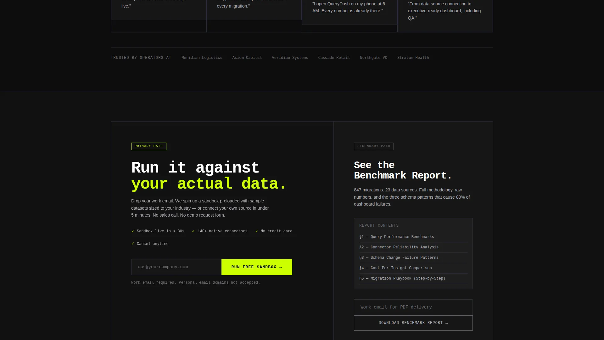
The primary call to action is a single email field labeled "Run It Against Your Data," which triggers a sandbox environment preloaded with sample datasets. The secondary path, "See the Benchmark Report," gates a downloadable PDF behind a work email. Both paths are low-friction and matched to different buyer readiness levels.
Bold Brutalist Grid Layout
The layout uses a hard concrete-block grid with no rounded corners, no gradients, and no decorative illustrations. Section dividers are single-pixel graphite lines. Architecture diagrams use sharp right angles. Every element earns its place the way components do in a precision-engineered spec sheet.
Carbon Fiber Color System
The palette is built on four values: deep cockpit black, woven graphite, machined aluminum, and high-voltage chartreuse. Chartreuse appears only on live data points, active states, and primary calls to action. Everything else is structure. The result is a visual language where color carries meaning rather than decoration.
Page sections overview
| Section | Purpose |
|---|---|
| Interactive Dashboard Header | Engages visitors immediately with a live, clickable data grid above the fold |
| Stats-First Benchmark Block | Delivers oversized benchmark numbers that establish speed credibility on scroll |
| Comparison Table Section | Pins legacy stack against Query in a side-by-side line-item breakdown |
| Customer Metrics Block | Displays reported metrics in monospaced type for raw, undecorated credibility |
| Architecture Diagram Section | Shows system structure using sharp right-angle diagrams and single-pixel lines |
| Primary call to action Section | Captures email for sandbox access with a single low-friction input field |
| Benchmark Report Gate | Offers a gated PDF download requiring only a work email address |
Design & branding system
The design language is Bold Brutalist, a deliberate rejection of soft marketing aesthetics in favor of engineered precision. It feels like the inside of a carbon-fiber monocoque: matte, tactile, and purposeful.
- Color palette includes deep cockpit black (#0D0D0D), woven graphite (#1A1A2E), machined aluminum (#B0B0B8), and high-voltage chartreuse (#CCFF00) reserved exclusively for live states and calls to action
- Typography uses monospaced typefaces for data labels and a single line of type beneath the dashboard, keeping the interface feeling like a technical instrument rather than a marketing page
- Section dividers are 1-pixel graphite lines; backgrounds stay pure black or near-black throughout; no gradients or rounded corners appear anywhere in the layout
Mobile & speed optimization
The template is structured for clean rendering across screen sizes. The brutalist grid system scales without losing visual hierarchy, and heavy elements like the dashboard mockup are scoped to stay functional on smaller viewports.
- KPI tiles and the comparison table reflow cleanly on narrower screens without losing the side-by-side clarity that makes them persuasive
- Monospaced type and single-pixel dividers scale proportionally, preserving the matte, precision feel of the design on any device
How this template helps you convert
The conversion strategy is built into the layout itself. Visitors are not asked to trust claims; they are shown evidence at every scroll step.
- The interactive dashboard header lets buyers experience the product before reading a single line of copy, which removes the most common early-exit reason for skeptical technical buyers
- The stats-first benchmark blocks build credibility through hard numbers, turning scroll momentum into growing conviction before the comparison section arrives
- The dual call-to-action system matches two buyer types: those ready to test their own data immediately and those who want a report to share with their team before committing
Other information about this template
This template is designed specifically for the business intelligence tool category and works well for product launches, competitive repositioning pages, and analyst-targeted demand generation campaigns.
- The template style is Dashboard and Data Grid, making it a strong fit for any platform that surfaces real-time metrics as its core value proposition
- The Comparison/Versus landing page direction is intentional; it works best when a clear incumbent or legacy workflow exists that your product improves upon
- The Bold Brutalist theme and Carbon Fiber color system are cohesive and ready to use out of the box; brand color swaps can be made by updating the four palette values
Theme
Bold Brutalist
Creative direction
Stats-First Impact
Color system
Carbon Fiber
Style
Dashboard/Data Grid
Direction
Comparison/Versus
Page Sections
Interactive Live Dashboard Header
Stats-first Brutalist Scroll Flow
Persistent Comparison Table
Dual Low-friction Call to Action Paths
Carbon Fiber Visual System
Monospaced Data Typography
Related questions
Can I replace the sample KPI data with my own metrics?
Does the comparison table work for any business intelligence tool?
What happens when a visitor submits their email on the primary call to action?
Is this template suitable for a product that is still in early access?
Can the chartreuse accent color be swapped for a different brand color?



