Search Discovery Landing Page Template
Queryvelocity is a split-screen landing page template built for search and discovery platforms that need to earn trust fast. It leads with live latency metrics, proof-dense stat panels, and a glowing violet-to-cyan call-to-action that reappears strategically as visitors scroll. The dark, iridescent visual system signals speed, precision, and engineering credibility from the first pixel.
by Rocket studio
Quick summary
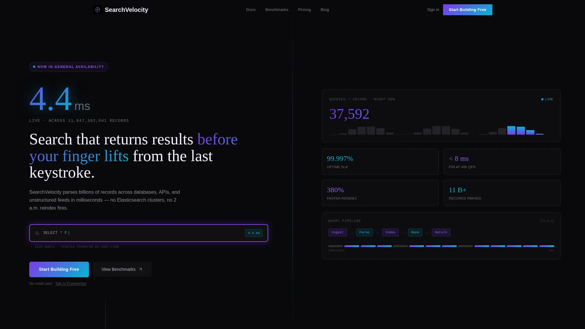
Queryvelocity is a single-page, click-through landing page template for search and discovery platforms. It opens with a dark full-bleed header, a pulsing search input, and a headline latency metric. Every scroll section leads with an oversized number before any narrative. The design runs on a void-black and iridescent AI color system that feels fast, synthetic, and alive.
Who this template is for
This template speaks directly to technical buyers and growth-focused product teams. It is built for people who evaluate infrastructure on evidence, not marketing language.
- Engineering leads assessing whether a search platform can handle real scale
- Product managers who need to show time-to-insight improvements to stakeholders
- Chief Technology Officers tired of maintaining fragile, duct-taped search clusters
What problem this template solves
Most search platform landing pages bury their strongest proof points deep in a page. Visitors leave before they see the numbers that would have convinced them. This template flips that structure entirely.
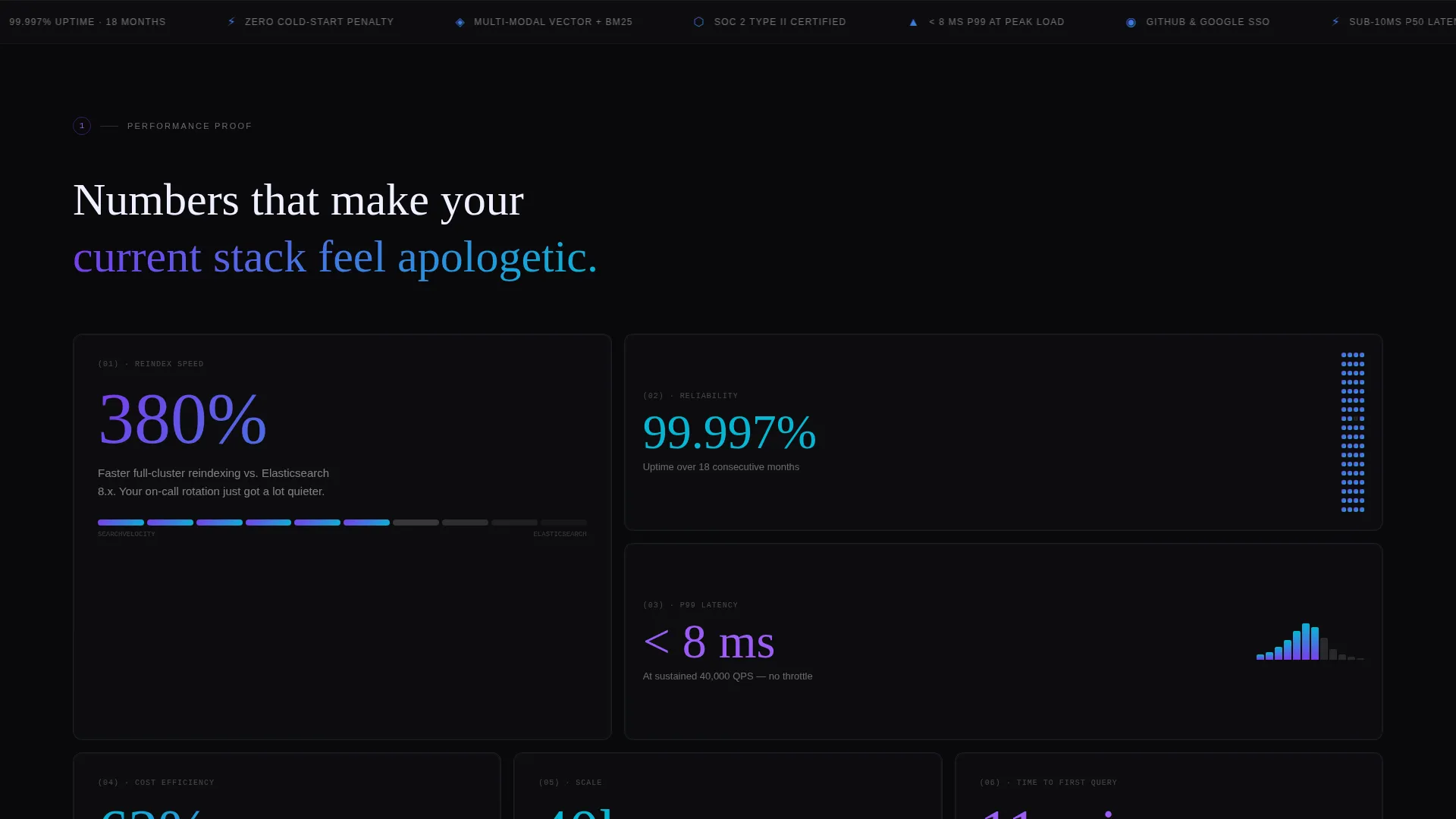
- Visitors see measurable performance metrics before any product description
- Each scroll section escalates from speed to scale to reliability to cost savings
- The call-to-action reappears after every second stat pair, so momentum is never lost
What you get with this template
You get a fully structured, stats-first landing page designed to move a skeptical technical audience toward a signup click. Every layout decision is deliberate and grounded in conversion logic.
- A 50/50 split-screen layout pairing oversized metrics with supporting context panels
- A dark full-bleed header with a centered, glowing search input and live latency display
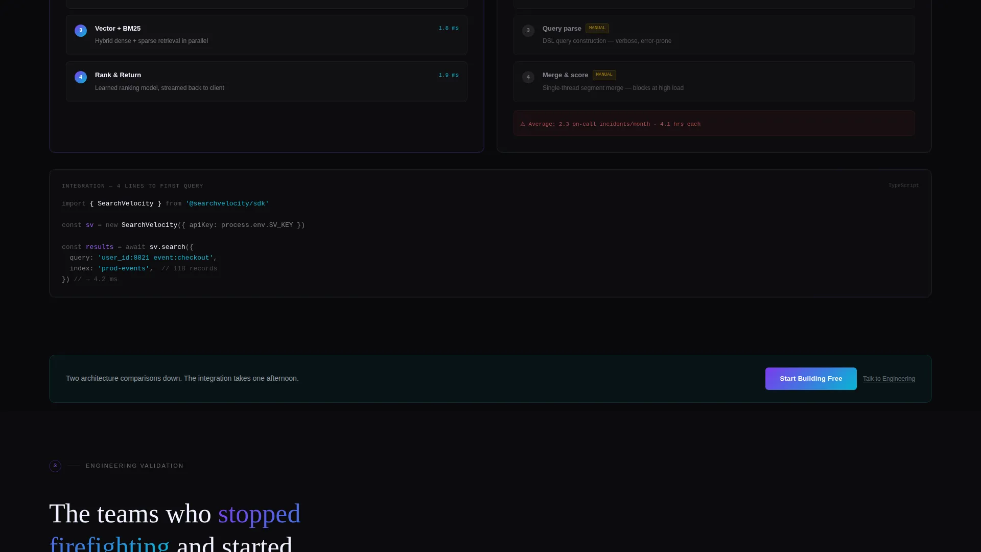
- A primary "Start Building Free" gradient call-to-action button and a secondary "Talk to Engineering" text link, both placed at strategic scroll intervals
Feature list
This template is built around a specific set of structural and visual components drawn directly from the source brief.
Stats-First Split Screen Layout
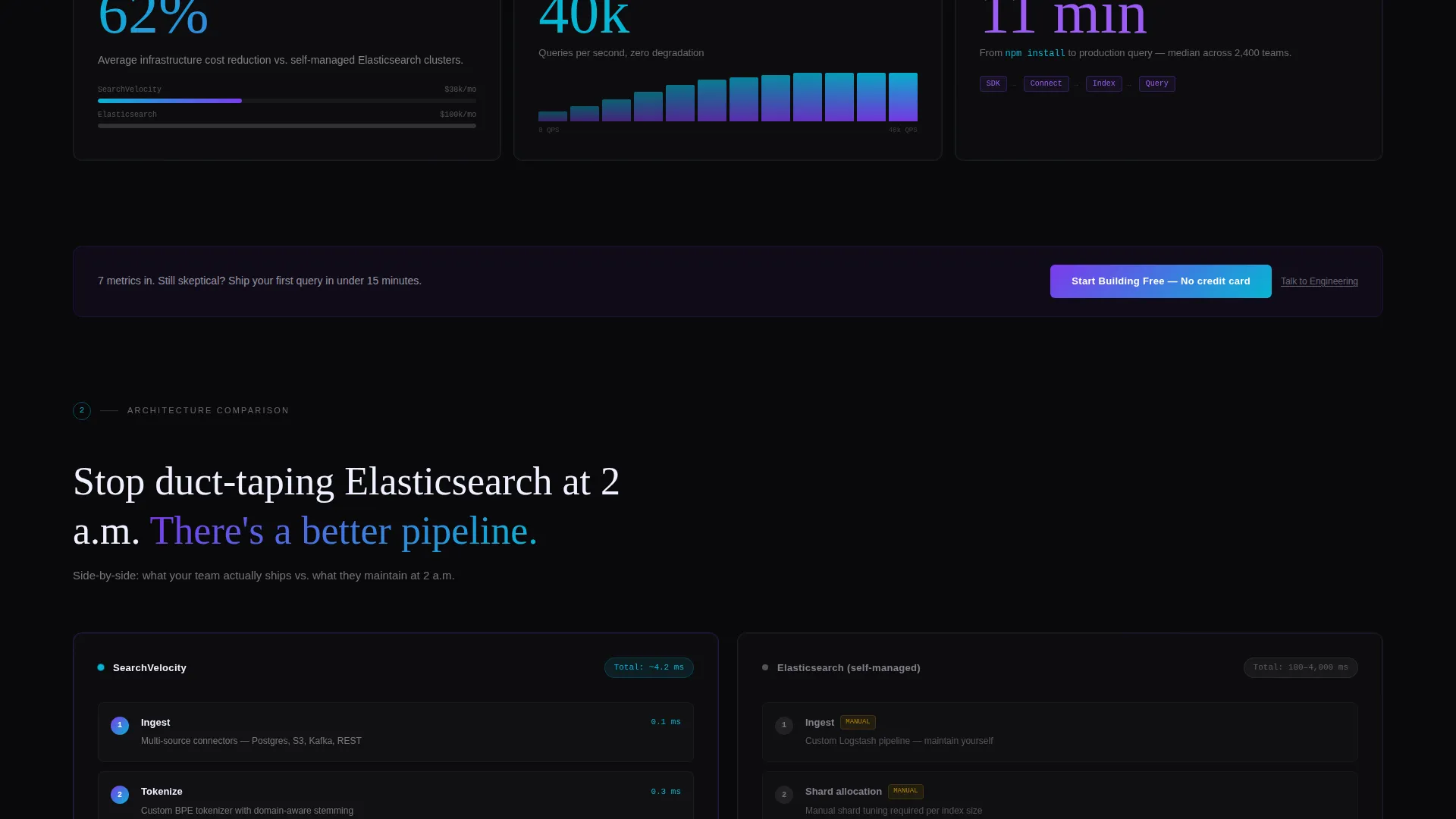
Every content section is divided 50/50. The left panel holds a stark, oversized metric. The right panel delivers the architecture diagram, comparison, or customer quote that earns that metric. The escalating sequence moves through speed, scale, reliability, and cost savings.
Dark Full-Bleed Header
The header fills the entire viewport in void black (#09090B). A centered search input sits at its heart, bordered by an iridescent glow that cycles from holographic violet to shimmer cyan. Above it, a single large latency number sets the tone: "4.2 ms across 11 billion records."
Strategic Call-to-Action Placement
The primary call-to-action button, rendered as a violet-to-cyan gradient, appears first in the header. It reappears after every second stat pair as the visitor scrolls. By the third appearance, the visitor has already encountered seven metrics, two architecture comparisons, and a live latency counter.
Live Latency Counter
A real-time latency counter ticks visibly on the page. This single component communicates platform speed more convincingly than any headline claim. It turns an abstract promise into a live, observable fact.
Click-Through Flow with SSO Routing
There is no form on the page. The primary call-to-action routes directly to a signup flow supporting GitHub or Google single sign-on (SSO). The secondary link, "Talk to Engineering," routes enterprise visitors toward a human conversation.
AI Iridescent Color System
The palette uses void black (#09090B), holographic violet (#7C3AED), shimmer cyan (#06B6D4), and neural white (#F0F0FF). Violet and cyan alternate as gradients on interactive elements, cards, and hover states. White type floats above the dark background, clean and weightless.
Page sections overview
| Section | Purpose |
|---|---|
| Dark header canvas | Opens with latency metric and glowing search input |
| First stat pair | Leads with reindexing speed metric and context panel |
| Second stat pair | Presents uptime figure alongside architecture detail |
| Third stat pair | Shows query-per-second reliability with supporting proof |
| Cost savings panel | Closes the evidence sequence with financial impact |
| call to action reappearance blocks | Reinforces signup prompt after every second stat pair |
| Secondary link row | Offers "Talk to Engineering" path for enterprise buyers |
Design & branding system
The visual identity is built on the AI Iridescent color system inside the Startup Velocity theme. Every color choice is deliberate: void black holds the background, while violet and cyan create energy on interactive surfaces.
- Four-color palette: void black (#09090B), holographic violet (#7C3AED), shimmer cyan (#06B6D4), and neural white (#F0F0FF)
- Violet-to-cyan gradients applied to buttons, cards, and hover states; white type remains clean and unaffected above the dark base
- No stock photography or illustration; the design relies entirely on glow effects, live metrics, and typographic weight for visual impact
Mobile & speed optimization
The split-screen layout is designed to reflow cleanly for smaller viewports. Stat panels stack vertically so the metric always appears before its context, preserving the stats-first reading order on every screen size.
- 50/50 columns collapse to single-column stacks on mobile, with the metric panel leading
- The glowing search input and header latency number scale proportionally to maintain visual impact on smaller screens
- Call-to-action buttons remain full-width and tap-friendly at every breakpoint
How this template helps you convert
This template is built around a single conversion goal: getting a technically literate visitor to click "Start Building Free." Every structural decision supports that moment.
- Front-loading seven metrics and two architecture comparisons before the third call-to-action appearance means visitors arrive at the click already convinced, not still evaluating.
- Removing the on-page form entirely eliminates friction; the SSO routing shortens the path from interest to active account.
- The "Talk to Engineering" secondary link captures enterprise buyers who need a human touchpoint, preventing drop-off from high-intent visitors who are not yet ready for self-serve.
Other information about this template
This template is a strong fit for teams building or marketing search infrastructure, query engines, and data discovery products. It is designed to work as a standalone click-through page within a broader product site or as an isolated campaign page.
- The Startup Velocity theme and Stats-First Impact creative direction are matched to audiences that respond to evidence over storytelling
- The Dark Full-Bleed header concept and AI Iridescent color system are part of the matched intersection context, meaning design and conversion strategy are aligned by design
- The page type is a single landing page, not a multi-page website; all content lives in one scrollable, section-led flow
Theme
Startup Velocity
Creative direction
Stats-First Impact
Color system
AI Iridescent
Style
Split Screen (50/50)
Direction
Click-Through
Page Sections
Stats-first Split Screen Layout
Dark Full-bleed Glowing Header
Strategic Repeating Call-to-action
Live Latency Counter
Form-free Click-through Flow
AI Iridescent Color System
Related questions
What layout style does this template use?
Is there a contact form on the page?
Can I customize the metrics and statistics in the template?
Who is this template best suited for?
Does the page use any stock photography or illustrations?



