White-Label CRM Comparison Landing Page Template
Rebrand is a white-label CRM landing page template built for agencies, SaaS resellers, and IT consultancies. It combines a live Dashboard Preview header, a sticky comparison table, and a progressive lead-capture form into one sharp, dark-themed page. Prospects see the branding depth immediately and move toward "Launch Your Branded CRM" before they finish reading.
by Rocket studio
Quick summary
Rebrand is a single-page lead generation template for white-label CRM platforms. It opens with an animated browser mockup mid-customization, anchors attention with a sticky feature comparison table, and closes with a two-path conversion flow. The Tech Glass visual identity keeps everything dark, precise, and premium from top to bottom.
Who this template is for
This template is built for the people selling branded software to clients, not building raw tools from scratch. If your revenue depends on clients seeing your name on every screen, this page speaks your language directly.
- Digital agency founders managing multiple client accounts who need a clean pitch for their branded CRM offering
- White-label SaaS resellers building recurring revenue stacks who need to justify their platform over generic alternatives
- IT consultancies bundling CRM into managed service contracts who need a comparison-driven sales page
What problem this template solves
Selling a white-label product is harder than it sounds. Prospects want proof of depth, not promises. They want to know your platform goes further than a logo swap on a login screen. This template structures that proof visually, row by row, before a prospect can form their next objection.
- Generic product pages bury white-label depth in walls of text instead of showing it at a glance
- Comparison tables without expandable detail leave technical buyers unconvinced at the exact moment they need clarity
- Disconnected call-to-action flows ask for commitment too early, before trust is established
What you get with this template
You get a complete, conversion-ready landing page built around one core idea: prove the white-label depth, then open the door. Every section earns the next one, and the two conversion paths work together without competing.
- A full-width animated header mockup cycling through three live brand skins in real time
- A sticky comparison table with expandable micro-detail panels for each feature row
- A progressive three-field lead capture form and a secondary sandbox conversion path
Feature list
This template is built from deliberate, purpose-specific components. Each one serves the broader goal of turning a skeptical technical buyer into a qualified lead.
Animated Dashboard Preview Header
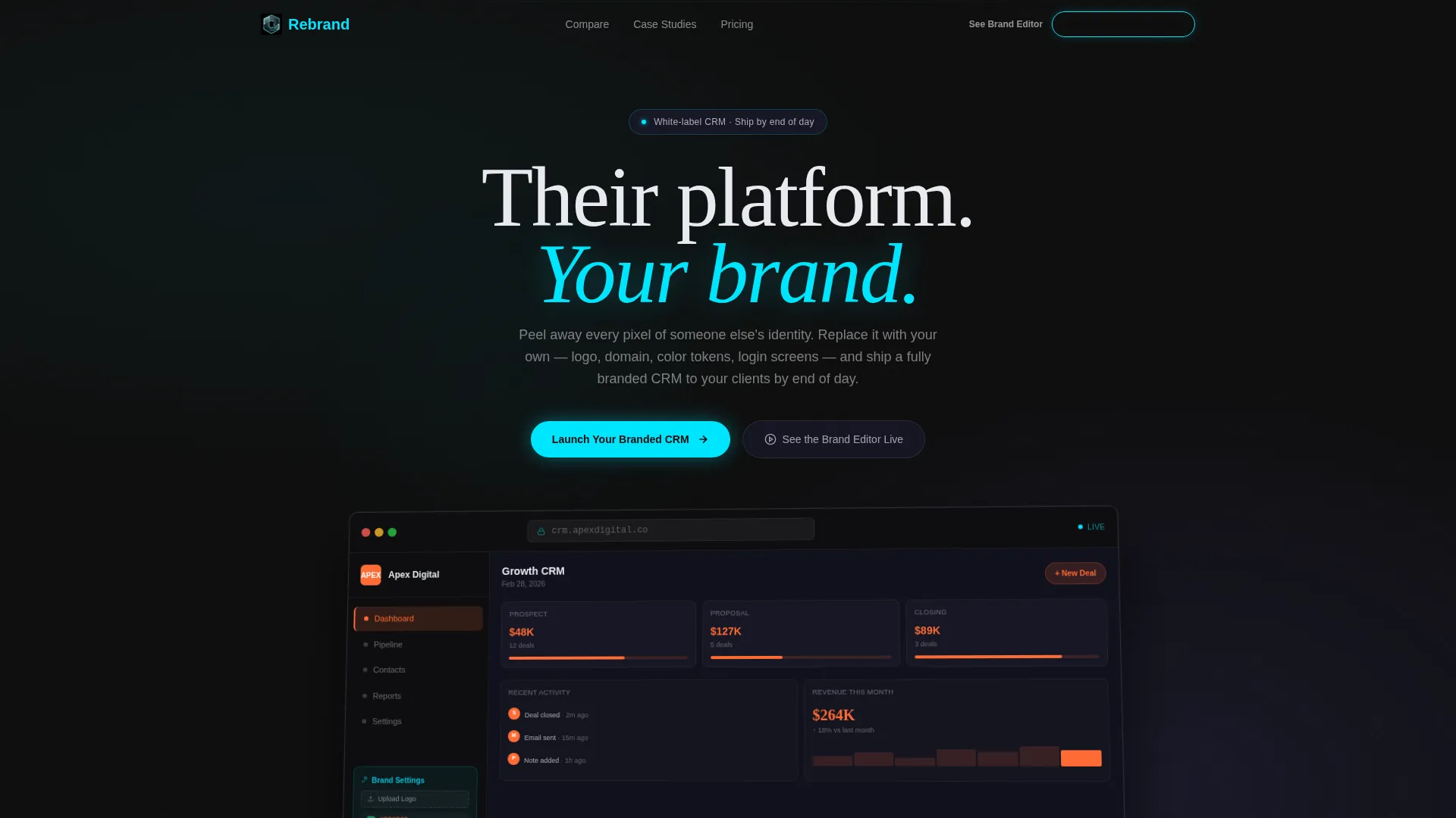
The header loads a full-width, slightly angled browser mockup showing the CRM interface mid-customization. A looping animation cycles through three different brand skins, swapping logos, accent colors, and favicons in real time. The left panel shows a brand settings drawer with a logo upload field, a hex-code color picker, and a custom domain input field.
Sticky Comparison Table
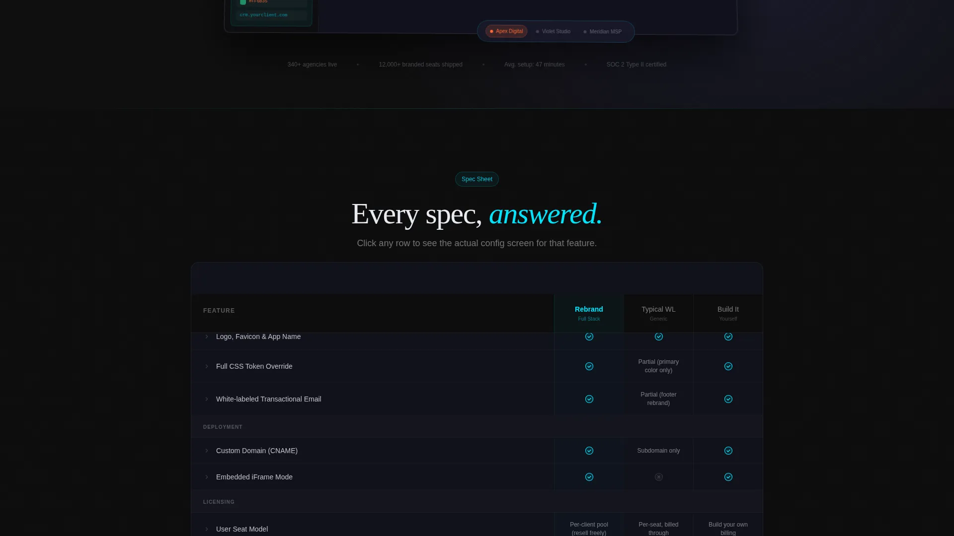
The comparison table anchors the middle of the page and stays visible as the user scrolls. Rows cover branding depth, deployment options, user seat models, API rate limits, and SSO (Single Sign-On) support. The template compares the platform against "Typical White-Label" and "Build It Yourself" columns using cyan checkmarks and muted graphite gap indicators.
Expandable Row Detail Panels
Each row in the comparison table is clickable. Clicking a row expands a micro-detail panel showing the actual configuration screen for that feature. This gives technical buyers the specific proof they need without cluttering the main table view.
Progressive Lead Capture Form
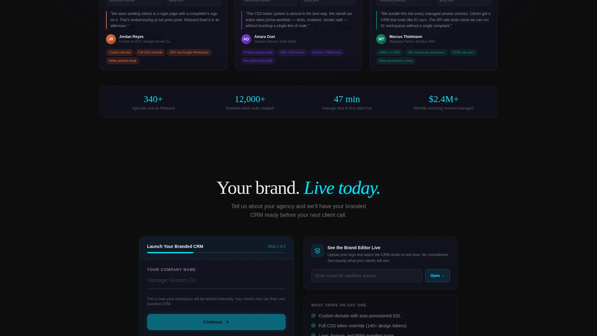
The form sequence asks for information in three steps: company name first, then estimated client accounts via a dropdown (1 to 10, 11 to 50, or 50 and above), then email address. This order reduces friction by starting with the least personal field and builds context before asking for contact details.
Secondary Sandbox Conversion Path
A second call-to-action labeled "See the Brand Editor Live" links to an interactive sandbox. Prospects can upload their own logo and watch the CRM reskin in real time. Email is captured on sandbox entry, creating a second lead path for prospects not ready to commit to the primary form.
Agency Case Study Cards
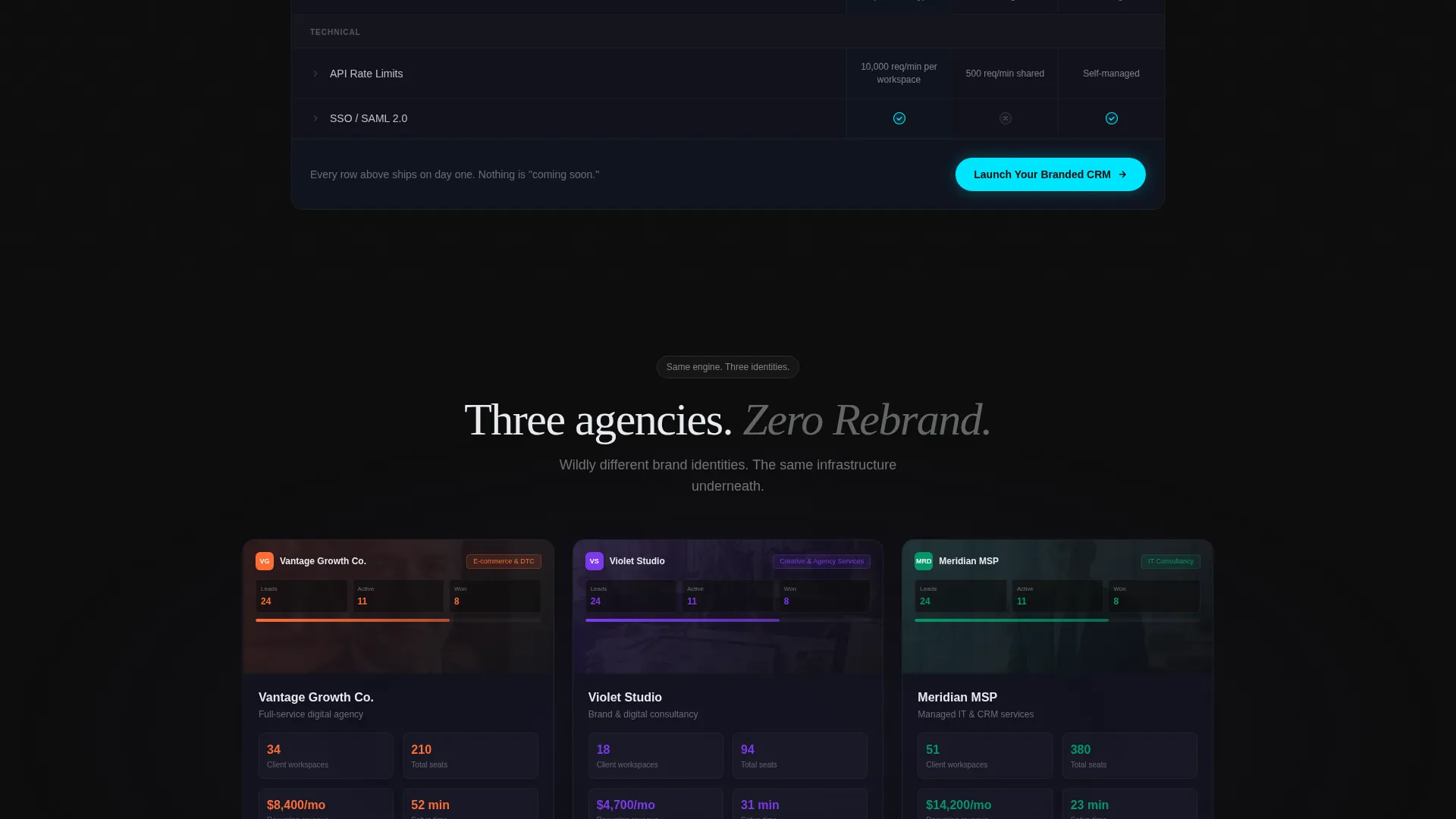
Three case-study cards appear below the comparison table. Each card shows a real agency dashboard wearing a distinct brand identity, all powered by the same underlying platform. This section reinforces that the engine is consistent even when the brand output looks completely different.
Page sections overview
| Section | Purpose |
|---|---|
| Animated Header Mockup | Show live brand-skin cycling to prove white-label depth immediately |
| Sticky Comparison Table | Compare platform against typical white-label and build-it-yourself alternatives |
| Expandable Detail Panels | Give technical buyers per-feature configuration proof on demand |
| Primary call to action Block | Capture leads with a three-step progressive form below the table |
| Case Study Cards | Show three distinct agency brand outputs from one platform |
| Secondary Sandbox call to action | Offer a live brand editor preview as a lower-commitment conversion path |
| Pinned Header Nav call to action | Keep "Launch Your Branded CRM" visible at all scroll depths |
Design & branding system
The visual identity follows a Tech Glass theme built on a Carbon Fiber color system. The palette feels like holding a matte-black flagship device under showroom lighting, where dark surfaces absorb everything except the lines that matter.
- Core colors: deep carbon black (#0D0D0D) for backgrounds, woven graphite (#1A1A2E) for surface layers, and frosted glass white (#E8EAF0) for readable body text
- Electric cyan (#00E5FF) reserved exclusively for interactive states, toggle switches, call-to-action borders, and comparison table checkmarks
- Comparison table gap indicators use muted graphite to signal missing features without visual noise
Mobile & speed optimization
The layout is designed with responsive behavior in mind so the comparison table, header mockup, and form flow all remain usable on smaller screens. The sticky table header and expandable row panels are built to work within touch-based navigation patterns.
- The comparison table adapts to narrower viewports without losing column clarity or row expand functionality
- The progressive form fields stack cleanly on mobile so the three-step sequence feels natural on a phone screen
How this template helps you convert
The page is structured so that every scroll depth does selling work. The comparison table handles objections. The calls to action open doors at the right moment.
- The animated header proves white-label depth in the first three seconds, giving prospects a reason to keep reading before a single headline is processed
- The sticky comparison table keeps the competitive case visible as the user scrolls, so the primary call to action appears right after the most persuasive content
- Two conversion paths serve two buyer types: the progressive form captures decision-ready leads, and the sandbox path captures curious prospects who need one more proof point before committing
Other information about this template
This template is designed for the white-label CRM niche inside the broader white-label enterprise software category. It sits at the intersection of technical credibility and agency sales, which is a combination most generic landing page templates do not address well.
- The template style is a Comparison Table layout, which is purpose-built for feature-heavy products where differentiation needs to be shown, not summarized
- The creative direction follows a Spec Sheet approach, meaning each scroll section answers the next likely objection before it forms in the buyer's mind
- The header concept is a Dashboard Preview, which immediately signals product maturity to technical evaluators
- The lead generation direction is built around two capture paths so a single page can serve both high-intent and discovery-stage visitors
Theme
Tech Glass
Creative direction
Spec Sheet
Color system
Carbon Fiber
Style
Comparison Table
Direction
Lead Generation
Page Sections
Animated Live Brand-skin Header
Sticky Comparison Table with Row Expand
Progressive Three-step Lead Form
Secondary Sandbox Conversion Path
Agency Case Study Cards
Pinned Navigation Call-to-action
Related questions
Can I customize the comparison table rows for my own platform features?
How does the two-path conversion flow work?
Is this template only suitable for CRM platforms?
What does the looping header animation demonstrate?
Can I connect the sandbox call-to-action to my own tool?



