Recover - High-Converting Restaurant Landing Page Template
Recover is a high-converting landing page template built for restaurant abandoned cart email platforms. It pairs a dark, metric-driven visual identity with a structured comparison table, a recovery calculator, and a focused lead generation form. Restaurant operators can see clearly how much revenue they are losing and what they stand to reclaim.
by Rocket studio
Quick summary
Recover is a single-page landing page template designed for a SaaS platform that sends automated recovery emails when diners abandon online orders mid-checkout. The layout leads with live-looking data panels, builds trust through a feature comparison grid, and closes with a lead generation form and an interactive revenue calculator.
Who this template is for
This template is built for SaaS founders and marketing teams promoting restaurant abandoned cart email tools. It speaks directly to the operators those tools serve, so the messaging resonates immediately with the buyer's own customers.
- Multi-location restaurant operators losing revenue to incomplete online checkouts
- Ghost kitchen founders and independent pizzeria owners running online ordering systems
- SaaS product teams who need a conversion-focused landing page to generate qualified leads
What problem this template solves
Restaurant operators watch thousands of dollars disappear every month when diners abandon their carts mid-checkout. The problem is not just lost revenue, it is not knowing how much is gone or having no clear path to recover it. This template gives the platform a landing page that makes that problem visceral and the solution immediately believable.
- No clear way to visualize the scale of abandoned order revenue to potential customers
- No structured comparison to show operators what life looks like before and after using the tool
- No lead capture flow that builds ownership of the recovery number before asking for contact details
What you get with this template
The template delivers a complete single-page layout with every section a SaaS restaurant tool needs to move a skeptical operator from awareness to a submitted lead form. The design does the heavy lifting before a single word of copy is read.
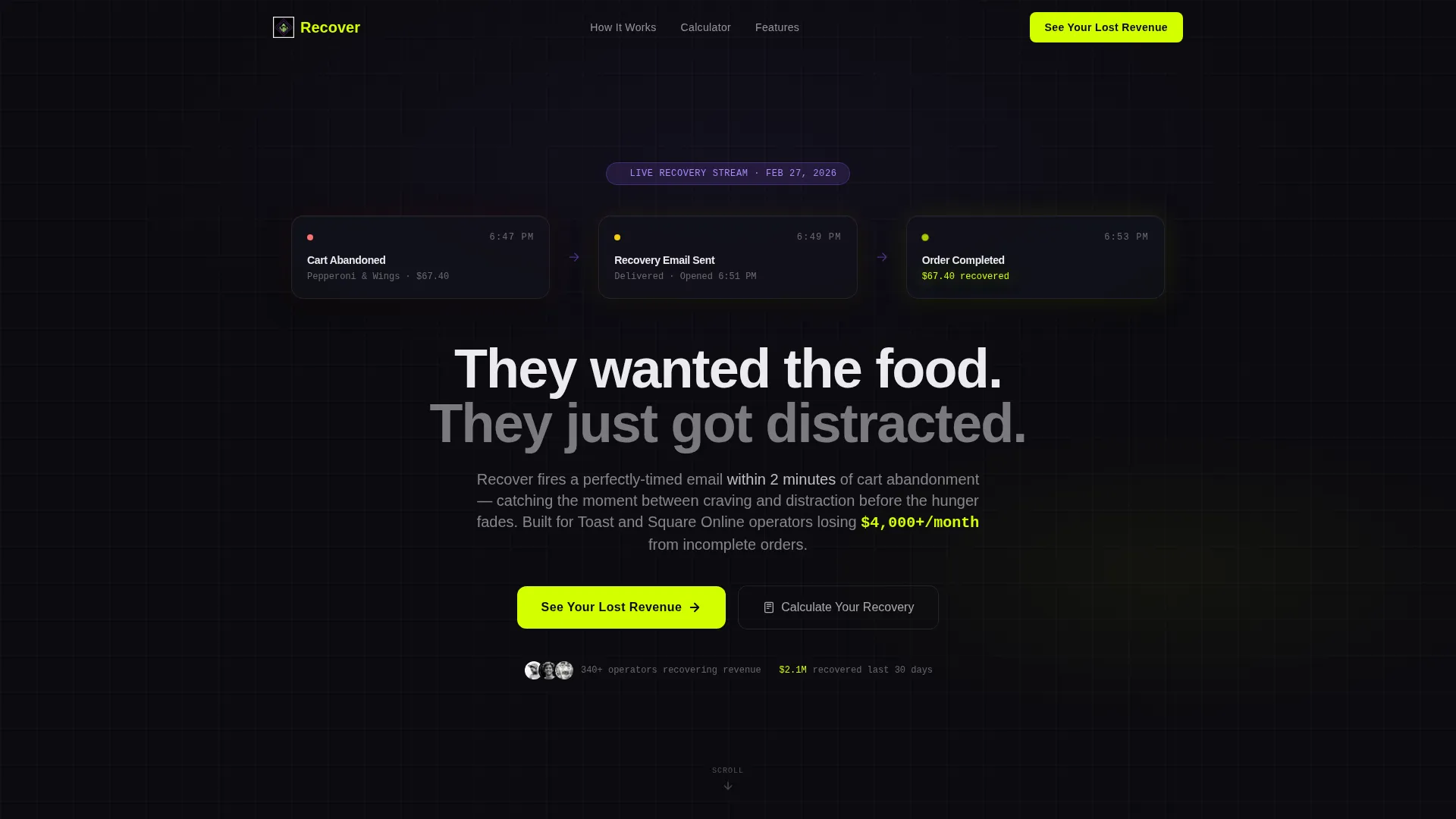
- A dark-glass header with three live-metric panels showing the cart abandonment and recovery sequence in real time
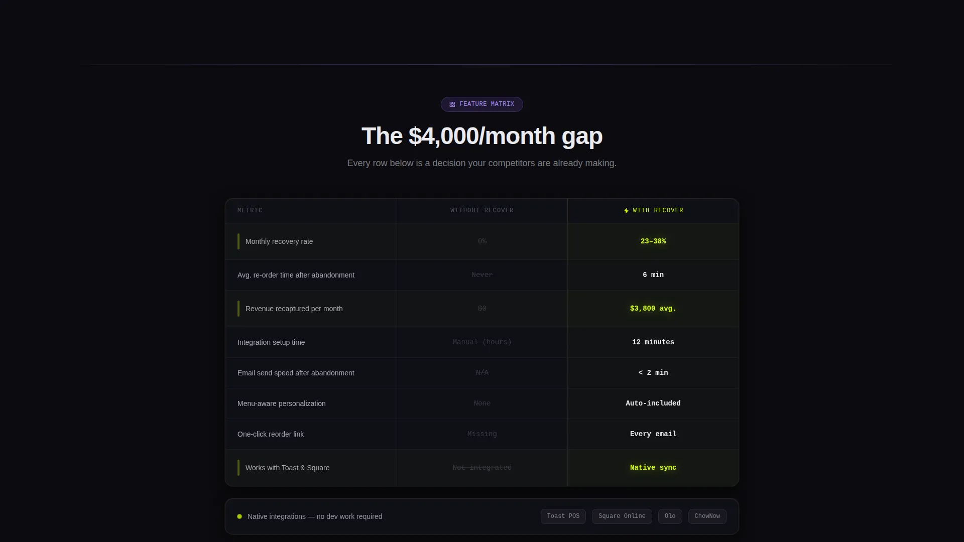
- A structured comparison table that contrasts "Without Recover" and "With Recover" across the metrics operators care about most
- An interactive revenue calculator and a three-field lead generation form with a sticky mobile call-to-action bar
Feature list
This section describes the core built-in components and design capabilities included in the Recover landing page template.
Dark Glass Header Panels
Three frosted, translucent cards float against the void-black background. Each panel displays a timestamped metric: cart abandoned, recovery email sent, and order completed. A faint chartreuse glow lines each card edge, making the data feel live and urgent without any actual animation dependency.
Feature Comparison Table
The scroll reveals a structured grid that pits "Without Recover" against "With Recover" across key operator metrics. The "without" column renders in muted gray and the "with" column punches in electric chartreuse. Rows cover recovery rate, average re-order time, revenue recaptured per month, integration steps, and email send speed.
Individual Feature Cards
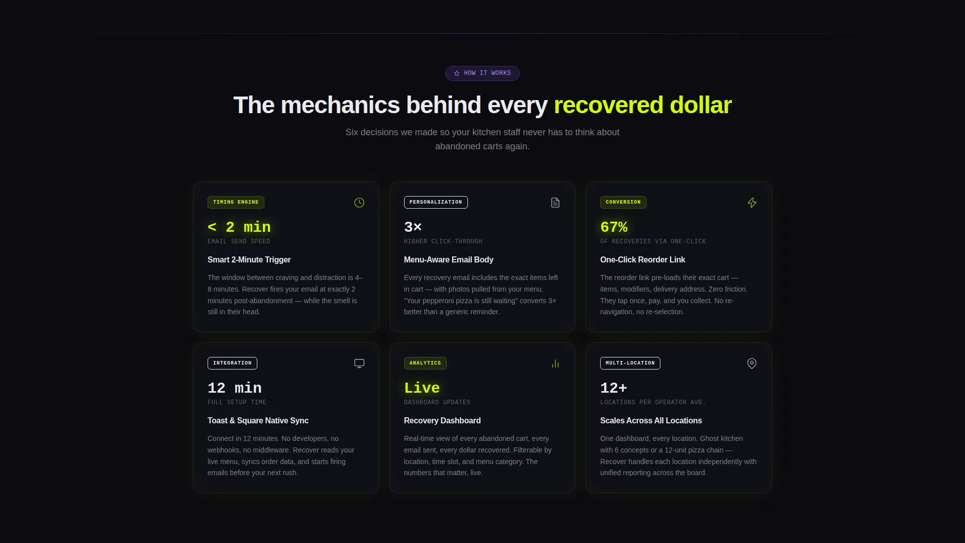
Below the comparison table, dedicated dark glass cards break down smart timing logic, menu-aware personalization, and one-click reorder links. Each card centers on a single stat rendered in chartreuse, keeping the focus on measurable outcomes rather than abstract claims.
Revenue Recovery Calculator
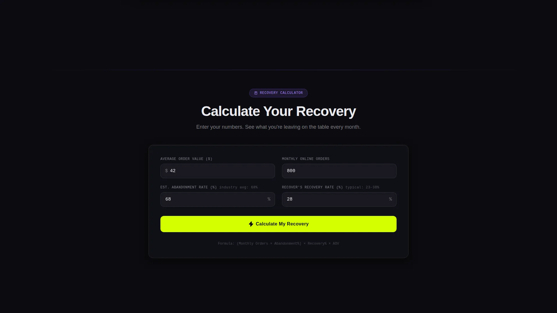
A lightweight, interactive calculator lets operators input their average order value and estimated abandonment rate. The tool outputs projected monthly recovery dollars in real time. This builds personal ownership of the number before the lead form appears, making form submission feel like the natural next step.
Lead Generation Form
The form captures three sequential fields: restaurant name, monthly online order volume via dropdown, and work email. The primary call-to-action reads "See Your Lost Revenue" in chartreuse on black. A sticky bottom bar repeats the call-to-action on mobile so it is always visible during the scroll.
Sticky Mobile Call-to-Action Bar
The mobile layout includes a persistent bottom bar that keeps the primary call-to-action in view throughout the entire scroll. This ensures the lead generation path is never more than one tap away, regardless of where the visitor is on the page.
Page sections overview
| Section | Purpose |
|---|---|
| Dark Glass Header | Opens with timestamped recovery metrics to hook attention immediately |
| Hero Headline Block | Delivers the core message in oversized white type above the fold |
| Comparison Table | Shows side-by-side metrics for without and with the platform |
| Feature Cards Row | Breaks down smart timing, personalization, and reorder link features |
| Recovery Calculator | Lets operators project their own monthly recovery figure interactively |
| Lead Generation Form | Captures restaurant name, order volume, and work email |
| Sticky Mobile Bar | Keeps the primary call-to-action visible throughout the mobile scroll |
Design & branding system
The visual identity follows a Startup Velocity theme powered by an Acid Digital color system. The palette is intentionally dark and metric-driven, evoking a live revenue dashboard rather than a traditional marketing page.
- Void black (#0B0B0F) dominates every background; electric chartreuse (#D4FF00) is reserved for calls-to-action, active states, and money figures; synthetic violet (#8B5CF6) marks section dividers and badges; interface white (#EAEAEF) carries all body text
- Typography is oversized and bold above the fold, scaling down to clean, readable body weights in card and form sections
- Frosted dark glass panels, chartreuse edge glows, and violet accent badges create a layered depth effect that feels like a live operations dashboard
Mobile & speed optimization
The Recover template is structured so that its most important conversion elements adapt cleanly to smaller screens without losing the visual weight that makes the design work.
- The sticky bottom call-to-action bar keeps lead generation accessible on mobile throughout the full scroll
- The comparison table is designed to remain readable at mobile widths, with column contrast reinforced by chartreuse and gray color coding
- The revenue calculator and three-field form are sequenced vertically for a natural thumb-friendly flow on small screens
How this template helps you convert
Every design and layout decision in this template is engineered to move a restaurant operator from skepticism to a submitted lead, using their own revenue numbers as the motivator.
- The header data panels create immediate context: the visitor sees a real checkout recovery sequence in six seconds, before reading a single line of body copy.
- The comparison table builds belief by translating the platform's value into the exact metrics operators track, with chartreuse figures reinforcing the "with" column as the obvious winner.
- The calculator hands the visitor a personalized recovery figure, so filling out the lead form feels less like giving up an email address and more like claiming a number they already calculated.
Other information about this template
This template is designed to work within the restaurant technology ecosystem and is particularly well-suited for platforms that connect with online ordering infrastructure already in use by independent and multi-location operators.
- The template references integration compatibility with Toast and Square Online as part of the comparison table row for integration steps, reflecting the target audience's existing toolstack
- The dropdown field for monthly online order volume (under 500, 500 to 2,000, 2,000 and above) helps the platform pre-qualify leads before any sales conversation begins
- The "Calculate Your Recovery" secondary call-to-action path is designed as a lower-friction entry point for visitors not yet ready to submit their contact details
- The template is categorized under Restaurant Email Templates within the Technology category, making it discoverable to SaaS teams building in the restaurant abandoned cart email niche
- Customer dashboard screenshots are referenced in the brief as a closing trust element, positioned after the feature cards to seal credibility with social proof
Theme
Startup Velocity
Creative direction
Feature Matrix
Color system
Acid Digital
Style
Comparison Table
Direction
Lead Generation
Page Sections
Dark Glass Header with Live Metrics
Side-by-side Comparison Table
Interactive Revenue Calculator
Three-field Lead Generation Form
Sticky Mobile Call-to-action Bar
Feature Detail Cards
Related questions
Who is the Recover template built for?
What does the comparison table show?
How does the revenue calculator support lead generation?
What fields does the lead generation form include?
What makes this template specific to the restaurant cart recovery niche?



