Data-Driven Restaurant Booking Landing Page Template
Slate is a stats-first restaurant booking and scheduling landing page template built for food and beverage operators who need one command-center screen before service starts. The landing page leads with live metrics, scroll-reveal stat sections, an interactive demo module, and a freemium trial form. No coding required. No credit card needed to start.
by Rocket studio
Quick summary
Slate is a scroll-reveal landing page template designed for food and beverage operations teams. It opens with a live cover counter and a logo marquee, then builds momentum through a series of stat-first reveals that each lead with a single arresting number before the supporting interface appears. The page is built to move operators from first scroll to free trial signup without friction.
Who this template is for
Slate is built for operators who manage real service pressure every day. This template speaks directly to the people running the floor, the bar, and the calendar.
- Restaurant general managers handling Friday night wait-lists and new-staff onboarding at the same time
- Bar owners tracking pour volume against inventory shrink who need one screen that makes every shift legible
- Catering directors coordinating simultaneous off-site events and food hall operators governing multiple vendor stalls from a single view
What problem this template solves
Before service, most operations still run on a patchwork of reservation notebooks, group texts, and spreadsheet shift grids. That fragmentation costs time and creates the kind of errors that appear at the worst possible moment. Slate addresses this directly by giving operators a landing page that communicates a unified solution.
- The template removes the noise and leads every new section with a single metric, so the value is felt before it is read
- It replaces the traditional landing page structure of headline-then-copy with a number-then-proof rhythm that keeps visitors scrolling and building confidence
- The progressive signup form lowers the barrier to entry: a visitor only needs to enter an email address first, making the first step feel small and the decision feel safe
What you get with this template
You get a complete, single-page scroll-reveal landing page template that is production-ready and fully custom. Every component is defined in the brief, from the header marquee down to the footer. Building a landing page from scratch takes weeks; using this template compresses that process to hours.
- A live-counting hero stat, a logo marquee, two stat-reveal sections with interface mockups, an interactive three-view demo module, a multi-venue specificity section, and a linear footer
- A Monochrome Steel design system with a single electric mint accent, JetBrains Mono data typography, and Manrope headings that make every text element feel purposeful
- A freemium trial conversion form with a progressive field structure, two call-to-action paths, and a floating persistent button that stays available as the user scrolls
Feature list
Slate packs a focused set of high-impact capabilities into one landing page template. Each feature below is directly specified in the template brief and is part of what you get when you use this template.
Stats-First Scroll Reveal Architecture
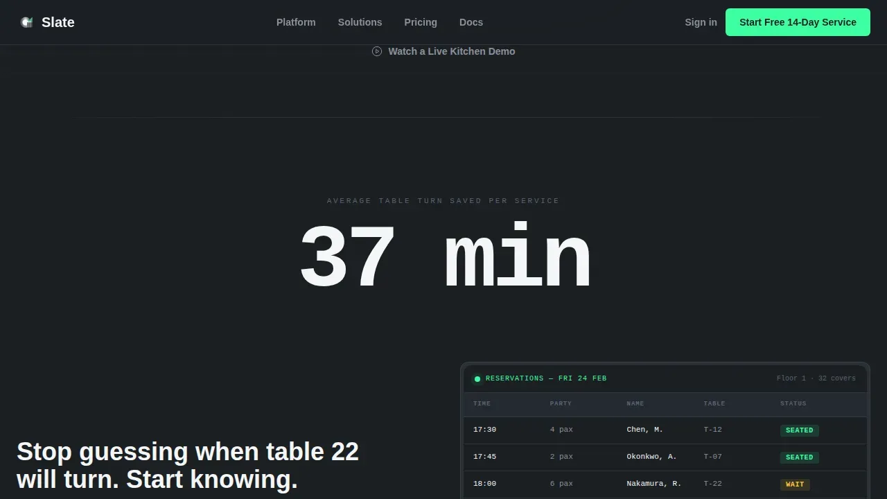
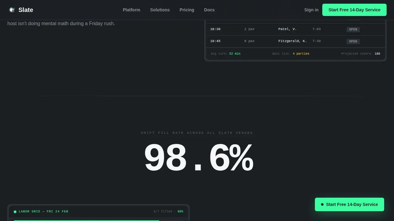
Each new section of the landing page leads with one oversized metric rendered in monospaced text. The number dissolves in first and holds, then the interface screenshot and supporting copy slide up beneath it. The rhythm of number-then-proof repeats across the page, building confidence with every scroll and training the visitor to keep reading because each reveal is a larger payoff than the last.
Live Hero Cover Counter
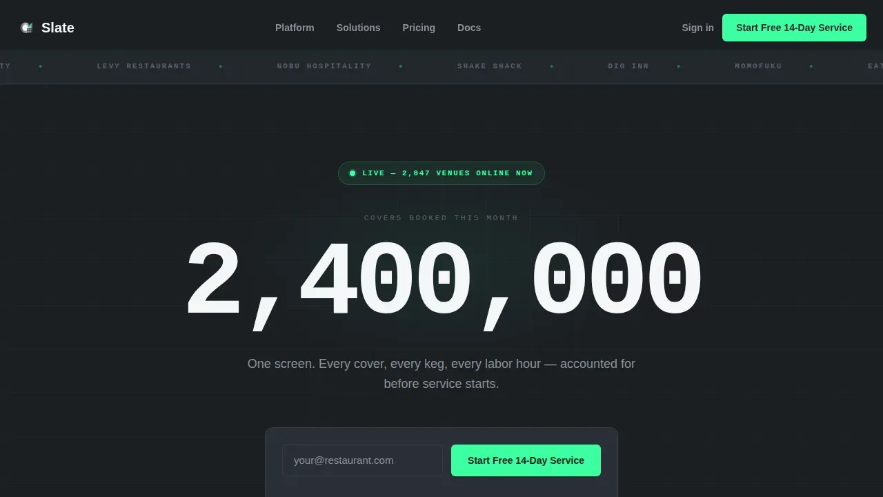
The hero section skips lifestyle photography entirely. Instead, a single stat lands in oversized monospaced type and counts upward in real time using JavaScript. This gives first-time visitors immediate, visceral social proof: the system is running right now, at scale, processing real bookings. It is one of the most direct ways to build trust on a service booking landing page without relying on static copy or staged images.
Interactive Three-View Demo Module
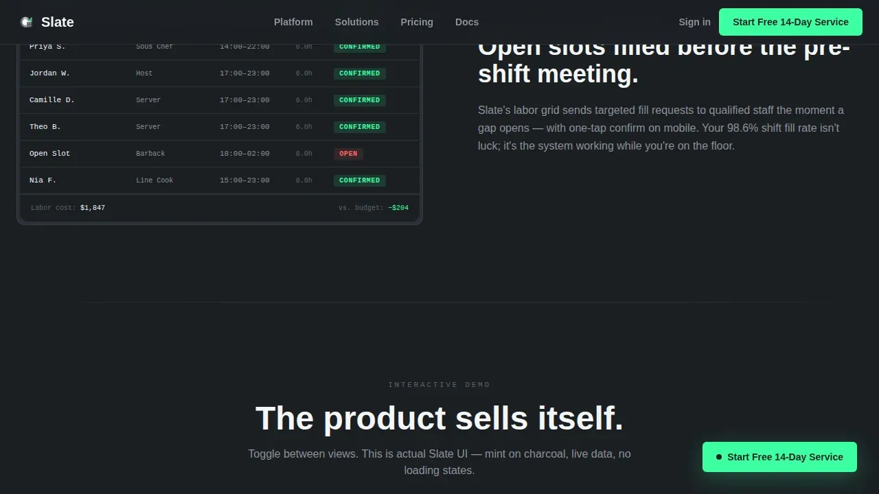
Midway down the page, a dark-on-dark interactive module lets visitors toggle between three different dashboard views: booking, labor grid, and inventory ticker. All three are rendered in the mint-on-charcoal palette. This is one of the most effective ways to let the product sell itself through use rather than description, and it gives the user a real sense of the interface before they commit to a session with the actual platform.
Progressive Trial Signup Form
The freemium conversion form is designed to minimize friction. The first field asks only for an email address. On entry, the form expands to ask for venue type, number of locations, and average weekly covers. This staged approach keeps the form feeling short even when it is collecting detailed information. The copy beneath the primary action button reads clearly: no card, no contract, no obligation before the check drops.
Logo Marquee Social Proof Header
The header is a slim, confident strip of hospitality brand logos scrolling in a slow, infinite marquee against the deep charcoal background. This design choice sets the page's credibility before a single word of copy appears. It functions like a table of contents for trust: visitors scan the names and immediately understand the scale and caliber of operators already using the platform.
Multi-Venue Specificity Cards
Below the interactive demo, a bento-style section contains four venue-type cards: restaurant, bar, catering, and food hall. Each card addresses a different operational reality. This section makes the landing page feel personal to each visitor type, which is important when your audience includes general managers, bar owners, catering directors, and food hall operators who all have different ways of thinking about scheduling and service.
Page sections overview
| Section | Purpose |
|---|---|
| Logo Marquee Header | Builds trust with hospitality brand names before copy appears |
| Live Cover Counter | Delivers social proof with a real-time booking stat |
| Hero Signup Form | Captures email address and initiates the freemium trial path |
| Stats Reveal One | Shows table turn efficiency stat with booking user interface mockup |
| Stats Reveal Two | Shows shift fill rate stat with labor grid mockup |
| Interactive Demo Module | Lets visitors toggle booking, labor, and inventory views |
| Multi-Venue Bento Cards | Addresses restaurant, bar, catering, and food hall use cases |
| Linear Footer | Closes the page with a clean, single-row link structure |
Design & branding system
Slate uses a Monochrome Steel color system that feels like the stainless-steel pass under halogen light. Every design decision on this landing page is intentional and functional. There is no warmth, no decoration, and no wasted visual space.
- Colors: deep charcoal (#1B1F23) for the primary background, brushed steel (#5C6370) for secondary surfaces and dividers, surgical white (#F5F6F8) for card faces and data readouts, and electric mint (#3DFFA2) reserved exclusively for live-status indicators, active toggles, and primary call-to-action elements
- Typography: JetBrains Mono for all data and stat text, Manrope for headings and body copy; the combination makes numbers feel live and headings feel authoritative
- Custom layout: the template uses a Dashboard Pro theme with no hero image, no lifestyle photography, and no visual clutter; every pixel of color that is not steel or white is mint, making interactive elements impossible to miss
Mobile & speed optimization
This landing page template is desktop-first by design, built for general managers who use it at a pass terminal or office desktop. That said, the template is fully responsive and built to remain functional and legible on mobile devices, because a significant portion of users will still check a landing page on their smartphones before committing to a service signup.
- The scroll-reveal animations, live counter, logo marquee, and tab toggle are built with performance-aware implementation in mind, using server components for static sections and client-side components only where interactivity is required
- Mobile layout preserves the stat-first reveal rhythm and keeps the signup form field structure intact so users can enter their email address and complete the progressive form without layout issues
- The floating call-to-action button remains available at every scroll position on both desktop and mobile, ensuring the primary action is never more than one click away
How this template helps you convert
Slate is built around a freemium trial conversion goal. Every design and layout choice on the landing page supports that one objective. The page does not try to do two things at once.
- The stats-first reveal sequence builds confidence progressively: each number the visitor sees is bigger than the last, and each one is backed by a real interface screenshot, making the value of the service feel concrete and well-documented before the signup form appears
- The two-path conversion system offers both a primary action ("Start Your Free 14-Day Service") and a secondary action ("Watch a Live Kitchen Demo") so visitors who are not yet ready to enter their email address still have a way to engage and provide contact information in exchange for a video of the dashboard during an actual Friday dinner rush
Other information about this template
Slate is a purpose-built template for food and beverage operations teams who are serious about converting online visitors into active platform users. It is part of a growing set of landing page templates designed for the hospitality technology niche.
- The slate stats first restaurant booking scheduling landing page template is the only template in this category that combines a live-counting hero stat, an interactive three-panel demo module, and a progressive multi-field form in one cohesive landing page design
- Pre-designed landing page layouts like Slate eliminate the need for coding or hiring a designer, saving time and cost while still delivering a professional, high-converting page that is ready to customize and launch
- The template is well-suited for operators who want to share a polished online presence with potential partners or investors, as the dashboard-style design communicates operational maturity and data fluency without requiring any additional external assets
- Using templates for landing pages can significantly speed up the design process and improve conversion rates by providing proven structures that are already optimized for the right user actions
- Customizable design options in this template allow teams to configure color details, update text, add venue-specific copy, and set the form fields to match their own service offerings without needing to start from scratch
- The page is designed to appear credible to first-time visitors by leading with social proof, then building a case through data, and finally offering a low-friction way to start a trial session; this process is well-established in high-performing service booking landing pages
- Visual elements like the interactive demo module and the stat-reveal animations can enhance engagement and help communicate value quickly, which is especially important when looking to convert operators who are skeptical of new tools and still running on manual processes
- The template is part of a platform that makes it easy to find, customize, and deploy landing page designs for food and beverage businesses, including options for restaurants, bars, catering companies, and food hall operators
- Linking out to an external video demo is supported by the secondary call-to-action path, which captures email in exchange for access to a three-minute screen recording of the dashboard during a live dinner service
Theme
Dashboard Pro
Creative direction
Stats-First Impact
Color system
Monochrome Steel
Style
Scroll Reveal (Progressive)
Direction
Freemium/Trial
Page Sections
Stats-first Scroll Reveal Layout
Live Hero Cover Counter
Interactive Three-view Demo Module
Progressive Freemium Trial Form
Logo Marquee Trust Header
Multi-venue Specificity Bento Section
Related questions
Who is the Slate landing page template designed for?
Do I need to know how to code to use this template?
What does the progressive signup form collect?
Is there a path for visitors who are not ready to sign up immediately?
Can I customize the colors and text in this template?



