Restore — Enterprise ITSM Landing Page Template
Resolve is a hub-and-spoke landing page template built for a headless IT Service Management platform. It pairs a live dashboard header with a stats-first comparison layout, six anchor-nav spokes, and a versus module for each metric. The design uses a void-black canvas with holographic violet and neural teal accents to make every data point feel immediate and credible.
by Rocket studio
Quick summary
Resolve is a single-page, anchor-nav landing page template for a headless IT Service Management (ITSM) platform. It leads with a live dashboard preview, follows with six metric-driven comparison spokes, and closes every section with a primary call to action. The layout is built to convert engineering leads and IT directors through accumulated data proof, not persuasive narrative.
Who this template is for
This template is designed for teams marketing a headless ITSM platform to technical buyers who evaluate tools by reading numbers, not headlines. It speaks directly to people who have already lived the pain of legacy service desks.
- Platform engineering leads at mid-market SaaS companies who are patching together Jira Service Management and Slack bots to handle incidents
- IT directors at enterprises who need to modernize their service desk without disrupting existing configuration management database (CMDB) structures
- Product marketing teams who need a high-credibility, data-forward page that earns trust before asking for a conversion
What problem this template solves
Legacy service desk tools force engineers into slow, click-heavy interfaces. Context-switching between ticketing systems, chat tools, and monitoring dashboards kills response time and drains team focus. This template gives headless ITSM platforms a page that matches the product's technical confidence.
- Teams drowning in context-switching have no single page that shows the cost of their current stack in plain numbers
- Enterprise IT buyers face pressure to modernize without a clear side-by-side comparison of what the switch actually delivers
- Engineering-led buyers distrust marketing copy and need direct access to API documentation before procurement gets involved
What you get with this template
The template delivers a full hub-and-spoke page structure with a pinned anchor navigation bar and six dedicated metric spokes. Every section is designed to present hard data before a single line of copy.
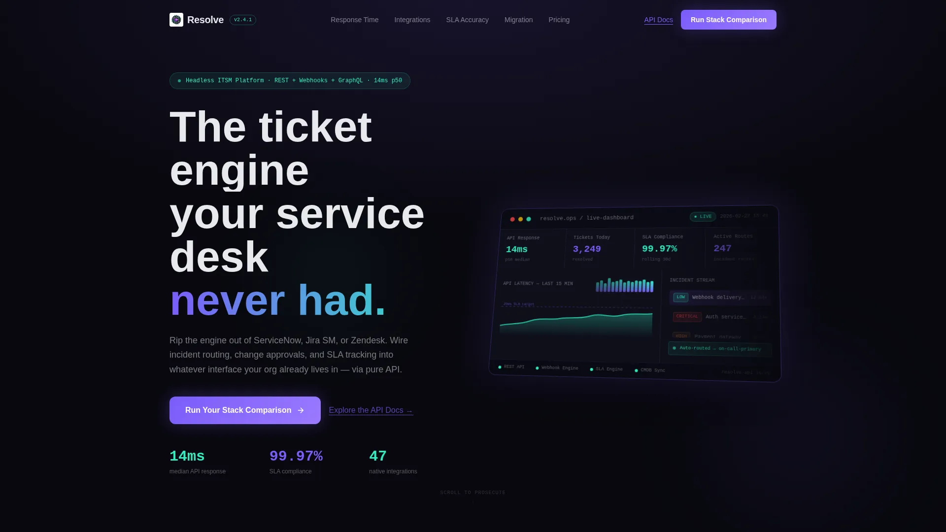
- A full-width isometric dashboard header showing live platform metrics including 14ms median API response time, 3,247 tickets resolved, and 99.97% SLA compliance
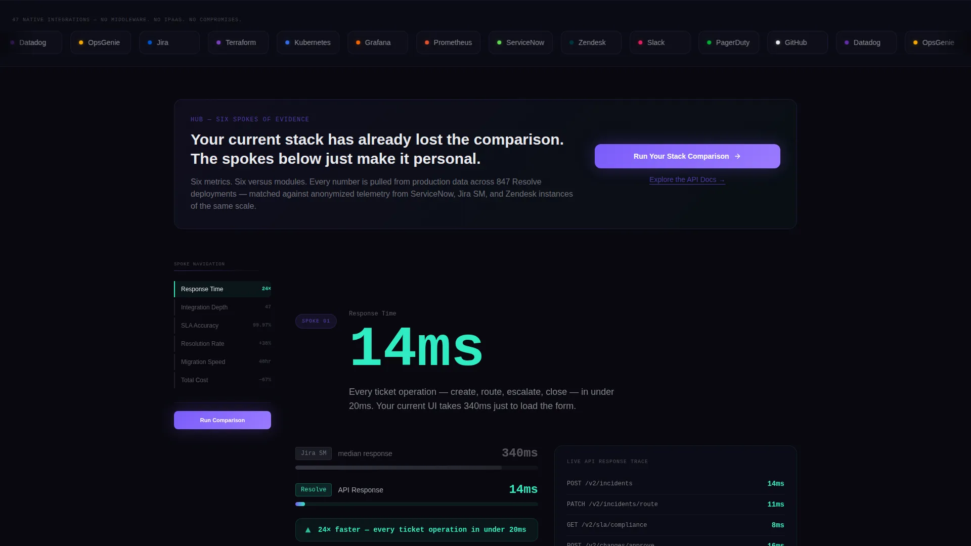
- Six versus modules, each comparing a visitor's current ITSM stack against Resolve's metrics with an animated delta counter
- A two-field qualifier form triggered by the primary call to action, delivering a personalized benchmark PDF on submission
Feature list
This section covers the core structural and interactive capabilities built into this landing page template.
Live Dashboard Header
The header renders a full-width, isometric perspective view of the platform's real-time operations dashboard. It displays key metrics including median API response time, daily ticket resolution count, SLA compliance rate, and a streaming incident feed with color-coded severity badges. No stock photography or illustration is used; the product itself is the visual.
Hub-and-Spoke Anchor Navigation
A left-pinned anchor navigation bar links to six metric spokes: Response Time, Resolution Rate, Integration Depth, SLA Accuracy, Migration Speed, and Total Cost. The hub center features the primary call-to-action button, keeping conversion access visible at every scroll position.
Versus Comparison Modules
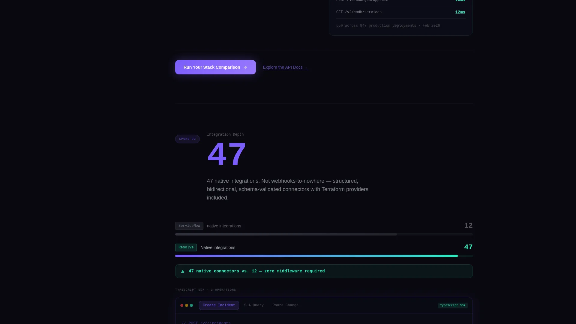
Each spoke loads as a side-by-side versus module. The visitor's current stack appears on the left in muted gray. Resolve's metrics appear on the right in neural teal. The performance delta is rendered as an animated counter that climbs to its final value on scroll entry.
Personalized Benchmark Form
The primary call to action opens a two-field qualifier: a dropdown for the visitor's current ITSM tool and a company email input. On submission, the visitor receives a personalized benchmark PDF comparing their named tool against Resolve across all six spoke metrics.
Secondary API Documentation Path
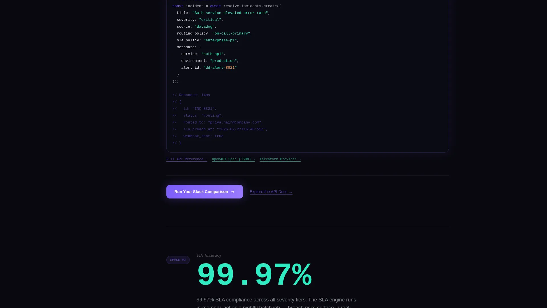
An underlined text link labeled "Explore the API Docs" sits beneath every primary call-to-action button. This secondary path gives engineering leads direct access to endpoint documentation before procurement or approval processes begin.
Stats-First Scroll Rhythm
Every scroll stop in this template opens with a hard metric before any descriptive copy appears. The page builds a cumulative case through six successive data comparisons, each section designed to feel more conclusive than the one before it.
Page sections overview
| Section | Purpose |
|---|---|
| Dashboard Header | Display live platform metrics in isometric view |
| Anchor Nav Hub | Pin six spoke links and primary call to action |
| Response Time Spoke | Compare API latency against legacy tools |
| Resolution Rate Spoke | Show daily ticket resolution delta |
| Integration Depth Spoke | Highlight API surface versus closed interfaces |
| SLA Accuracy Spoke | Present SLA compliance rate comparison |
| Migration Speed Spoke | Compare onboarding and migration timelines |
| Total Cost Spoke | Contrast total cost of ownership across stacks |
| Benchmark Form | Qualify visitor and deliver personalized report |
Design & branding system
The visual identity follows a Dashboard Pro theme using an AI Iridescent color system. The palette is built around a void-black canvas that lets every data point and metric glow with intentional contrast. Cards lift with faint violet-to-teal gradient borders, and interactive elements carry an iridescent micro-shimmer on hover.
- Void black (#09090F) as the primary canvas, holographic violet (#7B5CFA) for active states and data highlights, neural teal (#2EECC2) for positive metrics and success indicators, and signal white (#E8E9ED) for body text and axis labels
- Backgrounds stay in the void range so that glowing metric cards and animated counters visually dominate each section
- Interactive elements pulse with iridescent micro-shimmer on hover, giving the page a sense that the data itself is responding to the visitor
Mobile & speed optimization
The template is structured so that the hub-and-spoke layout remains functional and readable on smaller screens. The anchor navigation adapts to a top-pinned bar on mobile, keeping the six spokes accessible without side-panel overlap.
- The isometric dashboard header scales down gracefully, preserving the depth-of-field effect at narrower viewports
- Versus modules stack vertically on mobile, keeping the left-versus-right comparison legible without horizontal scrolling
- The two-field qualifier form is touch-friendly and keeps the submission flow intact across device sizes
How this template helps you convert
The page is designed around a Comparison/Versus conversion strategy. Every structural decision pushes a technically skeptical buyer toward the benchmark form by building an evidence-based case across six sequential data points.
- The stats-first scroll rhythm ensures the visitor encounters hard performance numbers before any marketing language, reducing resistance and establishing platform credibility early in the session.
- The animated delta counters in each versus module make the performance gap between legacy tools and Resolve viscerally concrete, so by the time the visitor reaches the benchmark form, the comparison has already been made.
- The secondary "Explore the API Docs" link beneath every call to action keeps engineering leads engaged without forcing them into the procurement funnel before they are ready, broadening the conversion surface of the page.
Other information about this template
This template is suited for headless ITSM platforms competing in a market where buyers are already familiar with incumbent tools and need more than feature lists to justify a switch.
- The template style is Hub and Spoke with anchor navigation, making it straightforward to extend with additional metric spokes if the platform adds new comparison dimensions
- The creative direction is Stats-First Impact, which aligns with how engineering and IT operations buyers evaluate new infrastructure tools
- The header concept is a Dashboard Preview, showing real product output rather than abstract visuals, which reinforces credibility for a technical audience
- The template is categorized under Technology, specifically Headless Enterprise Software, in the Headless ITSM niche
- This template can support comparison positioning against tools such as ServiceNow, Jira Service Management, and Zendesk, as the versus module layout is designed to accept any named ITSM product in the left-hand muted-gray column
Theme
Dashboard Pro
Creative direction
Stats-First Impact
Color system
AI Iridescent
Style
Hub & Spoke (Anchor Nav)
Direction
Comparison/Versus
Page Sections
Live Isometric Dashboard Header
Pinned Hub-and-spoke Anchor Nav
Animated Versus Comparison Modules
Two-field Benchmark Qualifier Form
Secondary API Documentation Link
Stats-first Scroll Rhythm
Related questions
Can I change the metrics shown in the dashboard header?
How does the benchmark form delivery work?
Can I rename or reorder the six anchor nav spokes?
Do I need design experience to customize this template?
Can I add more versus modules beyond the six included spokes?



