Dental Volunteer Scheduling Landing Page Template
Roster is a dental volunteer management landing page template built as a dashboard and data grid interface. It helps clinic coordinators, nonprofit directors, and dental school outreach leads present a polished, organized scheduling system. The template combines a dark command-center aesthetic with structured data layouts to show volunteer shifts, credentials, and fill rates at a glance.
by Rocket studio
Quick summary
Roster is a single-page landing page template designed for dental volunteer scheduling platforms. It uses a dark, iridescent data-command visual style to showcase a live-looking operational grid. The layout follows a Problem to Solution arc, turning the chaos of spreadsheet-based coordination into a clear, convincing product story, complete with repeating calls to action and a footer booking option.
Who this template is for
This template is built for teams that coordinate licensed dental volunteers across community events, free clinics, and outreach programs. It speaks directly to the people managing the complexity behind the scenes.
- Clinic coordinators managing dozens of volunteers across multiple Saturday events
- Nonprofit directors who need to demonstrate credentialing compliance to state boards
- Dental school outreach leads placing fourth-year students into supervised clinical rotations
What problem this template solves
Coordinating dental volunteers with spreadsheets leads to real operational failures. Expired credentials go unnoticed. Shift gaps appear at the last minute. Cancellations cascade through patient schedules. This template gives your platform a page that shows exactly how those problems get solved.
- Unfilled chairs caused by late-breaking volunteer no-shows and mismatched scheduling
- Expired or unverified credentials slipping through manual tracking processes
- No clear system for logging post-event volunteer hours or confirming shift attendance
What you get with this template
The template delivers a fully structured landing page with every section purpose-built for the dental volunteer management use case. It is designed to move a skeptical coordinator from doubt to click in a single scroll.
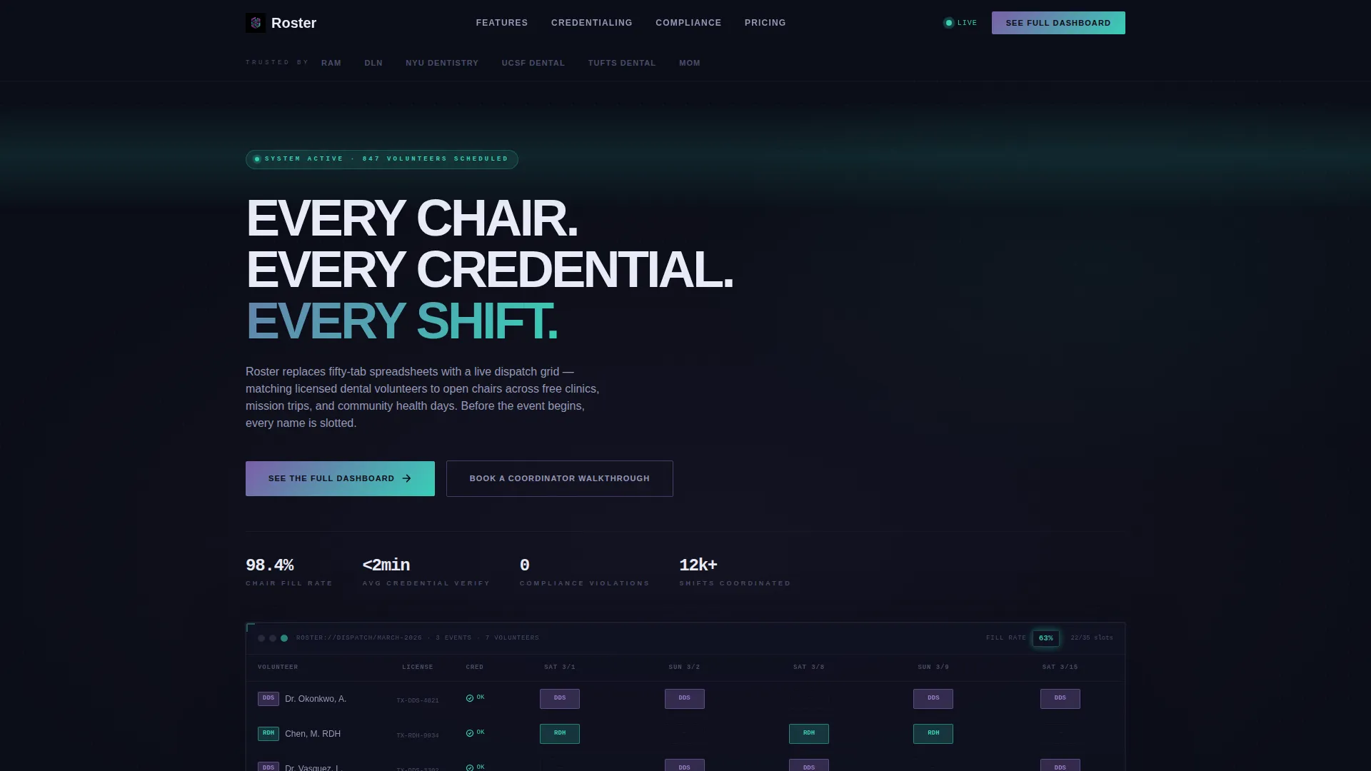
- A simulated hero dashboard grid showing volunteer names, license types, shift blocks, and a live fill-rate indicator
- A problem-to-solution scroll flow with paired data visualizations replacing painful spreadsheet screenshots
- Repeating primary and secondary calls to action placed strategically throughout the page
Feature list
This template includes prompt-backed layout features built specifically for a dental volunteer scheduling product presentation.
Simulated Hero Dashboard Grid
The hero section drops visitors directly into a weekly grid view. It shows volunteer names, license types, color-coded shift blocks by role, and a pulsing fill-rate percentage in iridescent teal. No stock photography is used. The product does the talking from the first second.
Problem Visualization Section
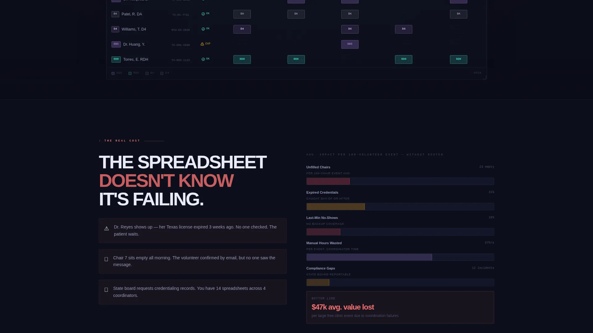
An opening data visualization communicates the real cost of disorganized volunteer management. Unfilled chairs, expired credentials caught too late, and last-minute no-shows are shown as quantified pain points before the solution is introduced.
Problem-Solution Scroll Pairs
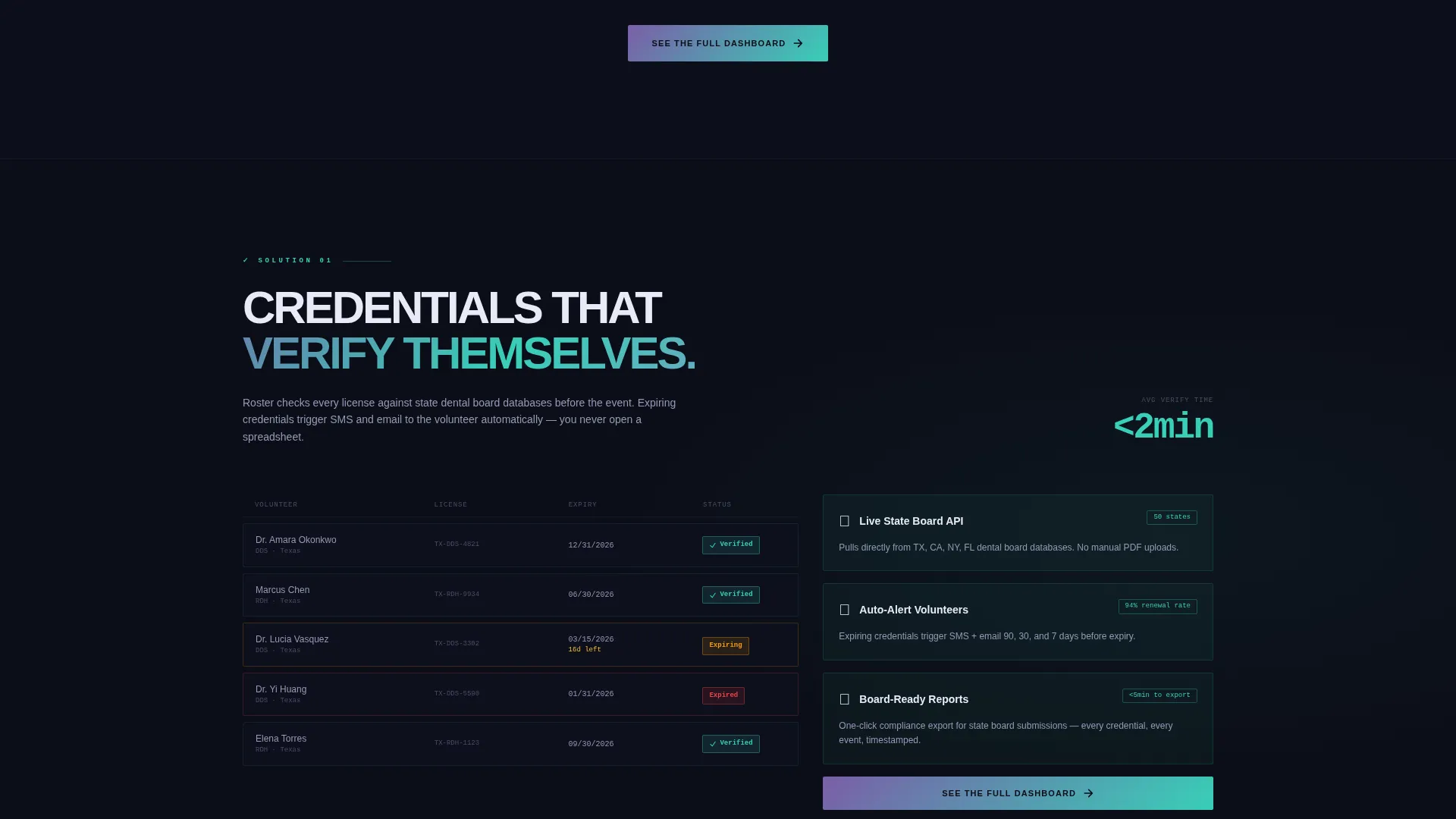
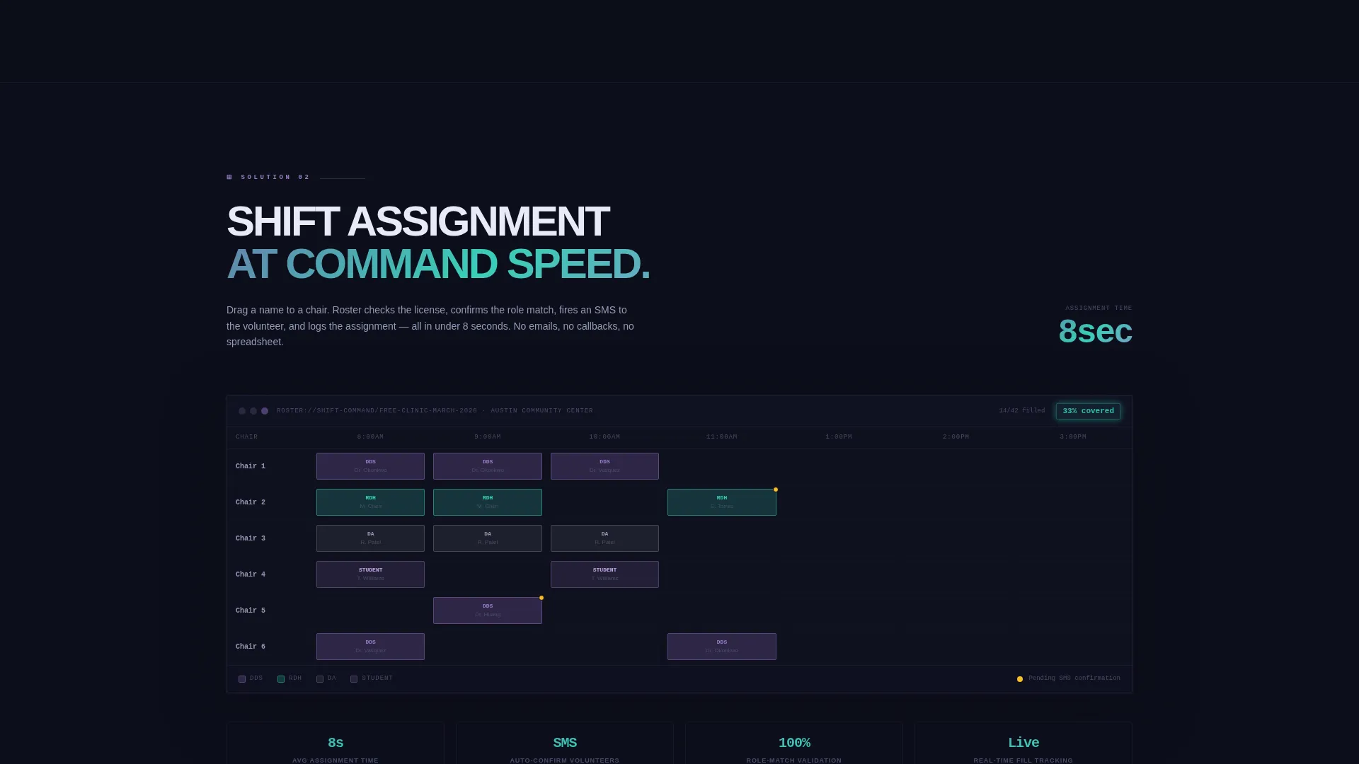
Each scroll section pairs a spreadsheet-style pain point with its clean grid equivalent. The contrast between broken and organized sharpens as the visitor moves down the page. The tension builds and resolves like a pressure valve releasing.
Repeating Primary Call to Action
A "See the Full Dashboard" button appears first beneath the hero grid and repeats after each problem-solution pair. It routes to a live demo environment requiring no sign-up, lowering the barrier to engagement at every decision point.
Partner Logo Bar Header
A slim, confident logo bar sits above the hero. It features partner organization logos anchoring credibility before the visitor reads a single word of body copy.
Footer Booking Call to Action
A secondary call to action, "Book a Coordinator Walkthrough," sits at the page footer. It captures leads who want a guided tour rather than a self-serve demo, covering both low-touch and high-touch conversion paths.
Page sections overview
| Section | Purpose |
|---|---|
| Partner Logo Bar | Establishes credibility with recognizable partner organizations above the fold |
| Hero Dashboard Grid | Immerses visitors in a simulated live scheduling view with fill-rate indicator |
| Problem Data Visualization | Shows the quantified cost of unmanaged volunteer coordination |
| Credential Tracking Section | Introduces automated credential verification as a direct solution |
| Shift Assignment Section | Presents drag-and-drop shift scheduling as a replacement for manual grids |
| SMS Confirmation Section | Demonstrates shift confirmation flow with automated messaging |
| Hour Logging Section | Shows post-event volunteer hour tracking as a clean data output |
| Footer Booking call to action | Captures high-intent leads with a guided walkthrough offer |
Design & branding system
The visual identity follows a Data Command theme executed through an AI Iridescent color system. Every color choice references a clinical or operational object, surgical precision expressed through palette.
- Void-black (#0B0D17) as the primary background, reading like an unlit operating theater ready for action
- Iridescent violet (#7B5EA7) across data cells and hover states, teal (#38CFB8) marking verified credentials and active shifts
- Pale holographic white (#E8EAF6) for typography that floats above the dark surface like projected light on a screen
Mobile & speed optimization
The template is structured for clean rendering across screen sizes, keeping the data grid layout readable on smaller displays without losing the command-center feel.
- Data grid components are designed to reflow naturally on mobile viewports without losing hierarchy
- Typography choices in holographic white maintain contrast and legibility at all display sizes
How this template helps you convert
Every design and layout decision in this template is oriented toward earning the click before asking for it. The page shows the product working in full before any form or commitment appears.
- The hero grid and problem visualization create immediate relevance, coordinators see their own pain reflected back before a single word of solution copy appears
- The repeating "See the Full Dashboard" call to action meets the visitor at every moment of conviction, removing friction at every scroll depth without requiring sign-up
Other information about this template
This template is a strong fit for dental software products serving the community health and nonprofit outreach sector. It covers the full coordinator decision journey in one page.
- The template style is a Dashboard and Data Grid layout, purpose-built for operational product presentations
- The header concept is a Logo Bar, ideal for platforms with established nonprofit or university partnerships
- The creative direction follows a Problem to Solution Arc, a proven narrative structure for operational software
- The landing page direction is Click-Through, optimized to route visitors to a live demo with no sign-up barrier
- This template works well alongside platforms serving organizations like Remote Area Medical, Dental Lifeline Network, and university dental school outreach programs
Theme
Data Command
Creative direction
Problem→Solution Arc
Color system
AI Iridescent
Style
Dashboard/Data Grid
Direction
Click-Through
Page Sections
Simulated Hero Dashboard Grid
Problem Visualization Data Section
Problem-solution Scroll Pairs
Repeating Click-through Call to Action
Partner Logo Bar Header
Footer Coordinator Booking Call to Action
Related questions
Who is this landing page template designed for?
Does the template include a working dashboard or live demo?
What calls to action are built into the template?
Can I adapt this template if I do not have partner logos?
Is this template suited for recurring programs or one-time clinic events?



