Financial Services Volunteer Management Landing Page
Roster is a split-screen landing page template built for financial services volunteer management platforms. It pairs a live stats dashboard with an interactive matching estimator to show program directors and licensed professionals exactly why manual coordination falls short. The template uses a Directory and Discovery theme with an AI Iridescent color system to communicate institutional trust alongside modern intelligence.
by Rocket studio
Quick summary
Roster is a single-page template designed for platforms that connect licensed financial professionals with nonprofits seeking pro bono guidance. The split-screen layout leads with animated metrics and a tool-first estimator. Every section builds a case through direct comparison, moving visitors from curiosity to conviction before they reach the sign-up form.
Who this template is for
This template speaks directly to organizations and individuals working at the intersection of financial expertise and community need. It is designed for platforms that coordinate credentialed volunteers with mission-driven organizations.
- Volunteer program directors at community foundations and nonprofit chapters who manage financial service clinics
- Licensed professionals such as Certified Public Accountants, Certified Financial Planners, and enrolled agents seeking meaningful pro bono hours
- Platform builders and product teams launching a financial services volunteer management solution that needs to convert on first visit
What problem this template solves
Recruiting and placing credentialed financial volunteers manually is slow, error-prone, and hard to justify to stakeholders. Program directors juggle spreadsheets, unverified credentials, and fragmented communication while trying to meet compliance deadlines.
- Organizations struggle to verify volunteer credentials quickly, which delays tax-prep clinics and audit review engagements
- Manual tracking makes it nearly impossible to demonstrate response time, placement cost, or liability coverage status to funders
- Volunteers with active credentials have limited time and expect a professional, organized process that respects their expertise
What you get with this template
The template delivers a fully structured, persuasion-first landing page built around a comparison-driven conversion flow. Every section is purpose-built to move a skeptical program director toward signing up.
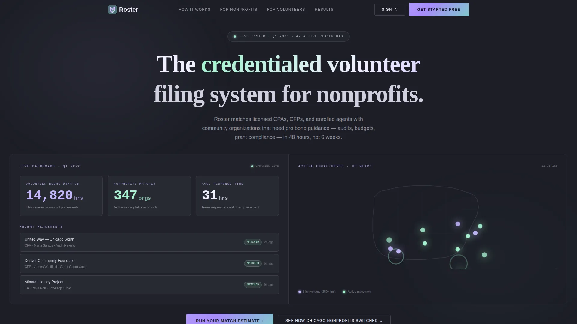
- A live stats dashboard header with three animated counters showing volunteer hours donated, nonprofits matched, and average response time
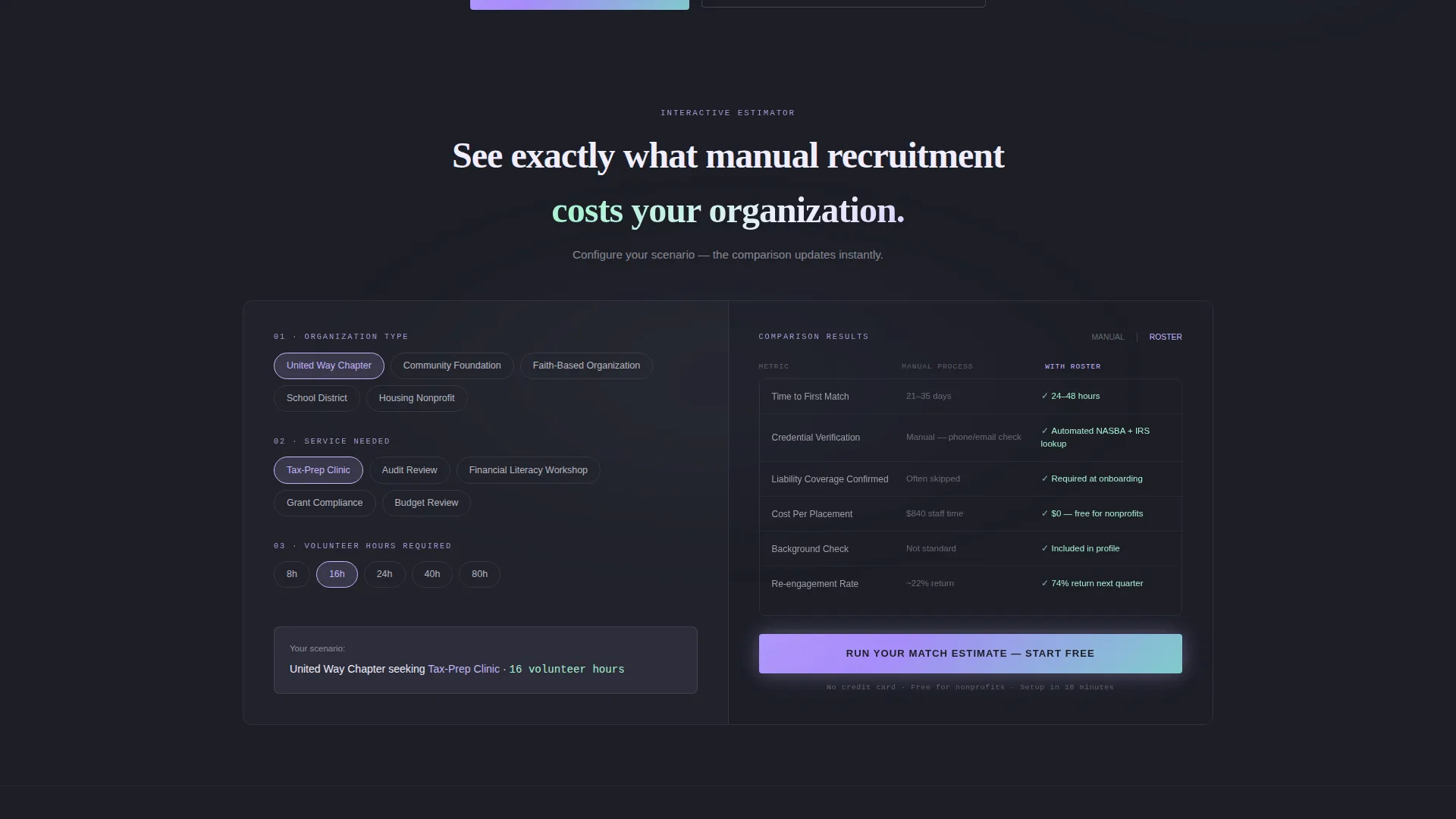
- An interactive matching estimator split across both screen halves, instantly comparing manual recruitment against the platform across key dimensions
- A closing section with a side-by-side scorecard and a three-field sign-up form collecting organization name, service category, and work email
Feature list
This section covers the core functional and design capabilities included in the Roster template.
Animated Stats Dashboard Header
The header splits into two panels. The left panel displays three animated counters ticking upward in real time: volunteer hours donated this quarter, nonprofits matched, and average response time to placement requests. The right panel shows a live map with glowing iridescent dots marking active volunteer engagements across metro areas. Numbers are set in a monospaced typeface and feel like a living system rather than a static infographic.
Interactive Matching Estimator Tool
Immediately below the header, an interactive estimator spans both screen halves. Visitors select their organization type, the service needed (tax preparation, audit review, financial literacy workshop, or grant compliance), and the volunteer hours required. The right side instantly populates a comparison table covering time-to-match, credential verification steps, liability coverage status, and cost per placement.
Comparison-Driven Scroll Sections
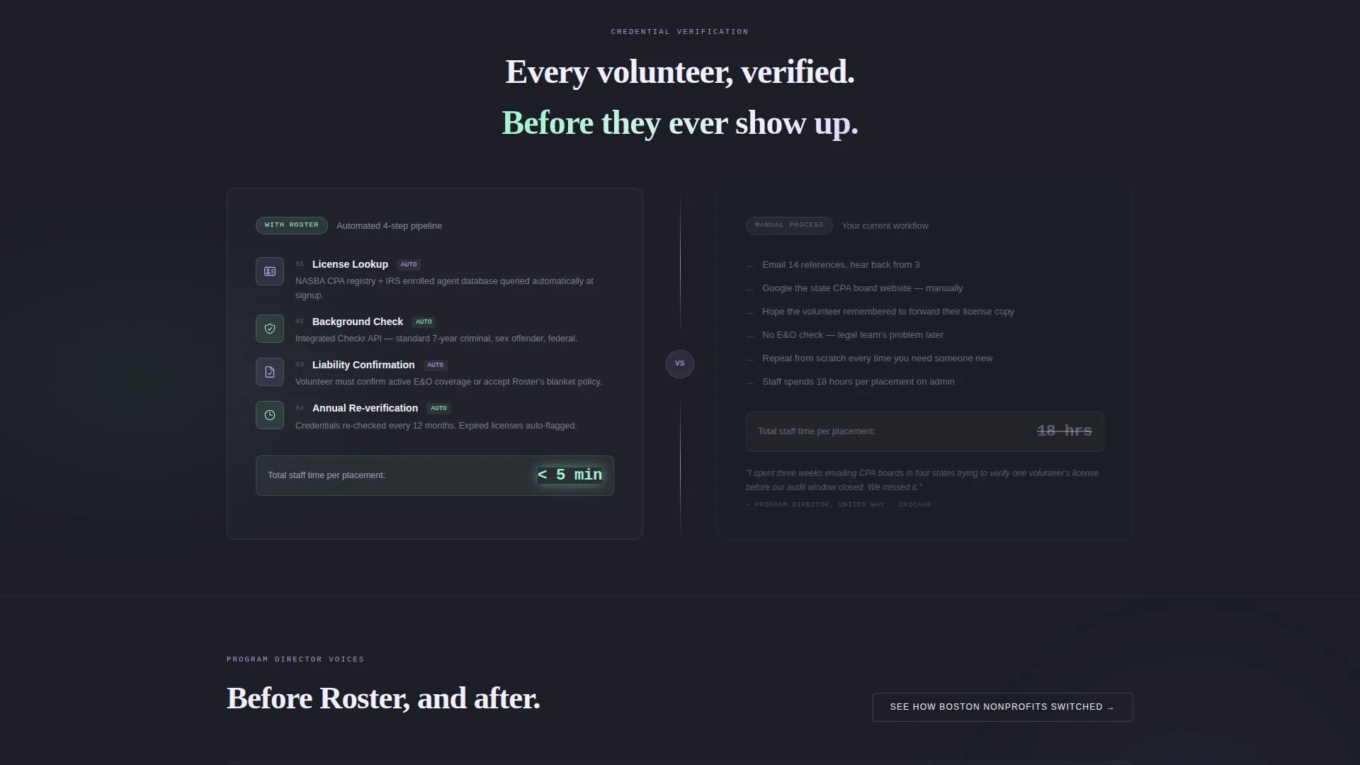
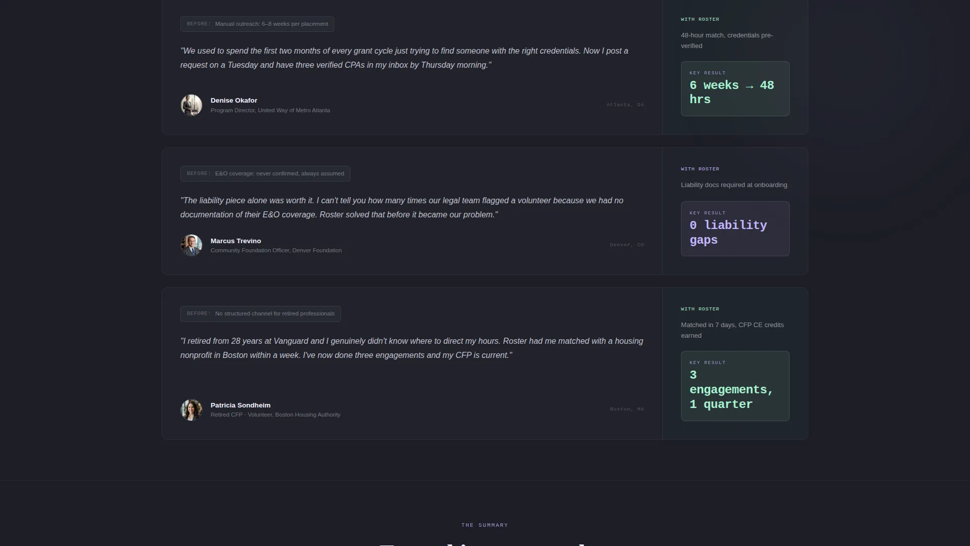
Each scroll section deepens the manual-versus-platform comparison with progressively specific evidence. The sections move through compliance automation against spreadsheet tracking, background-check integrations against manual vetting, and real testimonials from program directors paired with their previous workflow pain points. The structure makes the manual alternative feel heavier with every section.
Localized Social Proof Link
A secondary call-to-action appears mid-page, reading "See How [City] Nonprofits Switched." This links to localized case studies and grounds the platform's credibility in recognizable geography, making the evidence feel specific rather than generic.
Side-by-Side Closing Scorecard
The final section presents a summary scorecard comparing the platform against manual coordination across all tracked dimensions. The "Start Matching Volunteers Free" call-to-action sits beside the three-field sign-up form, so the visitor arrives at the form already persuaded rather than still skeptical.
Anchored Primary Call-to-Action
The primary call-to-action, "Run Your Match Estimate," is anchored to the bottom of the calculator tool. It glows in holographic lilac and remains visually prominent throughout the estimator interaction, reducing the distance between interest and the next step.
Page sections overview
| Section | Purpose |
|---|---|
| Animated Stats Header | Show live platform activity to build immediate credibility |
| Interactive Matching Estimator | Let visitors compare manual recruitment against the platform in real time |
| Comparison Scroll Sections | Deepen the manual-versus-platform case with specific, accumulating evidence |
| Testimonials and Pain Points | Pair real program director quotes with their previous workflow struggles |
| Localized Case Study Link | Connect mid-page momentum to geographically specific social proof |
| Closing Scorecard Section | Summarize the full comparison and present the sign-up form |
Design & branding system
The visual identity follows a Directory and Discovery theme layered with an AI Iridescent color system. The palette is designed to feel like light refracting through a crystal paperweight on a mahogany desk: futuristic intelligence sitting on a foundation of institutional trust.
- Deep graphite (#1C1E26) serves as the primary background, anchoring the layout in calm authority
- Shifting holographic lilac (#C4B5FD) activates on hover states and call-to-action elements, while cool opalescent mint (#A7F3D0) marks success indicators and matched-pair confirmations
- Soft prismatic white (#F0EEFF) covers card surfaces and text panels, keeping content readable against the dark background
Mobile & speed optimization
The split-screen layout is built to remain clear and functional as screen sizes change. The template keeps visual complexity contained so the estimator tool and stats dashboard remain usable across devices.
- The 50/50 split-screen structure is designed to reflow cleanly on narrower viewports without losing the side-by-side comparison logic
- Animated counters and the iridescent map panel are structured to load as part of the page's natural render sequence rather than as blocking elements
How this template helps you convert
The Roster template is engineered around a single conversion principle: let the tool do the persuading so the form only needs to collect the already-convinced.
- The matching estimator creates a personalized, data-driven case for the platform before any marketing copy needs to make a claim, making the primary call-to-action feel like a natural next step rather than a sales push
- The progressive comparison structure means each scroll section adds a new layer of evidence, so visitors who are skeptical at the header are rarely still skeptical by the time they reach the closing scorecard and sign-up form
Other information about this template
This template is part of a broader financial services software category focused on volunteer coordination technology. It is designed to support platforms operating in the financial services volunteer management niche, where credential verification, compliance tracking, and placement efficiency are central selling points.
- The template style is a 50/50 split screen, meaning both halves carry equal visual weight throughout every section
- The Calculator/Tool First creative direction means the interactive estimator is the dominant conversion mechanism, not passive copy
- The Comparison/Versus landing page direction structures the entire page as a side-by-side argument, which suits buyers who arrive already aware of their pain point but uncertain about switching
Theme
Directory & Discovery
Creative direction
Calculator/Tool First
Color system
AI Iridescent
Style
Split Screen (50/50)
Direction
Comparison/Versus
Page Sections
Animated Stats Dashboard Header
Interactive Matching Estimator
Comparison-driven Scroll Sections
Localized Case Study Call-to-action
Side-by-side Closing Scorecard
Anchored Primary Call-to-action
Related questions
Who is this template designed for?
Can I adapt the matching estimator fields to my platform's specific services?
Does the template include both call-to-action buttons?
What does the closing sign-up form collect?



