Salon & Spa Route Optimization Landing Page Template
Route is a scroll-reveal landing page template built for salon and spa route optimization platforms. It uses a Data Command visual theme with a Teal Catalyst color system to contrast inefficient scheduling against smarter routing. The design walks visitors through a progressive feature matrix, quantifies wasted drive time at every step, and drives sign-ups through a focused route audit form.
by Rocket studio
Quick summary
Route is a single-page, scroll-reveal template designed for mobile beauty service platforms. It opens with a dark glass panel header showing before-and-after route maps, then builds a feature matrix row by row as visitors scroll. Every section leads with a specific number, making the cost of inefficient routing impossible to ignore before the call-to-action appears.
Who this template is for
This template is built for software companies and platforms serving mobile beauty professionals who need smarter appointment routing. It speaks directly to operations-minded buyers who already feel the pain of disorganized scheduling.
- Mobile blow-dry bar owners managing multiple stylists across different zones
- Spa franchise managers dispatching therapists to corporate or on-site wellness events
- Solo mobile nail technicians, estheticians, and massage therapists booking house calls around fixed daily windows
What problem this template solves
Mobile beauty professionals lose hours each week to inefficient routing. Stylists crisscross metro areas unnecessarily, appointment gaps open up from no-shows, and territories are assigned by guesswork rather than logic. This template gives the platform selling the solution a page that makes all of that waste visible and undeniable.
- Visitors arrive skeptical; the page quantifies their exact loss before asking for anything
- The before-and-after visual format removes abstract selling and replaces it with direct comparison
- The progressive reveal structure means each scroll adds evidence, so the form appears only after the case is already made
What you get with this template
You get a fully structured, single-page scroll-reveal layout built around a Feature Matrix creative direction. The design is production-ready and opinionated, with every section tied to the comparison-versus conversion strategy described in the brief.
- A Dark Glass Panels header with three data visualization cards showing before route, after route, and a live-style savings counter
- Four scroll-reveal comparison panels that build a full feature matrix row by row
- A three-field route audit form and a secondary competitor comparison slide-out panel
Feature list
This template is built around purposeful, conversion-focused components. Each one is described as it appears in the template.
Dark Glass Panel Header
Three translucent, frosted-glass cards float over a midnight dashboard background. The first shows a spaghetti-mess route map labeled "Before," the second shows a streamlined route labeled "After," and the third displays a savings counter ticking upward across miles saved, minutes recovered, and appointments added. A self-typing headline in clinical silver reads: "Your stylists are driving 47% more miles than they need to."
Scroll-Reveal Feature Matrix
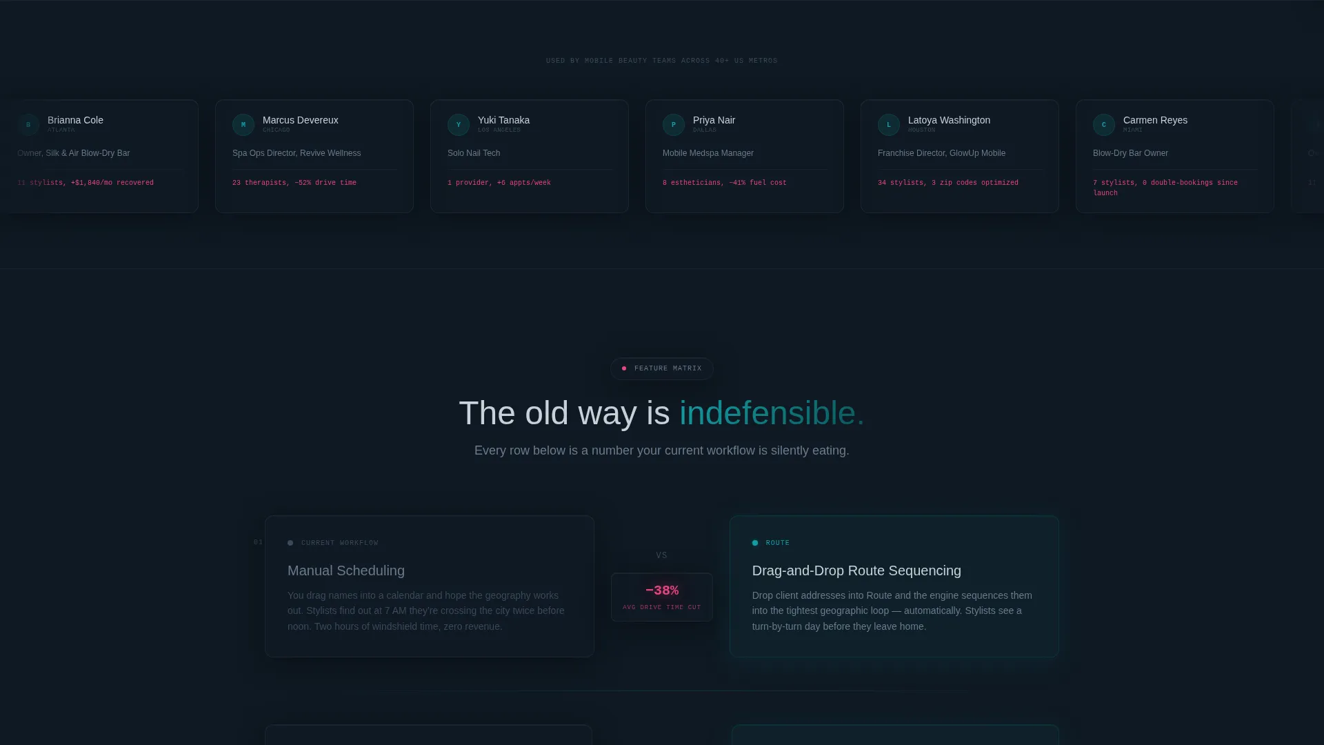
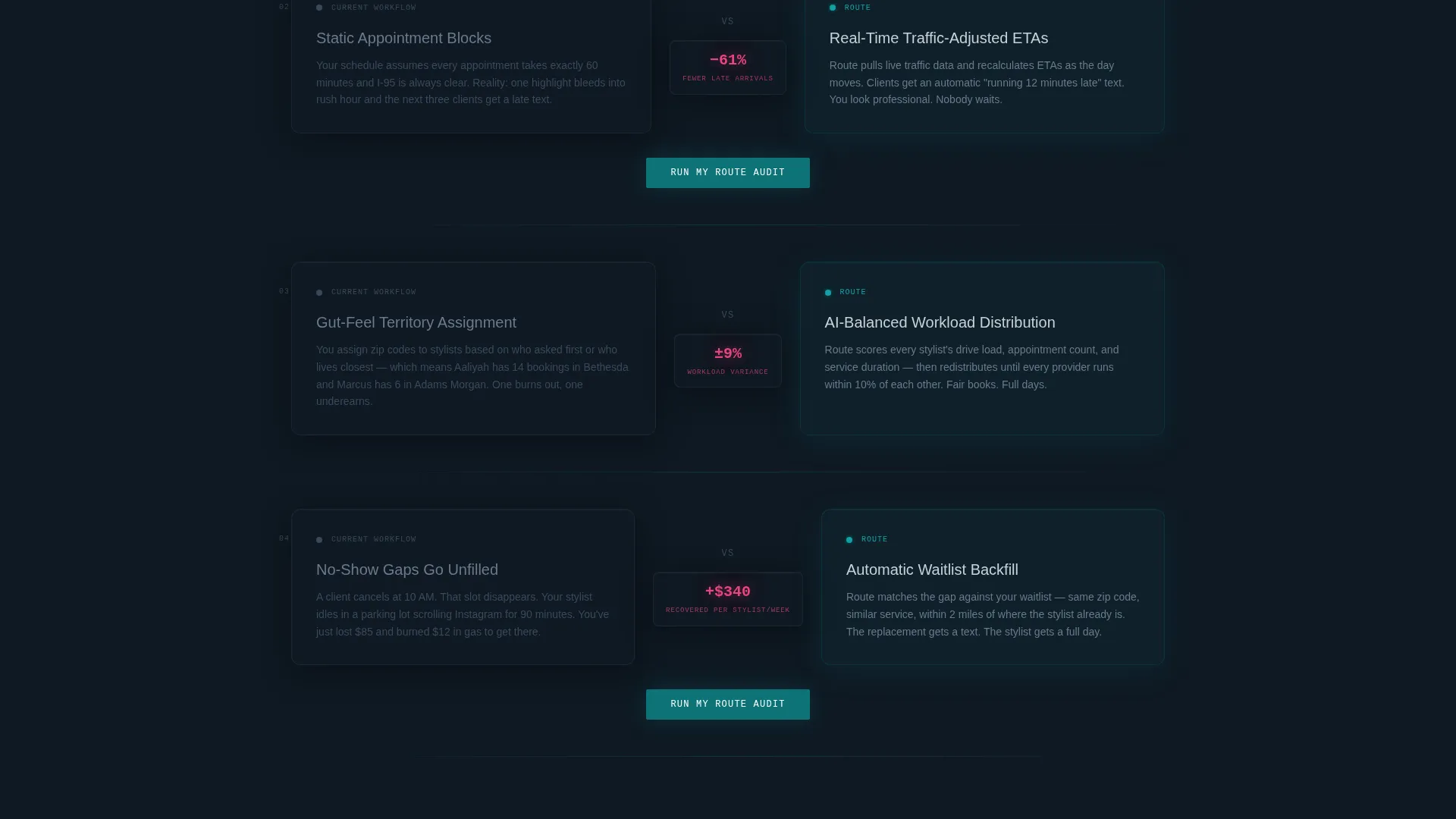
Each scroll event materializes a new comparison panel from transparency into full visibility. The visitor's current workflow appears on the left in muted silver, and the platform's solution appears on the right in deep operations teal. Reactive magenta highlights the delta between the two states. The four panels cover drag-and-drop route sequencing, real-time traffic-adjusted ETAs, AI-balanced workload distribution, and automatic waitlist backfill.
Route Audit Conversion Form
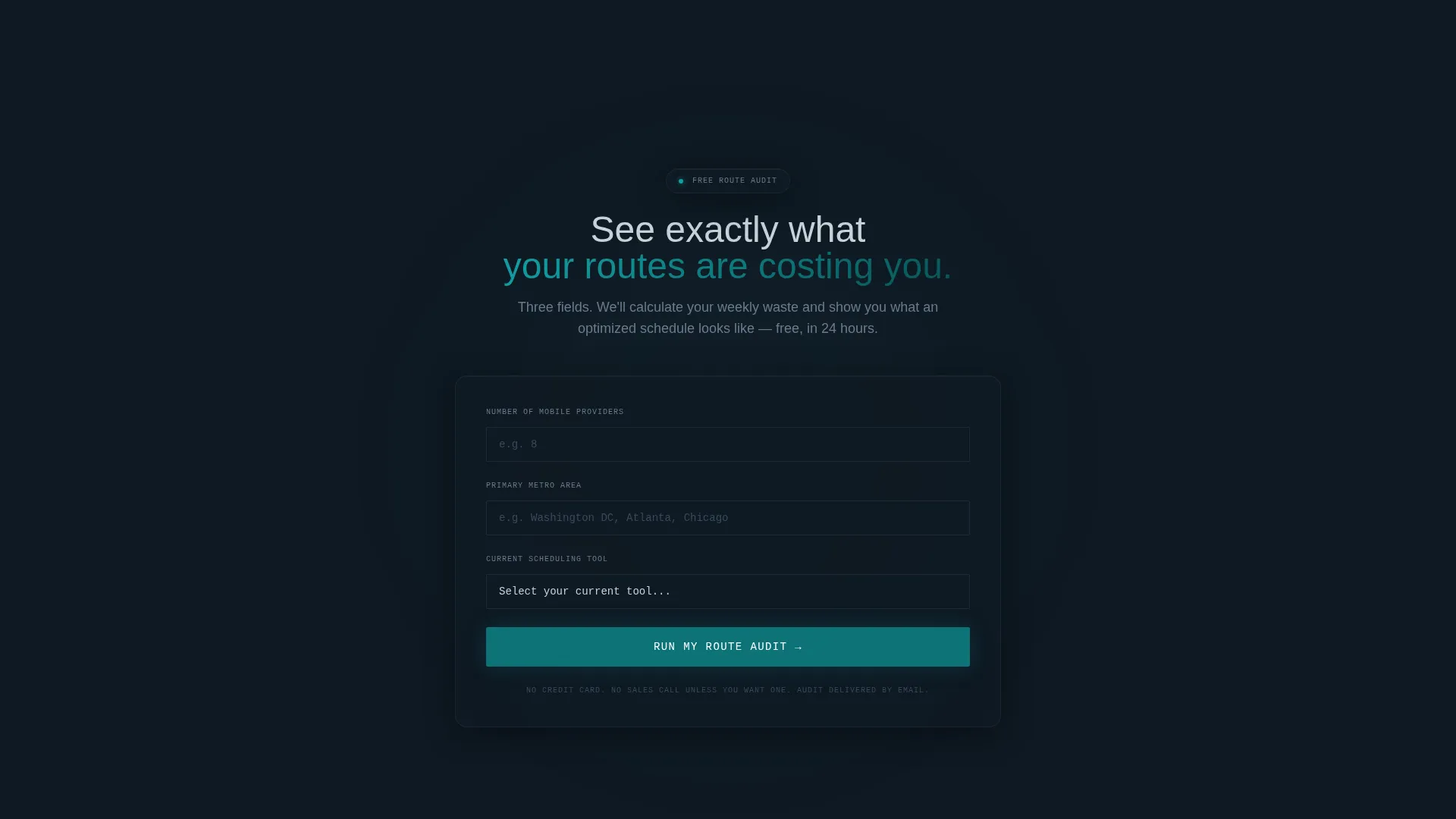
The primary call-to-action is a three-field form labeled "Run My Route Audit." Fields capture the number of mobile providers, the primary metro area, and the current scheduling tool via a dropdown. The dropdown includes options for spreadsheet, pen and paper, another platform, and nothing. A teal button submits the form on every third panel as the page builds.
Competitor Comparison Slide-Out Panel
A secondary conversion path labeled "See How We Beat [Competitor]" appears as a magenta text link. Clicking it opens a slide-out panel containing a head-to-head feature grid. This gives visitors a direct comparison without leaving the page or breaking the scroll flow.
Data-First Section Numerics
Every section opens with a specific, quantified number tied to routing inefficiency. These figures are placed before any call-to-action so the cost of inaction is already visible when the form arrives. The cumulative effect is a page that earns each click rather than asking for it upfront.
Page sections overview
| Section | Purpose |
|---|---|
| Dark Glass Header | Visualize before-and-after routing and display a live savings counter |
| Self-Typing Headline | Hook visitors immediately with a specific, quantified inefficiency claim |
| Reveal Panel 1 | Compare manual scheduling against drag-and-drop route sequencing |
| Reveal Panel 2 | Compare static blocks against real-time traffic-adjusted ETAs |
| Reveal Panel 3 | Compare gut-feel territories against AI-balanced workload distribution |
| Reveal Panel 4 | Compare no-show gaps against automatic waitlist backfill |
| Assembled Feature Matrix | Show the full comparison table after all four panels have built up |
| Route Audit Form | Capture provider count, metro area, and current scheduling tool |
| Competitor Slide-Out | Deliver a head-to-head feature grid without breaking the scroll flow |
Design & branding system
The template uses a Data Command theme built on the Teal Catalyst color system. The palette is designed to feel like a dispatch screen at early morning: calm authority punctuated by sharp signals where the numbers matter most.
- Deep operations teal (#0D7377) is the primary action color used for solution-side panels, buttons, and the route audit call-to-action
- Midnight dashboard (#0F1923) covers all backgrounds and panel surfaces, with clinical silver (#C8D1D9) handling body text and secondary interface elements
- Reactive magenta (#E8457C) is reserved exclusively for alerts, savings callouts, competitive advantage markers, and the competitor comparison link
Mobile & speed optimization
The scroll-reveal structure is built to perform on smaller screens without sacrificing the progressive reveal experience. Panel transitions are designed to feel intentional on touch devices, not accidental.
- Each comparison panel is sized and spaced for readability on mobile viewports, keeping the left-versus-right layout legible on narrower displays
- The three-field route audit form is minimal by design, reducing friction on any screen size
- The slide-out competitor panel is triggered by a text link rather than a hover state, making it accessible on touch-based devices
How this template helps you convert
The conversion strategy is built on a single principle: quantify the cost of inaction before asking for anything. Every visual and structural choice serves that principle.
- The header savings counter and self-typing headline create an immediate, number-backed hook that primes the visitor to recognize their own inefficiency within the first seconds on the page.
- The scroll-reveal feature matrix builds the case incrementally, so by the time the "Run My Route Audit" form appears, visitors have already seen four specific comparisons that make the old workflow look indefensible.
- The competitor slide-out panel handles objections from visitors who are already evaluating alternatives, keeping them on the page and moving them toward a decision rather than an exit.
Other information about this template
This template is designed specifically for the salon and spa software category within the broader technology space. It is well-suited for platforms competing in the mobile beauty services market and for teams building route optimization tools targeting beauty professionals in metro areas.
- The template is built as a single scroll-reveal landing page, not a multi-page website
- The Teal Catalyst color system and Data Command theme are fully defined in the brief and ready for brand customization
- The Feature Matrix creative direction and Comparison/Versus landing-page strategy make this template suitable for competitive positioning campaigns where the platform needs to demonstrate measurable advantages over spreadsheet-based or manual scheduling workflows

Theme
Data Command
Creative direction
Feature Matrix
Color system
Teal Catalyst
Style
Scroll Reveal (Progressive)
Direction
Comparison/Versus
Page Sections
Dark Glass Panel Header with Live Data Cards
Scroll-reveal Comparison Panels
Route Audit Conversion Form
Competitor Comparison Slide-out
Data-first Section Numerics
Related questions
Who is this landing page template designed for?
What is the scroll-reveal feature matrix?
What does the route audit form collect?
Can I customize the competitor name in the slide-out panel?
What makes this template different from a standard software landing page?



