Franchise Route Optimization Landing Page Template
Routea is a hub-and-spoke landing page template built for franchise route optimization platforms. It opens with a full-scale product screenshot hero, guides visitors through four interactive demo sections, and drives app downloads with a persistent bottom call to action. The Midnight Blue color system and cyan route-line accents make the platform feel like mission control the moment the page loads.
by Rocket studio
Quick summary
Routea is a single-page, anchor-navigated landing page template designed for franchise route optimization software. It pairs a live-map product screenshot hero with four scroll-driven demo sections, a persistent app download bar, and a zip-code-powered territory preview. The dark Midnight Blue palette and electric cyan highlights give every section the focused energy of a logistics command center.
Who this template is for
This template is built for founders and marketing teams selling route optimization software to multi-unit franchise operators. If your platform helps fleet managers cut fuel costs and reduce idle time across dozens or hundreds of locations, this page is designed around your pitch.
- Multi-unit franchise software companies targeting operators running 15 to 200 locations
- Logistics platform teams needing a demo-first page that lets visitors feel the product before they download
- Growth marketers who want a no-form, one-tap app download funnel for iOS and Android audiences
What problem this template solves
Franchise fleet operators lose real money every day running routes built on habit rather than data. A generic product page cannot communicate that kind of urgency. This template solves the presentation gap between a powerful optimization engine and the operators who need to feel it working before they commit.
- Static screenshots and bullet-point feature lists fail to show how route recalculation actually feels in motion
- Multi-unit operators need to see their own territory, not a generic demo, before they trust a new tool
- A fragmented download funnel with forms and friction kills conversion before the operator ever tries the app
What you get with this template
You get a complete, launch-ready landing page structured around a hub-and-spoke anchor navigation system. Every section is purpose-built to move a skeptical fleet manager from curious visitor to app installer in one uninterrupted scroll.
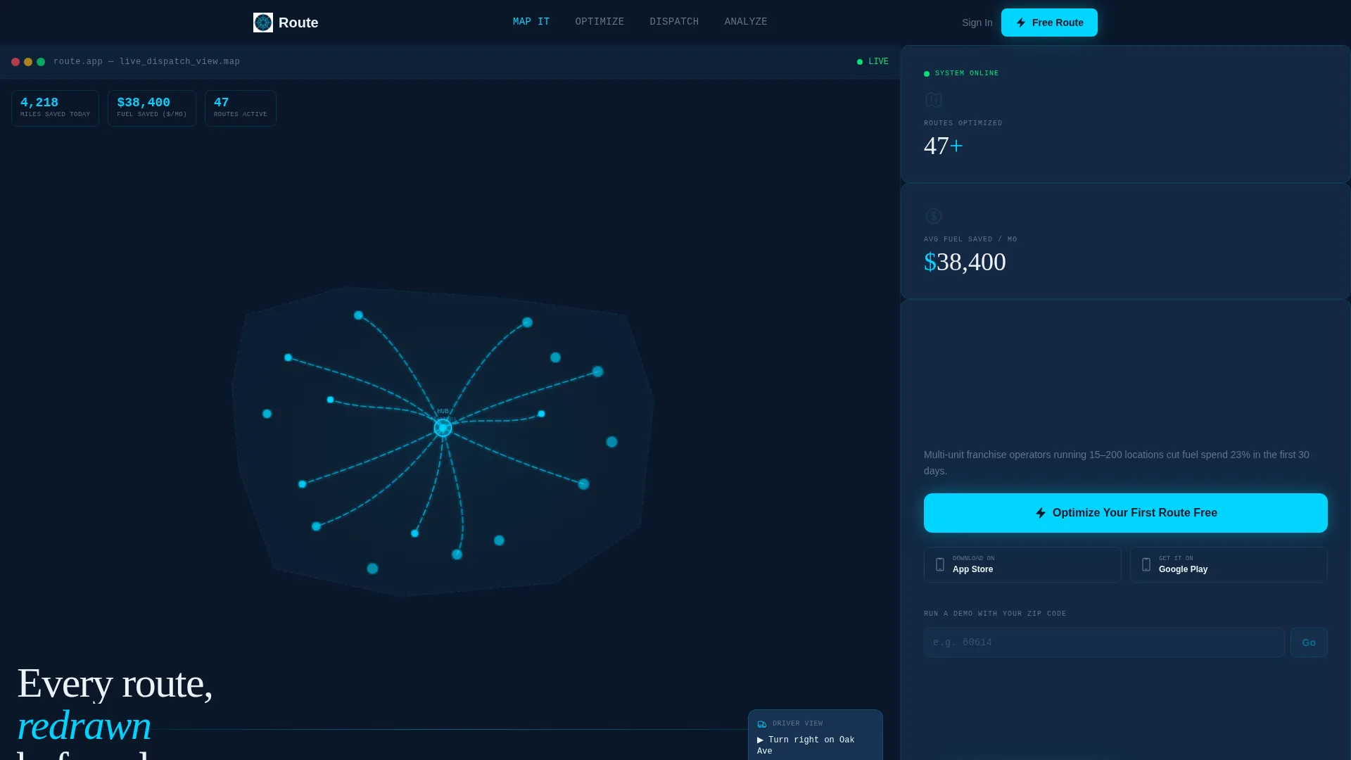
- A hero section with a blown-up product screenshot showing a 47-stop optimized franchise territory map with live-style counters
- Four interactive demo spoke sections covering single-route, multi-vehicle, multi-day, and weather-adjusted scenarios
- A persistent bottom call to action bar with iOS and Android app store badges and a zip-code territory preview tool
Feature list
This template includes the following purpose-built capabilities directly from the source brief.
Hero-Scale Product Screenshot Header
The header places the app's live map view at full viewport scale. A franchise territory with 47 stops is shown already optimized, with cyan route lines pulsing against the navy interface. Time-saved and miles-reduced counters animate toward their final numbers, and a driver's-eye next-turn inset anchors the bottom right corner.
Hub and Spoke Anchor Navigation
The top navigation acts as a mission selector with four labeled anchors: "Map It," "Optimize," "Dispatch," and "Analyze." Each anchor scrolls directly to its corresponding demo section. Visitors always know where they are and can jump between sections without losing context.
Interactive Demo Sections
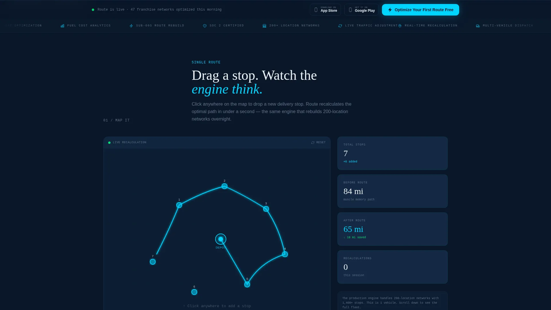
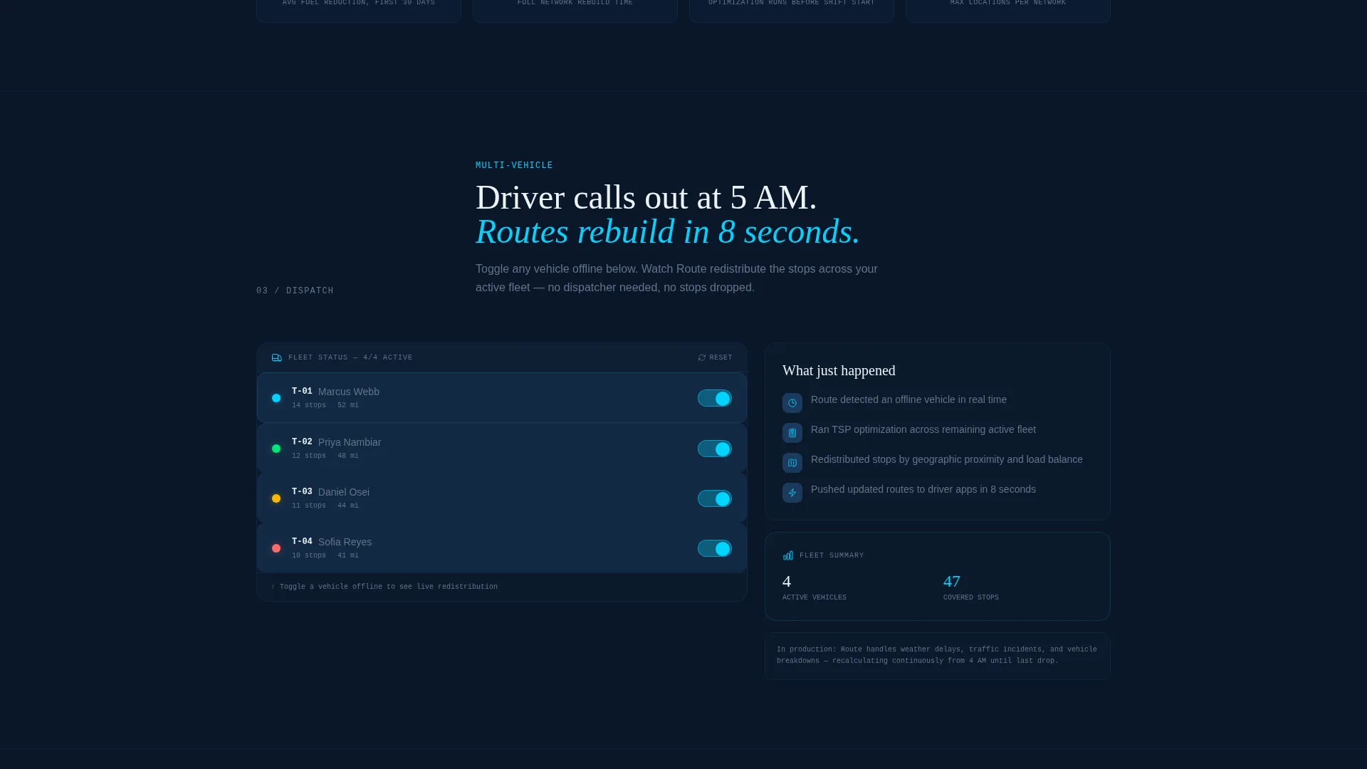
Each spoke section lets visitors manipulate a live demo dataset. They can drag a new stop onto the map and watch routes recalculate, or toggle a truck out of service and see load redistribution happen in real time. Complexity escalates section by section, from a single route through to weather-adjusted multi-day planning.
Persistent App Download call to action Bar
After the first scroll interaction, a bottom-pinned bar appears with the primary call to action: "Optimize Your First Route Free." It stays visible throughout the entire page experience and includes both iOS and Android store badges. No form fields stand between the visitor and the download.
Zip Code Territory Preview
A secondary conversion path invites visitors to enter a five-digit zip code. The tool generates a sample territory map for that area, creating a sense of personal ownership before the download. Visitors arrive at the app store feeling like the product was already built for their city.
Midnight Blue Visual System
The color palette runs from deep terminal navy on primary backgrounds through satellite blue on card surfaces, with electric cyan reserved for interactive paths and active states. Signal white is used only for typography and data labels. The result is a focused, high-contrast interface that communicates precision.
Page sections overview
| Section | Purpose |
|---|---|
| Hero Map Header | Showcase optimized map at full scale with animated counters |
| Anchor Nav Bar | Let visitors jump to any demo spoke instantly |
| Map It Section | Demonstrate single-route optimization with draggable stops |
| Optimize Section | Show multi-vehicle load balancing and redistribution |
| Dispatch Section | Present multi-day scheduling and fleet assignment flow |
| Analyze Section | Reveal weather-adjusted planning and platform depth |
| Zip Code Preview | Generate a sample territory map from a real zip code |
| App Download Bar | Pin the primary call to action and store badges to the viewport bottom |
Design & branding system
The visual identity is built around the Startup Velocity theme expressed through a Midnight Blue color system. Every color choice has a functional role, not just a decorative one.
- Deep terminal navy (#0A1628) for primary backgrounds, satellite blue (#1B3A5C) for card surfaces and section dividers, electric cyan (#00D4FF) for interactive route paths and hover states
- Signal white (#EDF2F7) used exclusively for typography and data labels, ensuring the eye lands exactly where the data lives
- No lifestyle photography or stock imagery anywhere on the page; the product interface carries all visual weight
Mobile & speed optimization
The template is structured with a mobile-first hierarchy so the hero map, anchor nav, and call to action bar all remain functional on smaller screens. The Interactive Explorer direction is designed to keep interactive demo elements performant without sacrificing the visual depth of the dark palette.
- The persistent bottom call to action bar is sized for thumb reach on mobile viewports, keeping the app download path accessible at every scroll position
- Section-by-section complexity escalation keeps each demo interaction contained and lightweight, loading only what the current section needs
How this template helps you convert
Every structural decision in this template pushes toward one outcome: getting the right franchise operator to tap "download" without hesitation.
- The zip code territory preview builds personal investment before the visitor reaches the call to action, so the app store tap feels like claiming something already theirs rather than starting from scratch.
- The Interactive Explorer format lets visitors experience route recalculation firsthand, which makes the platform's value concrete and removes the need to explain it in paragraphs.
- The no-form, one-tap download path with a persistent call to action bar eliminates every moment of friction between decision and action.
Other information about this template
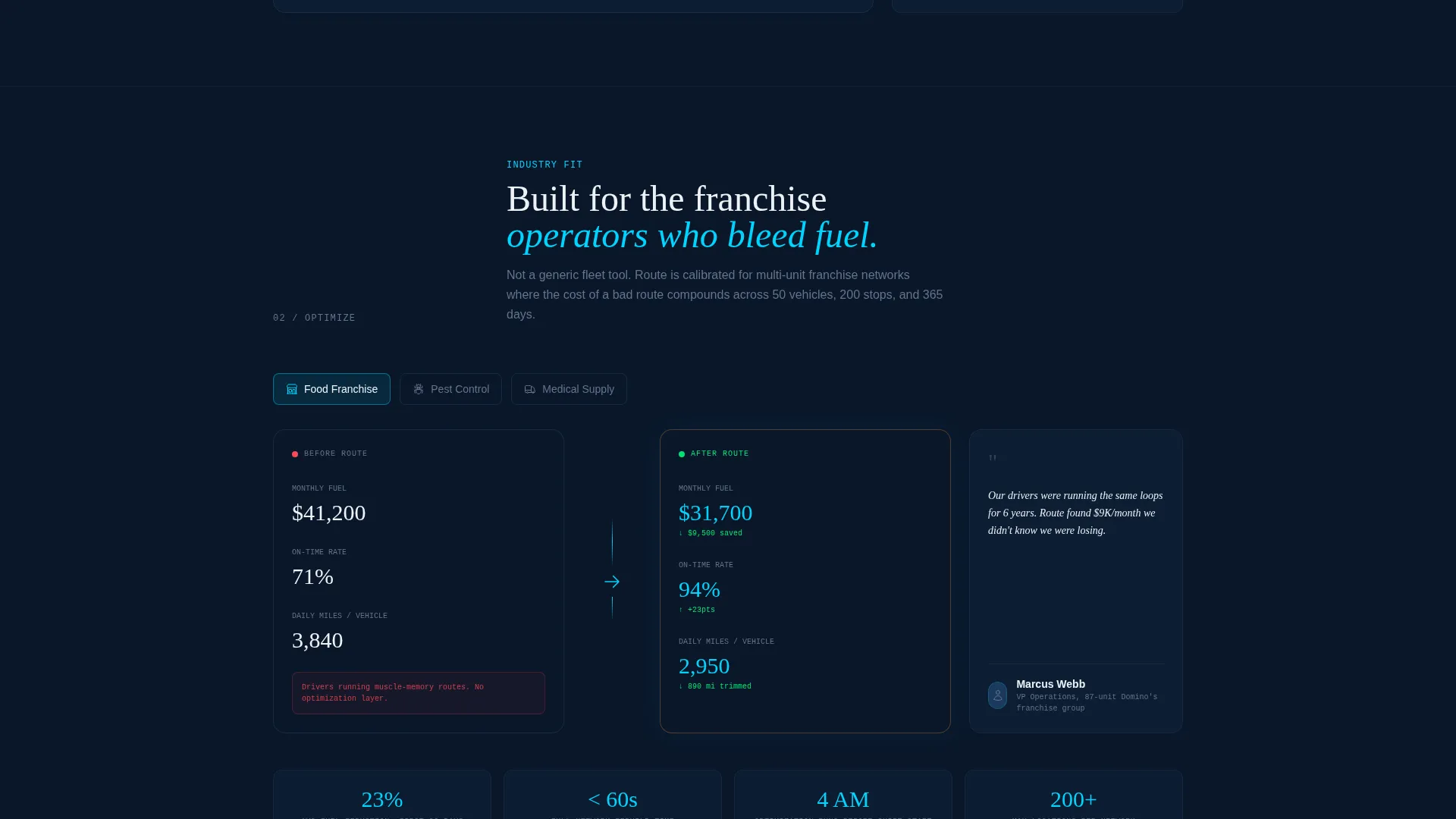
This template is categorized under Technology, specifically within the Franchise Software subcategory and the Franchise Route Optimization niche. It is well suited for teams building or marketing platforms that serve regional franchise groups in industries such as food delivery, pest control, and medical supply distribution.
- The template style is Hub and Spoke with anchor navigation, classified as a single landing page, not a multi-page website
- The creative direction is Interactive Explorer, meaning the page is built to demonstrate rather than describe
- The header concept is Product Screenshot at hero scale, which aligns with the principle that no lifestyle imagery appears on the page
- The landing page direction is App Download, driving visitors toward iOS and Android installs as the single primary conversion goal
Theme
Startup Velocity
Creative direction
Interactive Explorer
Color system
Midnight Blue
Style
Hub & Spoke (Anchor Nav)
Direction
App Download
Page Sections
Hero-scale Product Screenshot Header
Hub and Spoke Anchor Navigation
Interactive Demo Sections
Persistent App Download Call to Action Bar
Zip Code Territory Preview
Midnight Blue Visual Identity System
Related questions
Can I use this template without an interactive map already built?
Is this template only for food delivery franchises?
How does the zip code territory preview section work?
Can the anchor navigation labels be customized?
Does the template include placements for both iOS and Android store links?



