Specialist Insurance Digital Presence Cost Estimator Website Template
Underwrite is a dashboard-style insurance course and training landing page built for aspiring agents who need to pass their licensing exam without wasting time or money. The template leads with interactive tools, a premium calculator, an exam simulator, and a progress tracker, all wrapped in a dark Tech Glass visual identity that feels engineered, not decorated.
by Rocket studio
Quick summary
Underwrite is a single-page insurance course and training platform template. It uses a Dashboard and Data Grid layout to demonstrate real tools before asking visitors to commit. The header opens with a Feature Tab Switcher showing three live previews. Every scroll section does something, it calculates, quizzes, or visualizes progress, building conviction through interaction rather than narration.
Who this template is for
This template is built for insurance educators and course creators who need to convert skeptical, budget-conscious learners. The target student is practical and time-poor. They need to see proof before they pay.
- Career-changers studying between work shifts who want efficient, simulation-based preparation
- Captive agents adding new lines of authority, such as Property and Casualty or Life and Health
- Recent graduates aiming to pass their state licensing exam on the first attempt
What problem this template solves
Most insurance prep course pages read like textbooks. They list features, explain syllabi, and ask for credit card details before proving any value. Visitors bounce because they have no reason to trust the product.
- The page fails to demonstrate the tool, so visitors have no emotional proof the course works
- Long narration blocks push the call to action too far down, losing career-changers who are browsing on a phone between shifts
- A generic design signals a generic course, undermining confidence in learners who cannot afford to fail their exam
What you get with this template
You get a fully structured, single-page landing page designed to earn downloads through demonstration. Every section is a working visual that shows the product in motion.
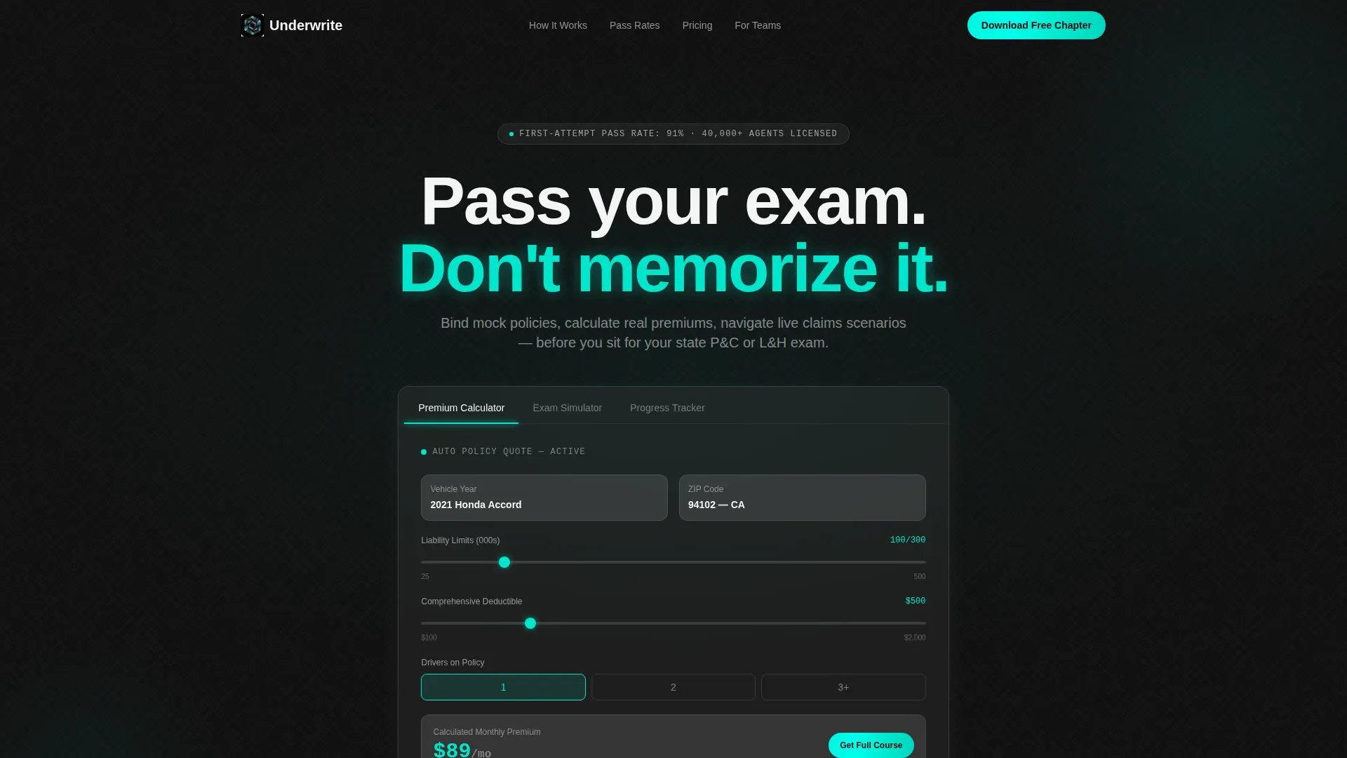
- A Feature Tab Switcher header with three glass-panel previews: Premium Calculator, Exam Simulator, and Progress Tracker
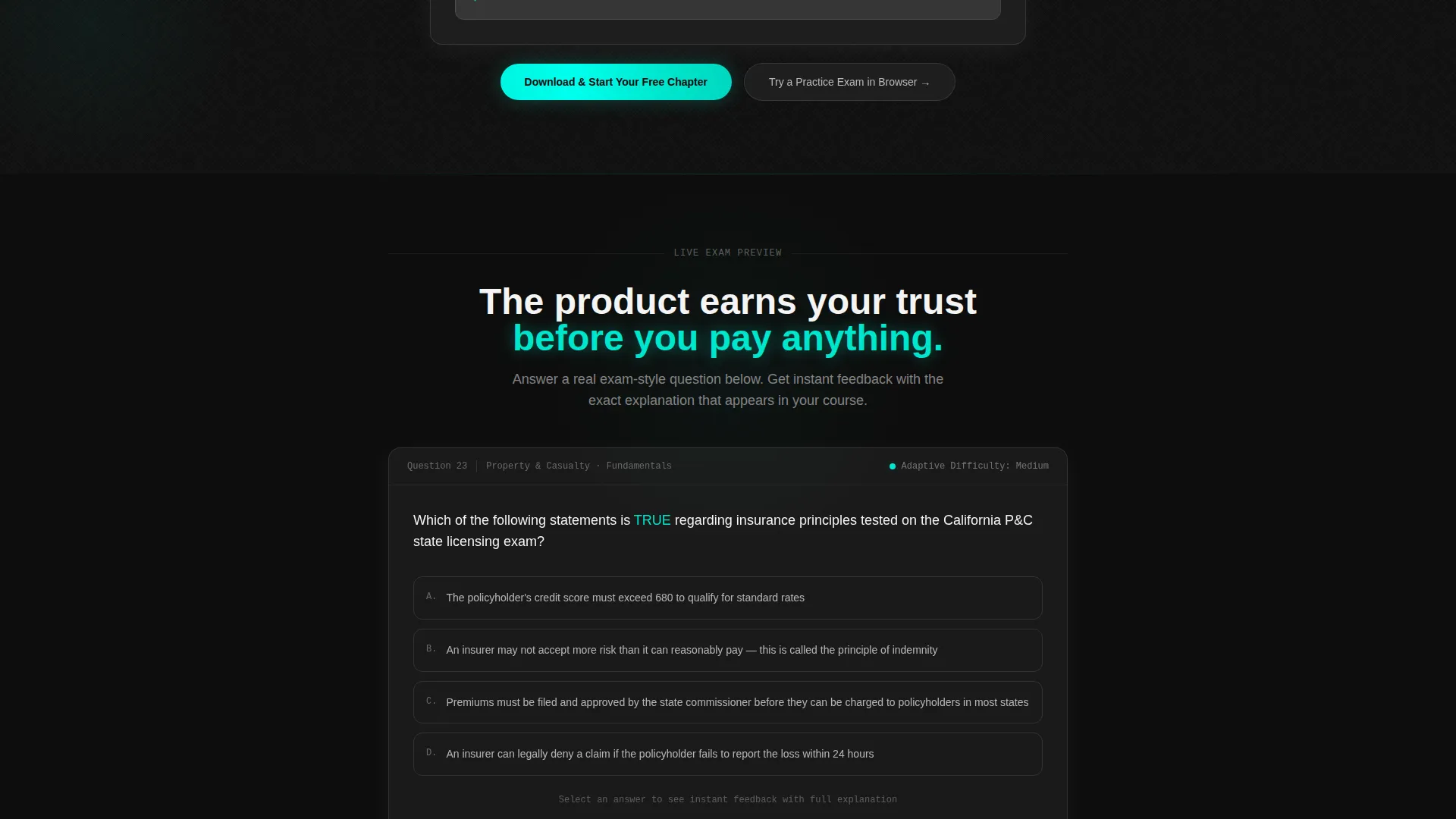
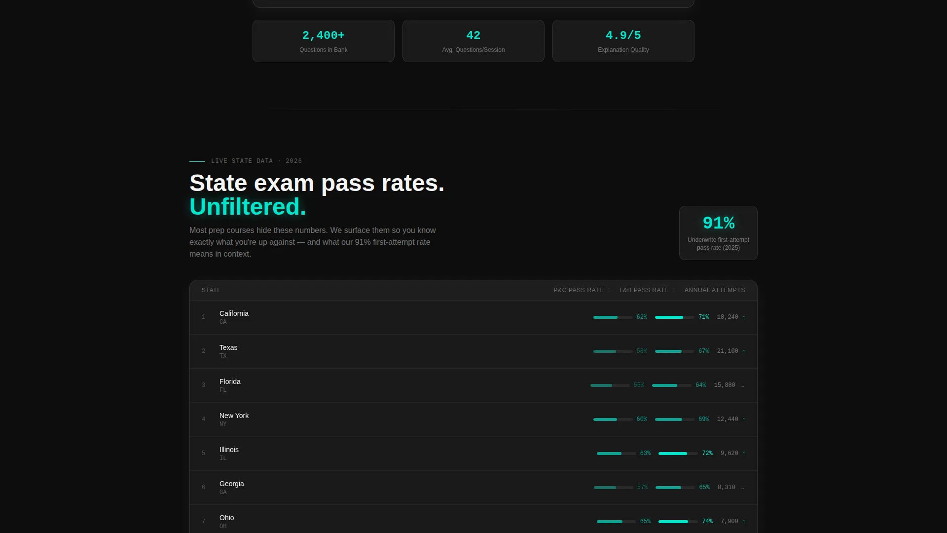
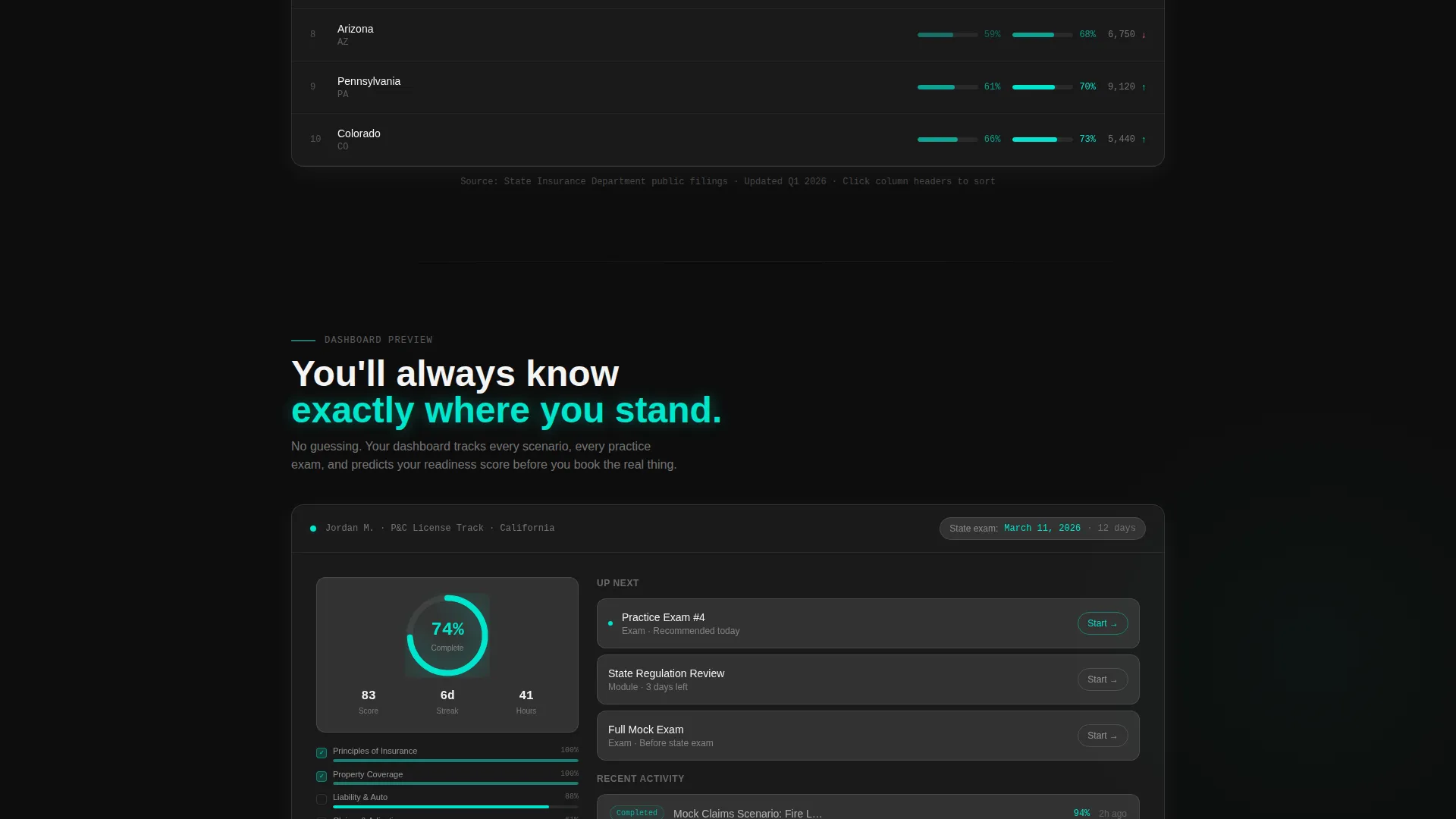
- A live exam-style question block with instant feedback, a state-by-state pass rate data grid, and a 74%-completion progress dashboard mockup
- A dual conversion path: a primary app download flow with platform selector and a secondary browser-based practice exam that captures email on submission
Feature list
This template includes purpose-built components that reflect the product they represent. Each one earns attention by doing something visible and useful.
Interactive Feature Tab Switcher Header
Three clickable glass tabs sit at the top of the page. Each tab reveals a different live interface preview below it. The default view shows a partially completed auto policy quote with liability limits, deductible sliders, and a calculated monthly premium displayed in electric teal. A thin teal underline slides between active tabs, and each tab shifts depth on hover using frosted-glass styling.
Live Premium Calculator Preview
The header calculator panel places a partially built insurance quote directly in front of the visitor. Liability limits and deductible sliders are visible mid-use. The calculated monthly premium glows in teal. A "Download and Start Your Free Chapter" call to action sits inside this panel, making the download feel like a natural next step after seeing the tool work.
Exam Simulator Question Block
Below the header, a functioning multiple-choice question demonstrates the exam simulator in action. The sample question covers insurable interest, a core licensing topic. Instant feedback appears on selection, showing visitors exactly how the learning experience feels before they commit to downloading.
State Pass Rate Data Grid
A structured data grid displays real pass rates organized by state and exam type. This section builds credibility through specificity. Visitors can scan actual numbers rather than reading marketing claims, which is exactly the kind of proof that converts a skeptical career-changer browsing late at night.
Progress Dashboard Mockup
A visual progress dashboard shows a learner at 74% course completion with two practice exams remaining. This mockup makes the learning journey tangible. Visitors can picture themselves inside the product, which reduces the psychological distance between browsing and committing.
Dual Conversion Path with Platform Selector
The primary call to action triggers a platform selector offering iOS, Android, and Desktop options. A single field collects a phone number or email to send the install link. A secondary path invites visitors to try a practice exam directly in the browser, capturing email on submission without requiring a download first.
Page sections overview
| Section | Purpose |
|---|---|
| Feature Tab Switcher | Demonstrates three core tools via interactive glass tabs |
| Premium Calculator Panel | Shows a live quote mid-use with embedded download call to action |
| Exam Question Block | Lets visitors experience a real multiple-choice question with instant feedback |
| Pass Rate Data Grid | Displays state-by-state pass rates to establish credibility through data |
| Progress Dashboard Mockup | Visualizes learner completion status to make the product journey feel real |
| App Download Call to Action | Triggers platform selector and collects contact detail to deliver install link |
| Secondary Browser Path | Offers a practice exam in-browser to capture emails from non-download visitors |
| Mobile Persistent Bar | Keeps the primary download call to action visible at the bottom on mobile screens |
Design & branding system
The visual identity follows a Tech Glass theme built on a Carbon Fiber color system. The palette is engineered to recede so the tool content commands full attention.
- Core colors: deep cockpit black (#0D0D0D) and woven carbon gray (#1A1A2E) for backgrounds, frosted glass panel (#E8EAF0 at 85% opacity) for card surfaces, and electric teal (#00E5CC) reserved for active states, progress indicators, and data callouts
- Typography uses clean white (#F4F4F4) for all body and heading text, with teal applied only to interactive moments and highlighted data points
- Backgrounds layer dark tones with glass-morphism card treatment, so each section feels like a distinct instrument panel on a dark dashboard
Mobile & speed optimization
The template is designed with mobile-first conversion behavior built directly into the layout. The heaviest conversion lift happens on small screens where career-changers browse between shifts.
- A persistent bottom bar keeps the "Download and Start Your Free Chapter" call to action fixed on mobile viewports throughout the scroll
- The platform selector (iOS, Android, Desktop) and single-field contact capture are structured for fast one-thumb completion on a phone screen
- Glass-morphism cards keep each section visually contained so the page remains scannable on narrow viewports without feeling cluttered
How this template helps you convert
The page is built around a Calculator and Tool First creative direction, which means every section earns trust before it asks for anything. Conversion happens through demonstration, not persuasion.
- The header tab switcher puts a working tool in front of the visitor immediately, replacing skepticism with firsthand experience before any scroll happens
- The exam question block and pass rate data grid provide social and empirical proof mid-scroll, addressing the core fear that the course might not be worth the investment
- The dual call-to-action structure gives every visitor a next step that matches their readiness, whether they want to download the app now or try a practice exam first
Other information about this template
This template is categorized under Technology with a subcategory focus on Insurance Digital Presence. It is purpose-built for the Insurance Course and Training Platform niche, where trust and demonstrated utility are the primary conversion drivers.
- The template style is Dashboard and Data Grid, making it well suited for any edtech or professional certification platform that relies on data visualization and interactive previews to convert visitors
- The Tech Glass theme and Carbon Fiber color system give the page a technical, premium feel that positions the course as a serious professional tool rather than a cheap cram guide
- The intersection of a simulation-heavy curriculum and a tool-first landing page design means the page and the product share the same promise: you learn by doing, not by reading
Theme
Tech Glass
Creative direction
Calculator/Tool First
Color system
Carbon Fiber
Style
Dashboard/Data Grid
Direction
App Download
Page Sections
Feature Tab Switcher Header
Live Premium Calculator Panel
Exam Simulator Question Block
State Pass Rate Data Grid
Progress Dashboard Mockup
Dual Conversion Path with Platform Selector
Related questions
Who is this landing page template designed for?
Can I customize the calculator and exam question sections?
What makes this template different from a standard course landing page?
Does the template support both app download and browser-based conversion paths?
Is this template suitable for a Property and Casualty or Life and Health exam prep platform?



