Beauty Referral Matching Landing Page Template
Salonmatch is a split-screen beauty referral landing page template built for services that connect clients with vetted stylists. It features a live-styled matching dashboard, an industry-data-driven scrolling layout, and a three-step progressive form. The design uses a Carbon Fiber color system to feel polished, modern, and conversion-ready from the first scroll.
by Rocket studio
Quick summary
Salonmatch is a single-page referral matching template for beauty and salon services. It combines a dashboard-style hero, data-driven storytelling columns, and a side-by-side comparison table into one cohesive layout. The result is a landing page that earns trust through specificity and moves visitors toward a personalized salon referral request.
Who this template is for
This template is built for founders, marketers, and product teams running beauty-focused referral or discovery services. It speaks directly to the clients those platforms serve and converts them through structured, credible content.
- Referral platform operators who match clients with stylists, colorists, or estheticians
- Beauty service marketers targeting newly relocated professionals, brides, or clients recovering from a bad treatment
- Teams launching or promoting a salon discovery and recommendation service
What problem this template solves
Finding a trusted stylist in a new city or after a poor experience is stressful and time-consuming. Word-of-mouth alone rarely delivers the right match fast enough. This template addresses that friction head-on by presenting algorithmic matching as a smarter, faster alternative.
- Visitors searching for a balayage specialist or a last-minute rescue appointment need immediate credibility signals
- Generic salon directories offer no proof of quality, wait times, or rebooking rates
- Without a clear conversion path, high-intent visitors leave before submitting their referral request
What you get with this template
You get a fully structured, single-page layout designed around the specific flow of a beauty referral service. Every section has a defined job, from building authority with data to capturing leads through a progressive form.
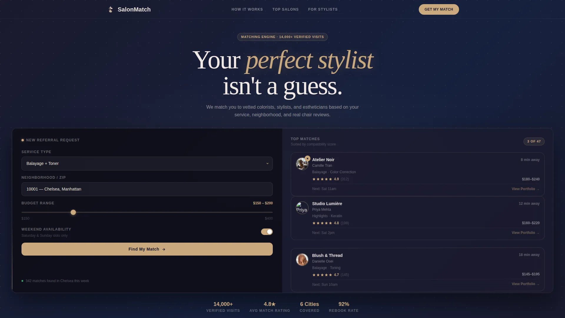
- A split-screen hero with a realistic referral matching dashboard mockup on the right panel
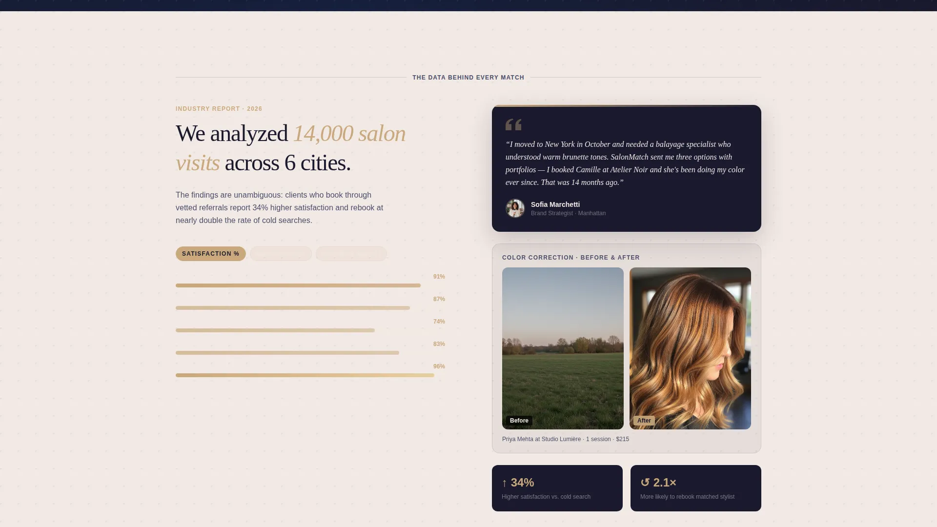
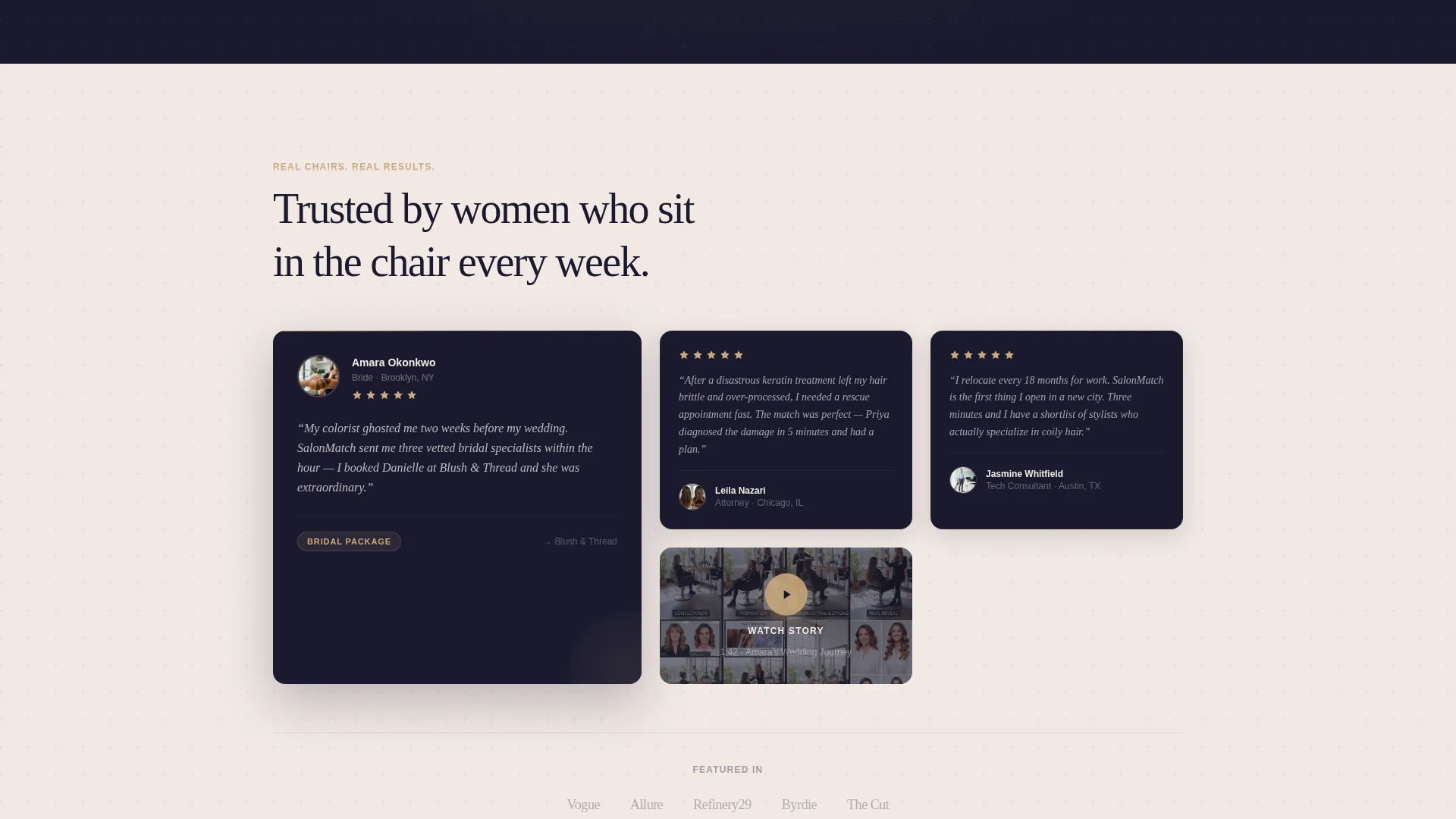
- A scrolling two-column section pairing industry statistics with personal testimonials and before/after visuals
- A comparison table, a three-step progressive form, and a secondary zip-code micro-form for lower-intent visitors
Feature list
This template ships with purpose-built components that reflect how real referral platforms earn and convert visitors.
Split-Screen Dashboard Hero
The header divides into two equal panels. The left panel shows a client request form mid-completion, with a service dropdown set to "Balayage + Toner," a zip code field, a budget slider, and a weekend availability toggle. The right panel displays three matched salon cards with stylist headshots, rosé gold star ratings, distance badges, and a "View Portfolio" hover link.
Industry Report Scroll Layout
The body uses a two-column scrolling structure. The left column presents hard data, including bar charts covering average wait times, rebooking rates, and client satisfaction by service category, all anchored by a headline citing 14,000 analyzed salon visits across six cities. The right column runs parallel human stories: a bride's pull quote, a before/after color correction series, and a testimonial video thumbnail.
Comparison Table Conversion Engine
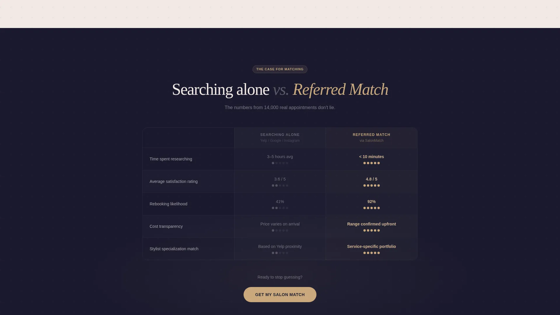
A visible side-by-side table scores "Searching Alone" against "Referred Match" across four criteria: time spent researching, average satisfaction rating, rebooking likelihood, and cost transparency. This section does the persuasion work so the call-to-action feels like a logical conclusion rather than a hard sell.
Three-Step Progressive Form
The primary conversion path is a three-screen form that collects information gradually. The first screen asks for service type and preferred neighborhood. The second screen captures budget range and scheduling urgency. The third screen collects the visitor's email for personalized referral email delivery.
Secondary Micro-Form Path
A low-commitment conversion option sits below the primary call-to-action. Visitors who are not ready to commit can enter only their zip code and land in the salon directory without filling out the full form. This catches lower-intent traffic before it exits.
Rosé Gold Call-to-Action System
Every clickable surface uses rosé gold (#C9A87C) as a deliberate visual signal. The primary call-to-action button reads "Get My Salon Match" in rosé gold on a graphite background. Star ratings and active hover states share the same accent, creating a consistent visual language that guides the eye toward action throughout the page.
Page sections overview
| Section | Purpose |
|---|---|
| Split-Screen Hero | Display the referral matching dashboard mockup and frame the service instantly |
| Client Request Form | Capture service type, zip code, budget, and availability preferences |
| Matched Salon Cards | Show vetted stylist results with ratings, distance, and portfolio links |
| Industry Data Column | Present market statistics to establish credibility and platform authority |
| Human Stories Column | Balance data with testimonials, before/after visuals, and a video thumbnail |
| Comparison Table | Contrast unguided searching with a referred match across four scored criteria |
| Primary call to action Block | Drive submissions through the three-step progressive referral form |
| Secondary Micro-Form | Offer a zip-code-only entry point for lower-intent browsing visitors |
Design & branding system
The template uses a Carbon Fiber color system built for a beauty-tech audience that values precision and warmth in equal measure. Deep graphite and pearl alternate as section backgrounds, while rosé gold acts as the sole accent across interactive elements.
- Color palette: deep graphite black (#1A1A2E), brushed titanium gray (#4A4E69), pearl highlight (#F2E9E4), and rosé gold (#C9A87C) reserved for calls-to-action, star ratings, and hover states
- Typography lives in titanium gray for body text, with rosé gold drawing the eye to every clickable or interactive surface
- The overall aesthetic follows a Directory and Discovery theme: clean, technical, and modern with warmth introduced through the accent color and human-story content blocks
Mobile & speed optimization
The split-screen layout is designed with stacked mobile behavior in mind, so the dashboard hero, data columns, and form steps each reflow cleanly on smaller screens.
- The 50/50 split panels collapse into a single-column stack on mobile, keeping the form and matched cards readable without horizontal scrolling
- The three-step progressive form breaks a long data-collection process into short, focused screens that feel manageable on a phone
How this template helps you convert
The page is structured as a deliberate persuasion sequence, moving a skeptical visitor from curiosity to form submission through layered proof and a frictionless entry point.
- The dashboard hero creates immediate context. Visitors see a realistic matching interface rather than abstract marketing copy, which sets accurate expectations and builds trust within the first scroll.
- The comparison table removes the final objection. By scoring "Searching Alone" against "Referred Match" on concrete metrics, the template gives visitors a rational reason to act before the call-to-action appears.
Other information about this template
This template is categorized under Technology with a subcategory focus on Beauty and Salon Email Templates. It is purpose-built for the Beauty and Salon Referral Request Email niche and carries an intersection match score of 13, reflecting strong alignment between the template style and the niche's conversion needs.
- The creative direction follows an Industry Report structure, pairing quantitative data with personal proof in a format that builds authority progressively
- The header concept is a Dashboard Preview, meaning the hero functions as a working visual of the product rather than a decorative banner
- The landing page direction is Comparison/Versus, a format well suited to services that need to justify a new behavior against an existing habit
- The template style is Split Screen (50/50), and the theme is Directory and Discovery, both of which reinforce the sense that visitors are entering a curated, expert-led environment
Theme
Directory & Discovery
Creative direction
Industry Report
Color system
Carbon Fiber
Style
Split Screen (50/50)
Direction
Comparison/Versus
Page Sections
Split-screen Dashboard Hero
Industry Report Scroll Layout
Comparison Table Conversion Engine
Three-step Progressive Form
Secondary Zip-code Micro-form
Rosé Gold Call-to-action System
Related questions
Who is the ideal user of this template?
Can I adapt the form steps to capture different information?
Does the template include real salon data or placeholder content?
What makes this different from a standard salon directory template?
Is the secondary micro-form meant to replace the main form?



