Document Processing Landing Page Template
Parse is a B2B artificial intelligence document processing landing page template built for enterprise SaaS platforms. It uses a Problem-to-Solution comparison table structure, a real-time metrics header, and a Carbon Fiber visual identity to show prospects exactly how much manual document processing is costing them and why switching is a measurable decision.
by Rocket studio
Quick summary
Parse is a single-page landing page template for enterprise AI document processing platforms. It opens with a live stats wall, moves through a Problem-to-Solution comparison table, and closes with two conversion paths. The design runs on a Carbon Fiber color system with electric cyan accents. Every section is built to quantify pain and make the switch feel inevitable.
Who this template is for
This template is built for B2B SaaS companies selling intelligent document processing to enterprise buyers. It speaks directly to teams buried in manual data entry and compliance risk.
- Operations directors managing large-scale invoice and purchase order backlogs
- Procurement leads reconciling vendor data across multiple enterprise resource planning systems
- Compliance officers who need audit-ready extraction logs on tight deadlines
What problem this template solves
Legacy optical character recognition tools and manual review workflows create measurable, compounding problems. Buyers already know something is broken; they just need to see the numbers.
- No side-by-side comparison to show the true cost of manual processing versus automated extraction
- No conversion path that feels like a diagnostic rather than a sales pitch
- No visual structure that quantifies error rates, per-document cost, and compliance risk in one place
What you get with this template
You get a fully structured landing page that guides enterprise buyers from recognizing their pain to requesting a benchmark. Every section has a defined job.
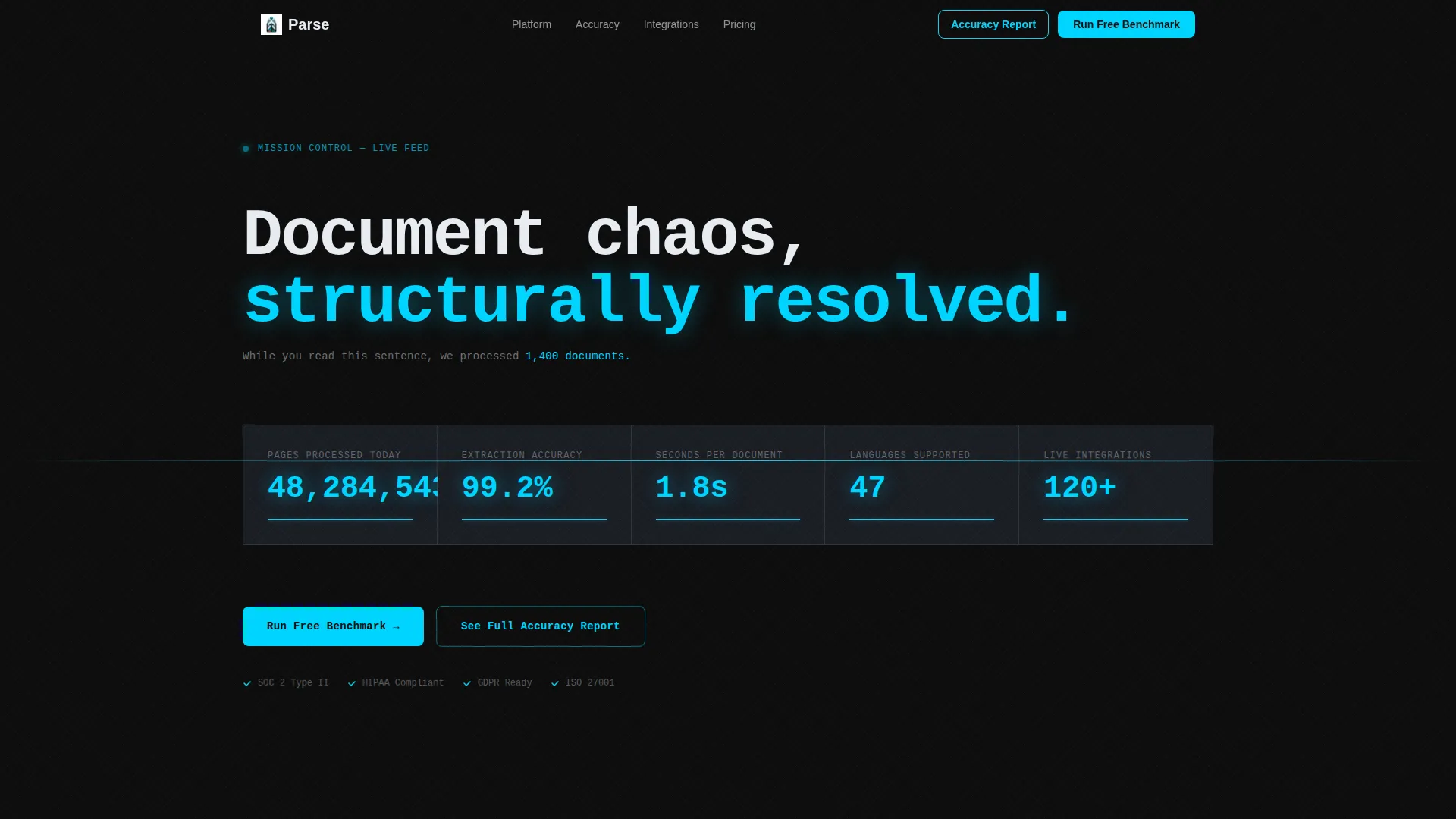
- A five-counter metrics header that displays live processing statistics in a monospaced typeface with electric cyan glow
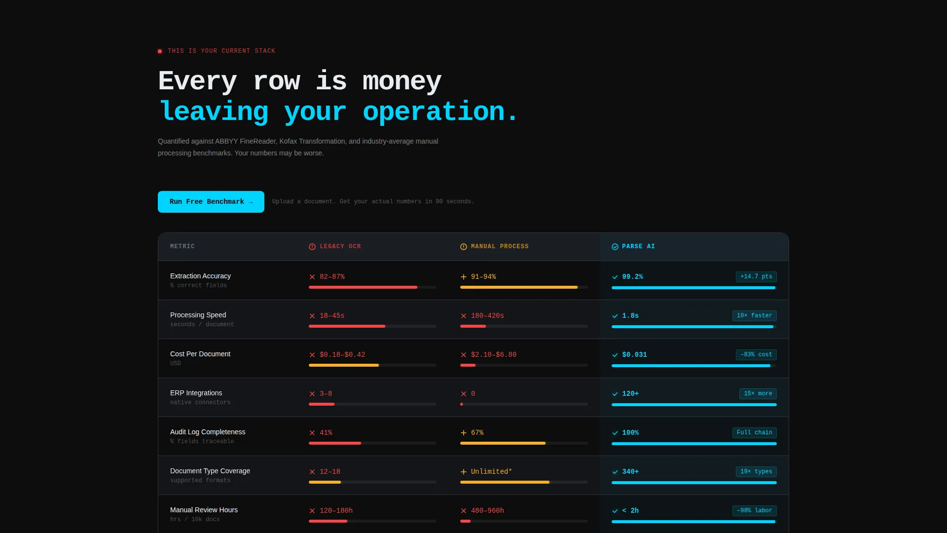
- A multi-column comparison table with animated bar charts, red-flag legacy metrics, and cyan checkmark improvements
- Two conversion paths: a two-step benchmark form and a gated accuracy report behind a work email field
Feature list
This template ships with purpose-built sections and interaction patterns drawn directly from the source brief. Each component earns its place by moving the visitor closer to a conversion.
Live Stats and Metrics Header
Five independently animating counters sit against pure carbon black. They display pages processed today, average extraction accuracy, seconds per document, languages supported, and integrations live. A single anchor line beneath reads: "While you read this sentence, we processed 1,400 documents." The numbers do the talking before a single feature is listed.
Problem-to-Solution Comparison Table
The table opens with the legacy column filled with red flags: manual review hours, error rates, per-document cost, integration count, and compliance gap risk. The second column then illuminates with Parse metrics, cyan checkmarks, and percentage improvements. Animated bar charts fill as each row scrolls into view, turning the comparison into a small victory per row.
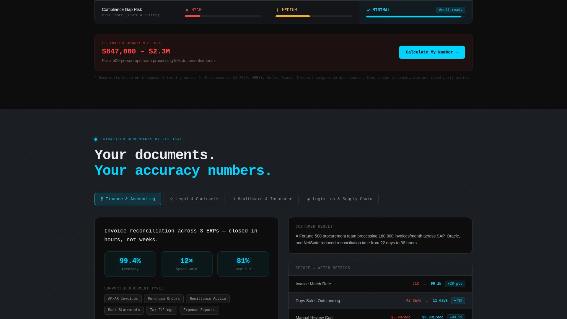
Vertical-Specific Use Case Toggle
Visitors can toggle between finance, legal, healthcare, and logistics verticals. Each selection surfaces its own extraction accuracy benchmarks and a return-on-investment calculator. This keeps the comparison table relevant to the specific buyer reading it rather than showing generic claims.
Floating Benchmark Call to Action
The primary call to action, "Run a Free Benchmark," sits at the top of the comparison table and pins as a floating bar once the visitor scrolls past it. The click opens a two-step form: select a current solution from a dropdown, then upload a sample document or paste a public filing URL.
Gated Accuracy Report Path
A secondary conversion path offers "See the Full Accuracy Report" behind a minimal gate: work email and document vertical only. No phone number, no company size field. The friction is intentional and low, making the report feel like a useful diagnostic rather than a lead-capture trap.
Carbon Fiber Visual Identity System
The design uses deep carbon black, woven graphite panel surfaces, translucent glass white text, and electric cyan as the sole accent color. Crosshatch background textures evoke actual carbon weave. Cyan appears only on numbers, checkmarks, and percentage lifts, reserving its visual weight for moments of proof.
Page sections overview
| Section | Purpose |
|---|---|
| Stats Metrics Header | Anchor attention with five live processing counters and a single proof statement |
| Legacy Stack Table | Show red-flag metrics for manual processing and legacy optical character recognition tools |
| Parse Metrics Column | Illuminate improvements with cyan checkmarks and animated bar chart fills |
| Vertical Toggle Module | Let visitors filter by finance, legal, healthcare, or logistics for relevant benchmarks |
| ROI Calculator Row | Quantify the quarterly cost gap between current stack and Parse |
| Floating Benchmark Bar | Keep the primary call to action visible as a pinned bar after the visitor scrolls |
| Two-Step Benchmark Form | Collect current solution selection and a sample document or public filing URL |
| Gated Accuracy Report | Offer a secondary conversion behind work email and document vertical fields |
Design & branding system
The visual identity is built on a Tech Glass theme using a Carbon Fiber color system. Every color decision is deliberate and load-bearing.
- Deep carbon black (#0D0D0D) as the base background, woven graphite (#1A1D23) for surface panels, and translucent glass white (#E8ECF1) for all body text
- Electric cyan (#00D4FF) reserved exclusively for interactive states, progress indicators, counter glows, checkmarks, and numerical proof points
- Subtle crosshatch background texture layered across sections to evoke an actual carbon weave material
Mobile & speed optimization
The template is structured for clean reflow across viewport sizes. Interaction-heavy sections adapt without losing their hierarchy.
- The comparison table collapses into a scannable vertical layout on smaller screens so no row data is lost
- Animated counters and bar charts are scoped to scroll-trigger events, keeping the page responsive as section after section loads in
How this template helps you convert
This template is engineered around a single insight: enterprise buyers convert when they see their own problem quantified before being asked for anything. Every layout decision follows that logic.
- The metrics header establishes immediate platform credibility with live counters before any feature copy appears, anchoring trust in real numbers rather than marketing claims.
- The comparison table structure shows the visitor their current pain in specific, measurable terms, then resolves it row by row with Parse's metrics, making the decision feel analytical rather than emotional.
- Two conversion paths serve two buyer stages: the benchmark form captures action-ready prospects, while the gated accuracy report captures researchers who need more proof before committing.
Other information about this template
This template was designed specifically for the AI document processing SaaS category, where buyers are skeptical of vague capability claims and respond to benchmarks, accuracy rates, and cost-per-document comparisons.
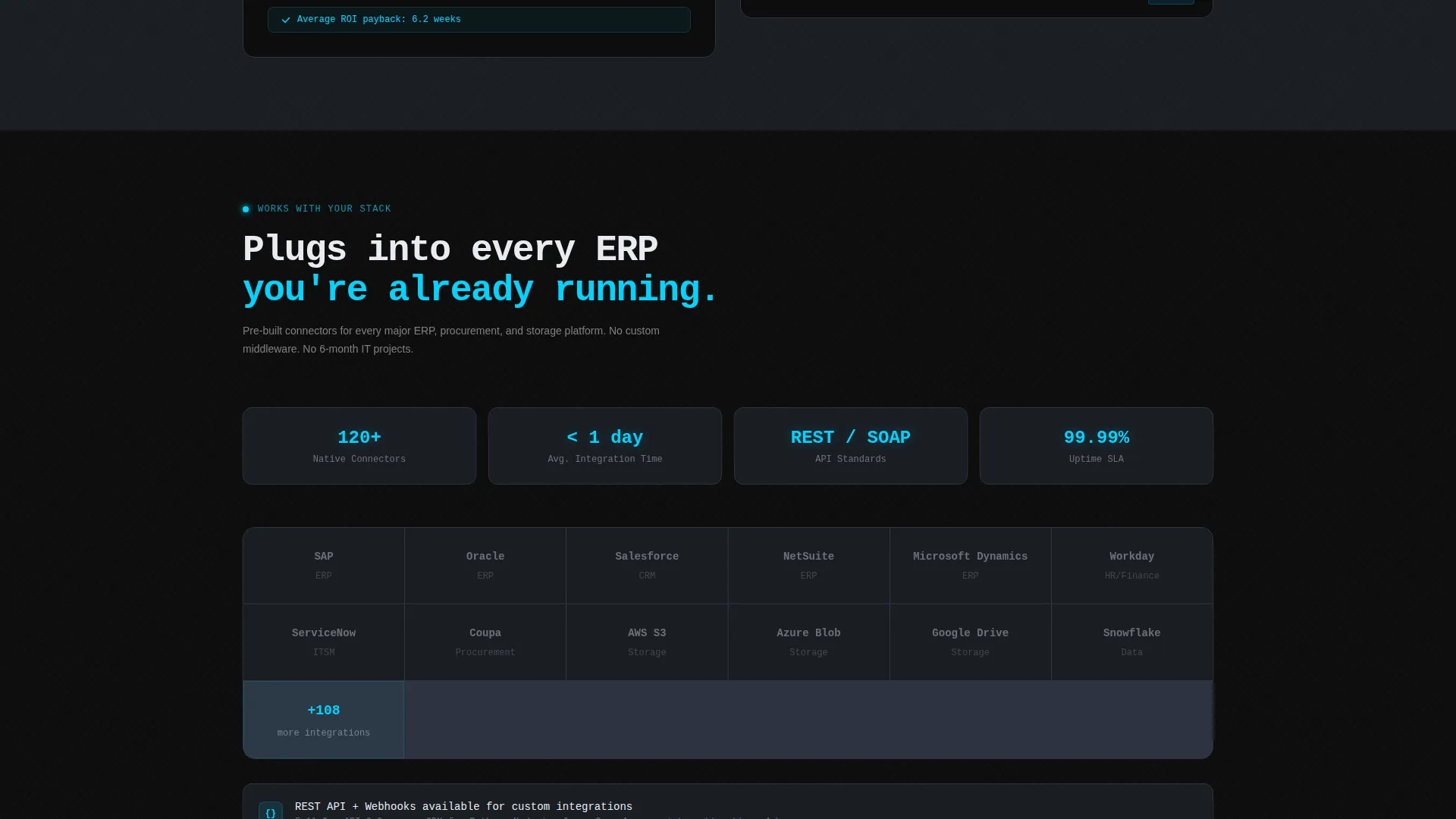
- The template is categorized under Technology and the AI for SaaS B2B subcategory, making it a strong fit for platforms competing in intelligent document processing, structured data extraction, and automated classification markets
- The comparison table structure is well suited for teams positioning against legacy optical character recognition software or manual review workflows, where side-by-side data wins the argument
- The vertical toggle and return-on-investment calculator rows make this template reusable across sales cycles targeting different enterprise departments without requiring a full redesign
Theme
Tech Glass
Creative direction
Problem→Solution Arc
Color system
Carbon Fiber
Style
Comparison Table
Direction
Comparison/Versus
Page Sections
Live Processing Stats Header
Problem-to-solution Comparison Table
Vertical-specific Toggle and ROI Calculator
Two-step Benchmark Conversion Form
Gated Accuracy Report Path
Carbon Fiber Visual Identity
Related questions
Can I adapt the comparison table for my specific document types?
What does the two-step benchmark form collect?
Do I need to use all four vertical toggle options?
How does the floating call-to-action bar work?
Is this template suitable for platforms that handle multiple document formats?



