SaaS Booking & Scheduling Landing Page Template
Schedule is a card-grid landing page template built for SaaS booking and scheduling platforms targeting B2B teams. It pairs a cinematic dashboard hero with a rapid-fire comparison grid, turning feature gaps into visual arguments. The Carbon Fiber color system and modular layout give operations-focused buyers an immediate sense of clarity, control, and product confidence before they ever speak to sales.
by Rocket studio
Quick summary
Schedule is a single-page, modular landing page template designed for SaaS booking and scheduling products. It opens with a live-feel dashboard preview, accelerates into a comparison card grid, and converges on a value-driving primary call to action. The dark Carbon Fiber palette and electric cyan accents create an interface that feels purposeful from the first scroll.
Who this template is for
This template is built for B2B SaaS teams who need to communicate a clear scheduling advantage over existing tools. It speaks directly to buyers who feel the daily cost of fragmented booking systems.
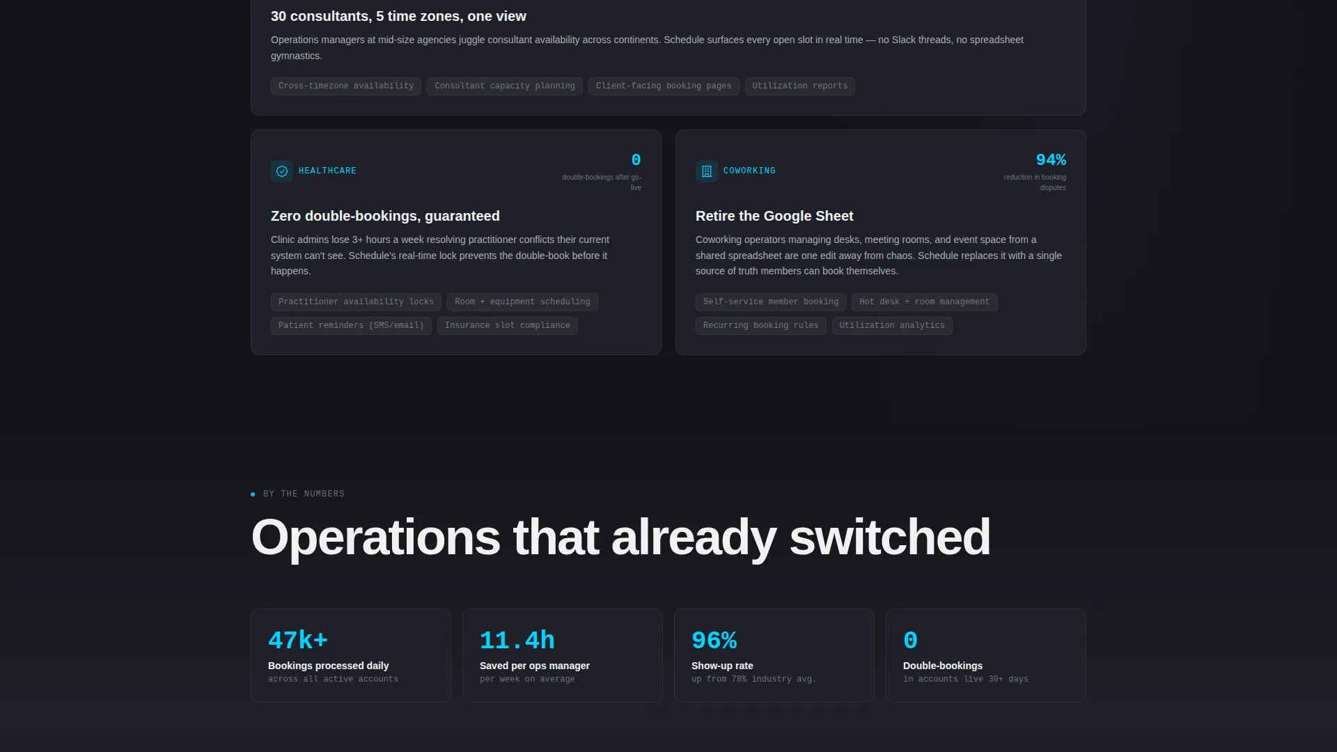
- Operations managers at mid-size agencies coordinating large consultant teams across multiple time zones
- Clinic administrators managing practitioner availability without real-time visibility into scheduling gaps
- Coworking space owners currently running bookings from a shared spreadsheet with no live conflict detection
What problem this template solves
Scheduling software buyers often arrive with skepticism. They have tried calendar tools, spreadsheet workarounds, and basic booking links, and none of them solved the underlying problem. This template makes the case visually and structurally before a single sales call happens.
- Visitors cannot see how a product is better than what they already use without a direct, side-by-side comparison
- Generic SaaS landing pages list features without connecting them to real operational pain
- Buyers need a quick win before they commit to a demo or a conversation
What you get with this template
This template delivers a complete, modular landing page structure ready to represent a B2B scheduling platform. Every section is designed to move a skeptical buyer one step closer to converting.
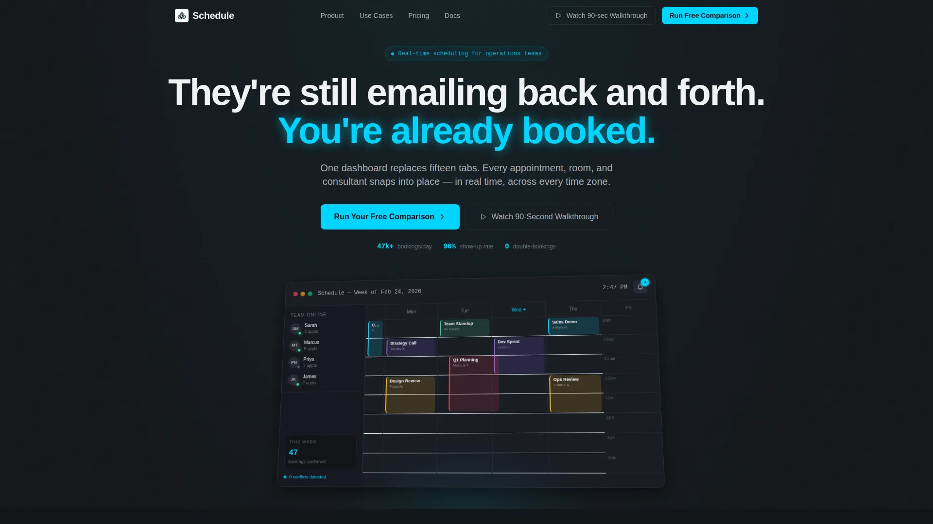
- A full-width dashboard hero section with an isometric product preview already populated with realistic booking data
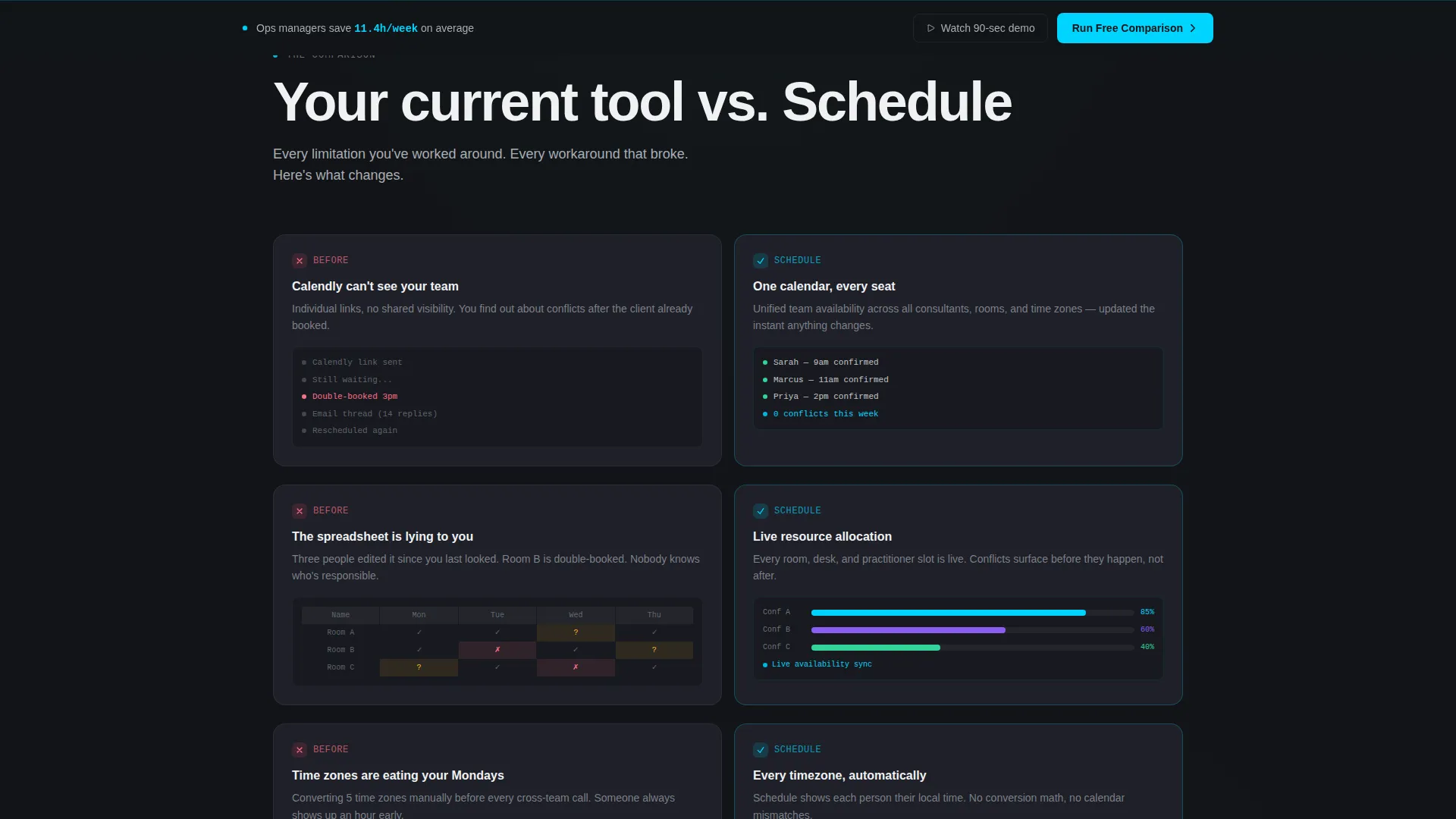
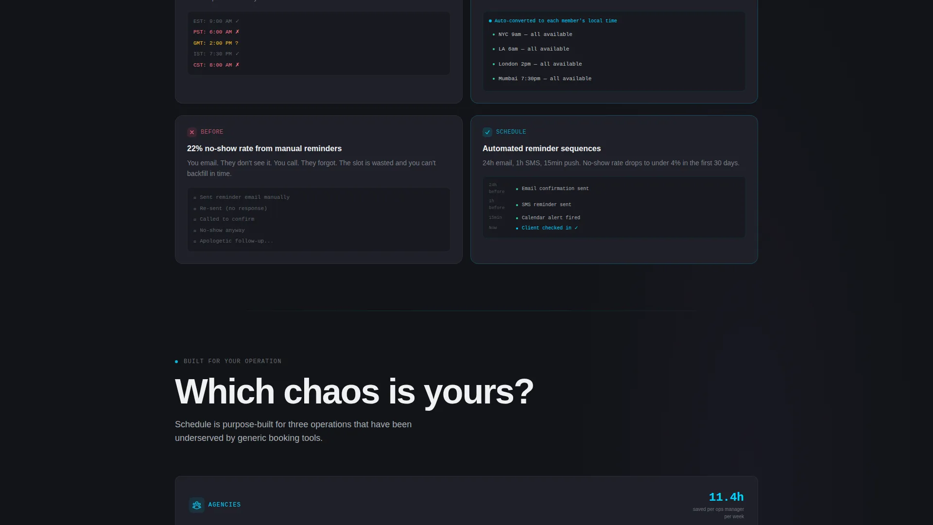
- A modular versus card grid where each pair contrasts a competitor pain point with the platform solution
- A two-field interactive qualifier that generates a personalized comparison card showing feature gaps and estimated hours saved
Feature list
This template packages its persuasive structure into six distinct functional components. Each one serves a specific role in moving a B2B buyer from awareness to action.
Isometric Dashboard Hero
The header opens with a product preview rendered at a slight isometric angle against pure carbon black. The interface shows color-coded appointment blocks, a team sidebar with live availability indicators, and a notification badge. A cursor mid-drag communicates motion and product confidence immediately.
Comparison Card Grid
Cards appear in pairs across a modular grid. The left card presents a competitor pain point in muted graphite with a static visual. The right card answers it in electric cyan trim with an animated micro-interaction. The pacing accelerates as the grid converges toward a single unified dashboard card.
Interactive Comparison Qualifier
The primary call to action opens a two-field form. The visitor selects their current scheduling tool from a dropdown and sets team size on a slider. Submitting instantly surfaces a personalized comparison card with feature gaps and an estimated weekly time saving, delivering real value before any sales contact.
Sticky Conversion Bar
After the first scroll, a sticky bottom bar appears and repeats the primary call to action. It stays visible throughout the browsing session, keeping the conversion path available without interrupting the reading experience.
Ghost Button Secondary Path
A quieter secondary conversion option sits in the header as a ghost button. It invites visitors to watch a ninety-second product walkthrough, giving motion-first buyers a lower-commitment entry point into the product story.
Headline and Copy System
The headline "They're still emailing back and forth. You're already booked." sets a versus tone from the first visible moment. Section headlines get shorter and sharper as the grid accelerates, matching the visual rhythm of the layout and reinforcing the launch energy direction.
Page sections overview
| Section | Purpose |
|---|---|
| Dashboard Hero | Opens with isometric product preview and headline |
| Headline Fade-In | Delivers the versus-tone primary value statement |
| Comparison Card Grid | Pairs competitor pain with platform solution per card |
| Convergence Full-Width Card | Unifies all solved problems in one dashboard visual |
| Primary call to action Block | Houses the "Run Your Free Comparison" action trigger |
| Comparison Qualifier Form | Two-field input generating a personalized comparison card |
| Personalized Result Card | Displays feature gaps and estimated hours saved instantly |
| Sticky Bottom Bar | Repeats primary call to action after first scroll throughout page |
| Ghost Button Walkthrough | Offers ninety-second video path for cautious buyers |
Design & branding system
The Carbon Fiber color system gives this template its cockpit-at-night atmosphere. Every surface is intentional, every glowing element earns its brightness against the dark.
- Core palette: deep carbon black (#121417) for backgrounds and card surfaces, graphite panel gray (#1E2028) for layered panel separation, brushed aluminum (#A8ADB5) for body text and secondary labels, signal white (#F0F1F3) for punchy headlines, and electric cyan (#00D4FF) for hover states, toggle switches, and primary buttons
- Visual elevation is created through subtle graphite layering rather than shadows, giving the layout a matte, purposeful depth that feels like a professional operations interface
Mobile & speed optimization
The modular card grid is built to reflow cleanly across screen sizes. Versus card pairs stack vertically on smaller viewports without losing the left-right comparison logic.
- The isometric dashboard hero scales proportionally, keeping the product preview readable and visually impactful on tablet and mobile
- The sticky bottom bar adapts its height for touch targets, keeping the primary call to action consistently accessible on all devices
How this template helps you convert
This template structures every scroll as a deliberate step toward conversion. The layout does not wait for visitors to find the value. It delivers it at each stage.
- The dashboard hero creates immediate product credibility by showing the interface in motion rather than in a static mockup pose, capturing buyer attention before a single word is read
- The comparison card grid translates abstract feature advantages into direct visual contrasts, making the product case without requiring the visitor to read dense copy
- The interactive qualifier gives buyers a personalized output before any sales interaction, lowering the psychological barrier to the next conversion step
Other information about this template
This template is built within the Dashboard Pro theme using the Card Grid (Modular) structure and the Launch Energy creative direction. It is designed for SaaS B2B digital presence in the booking and scheduling niche, with a Comparison/Versus landing page direction.
- The Dashboard Preview header concept positions the product as already-in-use rather than hypothetical, which is especially effective for buyers evaluating replacements for tools like Calendly, Acuity Scheduling, or Google Calendar
- The template style supports a clean swap of placeholder copy, dashboard screenshots, and comparison data to match any scheduling platform's specific positioning
- The intersection of Carbon Fiber visuals and B2B SaaS messaging gives this template a distinct identity that separates it from lighter, consumer-facing booking page styles
Theme
Dashboard Pro
Creative direction
Launch Energy
Color system
Carbon Fiber
Style
Card Grid (Modular)
Direction
Comparison/Versus
Page Sections
Isometric Dashboard Hero Section
Versus Comparison Card Grid
Two-field Comparison Qualifier
Sticky Bottom Conversion Bar
Ghost Button Walkthrough Path
Launch Energy Copy and Pacing System
Related questions
Who is this landing page template designed for?
Can I customize the comparison cards for my own product?
What does the interactive qualifier section do?
How does the sticky bottom bar work in this template?
Is this template suited for a single product or a multi-product platform?



