Healthcare AI Content Writer Landing Page Template
Scribe is a Bold Brutalist healthcare AI content writer landing page built as a dashboard and data grid. It combines an interactive text-generation preview with a scrolling comparison table, showing pharma brand managers, medcomm agency leads, and hospital marketing directors exactly how AI-powered copy outpaces traditional medical writing workflows.
by Rocket studio
Quick summary
Scribe is a single-page, dashboard-style landing page for a healthcare AI content writing tool. It opens with a live text-generation interface and scrolls into a comparative data grid. The design follows a Bold Brutalist theme with an Acid Digital color system. Every section is built to make one argument clearly: the old way of producing healthcare copy is too slow.
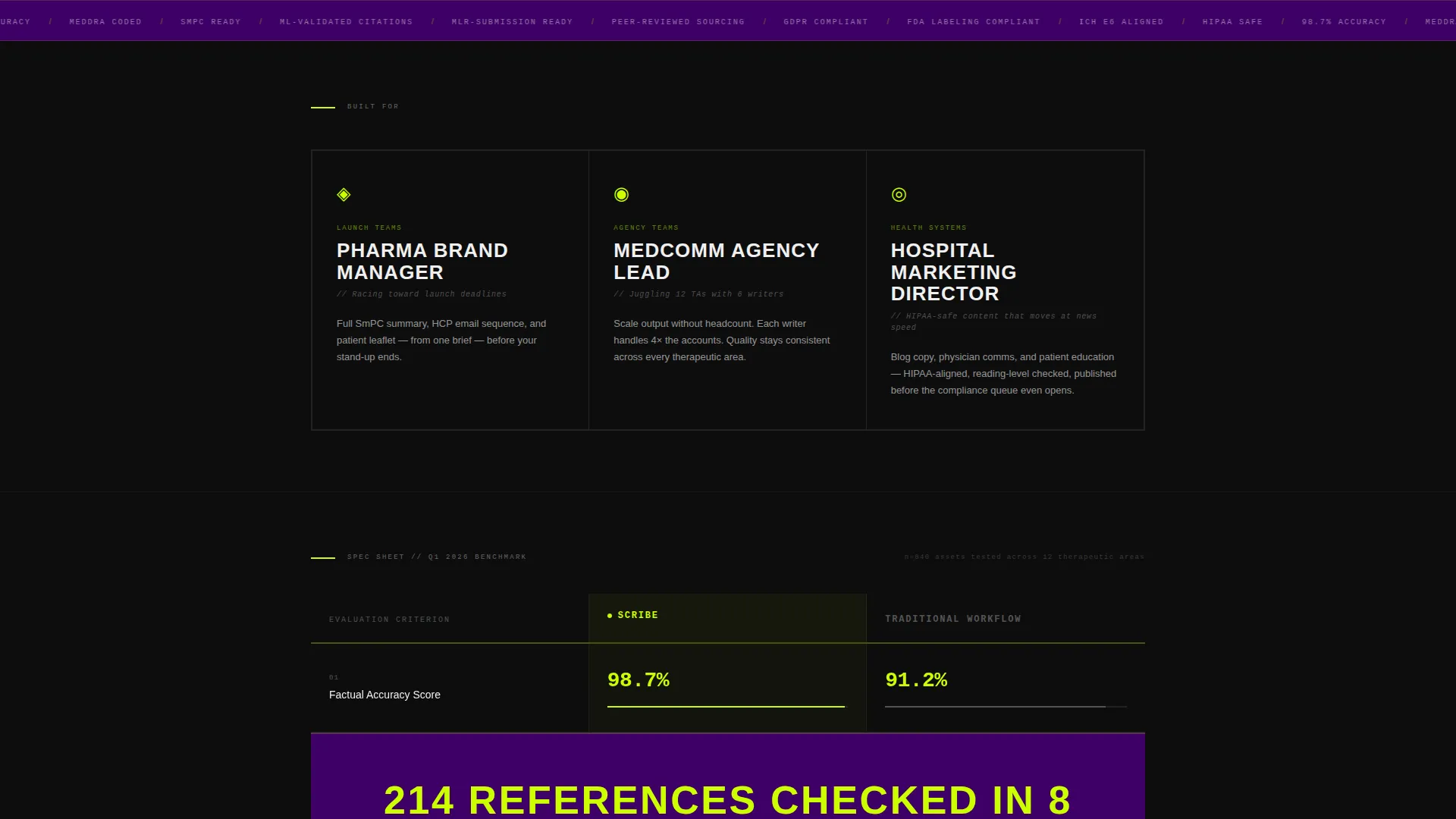
Who this template is for
This template is built for teams that produce regulated, clinical, or patient-facing content under tight deadlines. If your output includes mechanism-of-action descriptions, patient information leaflets, or health professional communications, this template speaks your language.
- Pharma brand managers racing toward product launch deadlines
- Medcomm agency leads managing multiple therapeutic areas with lean writing teams
- Hospital marketing directors who need compliant blog content without long review cycles
What problem this template solves
Healthcare content production is slow by default. Clinical accuracy requirements, citation needs, and compliance reviews create a bottleneck that no editorial calendar can easily absorb. The gap between "we need this copy" and "this copy is ready" costs time, money, and momentum.
- Writers spend hours formatting and sourcing before a single sentence is drafted
- Review cycles outlast the relevance of the content being reviewed
- Teams cannot scale output without scaling headcount proportionally
What you get with this template
You get a complete, conversion-focused landing page that positions an AI healthcare writing tool against traditional workflows. The layout is opinionated, data-forward, and built for a specific buyer who respects evidence over storytelling.
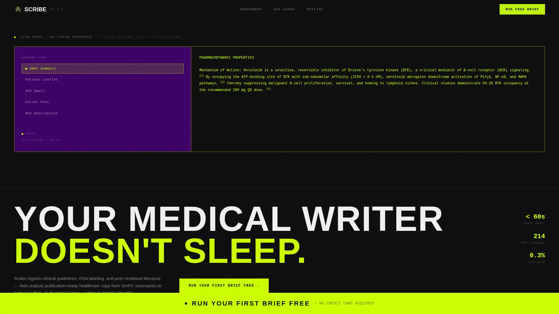
- An interactive header with a live streaming text-generation demo embedded in the viewport
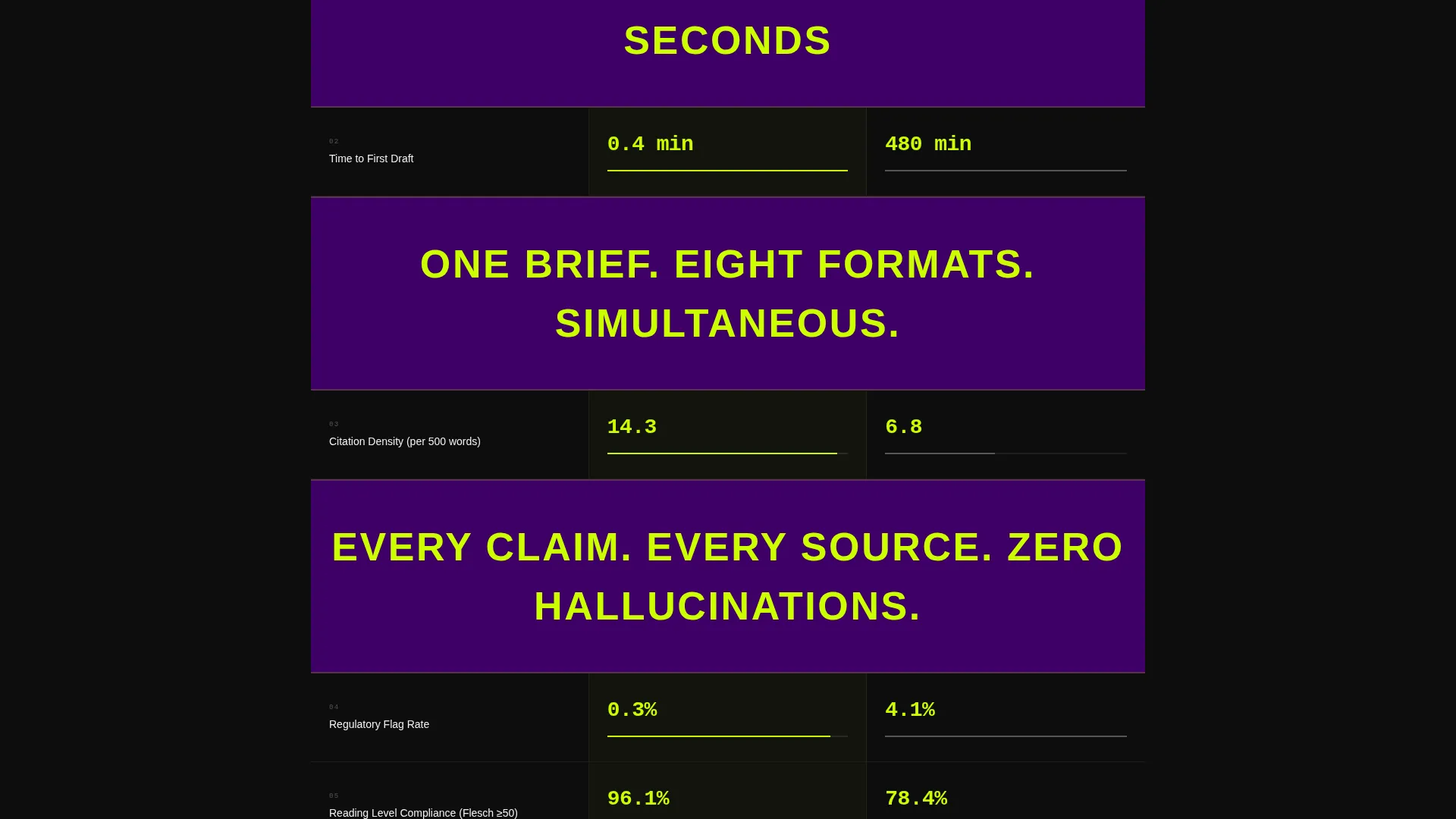
- A scrolling comparison data grid with count-up animations and full-width callout statements
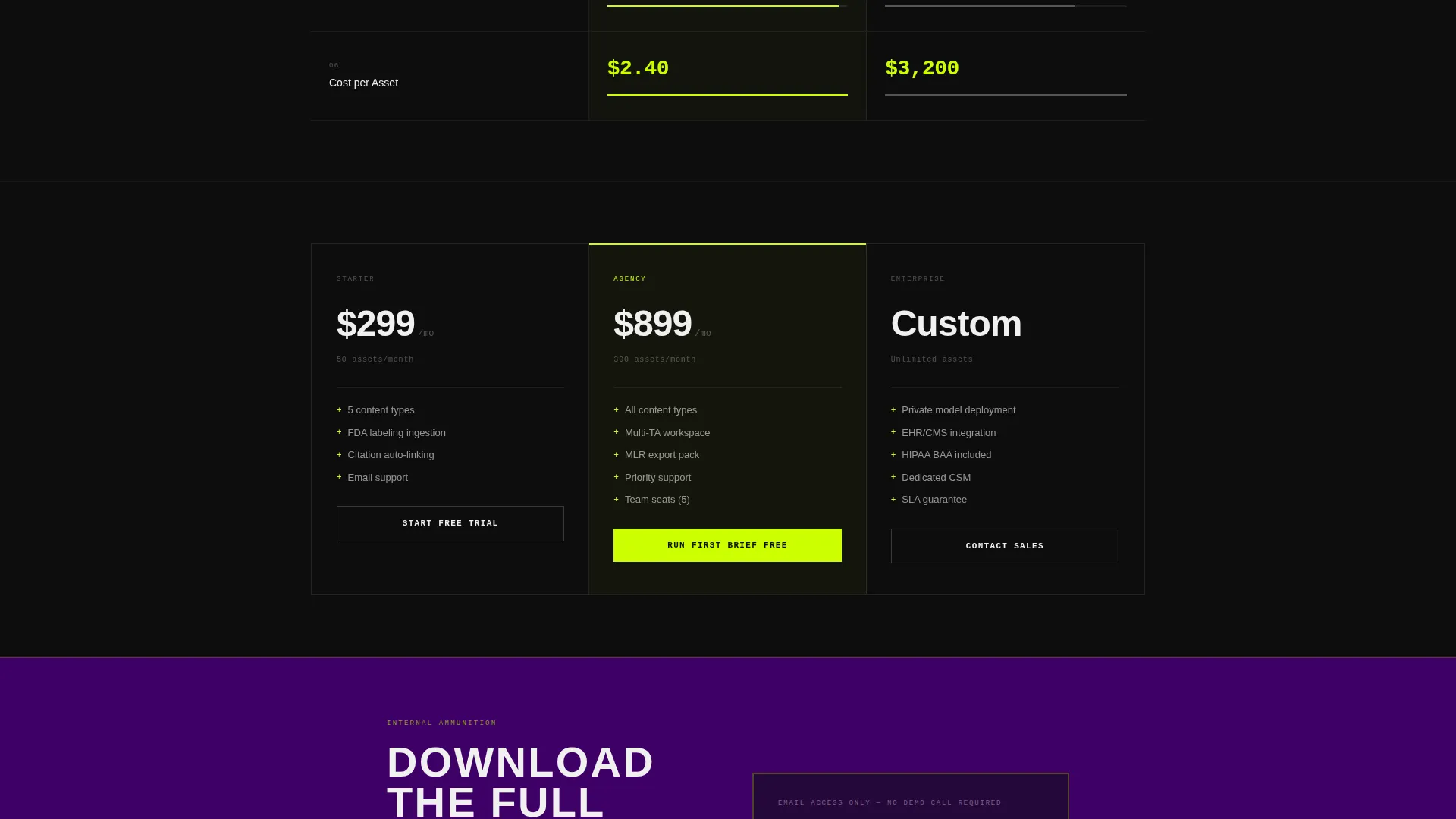
- A brutalist call-to-action bar, a qualification modal, and a gated benchmark PDF section
Feature list
This template includes the following built-in sections and interactive components.
Live Text-Generation Header
The header embeds a functioning content-type selector on the left and a streaming output panel on the right. Selecting a content type triggers a character-by-character text animation in chartreuse on black, complete with inline citation brackets that respond on hover. The product demonstrates itself before a visitor reads a single marketing line.
Comparative Data Grid
The core of the page is a spec-sheet-style table comparing Scribe against a traditional writing workflow across rows like accuracy score, time-to-draft, citation density, regulatory flag rate, reading-level compliance, and cost per asset. Numbers animate upward with count-up effects as each row enters the viewport.
Full-Width Brutalist Callouts
Between data grid sections, single-sentence statements span the entire page width. These act as rhythm breaks, letting each evidence cluster land before the next grid loads. They reinforce the data argument without adding narrative weight.
Sticky Conversion Bar
A full-width chartreuse call-to-action bar first appears after the third data row, then locks to the bottom of the viewport on continued scroll. It stays visible throughout the rest of the page, keeping the primary action within reach at every moment.
Qualification Modal
Clicking the primary call-to-action opens a focused modal with a therapeutic area selector, a content type dropdown, a brief description field, and an email input. The form is deliberately minimal to reduce friction and let the product experience serve as qualification.
Gated Benchmark Download
The terminal section of the page offers a downloadable comparison document for visitors who need internal evidence before committing to a trial. It is gated behind email only, with no additional form fields required.
Page sections overview
| Section | Purpose |
|---|---|
| Interactive Preview Header | Demonstrate the AI writing tool live inside the viewport |
| Brutalist Hero Headline | Anchor the core product promise in bold condensed type |
| Data Grid Row 1 | Compare accuracy score between Scribe and traditional workflow |
| Data Grid Row 2 | Compare time-to-draft and citation density metrics |
| Data Grid Row 3 | Compare regulatory flag rate and reading-level compliance |
| Full-Width Callouts | Provide rhythm breaks between data grid sections |
| Sticky call to action Bar | Keep the primary conversion action visible throughout scroll |
| Qualification Modal | Capture intent with minimal friction on click |
| Benchmark PDF Section | Gate a comparison document behind email for late-stage buyers |
Design & branding system
The visual identity follows a Bold Brutalist theme executed through an Acid Digital color palette. The result feels like a live terminal display in a biotech research environment, every element stripped to its functional purpose.
- Core palette: void black (#0D0D0D) as the dominant background, toxic chartreuse (#CCFF00) for accents and live-state indicators, clinical white (#F0F0F0) for body text and data cells, and deep ultraviolet (#3D0066) for secondary panels and hover states
- Typography splits into two registers: monospaced typefaces where data and output appear, and grotesque sans-serif where human-readable copy lives
- All borders are 2px solid with 0px corner radius; backgrounds alternate between void black and deep ultraviolet to create visual depth without decorative elements
Mobile & speed optimization
The template is designed with a mobile-first layout approach so the data grid and interactive header remain readable and functional across screen sizes.
- The comparison grid reflows to a stacked single-column layout on smaller viewports, keeping row labels and values legible without horizontal scrolling
- The sticky call-to-action bar adapts its height and touch target size for mobile users so the primary action remains accessible throughout the scroll experience
How this template helps you convert
Every structural decision in this template is oriented toward moving a skeptical, evidence-driven buyer from scroll to action.
- The live text-generation demo in the header removes abstraction immediately. A visitor sees the product working before they read a single claim, which builds credibility faster than any testimonial block.
- The comparison data grid accumulates evidence row by row with count-up animations, so by the time a visitor reaches the call-to-action bar their objections have been addressed numerically rather than narratively.
- The two-path conversion structure serves buyers at different stages: the low-friction modal captures ready buyers instantly, while the gated benchmark PDF gives hesitant buyers internal justification material without requiring a sales call.
Other information about this template
This template is part of a curated set built for the technology and AI for healthcare category. It is particularly well-suited for teams exploring AI-powered medical writing tools as an alternative to fully manual content pipelines.
- The template style is Dashboard and Data Grid, making it a strong fit for data-forward product positioning in regulated industries
- The Comparison and Versus landing page direction is built into the layout structure, so no redesign is needed to present a head-to-head product argument
- The Spec Sheet creative direction means the page persuades through accumulated evidence rather than emotional narrative, which aligns with how clinical and pharmaceutical buyers evaluate new tools
- The template is ready to use as a starting point for any healthcare AI writing product that needs to demonstrate speed, accuracy, and compliance readiness to a professional audience
Theme
Bold Brutalist
Creative direction
Spec Sheet
Color system
Acid Digital
Style
Dashboard/Data Grid
Direction
Comparison/Versus
Page Sections
Live Text-generation Preview Header
Comparative Spec-sheet Data Grid
Full-width Brutalist Callout Statements
Sticky Primary Conversion Bar
Minimal Qualification Modal
Gated Benchmark Download Section
Related questions
What type of buyer is this landing page designed for?
Can I change the content types shown in the interactive header?
Is the comparison data grid editable?
What is the gated benchmark PDF section for?
Does the sticky call-to-action bar appear on mobile as well?



