Bento Grid Creator Marketplace Landing Page Template
Scroll is a bento grid landing page template built for social media template marketplaces targeting content creators. It features a glassmorphic Tech Glass visual identity, a tab-switching header, animated template previews, and a sticky app download bar. Everything is pre-animated and editable in-app, designed for TikTok editors, Instagram managers, and YouTube thumbnail designers who need to move fast.
by Rocket studio
Quick summary
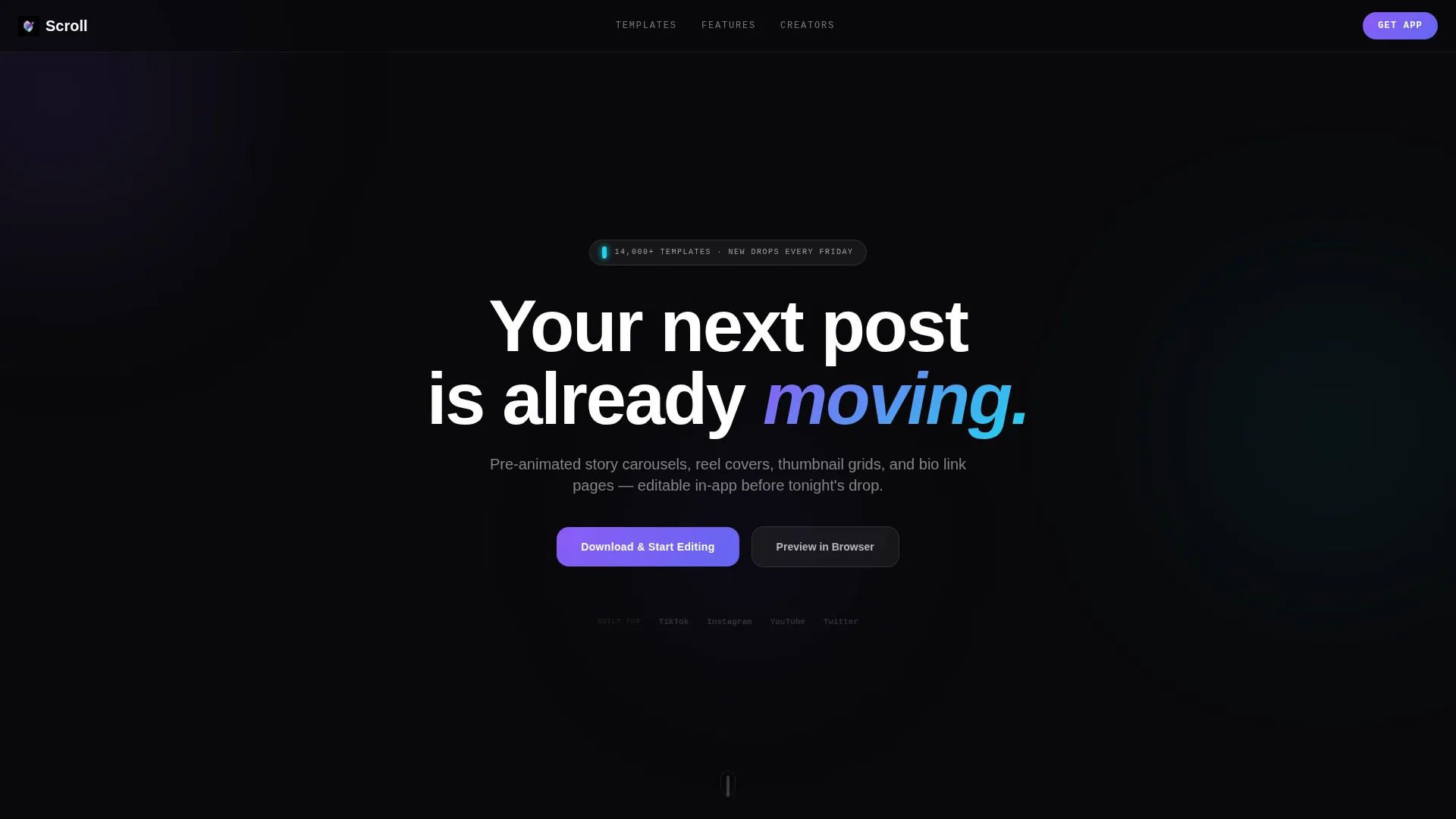
Scroll is a single-page bento grid template built for creator-focused social media kit marketplaces. It ships with a Feature Tab Switcher header, animated glass card previews, and a persistent app download bar. The design uses a void-black glassmorphic system with electric violet and neon cyan accents. Pre-animated content across every section means visitors see real templates in motion before they ever tap the download button.
Who this template is for
This template is built for teams and individuals running high-volume creative operations where speed and visual credibility matter equally.
- TikTok editors preparing assets before an album launch or campaign drop
- Instagram account managers handling multiple talent accounts simultaneously
- YouTube thumbnail designers who need scroll-stopping visuals built and ready fast
What problem this template solves
Content creators and their teams waste hours assembling social media assets from scratch. They need a marketplace page that communicates value instantly, before a visitor loses interest.
- Static previews fail to show how animated templates actually behave in a real editing session
- Creators hesitate to download an app without first seeing that the templates work for their format
- Marketplace pages built on generic layouts cannot match the energy or pace of a creator's workflow
What you get with this template
You get a fully structured bento grid landing page with every major section pre-built and visually coherent out of the box. Nothing requires you to source animations, mock up devices, or build layout logic from scratch.
- A Feature Tab Switcher header with three tabs, Stories, Reels, and Thumbnails, each loading a different live bento grid of template previews below
- A floating phone mockup showing a template being edited with a finger-drag gesture, always visible center-right in the hero area
- A sticky frosted bottom bar with primary and secondary calls to action that appear after the first scroll
Feature list
This section covers what the template delivers structurally and visually, drawn directly from the design brief.
Tab-Driven Bento Grid Header
Three glass-panel tabs labeled Stories, Reels, and Thumbnails sit horizontally across the viewport. Clicking any tab swaps the entire bento grid below with a different arrangement of live template previews for that format. The active tab glows at its edge in electric violet, giving visitors an immediate visual cue about where they are.
Animated Template Card Grid
Six template cards fill the default Stories bento arrangement in an asymmetric layout mixing tall and square proportions. Each card loops a three-second animation of the template in active use. Visitors experience the product before reading a single line of copy.
Floating Phone Mockup with Gesture Preview
A phone mockup floats center-right in the hero area with a live screen showing the selected template being edited via a finger-drag gesture. This component reinforces the in-app editing angle and grounds the animated cards in a familiar device context.
Capability Cluster Rows
Below the header, each bento grid row demonstrates a specific capability: animation presets, color-matching tools, font pairing, and platform auto-resizing. Each cluster holds two to four glass cards of varying sizes. Every card contains a micro-interaction, a color wheel spinning, a font stack shuffling, a template snapping between aspect ratios, so each tile proves the feature rather than describing it.
Sticky App Download Bar
A frosted bottom bar with the primary call to action "Download & Start Editing" pins itself to the viewport after the first scroll. App Store and Google Play badges flank the button. A secondary "Preview in Browser" option loads three free templates in a web editor for visitors who are not yet ready to install.
Glassmorphic Visual System
Every surface uses the void-black base (#09090B), frosted panel cards at 8% opacity with a 12-pixel blur, and 1-pixel luminous borders. Electric violet (#8B5CF6) marks interactive states. Neon cyan (#22D3EE) activates on hover and active indicators. Violet-to-cyan gradients appear exclusively on buttons and toggles during interactive moments.
Page sections overview
| Section | Purpose |
|---|---|
| Tab Switcher Header | Lets visitors filter template previews by format |
| Stories Bento Grid | Showcases animated story carousel templates |
| Reels Bento Grid | Displays reel cover templates on tab switch |
| Thumbnails Bento Grid | Presents thumbnail grid templates on tab switch |
| Phone Mockup Hero | Shows in-app editing with a gesture animation |
| Animation Presets Row | Demonstrates available motion preset options |
| Color Matching Row | Previews the color-matching tool via micro-interaction |
| Font Pairing Row | Shows font stack intelligence with a shuffle animation |
| Auto-Resize Row | Illustrates platform resizing from 9:16 to 1:1 |
| Sticky Download Bar | Drives installs with primary and secondary calls to action |
Design & branding system
The visual identity is built around a Tech Glass aesthetic, dark, recessive backgrounds with frosted layers that catch light and refract color only where interaction happens. The palette is disciplined and intentional.
- Base surfaces use void black (#09090B) with frosted panel cards at 8% white opacity and a 12-pixel Gaussian blur, bordered by 1-pixel luminous lines
- Electric violet (#8B5CF6) marks active states and tab indicators; neon cyan (#22D3EE) is reserved strictly for hover states and live toggles
- Body text is pure white (#FAFAFA) throughout; violet-to-cyan gradients appear only on interactive elements like buttons and active toggles
Mobile & speed optimization
The bento grid layout and sticky bottom bar are structured to work within a single-scroll mobile viewport. The template is designed with thumb-driven interaction patterns in mind from the start.
- The sticky frosted download bar remains visible after the first scroll, keeping the primary action reachable without requiring the visitor to scroll back up
- The floating phone mockup and tab-switching grid are sized and positioned to remain legible and functional on smaller screen breakpoints
- Micro-interactions inside capability cluster cards are lightweight enough to run smoothly without requiring the visitor to wait for heavy assets to load
How this template helps you convert
The template earns the tap by showing real product behavior before asking for anything. Every design decision moves hesitant visitors toward a download or browser preview.
- Animated template cards replace static screenshots, so visitors see exactly what they are getting before reading the feature copy, reducing doubt at the top of the page
- The "Preview in Browser" secondary path removes the commitment barrier by letting undecided visitors interact with three free templates in a web editor before installing the app
- The sticky download bar keeps both conversion paths visible at all times after the first scroll, ensuring neither the primary nor the secondary call to action is ever out of reach
Other information about this template
This template was designed specifically for the entertainment social media template niche, where marketplace pages compete on visual energy as much as on feature completeness.
- The template style is Bento Grid, suited for marketplaces that need to display multiple product formats simultaneously without losing visual hierarchy
- The header concept is a Feature Tab Switcher, a pattern that works well when a marketplace serves several distinct content formats under one roof
- The creative direction follows a Feature Matrix approach, where each section of the page demonstrates a real capability rather than describing it in abstract terms
- The landing page direction targets app downloads as the primary conversion event, with a browser preview path as a low-friction secondary option for discovery-stage visitors


Theme
Tech Glass
Creative direction
Feature Matrix
Color system
Glassmorphic
Style
Bento Grid
Direction
App Download
Page Sections
Tab-driven Format Switcher
Animated Template Preview Cards
Floating Phone Mockup
Capability Cluster Rows
Sticky App Download Bar
Glassmorphic Card System
Related questions
Can I edit the template colors to match a different brand palette?
Does the tab switcher require custom code to work?
What content formats does the bento grid support out of the box?
Is the sticky download bar visible on mobile screens?
Can I adapt this template for a marketplace covering more than three content formats?


