Brutalist Fraud Detection Landing Page Template
Sentinel is a bold brutalist landing page template built for fraud detection platforms. It uses a split-screen layout, acid digital color system, and an industry-report creative direction to position your product against legacy tools. It is designed for fraud ops leads, compliance officers, and payment processors who need to convert skeptical, data-literate buyers.
by Rocket studio
Quick summary
Sentinel is a single-page, split-screen landing page template for fraud detection platforms. It pairs hard benchmark data on the left with live-dashboard visuals on the right. Every scroll section is built around evidence, not marketing language. The result is a page that makes a visitor's current fraud tool feel obsolete before they reach the call to action.
Who this template is for
This template is built for teams that sell to technically sophisticated buyers in financial services. It is a strong fit if your product competes against established fraud detection solutions and you need your page to carry the weight of a proof-of-concept before any sales call happens.
- Fraud operations leads at mid-market fintechs overwhelmed by false positive rates
- Compliance officers at neobanks who face regulatory audits and need clear proof of detection capability
- Payment processors watching chargeback ratios approach network thresholds
What problem this template solves
Most fraud detection landing pages rely on vague claims and polished illustrations. That approach fails with buyers who read benchmark reports for breakfast. Sentinel solves the credibility gap by structuring the page like a case file, not a brochure.
- Visitors with a legacy rules engine or incumbent solution need to see hard numbers, not promises
- A generic template cannot carry the tension that makes a fraud ops buyer stop scrolling and pay attention
- Without a direct comparison structure, your detection speed advantage is invisible to a skeptical audience
What you get with this template
You get a fully structured, single-page layout that escalates from problem framing through benchmark comparison and into a conversion close. Every visual and typographic decision reinforces the platform's core claim: precision in the gap between a transaction firing and a bank approving it.
- A 50/50 split-screen header with a full-viewport product screenshot on the right and brutalist headline typography on the left
- An industry-report scroll structure with raw data tables, benchmark comparisons, and a staged narrative arc from problem through proof
- Two conversion paths: a primary "Run Your Data Against Ours" form and a mid-page gated benchmark report download
Feature list
This section covers the core built-in components and layout capabilities delivered with the Sentinel template.
Split-Screen Header Layout
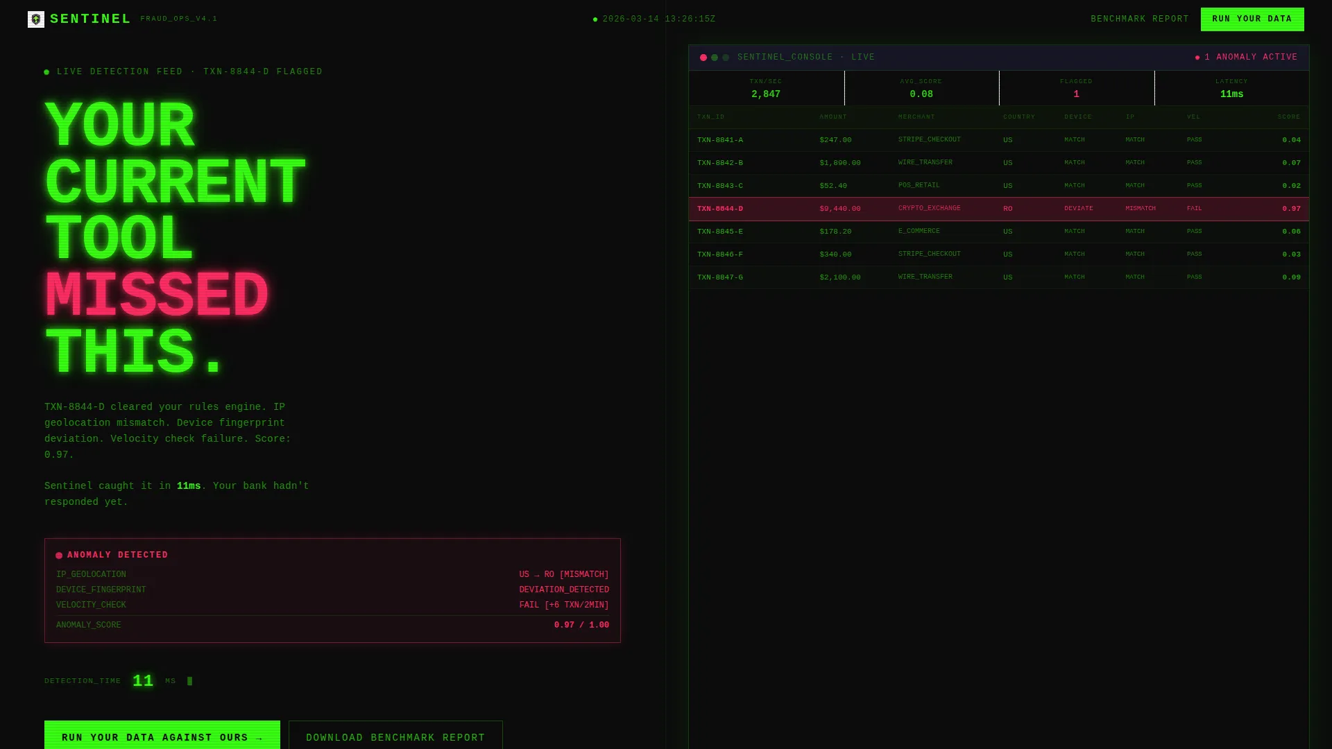
The header divides the full viewport into two equal halves. The right half displays a product screenshot of a live fraud detection dashboard, with one transaction row highlighted in warning magenta at an anomaly score of 0.97 and surrounding rows in phosphor green showing cleared transactions. Visible metadata includes an IP geolocation mismatch, a device fingerprint deviation, and a velocity check failure. The left half carries a condensed, uppercase, phosphor-green headline stacked like a concrete slab on a pure black background.
Industry Report Scroll Structure
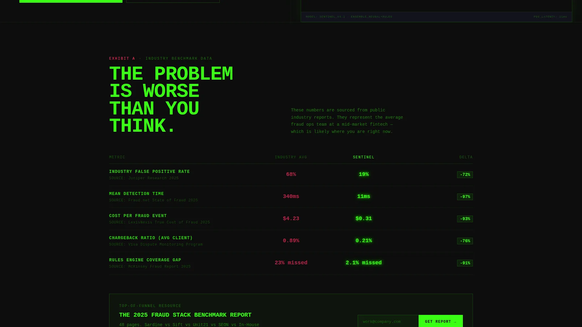
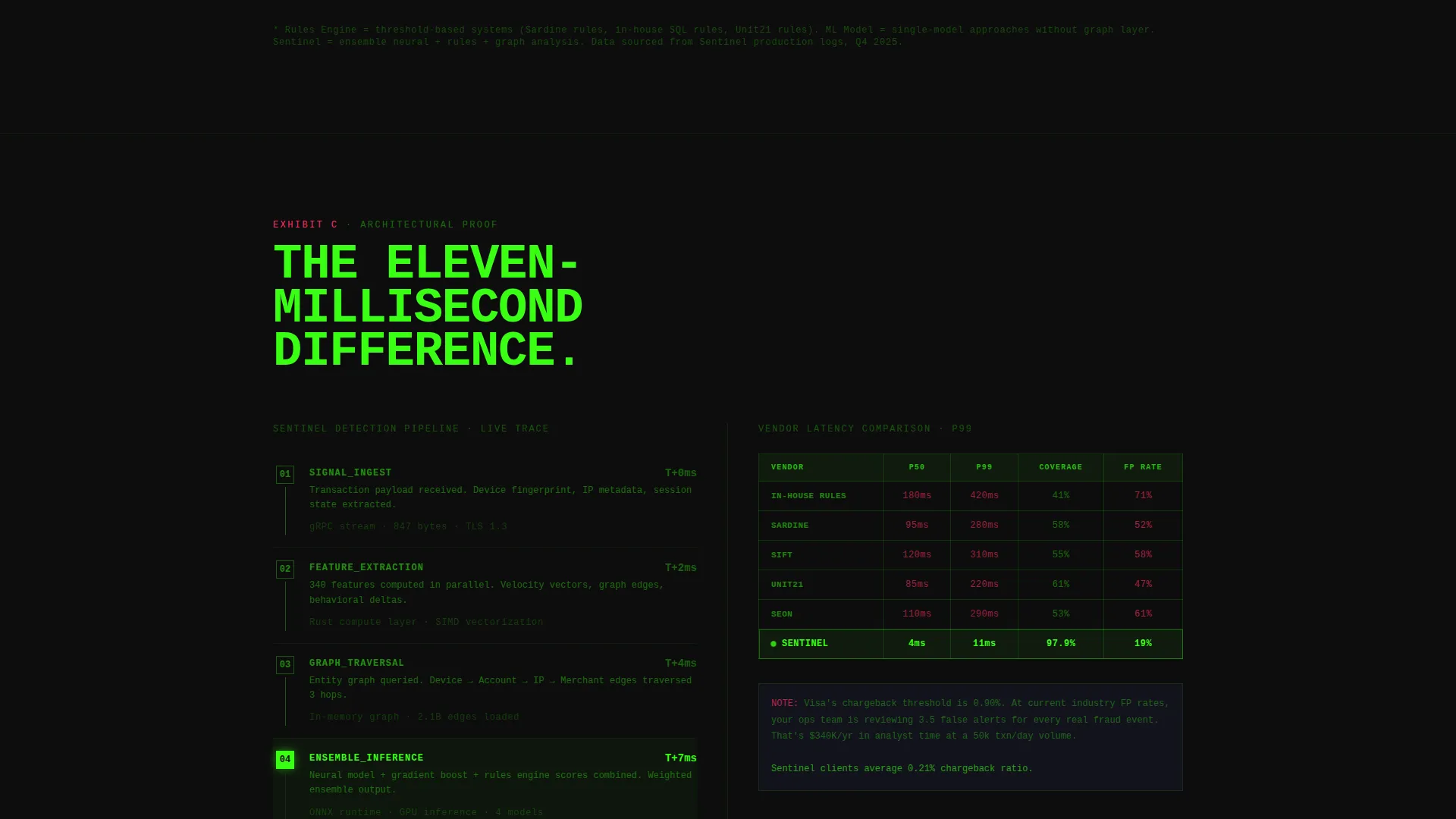
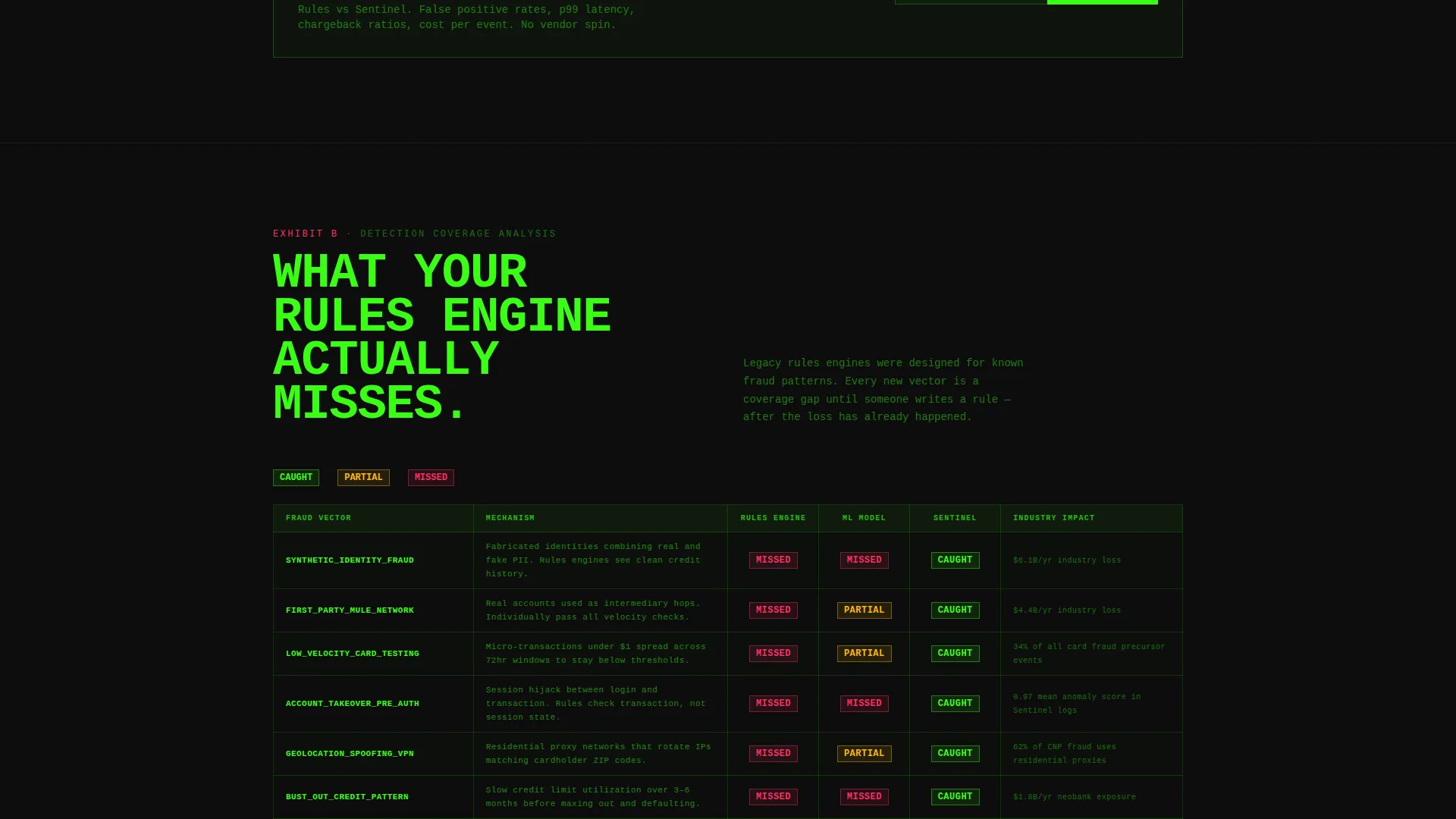
Each scroll section pairs a hard industry statistic on the left with the platform's own numbers on the right. The narrative moves in three stages: the problem is worse than buyers think, legacy rules engines miss specific categories of fraud, and the eleven-millisecond detection window is the difference. This structure turns the page into a sequential argument rather than a feature list.
Raw Brutalist Data Tables
All comparison data is presented in monospaced, grid-aligned tables with no gradients or decorative illustrations. The brutalist grid lines and scan-line gray column structure give every table the visual weight of evidence entered into a case file.
Dual Conversion Path Design
The primary call to action, "Run Your Data Against Ours," appears after the final benchmark section. It leads to a short form collecting work email, current fraud solution from a named dropdown, and monthly transaction volume range. A secondary path sits mid-page, gating the full benchmark report behind email only to capture top-of-funnel leads who are not yet ready to switch.
Acid Digital Color System
The template is built around four colors: void black (#0D0D0D) dominates every background, terminal phosphor green (#39FF14) runs through data visualizations and live metrics, warning magenta (#FF2E63) fires only on anomaly flags and critical alerts, and scan-line gray (#1A1A2E) structures the brutalist grid lines and monospaced type blocks.
Brutalist Typography System
All headlines use condensed, uppercase letterforms stacked in dense vertical blocks. Body copy and data labels use monospaced typefaces throughout. There are no soft rounded fonts, no friendly subheadings, and no decorative punctuation. Every typographic choice reinforces the platform's identity as a precision instrument, not a consumer product.
Page sections overview
| Section | Purpose |
|---|---|
| Split-Screen Header | Anchor the page with the product screenshot and core challenge headline |
| Problem Framing Block | Establish that false positive rates and detection gaps are worse than buyers assume |
| Legacy Tools Comparison | Show what rules-based engines miss across synthetic identity, payment anomaly, and account takeover categories |
| Eleven-Millisecond Proof | Present the detection-speed benchmark as the central product differentiator |
| Benchmark Report Gate | Capture mid-funnel leads with a gated full report behind email only |
| Primary call to action Form | Close comparison-ready buyers with the "Run Your Data Against Ours" form |
Design & branding system
The visual identity is built around the Acid Digital color system applied through a Bold Brutalist design language. The aesthetic is intentionally electric and unblinking, designed to feel like a wall of monitors at 2 AM rather than a polished SaaS homepage.
- Void black (#0D0D0D) as the dominant background across every section, keeping the visual weight heavy and focused
- Terminal phosphor green (#39FF14) for live metrics, data visualizations, and cleared-transaction rows, creating a pulse effect against the black
- Warning magenta (#FF2E63) reserved strictly for anomaly flags and critical alert highlights, so it lands with full visual force when it appears
Mobile & speed optimization
The template is structured as a single-page layout with a clear vertical content hierarchy. While the desktop experience is built around the 50/50 split-screen, the section structure supports a stacked vertical flow for smaller viewports.
- Each scroll section is self-contained, allowing the stacked mobile view to preserve the narrative escalation without losing context
- Data tables use monospaced formatting that remains readable when reflowed into a single-column mobile layout
- The dual conversion paths are positioned at logical scroll depths so both appear at natural stopping points on any screen size
How this template helps you convert
The Sentinel template is built around a comparison and versus conversion strategy. Every design and content decision is oriented toward moving a skeptical, data-literate buyer from doubt to action.
- The header immediately challenges the visitor's current tool with a specific, visible anomaly example, creating doubt before a single feature is listed.
- The industry-report scroll structure delivers escalating evidence, so by the time the visitor reaches the call to action they have already mentally audited their current stack against the benchmark data.
- The two-path conversion design captures buyers at different stages of readiness, turning both comparison-ready visitors and early-research visitors into leads.
Other information about this template
Sentinel is designed as a standalone landing page for fraud detection platforms operating in a competitive displacement market. It is well suited for teams whose buyers regularly evaluate tools alongside alternatives in the fraud intelligence space.
- The dropdown in the primary form includes named competitor categories as options, which reinforces the comparison framing without requiring the page copy to name competitors directly
- The template's visual language draws a clear line between the platform and consumer-grade or general-purpose tools, making it appropriate for enterprise and mid-market positioning
- Because the page earns the conversion through evidence rather than price or feature lists, it is equally effective when used before a pricing page exists or before a full product demo is available
Theme
Bold Brutalist
Creative direction
Industry Report
Color system
Acid Digital
Style
Split Screen (50/50)
Direction
Comparison/Versus
Page Sections
Split-screen Header with Dashboard Visual
Industry Report Narrative Structure
Brutalist Monospaced Data Tables
Dual Conversion Path Layout
Acid Digital Color System
Related questions
Who is the Sentinel template designed for?
Can I use this template without published benchmark data?
What makes the split-screen layout effective for fraud detection marketing?
How does the dual conversion path work?
Is this template suitable for a comparison-focused go-to-market strategy?



