Automotive Staff Scheduling Landing Page Template
Shift is a bento grid landing page template built for automotive staff scheduling platforms. It uses a Problem→Solution Arc to mirror the real chaos of service bay scheduling, then shows the fix in motion. Dark Glass Panel headers, a Midnight Blue color system, and live-state animations make the product itself the hero, no stock imagery needed.
by Rocket studio
Quick summary
Shift is a single-page bento grid template designed for automotive staff scheduling software. It opens with a visceral recreation of a broken Monday morning, then restructures on scroll into the resolved state. The design runs on Midnight Blue tones, glassmorphism panels, and diagnostic cyan accents that feel like a service bay command center after hours.
Who this template is for
This template is built for teams marketing scheduling tools directly to the people who live inside the problem every day. It speaks clearly to operators who know exactly how much a 7 AM call-out can cost.
- Dealership service directors managing large technician rosters across multiple shift patterns
- Independent shop owners who still coordinate schedules by text message or whiteboard
- Multi-location group operators who need a single view across every bay and rooftop
What problem this template solves
Scheduling software is hard to sell on a features list alone. Buyers need to feel the pain of their current workflow before they trust a new one. This template builds that emotional recognition into the scroll experience itself.
- Generic SaaS landing pages fail to connect with service bay operators who think in shifts, not software
- The gap between "we have a scheduling tool" and "here is exactly how your Monday improves" is where most automotive software pages lose the lead
- Visitors leave without converting because they never see their own daily problem reflected back at them
What you get with this template
You get a fully structured, single-page bento grid layout that walks visitors through a complete problem-to-solution journey. Every section is designed to escalate stakes and earn the conversion before asking for contact details.
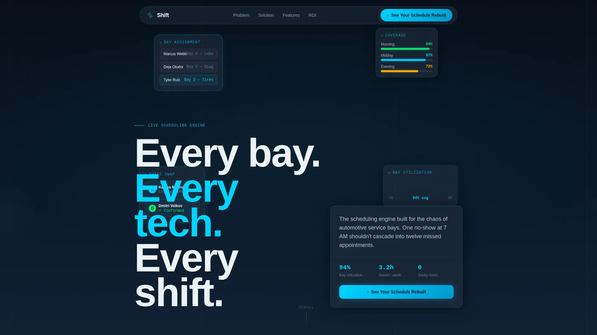
- A Dark Glass Panel header where animated schedule fragments serve as the hero, with glassmorphism blur, parallax depth, and cyan edge-light on each card
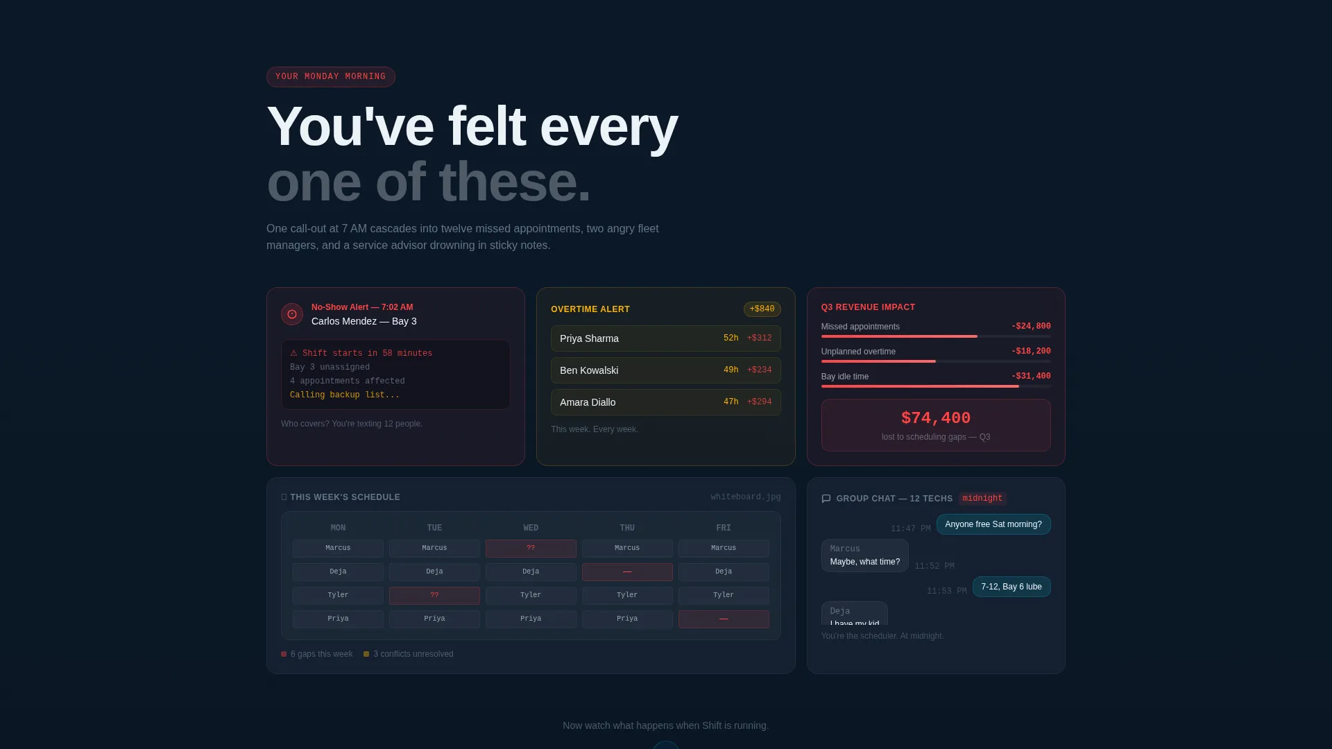
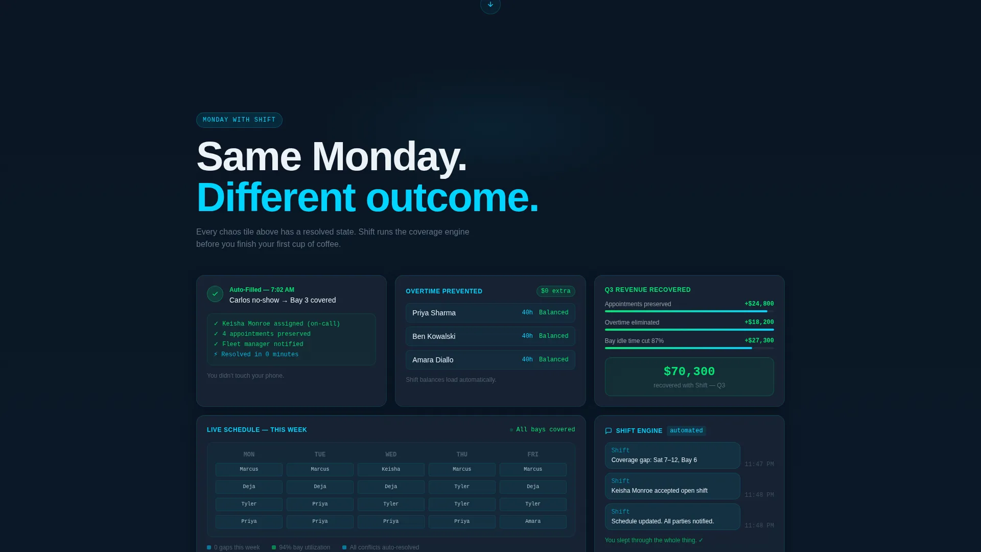
- A Problem→Solution Arc scroll structure with a "Your Monday Morning" chaos section that animates into "Monday with Shift," tile by tile
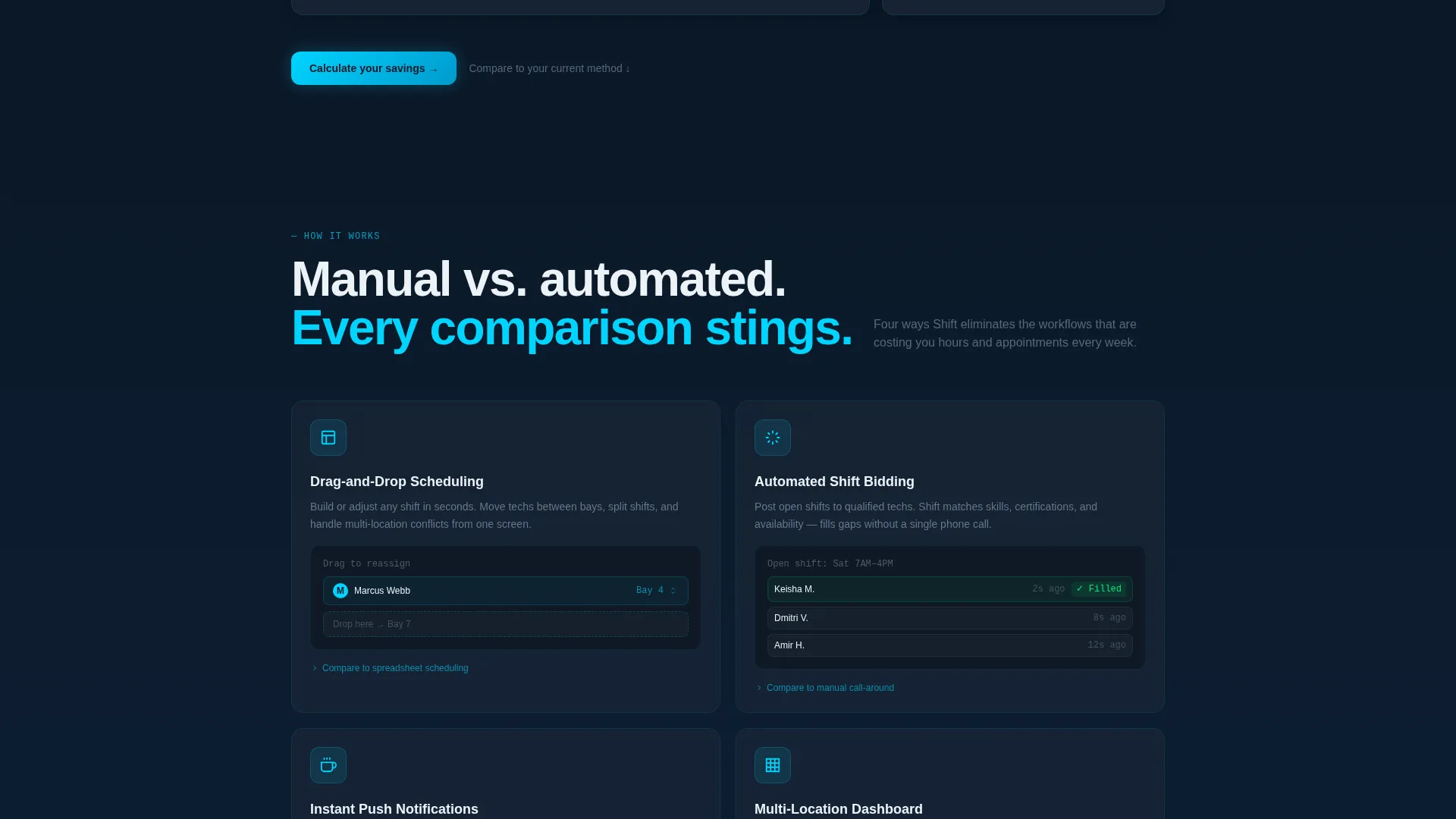
- A persistent sticky bar carrying the primary call to action, plus an interactive side-by-side calculator section and secondary comparison calls to action beneath each problem-solution pair
Feature list
This template is built from a specific set of visual and structural decisions. Each one directly supports the conversion goal.
Bento Grid Layout System
The page is organized as a bento grid, grouping content into modular tile clusters. Each cluster can show a different scheduling scenario, a comparison pair, or a live-state data fragment without the layout feeling crowded.
Dark Glass Panel Header
The header uses frosted, semi-transparent cards floating against a deep navy field. Each panel shows a different fragment of a live schedule in motion, including tech assignments, availability bars, shift swaps, and a coverage heat map. Subtle parallax depth and glassmorphism blur give the header genuine visual weight.
Animated Problem→Solution Arc
The scroll experience opens with a realistic cascade of scheduling failures rendered as bento tiles. On cue, the grid restructures with a smooth animation into its resolved state. Each chaos tile transforms into its fixed counterpart, from auto-filled coverage to instant swap confirmations.
Persistent Sticky call to action Bar
A sticky bar stays visible throughout the scroll, carrying the primary call to action. It opens a side-by-side interactive calculator where visitors input their technician count, number of locations, and current scheduling method to receive a personalized time-saved and coverage-gap comparison.
Comparison-Driven Section Architecture
Every problem-solution pair includes a secondary call to action linking to a detailed versus breakdown. The section architecture escalates from daily annoyance to quarterly revenue impact, keeping stakes rising as the visitor scrolls.
Midnight Blue Visual Identity
The color system runs on deep terminal navy, brushed-steel panel gray, high-beam white, and diagnostic-alert cyan. Cyan is reserved strictly for live data, active states, and call-to-action pulses, giving every interactive element immediate visual priority.
Page sections overview
| Section | Purpose |
|---|---|
| Dark Glass Header | Introduces the product through animated live schedule fragments |
| Your Monday Morning | Shows a realistic cascade of scheduling failures as bento tiles |
| Monday with Shift | Transforms chaos tiles into resolved states through grid animation |
| Manual versus. Automated | Compares shift bidding methods side by side |
| Spreadsheet versus. Drag-and-Drop | Highlights workflow improvement through direct comparison |
| Phone Calls versus. Push | Shows notification speed contrast between old and new method |
| Interactive Calculator | Lets visitors input their setup and see personalized time savings |
| Contact Form | Captures name, dealership, and technician headcount after trust is built |
Design & branding system
The visual identity is built around a Midnight Blue color system that evokes a dealership service bay after hours. Every color choice has a functional role, and the palette stays disciplined throughout the page.
- Core colors: deep terminal navy (#0B1929) for backgrounds, brushed-steel panel gray (#1E2A3A) for card surfaces, high-beam white (#EDF2F7) for primary text and labels
- Accent usage: diagnostic-alert cyan (#00D4FF) is reserved exclusively for live data indicators, active user interface states, and call-to-action pulse effects
- Visual language: Dynamic Motion theme with glassmorphism blur on header panels, subtle parallax depth, smooth grid restructure animations, and a pit-crew precision aesthetic throughout
Mobile & speed optimization
The bento grid layout is structured to adapt across screen sizes without losing the visual logic of each comparison pair. Tile clusters reflow cleanly so the problem-solution arc remains intact on smaller viewports.
- Grid tiles are designed to stack and reflow responsively, preserving the chaos-to-resolution narrative on mobile screens
- Animations are scoped to scroll events, keeping the motion purposeful and tied to the visitor's reading pace rather than running on load
How this template helps you convert
This template earns the conversion before it asks for it. The page builds specific, recognizable pain points first, then resolves them visually before any form appears.
- The Problem→Solution Arc makes visitors feel seen by recreating their exact Monday morning failures on screen, building trust through recognition rather than generic benefit claims
- The interactive calculator personalizes the value proposition by converting a visitor's own technician count and scheduling method into a concrete time-saved and coverage-gap estimate
- The contact form appears only after the visitor has scrolled through multiple comparison pairs and escalating stakes, arriving at the form already convinced rather than skeptical
Other information about this template
This template sits inside the Automotive Software and SaaS subcategory and is purpose-built for the automotive staff scheduling niche. It is a strong fit for teams positioning a scheduling product against older or manual workflows.
- Template style: Bento Grid, suited for modular content that needs to show multiple data states simultaneously
- Creative direction: Problem→Solution Arc, designed to open with visceral recognition and close with confident resolution
- Header concept: Dark Glass Panels, a glassmorphism approach where the product user interface is the visual centerpiece
- Landing page direction: Comparison/Versus, structured to make the visitor's current pain undeniable before presenting the alternative
- Theme: Dynamic Motion, with grid restructuring animations and scroll-triggered state transitions throughout
Theme
Dynamic Motion
Creative direction
Problem→Solution Arc
Color system
Midnight Blue
Style
Bento Grid
Direction
Comparison/Versus
Page Sections
Bento Grid Layout System
Dark Glass Panel Header
Animated Problem to Solution Arc
Persistent Sticky Call to Action Bar
Comparison Section Architecture
Midnight Blue Color System
Related questions
Who is this landing page template designed for?
Does the template include the interactive calculator functionality?
Can I adapt the comparison sections for my specific competitors?
What makes the header different from a standard hero image layout?
Is this template suitable for a single product or multiple tools?



