Roofing Membership Landing Page Template
Shingle is a split-screen landing page template built for roofing membership sites. It combines a glassmorphic visual system with an interactive header preview, spec-sheet-style content cards, and a clear app download flow. Field contractors, estimators, and shop owners get a polished, trust-building page that puts live directory data front and center before asking for anything.
by Rocket studio
Quick summary
Shingle is a single-page landing page template designed for roofing membership platforms. It uses a 50/50 split-screen layout, a glassmorphic color system, and a spec-sheet creative direction to present supplier directories, material libraries, and regional pricing data in a format contractors immediately recognize and trust.
Who this template is for
This template is built for roofing industry professionals who run or are launching a membership-based platform. The layout speaks directly to the people those platforms serve every day.
- Field superintendents who need quick access to supplier pricing data early in the morning before a job starts
- Estimators pulling material specifications mid-bid and comparing options side by side
- Shop owners and contractors who want a professional, credible web presence that matches the seriousness of their trade
What problem this template solves
Roofing membership sites often fail to earn trust before asking for a sign-up. Visitors land on generic pages, see no real product value, and leave. Shingle solves that by letting visitors interact with the actual directory before committing.
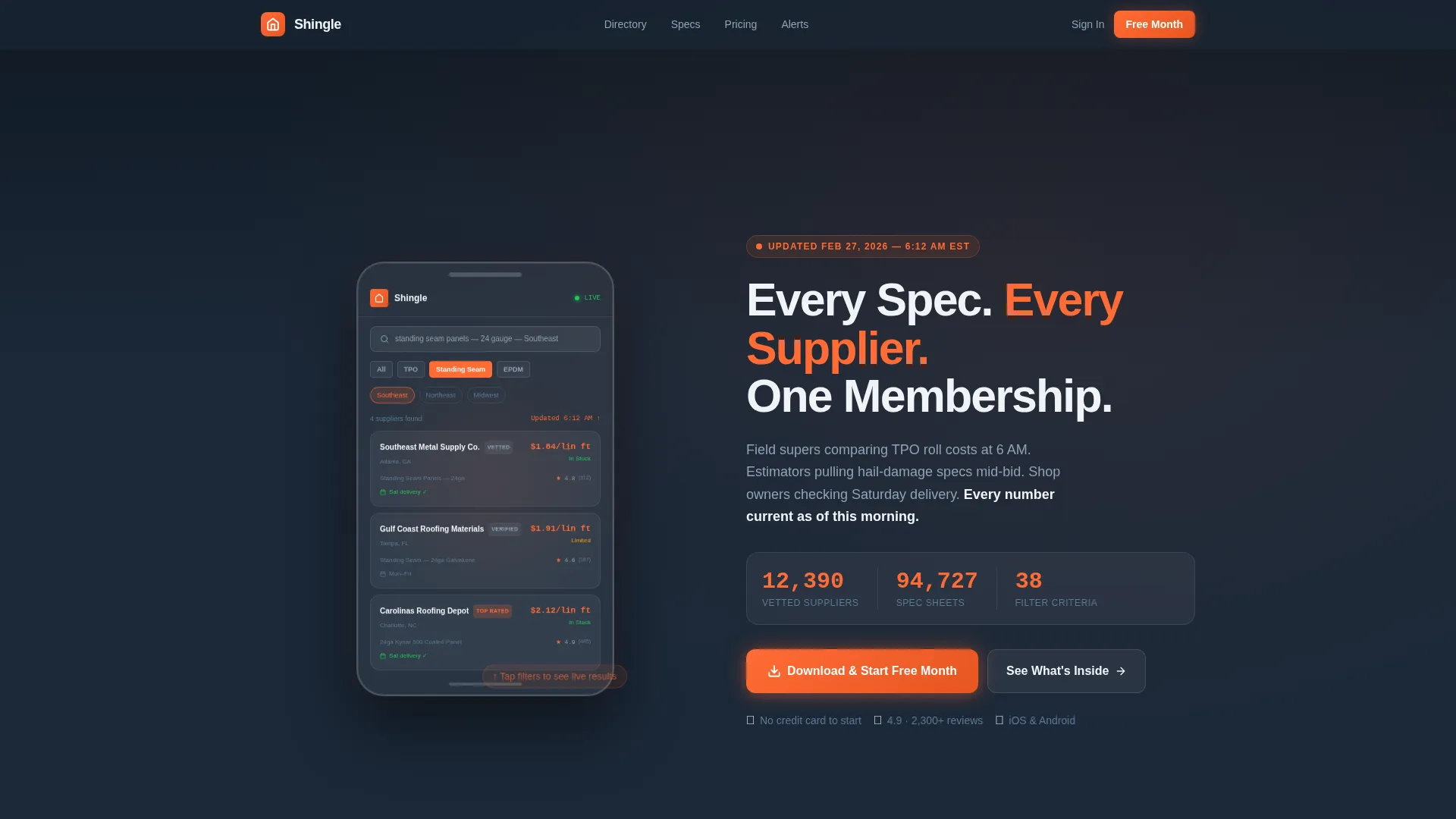
- The interactive header demonstrates real search results, so visitors understand the product in seconds
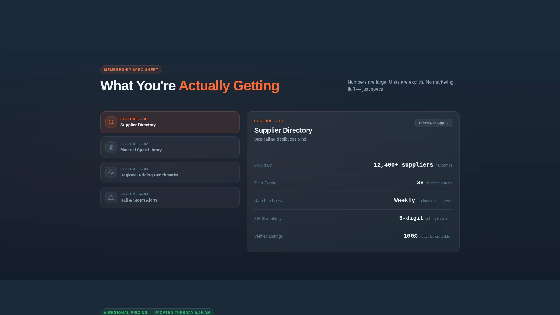
- Spec-sheet-style content cards present each membership feature with explicit numbers and units, not vague marketing language
- The app download flow is simplified with smart routing and an SMS fallback, removing friction for on-site contractors
What you get with this template
You get a complete, ready-to-customize single-page layout built around the needs of a roofing contractor audience. Every section is purposefully structured to move a visitor from curiosity to download.
- A 50/50 split-screen header with a glassmorphic phone frame showing a live-style supplier directory preview and filterable mock results
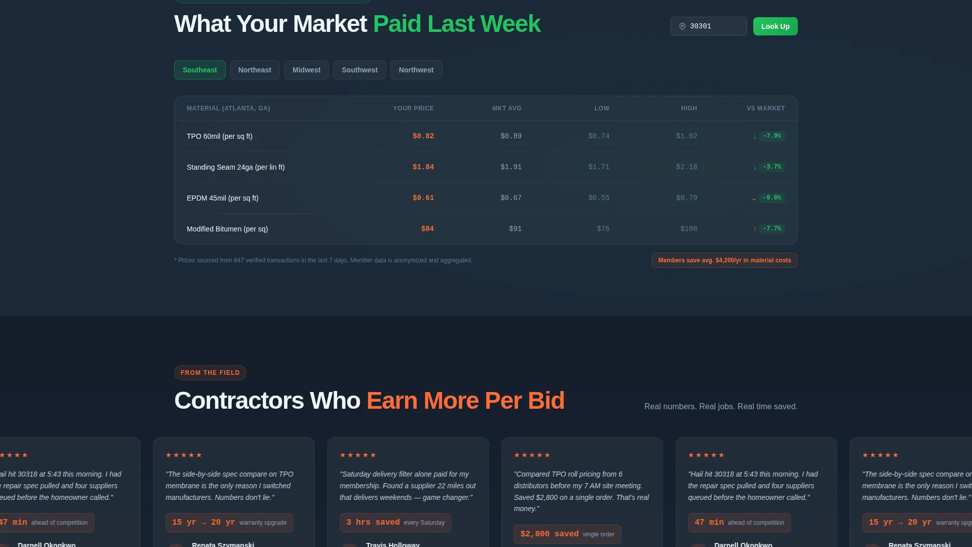
- Four frosted spec-card sections covering directory access, material specs, regional pricing, and storm alerts, each with a "Preview in App" toggle
- A floating mobile call-to-action bar, an inline desktop call-to-action at every section break, and an SMS link delivery option for low-friction conversions
Feature list
This template is built around a set of deliberate, well-defined design and layout capabilities. Each feature serves the roofing membership audience directly.
Interactive Split-Screen Header
The header divides the screen evenly. The left panel holds a translucent glassmorphic phone frame running a simulated supplier directory search. Visitors can tap mock filters for material type, region, and rating and watch results reorganize in real time. The right panel holds the primary headline and a live-pulsing supplier count in safety orange.
Spec-Sheet Content Cards
Each membership feature is presented as a frosted card styled like a product data sheet. Labels, numbers, and units are large and explicit. A "Preview in App" toggle swaps the static spec view for an animated screen recording, so visitors see the feature in action without leaving the page.
Floating and Inline Call-to-Action System
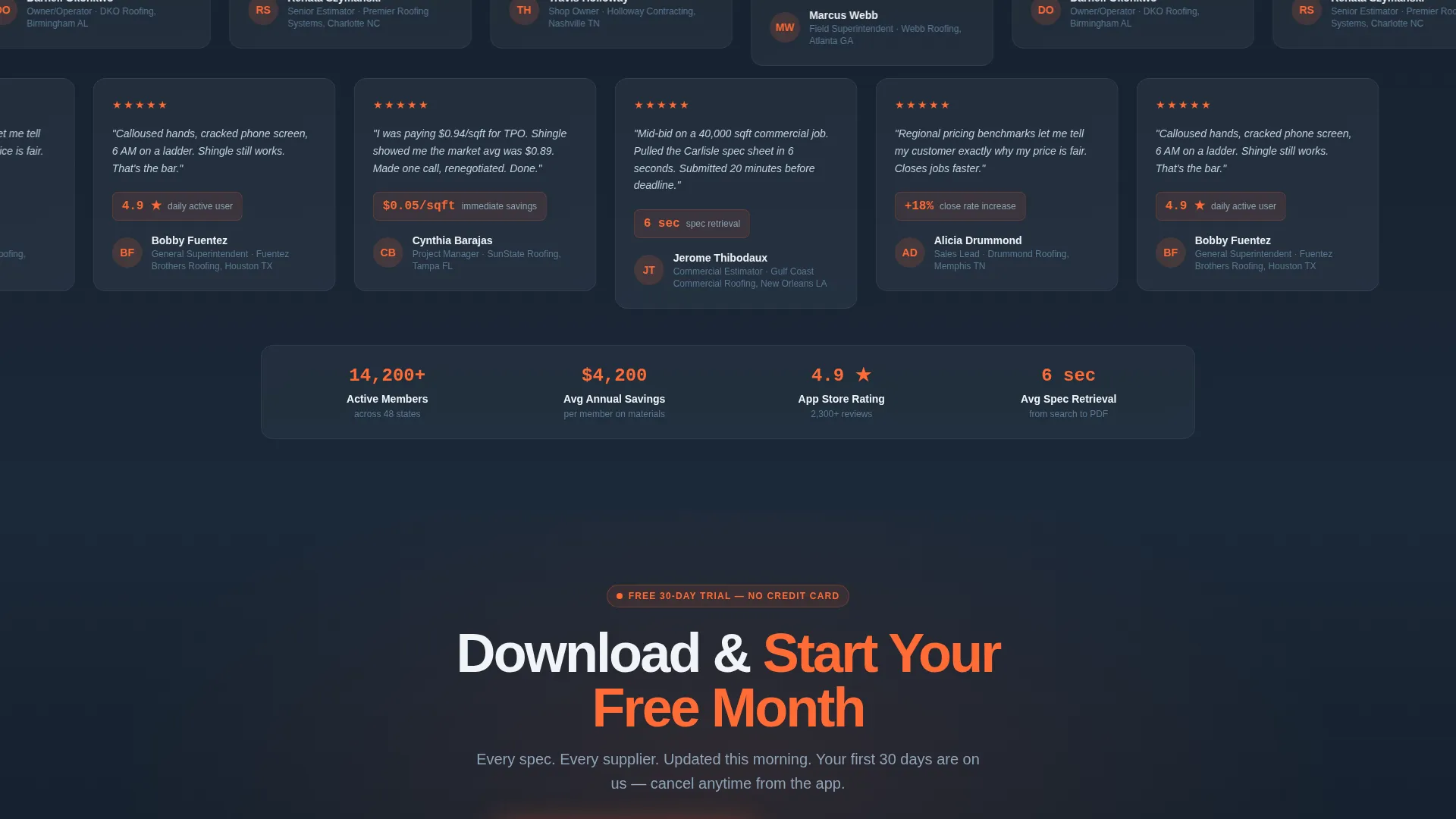
The primary call-to-action, "Download and Start Your Free Month," appears as a pinned floating bar on mobile and repeats at every section break on desktop. This ensures the conversion prompt stays visible regardless of how far a visitor has scrolled.
Smart OS Routing Interstitial
Tapping the download call-to-action opens a routing screen that detects the visitor's operating system and sends them to the correct app store. This removes guesswork and reduces drop-off at the final conversion step.
SMS Link Delivery Option
A secondary conversion path offers a single phone-number field so contractors can text themselves the download link. This accommodates users who find it difficult to type long URLs on a mobile device during or between jobs.
Glassmorphic Visual System
The entire page uses layered blur panels, translucent frosted containers, and a deep slate sky base. Safety orange highlights every live-data indicator and call-to-action button. The result is a visual language that feels familiar and credible to a trade audience.
Page sections overview
| Section | Purpose |
|---|---|
| Split-Screen Header | Introduces the product with an interactive supplier directory preview and headline |
| Live Supplier Counter | Pulses in safety orange to signal active, current data |
| Directory Access Card | Presents the supplier network with explicit filter and listing counts |
| Material Specs Card | Showcases manufacturer PDF access and side-by-side comparison capability |
| Regional Pricing Card | Communicates weekly update cadence and ZIP-code-level pricing granularity |
| Hail and Storm Alerts Card | Highlights push notification feature tied to weather data |
| App Download Bar | Drives the primary conversion with floating mobile and inline desktop placement |
| SMS Link Field | Offers a low-friction secondary path to the download |
Design & branding system
The visual identity follows a Directory and Discovery theme expressed through a glassmorphic color system. Every design choice reinforces the sense of looking at a sharp, current tool through a rain-beaded truck windshield.
- Core palette: translucent card white (#FFFFFFB3) layered over deep slate sky (#1B2838), with frosted zinc gray (#A4B0BD) divider lines and safety orange (#FF6B35) for all calls-to-action and live-data indicators
- Layered blur panels and frosted containers keep the dark base visible through the interface, giving the page depth without visual clutter
- Typography and number treatments are large and explicit, with units always present, so specs read clearly at a glance on any screen size
Mobile & speed optimization
The layout is designed with field use in mind. Contractors often view this page on a phone during a workday, so the mobile experience is a first-class priority.
- The floating call-to-action bar stays pinned at the bottom of the screen on mobile, keeping the download prompt accessible at all times
- Frosted glassmorphic cards stack cleanly in a single column on smaller screens, preserving readability without horizontal scrolling
- The SMS link delivery field is positioned for thumb-friendly one-hand entry, reducing friction for on-site or in-vehicle use
How this template helps you convert
Every structural decision in this template is aimed at earning the tap before asking for it. The page builds confidence progressively from the header down to the download prompt.
- The interactive header lets visitors filter and browse real-looking directory data before any sign-up request appears, establishing product value immediately and reducing skepticism
- Spec cards escalate the stakes section by section, moving visitors from browsing to comparing to bidding, so the download call-to-action arrives at the moment of highest intent
- Two conversion paths, the app store route and the SMS link option, ensure that different types of contractors, whether on a desktop in an office or on a phone on a roof, each have a friction-appropriate way to complete the action
Other information about this template
This template is well-suited for teams building in the roofing technology space who want a high-credibility first impression for a membership or directory product. A few additional points worth noting:
- The template style is a 50/50 split-screen layout, making it straightforward to customize each panel independently for different brand voices or membership tiers
- The theme, Directory and Discovery, translates well beyond roofing to any trade or construction niche that relies on vetted supplier networks and spec-driven decision making
- The creative direction follows a Spec Sheet approach, which means content is organized around labeled data rows rather than narrative paragraphs, a format that resonates strongly with technical buyers
- The header concept, Interactive Preview, is designed to demonstrate product value in the first viewport, which is especially important for membership products where the paywall prevents free browsing
Theme
Directory & Discovery
Creative direction
Spec Sheet
Color system
Glassmorphic
Style
Split Screen (50/50)
Direction
App Download
Page Sections
Interactive Split-screen Header
Spec-sheet Content Cards
Floating and Inline Call-to-action
Smart OS Routing Interstitial
SMS Link Delivery Field
Glassmorphic Visual System
Related questions
Who is this landing page template designed for?
Can I customize the color palette and branding?
What does the interactive header show visitors?
Does the template include both mobile and desktop conversion paths?
Is this template limited to roofing, or can other trades use it?



