Bold Storage Landing Page Template with Dashboard Design
Stash is a bold, brutalist-styled storage landing page template built for self-storage businesses that need a serious web presence fast. It features a live-feel stats dashboard header, a problem-to-solution scroll arc, real-time-style unit availability grids, and a click-through flow that pushes visitors straight into a sandbox demo with no forms required.
by Rocket studio
Quick summary
Stash is a single-page storage landing page template designed for self-storage operators who are tired of losing tenants to weak websites. The header opens on a command-center dashboard frozen mid-pulse. The page scrolls through a sharp problem-and-solution arc, ending with a single click into a live demo environment. Industrial, unapologetic, and built to convert.
Who this template is for
This template is built for people running self-storage businesses who need a credible, high-impact web presence without starting from scratch. It suits operators at different scales, from solo owner-operators to large portfolio teams.
- Owner-operators managing facilities of around 200 units off spreadsheets
- Regional chain operators with multiple locations and no current website
- Real estate investment trust portfolio managers who need every property online quickly
What problem this template solves
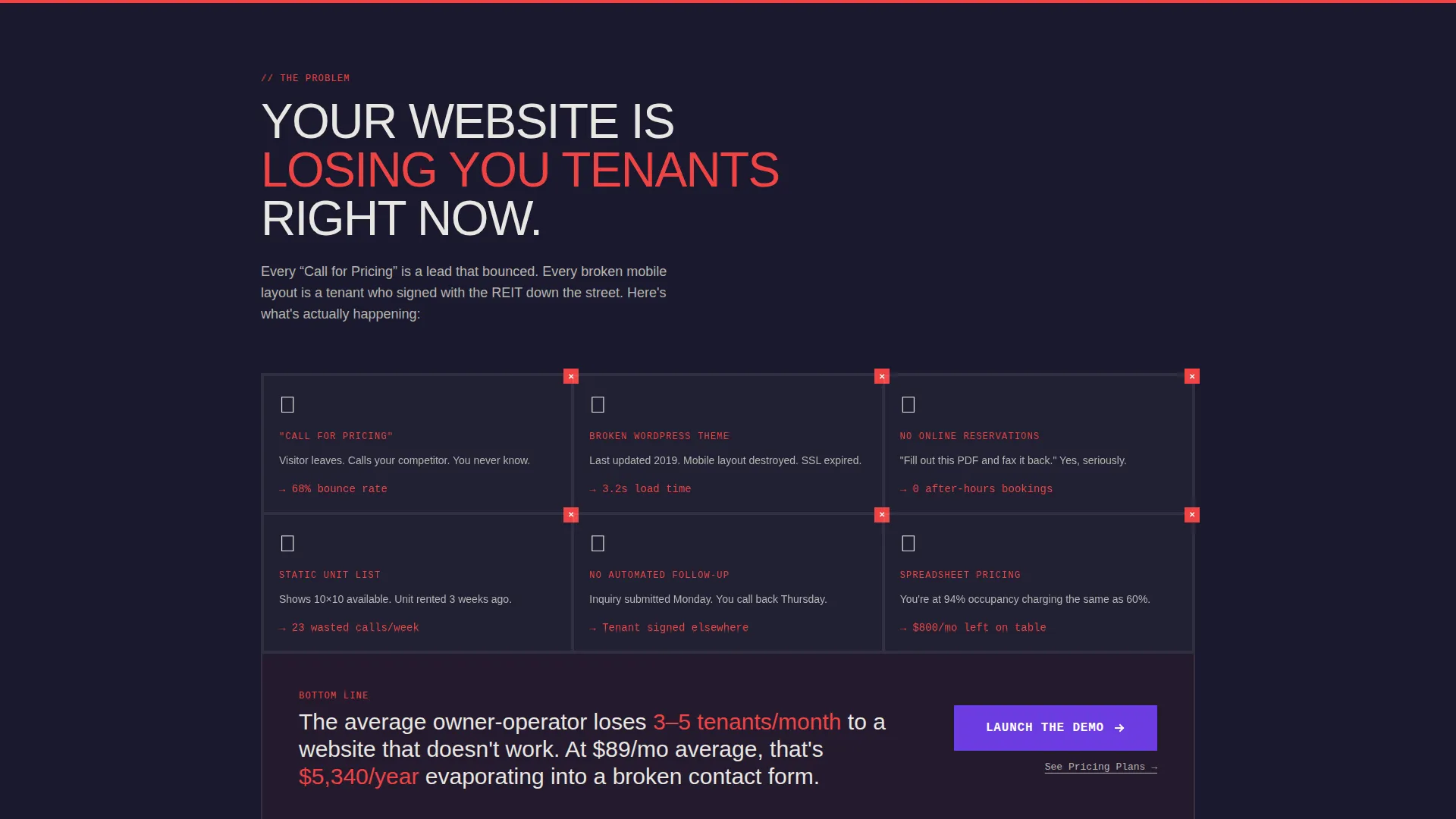
Most self-storage websites are losing tenants before a single conversation starts. Dead "Call for Pricing" pages, broken themes, and no online reservation path mean potential customers leave at 2 AM with nowhere to book.
- Visitors cannot see unit availability or current pricing without calling
- No online reservation option means lost bookings outside business hours
- Generic or broken website designs signal an unprofessional, unreliable facility
What you get with this template
You get a complete, single-page landing page that shows your facility working before it asks for anything. The layout is direct and scroll-driven, with every section built around a specific conversion moment.
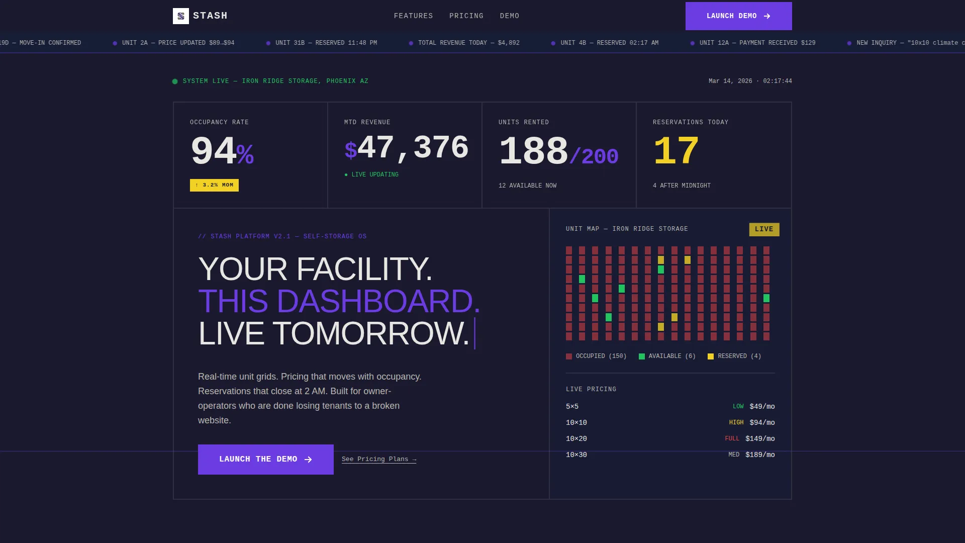
- A live-feel dashboard header with occupancy stats, a unit availability map, and revenue indicators
- A problem-to-solution scroll arc with abrupt, brutalist panel transitions
- A click-through call to action structure leading to a sandbox demo, repeated at key scroll points
Feature list
This template is built around a specific set of visual and structural capabilities drawn directly from the design brief. Each feature serves a clear purpose in moving a visitor from first impression to demo click.
Live-Feel Stats Dashboard Header
The header displays oversized occupancy rate figures, a climbing revenue ticker, a unit map with green and red availability indicators, and a reservations counter. Numbers are set in large monospaced type with no decoration. The data is intentionally dummy but looks and feels fully operational.
Problem-to-Solution Scroll Arc
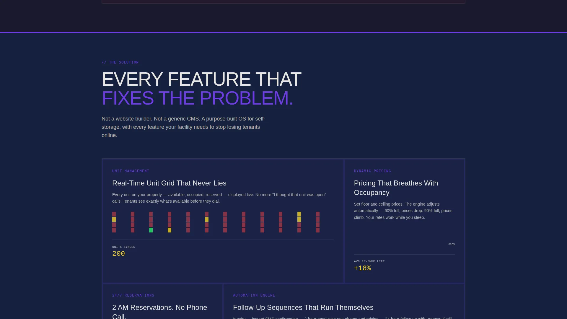
The page opens with a visual representation of the problem: broken themes, dead pricing pages, and unanswered phones. The next section snaps into a clean solution grid featuring unit maps and mobile checkout flows. Transitions between panels are abrupt and intentional, with no easing effects.
Unit Availability Grid Display
The template includes a unit grid layout that communicates availability through color-coded indicators. Green signals an open unit, red signals occupied. The layout is structured to feel like a real facility dashboard rather than a static marketing page.
Click-Through Demo call to action Flow
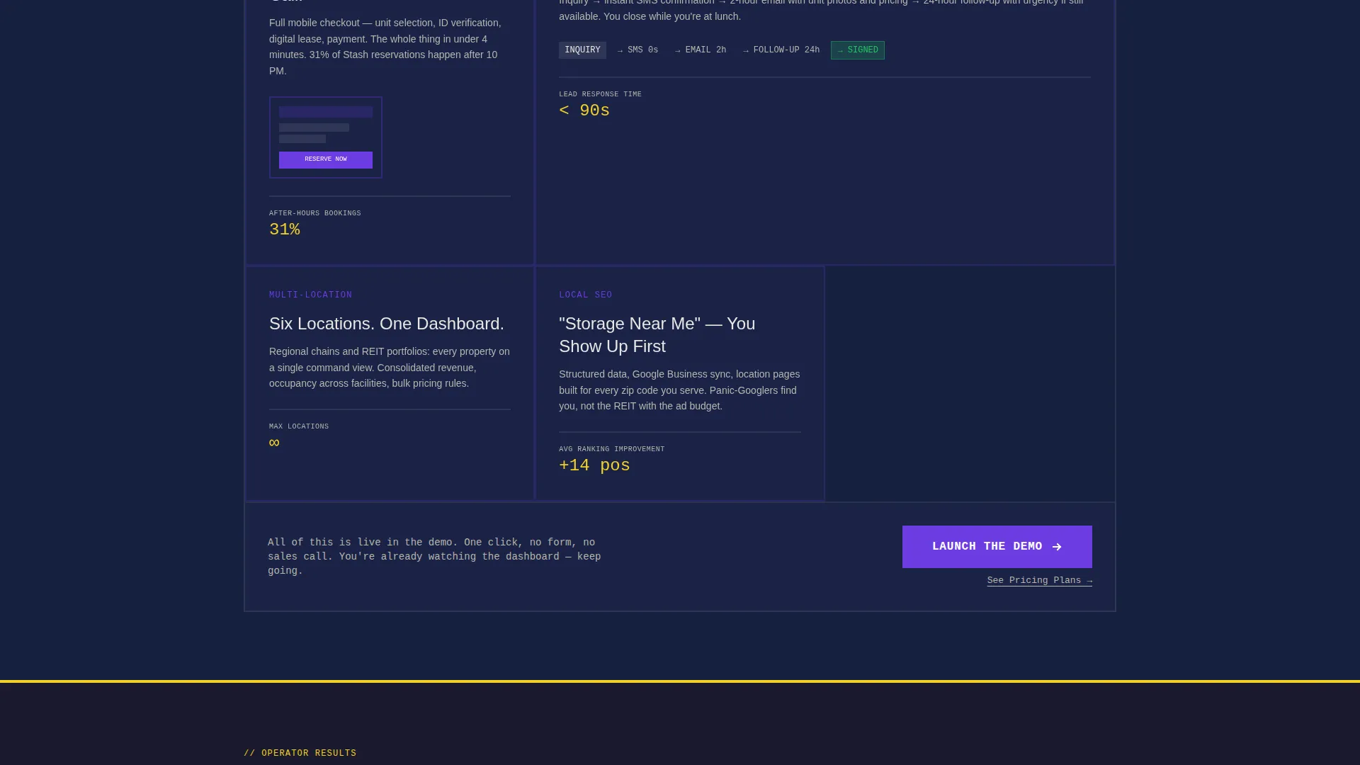
There are no forms on this page. The primary call to action, "Launch the Demo," appears after the problem section, after the feature grid, and in a fixed bottom bar on mobile. One click takes the visitor into a sandbox version of the template populated with dummy facility data.
Secondary Pricing Text Link
Beneath each primary call to action, a secondary text link reading "See Pricing Plans" gives already-committed visitors a direct next step. It sits quietly below the main button without competing for attention.
Mobile Fixed call to action Bar
On mobile, the primary "Launch the Demo" call to action stays fixed at the bottom of the screen throughout the scroll. Visitors always have a clear exit point into the demo, regardless of where they are on the page.
Page sections overview
| Section | Purpose |
|---|---|
| Dashboard Header Panel | Display live-feel occupancy stats and unit availability map |
| Headline Statement Block | Deliver the core value proposition in condensed uppercase type |
| Problem Visual Section | Show the broken-website pain point through collage-style layout |
| Solution Grid Section | Present clean unit maps and checkout flow as the fix |
| Feature Grid Block | List every capability that solves the stated problems |
| Primary call to action Block | Push visitors to launch the sandbox demo with one click |
| Fixed Mobile Bar | Keep the demo call to action accessible throughout mobile scroll |
Design & branding system
The visual identity follows a bold brutalist theme built around an electric indigo color system. Every color choice has a specific job, and nothing is decorative without purpose.
- Deep slab charcoal (#1A1A2E) dominates backgrounds in unbroken, heavy slabs
- High-voltage indigo (#6C3CE1) owns every button, link, and interactive element; raw concrete off-white (#E8E6E1) carries body text on dark panels
- Alarm yellow (#F2D024) fires only on hover states and availability badges, signaling open units, live prices, and conversion moments
Mobile & speed optimization
The template is designed so the conversion path works just as well on a phone as it does on a desktop. The mobile experience is shaped around the fixed call to action bar and a clear vertical scroll flow.
- The fixed bottom bar keeps "Launch the Demo" visible at all times on mobile screens
- The scroll arc is structured for vertical reading, with each panel slamming into view in sequence
- Oversized monospaced type and high-contrast color blocks remain readable at small screen sizes
How this template helps you convert
The entire page is engineered as a click-through funnel. There is no friction before the demo, no form to fill out, and no pricing gate to clear. The conversion logic is built into the scroll itself.
- The dashboard header shows the product working before any claim is made, building trust through visible data
- The problem-and-solution arc escalates naturally from "your current site is costing you tenants" to "here is every feature that fixes it," making the demo click feel like the next logical step
- The repeated "Launch the Demo" call to action, combined with the mobile fixed bar, ensures the conversion moment is always within reach no matter where a visitor stops scrolling
Other information about this template
This template is part of a broader category of storage digital presence tools built for operators who need a technology-forward website without a long development cycle. It is a strong fit for the storage website template niche because it speaks directly to the operational realities of running a self-storage facility.
- The template style is a dashboard and data grid layout, making it visually distinct from standard brochure-style storage websites
- The bold brutalist theme and electric indigo color system are designed to feel industrial and authoritative, matching the physical identity of a storage facility
- The creative direction follows a problem-to-solution arc, which is a proven structure for landing pages targeting operators who already know their current setup is failing them
- The template is offered as a starting point; operators can replace dummy facility data with real unit counts, real occupancy figures, and actual pricing as they build out their presence
Theme
Bold Brutalist
Creative direction
Problem→Solution Arc
Color system
Electric Indigo
Style
Dashboard/Data Grid
Direction
Click-Through
Page Sections
Live-feel Stats Dashboard Header
Problem-to-solution Scroll Arc
Unit Availability Grid Layout
No-form Click-through Call to Action Flow
Secondary Pricing Text Link
Mobile Fixed Bottom Call to Action Bar
Related questions
Does this template require any coding knowledge to use?
Can this template support multiple facility locations?
Is the dashboard data in the header real or placeholder?
What happens when a visitor clicks Launch the Demo?
Who is the fixed mobile call to action bar designed for?



