Steadfast — Dependable IT Services Landing Page Template
Uptime is a hub-and-spoke landing page template built for IT services companies targeting mid-market clients. It pairs a live-data Dashboard Preview header with three comparison-driven spoke sections, a progressive three-step contact form, and a gated PDF lead capture. The Electric Indigo color system gives the page the feel of a network operations center running at full capacity.
by Rocket studio
Quick summary
Uptime is a single-page IT services landing page template designed around one idea: the math of managed IT should be undeniable before a visitor ever fills out a form. The header opens with an animated network operations center display, and every scroll section adds another data point until the decision makes itself.
Who this template is for
This template is built for IT services companies that sell to mid-market businesses. It speaks directly to the buyers who feel the pain of unreliable IT the most.
- Managed service providers pitching operations directors at 150-to-300-person firms who just lost their internal IT person
- IT consultancies targeting CFOs tired of unpredictable break-fix invoices and recurring downtime costs
- Outsourced support teams selling to office managers who currently handle help desk tickets from a spreadsheet
What problem this template solves
Mid-market IT buyers do not need to be sold to. They need to be shown the numbers. The challenge is that most IT services landing pages lead with features instead of proof, losing skeptical buyers before the contact form appears.
- Buyers arrive already comparing in-house staffing costs against outsourced alternatives and need structured evidence to move forward
- Break-fix clients need to see the total cost of reactive support before they consider a managed services contract
- Leads who are not ready to call still need a path to stay engaged rather than bouncing without leaving any contact information
What you get with this template
The template delivers a complete, anchor-navigated single-page layout built around comparison content and progressive lead capture. Every section is structured to add cumulative weight to the managed services argument.
- An animated Dashboard Preview header with four live-metric widgets, a typing headline, and staggered load animations
- Three data-driven spoke sections covering managed services versus. break-fix, in-house versus. outsourced NOC, and legacy infrastructure versus. cloud migration
- A three-step progressive contact form and a secondary gated PDF download path for visitors not ready to speak with sales
Feature list
This template includes purpose-built components that serve the Comparison/Versus conversion strategy from the first pixel to the final call to action.
Animated NOC Dashboard Header
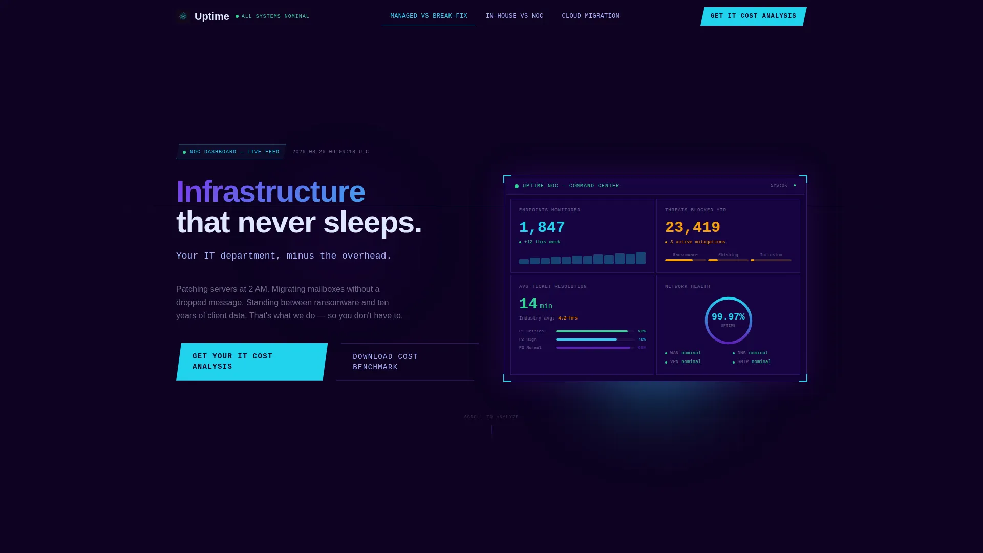
The header renders a stylized network operations center display with four animated widgets. Ticket resolution time counts down, endpoints monitored tick upward, a threat-blocked counter increments, and a network health ring chart pulses at 99.97%. Numbers animate on page load with staggered easing, and a headline types itself out beneath the display.
Anchor Navigation with Persistent Call to Action
A hub-and-spoke anchor navigation bar links directly to each comparison spoke. A persistent "Get Your IT Cost Analysis" button stays visible in the nav at all times, giving motivated visitors an immediate conversion path regardless of where they are on the page.
Three Comparison Spoke Sections
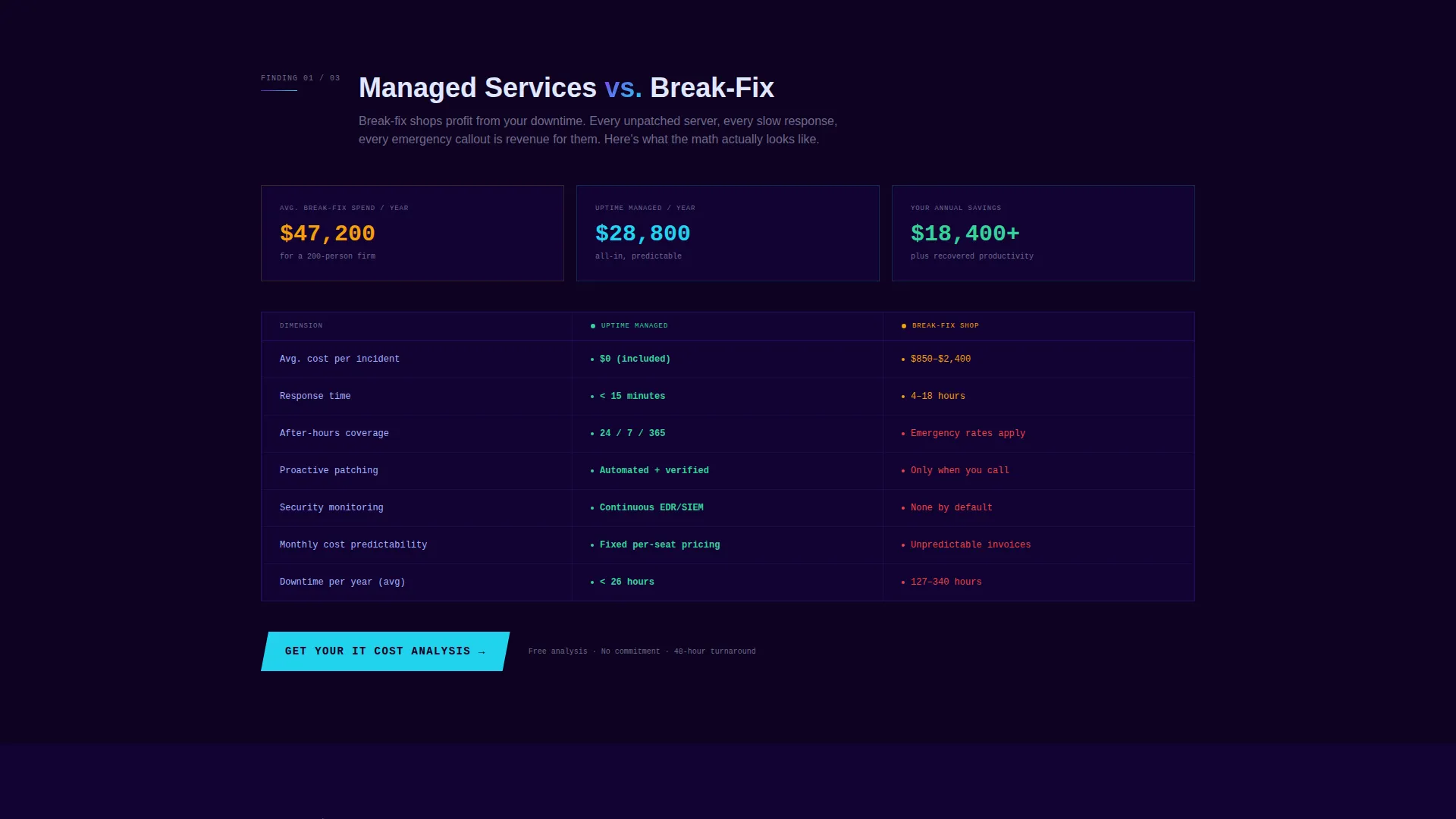
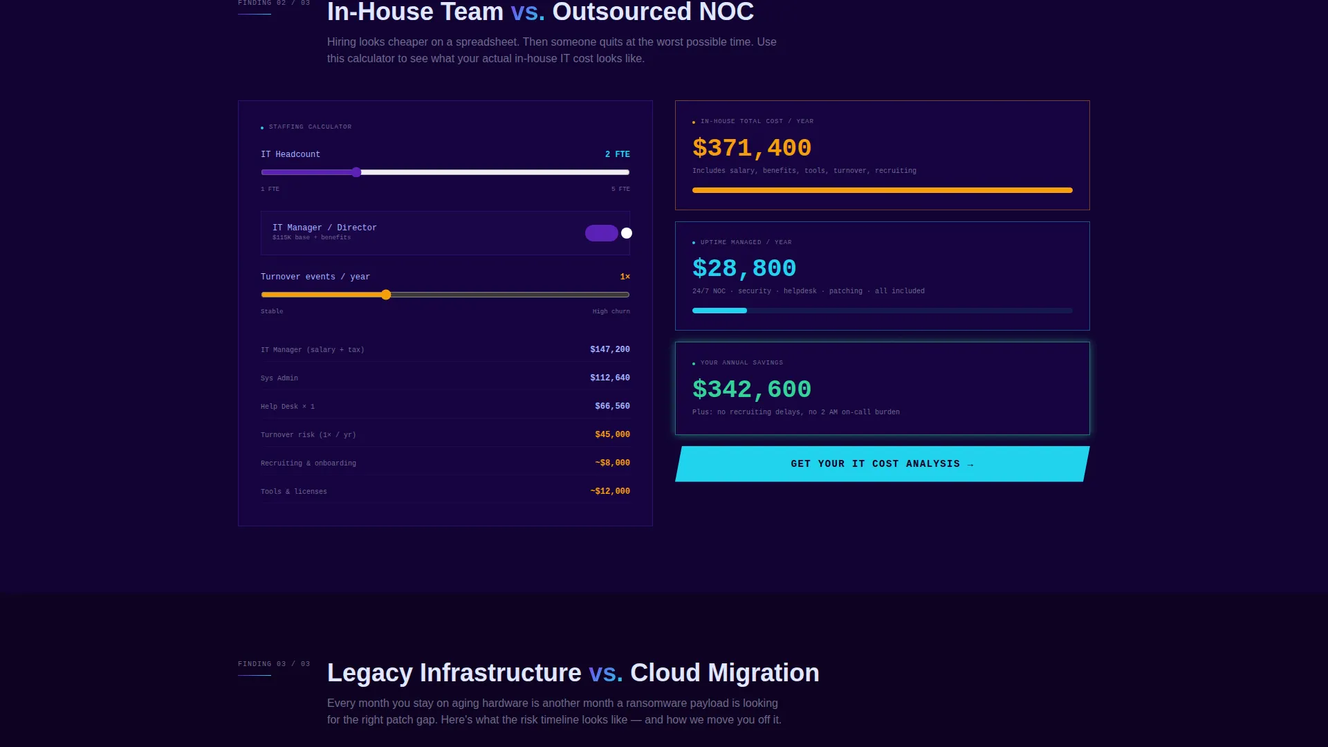
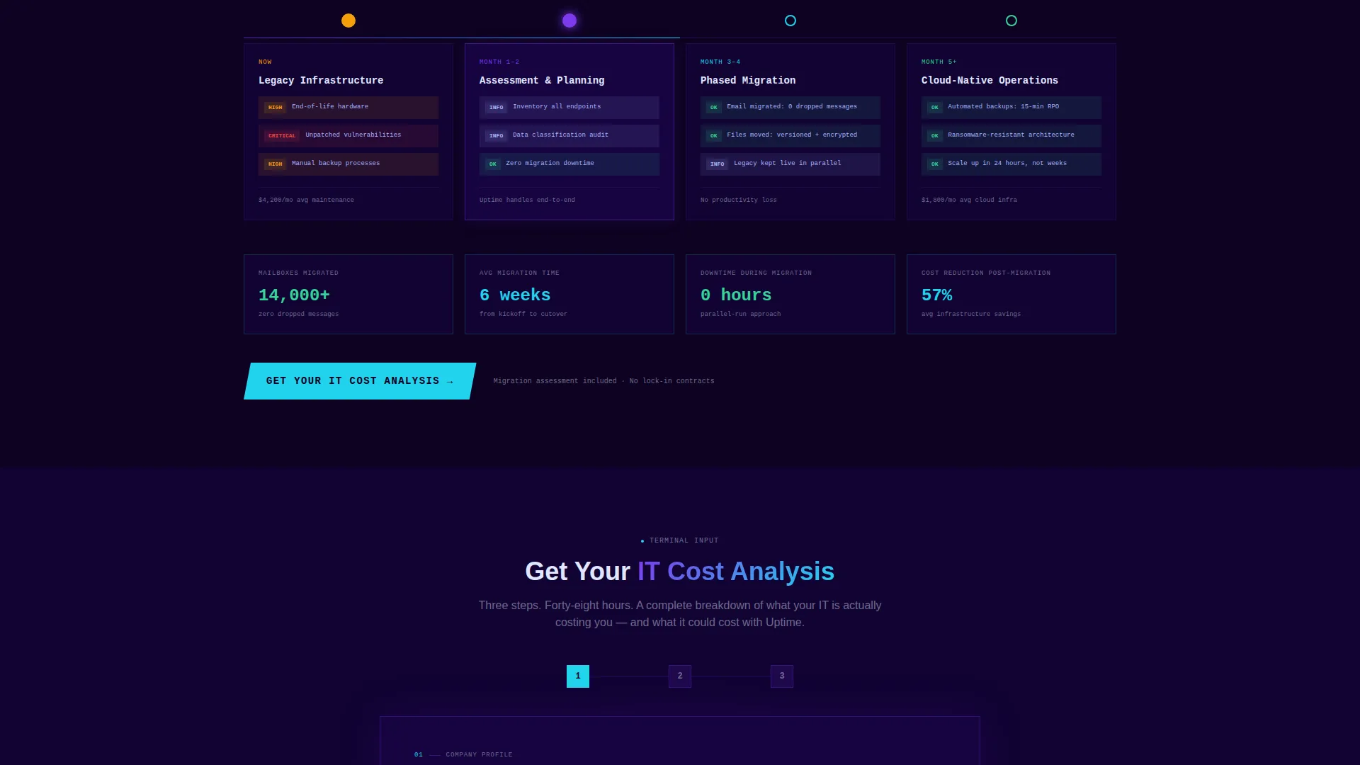
Each spoke presents a competitive dimension as a data-driven finding. The managed services versus. break-fix spoke opens with a cost-per-incident comparison table. The in-house versus. outsourced NOC spoke features a staffing calculator layout showing salary, benefits, and turnover. The legacy versus. cloud migration spoke displays a risk timeline visualization.
Progressive Three-Step Contact Form
The primary conversion form moves visitors through three focused steps. Step one collects company size and current IT setup. Step two presents a checkbox grid for top pain points including downtime, security, scaling, compliance, and cost. Step three captures name, email, and preferred contact window.
Gated PDF Lead Capture
A secondary conversion path offers a downloadable benchmark report for visitors not ready to speak with sales. This path captures lead contact details while letting the data continue selling on its own timeline.
Dynamic Motion Visual System
The template follows a Dynamic Motion theme with purposeful animation tied to diagnostic meaning. Status-green appears only for positive-state indicators and hover confirmations. Indigo-to-cyan gradients trace interactive pathways. Every animated element reinforces the network operations center aesthetic without feeling decorative.
Page sections overview
| Section | Purpose |
|---|---|
| NOC Dashboard Header | Opens with animated metrics and a typed headline to establish credibility immediately |
| Anchor Navigation Bar | Lets visitors jump to any spoke and access the primary call to action from any position |
| Managed Services versus. Break-Fix | Shows a cost-per-incident comparison table to make the financial case for managed services |
| In-House versus. Outsourced NOC | Presents a staffing calculator layout covering salary, benefits, and turnover costs |
| Legacy versus. Cloud Migration | Displays a risk timeline to frame infrastructure decisions as measurable business risk |
| Progressive Contact Form | Guides visitors through three steps to submit a qualified IT cost analysis request |
| Gated PDF Download | Captures leads not ready to call by offering a downloadable IT cost benchmark report |
Design & branding system
The Electric Indigo color system is built to feel like a network operations center at midnight. Every color choice carries diagnostic meaning, and nothing decorative competes with the data.
- Core palette: deep terminal black (#0D0221) for backgrounds, electric indigo (#5B21B6) as the primary brand color, live-wire cyan (#22D3EE) for interactive pathways, and cool white (#E0E7FF) for body text
- Status-green (#34D399) is reserved exclusively for positive-state indicators and hover confirmations, keeping it semantically meaningful throughout the page
- Indigo-to-cyan gradients trace navigation and interactive elements like data moving through a topology map, reinforcing the Dynamic Motion theme
Mobile & speed optimization
The template is structured for clean rendering across device sizes without sacrificing the animated components that define its visual identity.
- The hub-and-spoke anchor navigation collapses cleanly for smaller screens so visitors can still jump between spoke sections without losing orientation
- Animated widgets in the header use staggered easing that keeps the load sequence readable on both desktop monitors and mobile displays
- The three-step form breaks into focused single-step views on smaller screens, reducing cognitive load and keeping the completion path clear
How this template helps you convert
The conversion architecture is built around the idea that a well-informed buyer is a closer buyer. Every design and layout decision moves visitors incrementally toward the contact form.
- The animated NOC header establishes operational credibility in the first seconds of the visit, framing the company as a command center rather than a vendor
- Each comparison spoke adds another layer of evidence, so by the time a visitor reaches the contact form they have already done the math themselves
- The gated PDF download creates a second conversion path for research-phase visitors, capturing qualified leads who are not yet ready for a direct conversation
Other information about this template
This template sits within the IT Services Company Website Templates category under Technology. It is designed specifically for the IT services company contact page use case, where the primary goal is moving a skeptical mid-market buyer from comparison research to a scheduled conversation.
- The template style is Hub and Spoke with Anchor Navigation, making it well suited for IT services pages that need to address multiple buyer objections within a single scrollable layout
- The Industry Report creative direction means each spoke section reads as a data finding rather than a sales pitch, which aligns with how operations directors and CFOs prefer to evaluate vendors
- The Comparison/Versus landing page direction makes this template a strong fit for IT companies that routinely compete against in-house IT teams, break-fix shops, or legacy infrastructure vendors
Theme
Dynamic Motion
Creative direction
Industry Report
Color system
Electric Indigo
Style
Hub & Spoke (Anchor Nav)
Direction
Comparison/Versus
Page Sections
Animated NOC Dashboard Header
Persistent Anchor Navigation
Three Comparison Spoke Sections
Progressive Three-step Contact Form
Gated PDF Lead Capture
Dynamic Motion Visual System
Related questions
Who is the primary audience for this landing page template?
What conversion paths does this template include?
Can I customize the comparison tables and calculator layout?
How does the animated header work?
Is this template suitable for companies offering both managed services and project-based IT work?



