Premium Restaurant Software Cost Estimator Website Template
Stockroom is a single-page, comparison-table landing page template built for restaurant warehouse management platforms. It opens with a live waste calculator above the fold, flows into a three-column feature comparison table, and closes with a freemium signup form. The Dashboard Pro aesthetic uses a Monochrome Steel palette to make food cost data feel as precise and unforgiving as a real kitchen pass.
by Rocket studio
Quick summary
Stockroom is a focused, single-page landing page template designed for restaurant inventory and warehouse management platforms. It leads with an interactive waste calculator, presents a structured competitor comparison table, and drives free trial signups through a frictionless form. Every design and layout decision reflects the precision mindset of multi-unit kitchen operations.
Who this template is for
This template is built for software founders, product marketers, and growth teams selling inventory or warehouse management tools to the restaurant industry. It speaks directly to operators who already feel the pain of manual stock counting.
- Multi-unit restaurant operators tracking food cost creep past thirty percent
- Executive chefs who spend Sunday mornings counting par levels on clipboards
- Operations directors managing commissary kitchens that supply multiple locations from a single loading dock
What problem this template solves
Most software landing pages lead with features. This template leads with the visitor's own numbers. Generic hero sections fail to convert restaurant operators because they don't immediately show dollar impact. Stockroom solves that by putting a working savings calculator above the fold before asking for anything.
- Operators leave pages that don't speak to real kitchen pain like spoilage, FIFO failures, and multi-unit transfer confusion
- A feature list without a comparison gives no reason to switch from clipboards or spreadsheet-based tracking
- Long signup forms create friction before the visitor understands what they are getting
What you get with this template
You get a complete, ready-to-customize single-page layout with five purpose-built sections. Every element is scoped to move a skeptical restaurant operator from curiosity to free trial signup without friction.
- An interactive waste calculator embedded above the fold with animated output fields for annual savings, waste reduction percentage, and labor hours reclaimed
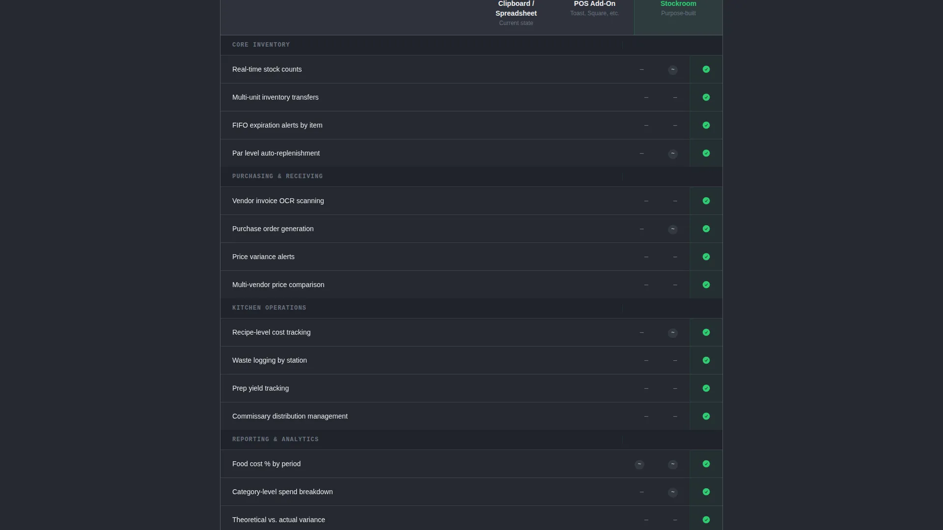
- A three-column comparison table contrasting clipboard or spreadsheet tracking, a competitor point-of-sale add-on, and the featured platform across rows for real operator pain points
- A freemium signup form asking only for restaurant name, number of locations, and work email, plus a secondary CSV vendor import path
Feature list
This template packages several purpose-built components that work together to build trust and drive action from restaurant operations professionals.
Above-the-Fold Waste Calculator
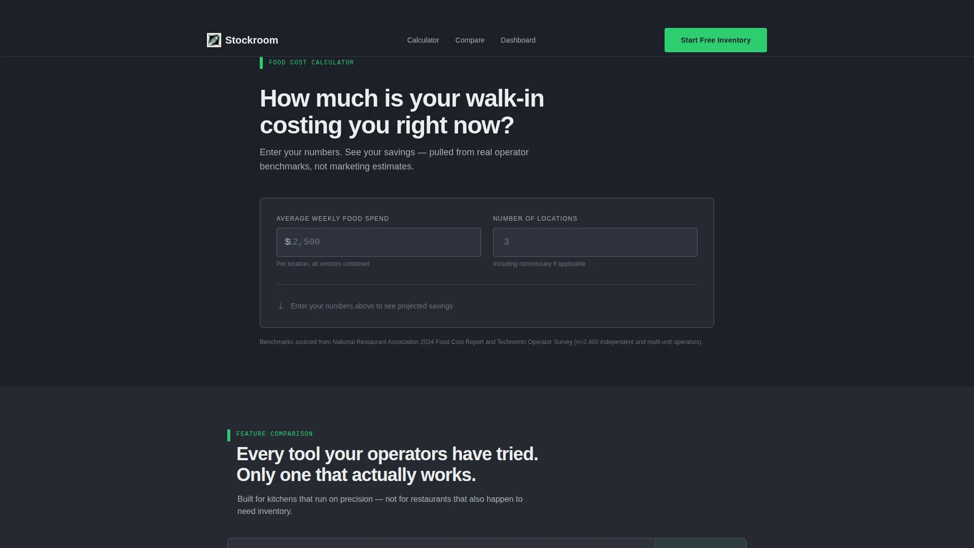
A dark steel card holds two input fields: Average Weekly Food Spend and Number of Locations. As the visitor types, the tool animates three output values in signal green. Projected annual savings, waste reduction percentage, and labor hours reclaimed all update in real time using industry benchmark logic. There is no hero image and no tagline. The calculator is the pitch.
Three-Column Comparison Table
The comparison section places three inventory management approaches side by side. Clipboard and spreadsheet tracking, a competitor point-of-sale add-on, and the featured platform are evaluated across rows covering multi-unit inventory transfers, vendor invoice optical character recognition scanning, recipe-level cost tracking, waste logging by station, and FIFO expiration alerts. Signal green checkmarks and brushed stainless dashes make the differences immediately readable.
Animated Live-Data Dashboard Mockup
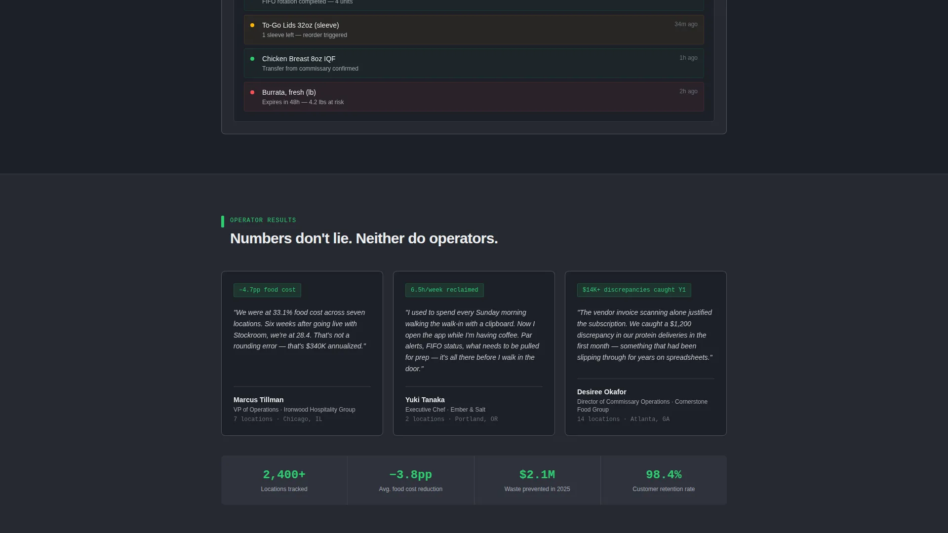
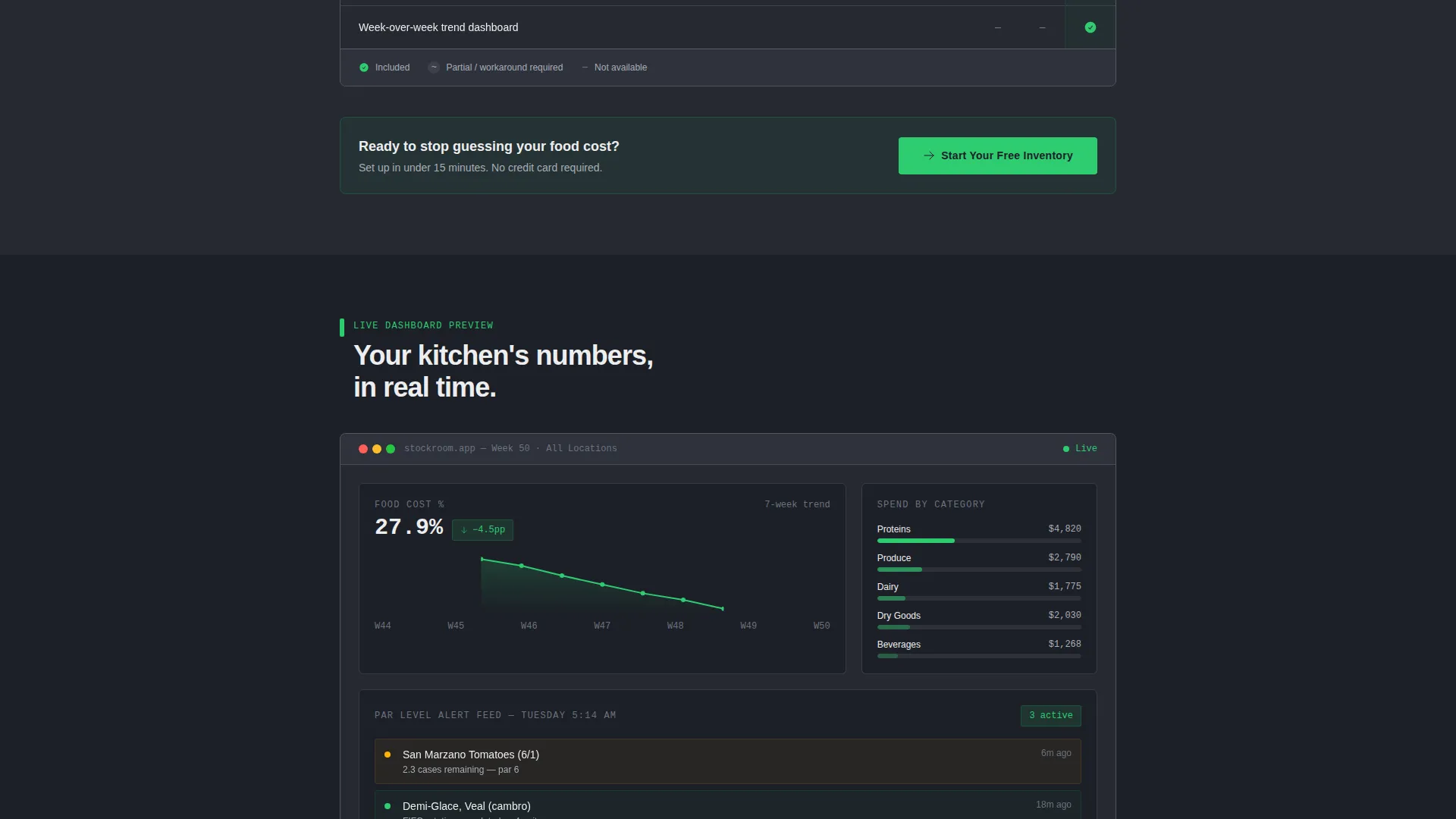
Below the comparison table, a dashboard mockup animates on scroll entry. It shows food cost trending downward week over week, category-level spend breakdowns, and a par level alert feed styled to look like a real kitchen's Tuesday morning report. This section converts feature claims into visible proof.
Pinned Freemium Call-to-Action
The primary call-to-action, reading "Start Your Free Inventory," appears twice. It is pinned below the calculator results and again anchoring the comparison table. No credit card is required. The placement ensures the signup prompt appears exactly when motivation is highest.
CSV Vendor Import Onboarding Path
A secondary conversion option invites visitors to upload their existing vendor list as a comma-separated values file. The upload immediately populates a demo account with the visitor's actual suppliers. This creates a personalized trial experience from the first minute and reduces the perceived effort of switching from an existing system.
Minimal Friction Signup Form
The signup form collects only three fields: restaurant name, number of locations via a dropdown with four range options, and work email address. No payment details are requested. The low barrier matches the freemium positioning and removes the hesitation that longer forms create for busy operators.
Page sections overview
| Section | Purpose |
|---|---|
| Waste Calculator Header | Capture attention with personalized savings output before any scrolling |
| Comparison Table Section | Show platform advantages against spreadsheet and point-of-sale alternatives |
| Dashboard Mockup Section | Translate feature claims into animated visual proof using kitchen-realistic data |
| Primary call to action Block | Drive free trial signups with a zero-friction, no-credit-card form |
| Vendor Import Path | Offer a secondary conversion route that personalizes the demo instantly |
Design & branding system
The visual identity follows a Dashboard Pro theme with a Monochrome Steel color system. Every color choice reinforces the precision and accountability that restaurant operators expect from a tool handling their food cost data.
- Deep galvanized charcoal (#1C1F26) for primary backgrounds, brushed stainless (#A8ADB7) for secondary surfaces and divider lines, and cold white (#EDEEF0) for card faces and data cells
- Signal green (#2ECC71) is reserved exclusively for savings figures, positive deltas, and primary call-to-action buttons, making every important number instantly identifiable
- The overall aesthetic evokes a commercial kitchen pass at 5 a.m., stainless steel under fluorescent light, clean and unforgiving, where every number has to be right
Mobile & speed optimization
The single-page layout is structured to load cleanly and remain fully navigable on any screen size. Restaurant operators often check tools on tablets or phones during or before a shift, so the layout respects compact viewports.
- The waste calculator inputs and animated output fields are sized for comfortable touch interaction on tablet and phone screens
- The comparison table is laid out to remain readable without horizontal scrolling on standard mobile viewport widths
- Section animations trigger on scroll entry, keeping the initial page load lightweight while still delivering the animated dashboard effect as the visitor reaches it
How this template helps you convert
The page is architected around a single principle: let the visitor see their own potential savings before asking them to do anything. Every subsequent section reinforces that first impression.
- The waste calculator creates a personalized, data-backed reason to keep scrolling. Visitors who see their own projected savings number in signal green are already invested before they reach the comparison table.
- The comparison table removes the "but what about my current system" objection by naming real alternatives and showing row-by-row where gaps exist, making the switch feel logical rather than risky.
- The CSV vendor import path turns a free trial into a demo that already looks like the visitor's own kitchen, which creates immediate switching cost and makes the platform feel familiar from the first session.
Other information about this template
This template is a strong fit for teams marketing restaurant inventory software, food cost tracking platforms, kitchen operations tools, and related warehouse management solutions to the foodservice industry. It is built as a single landing page and does not include a blog, pricing page, or multi-page navigation structure.
- The freemium and free-trial conversion model is built directly into the layout, making it suitable for product-led growth strategies common in restaurant technology
- The template style is a comparison table layout, which works well for platforms entering a market where buyers still rely on manual processes like clipboards or basic spreadsheets
- Teams can adapt the calculator benchmark logic, comparison row labels, and dashboard mockup data to reflect their own platform's positioning and real customer metrics
- The vendor import secondary conversion path is especially valuable for platforms competing against established point-of-sale systems with existing supplier data
Theme
Dashboard Pro
Creative direction
Calculator/Tool First
Color system
Monochrome Steel
Style
Comparison Table
Direction
Freemium/Trial
Page Sections
Interactive Waste Calculator
Three-column Comparison Table
Animated Dashboard Mockup
Dual Placement Call to Action Strategy
CSV Vendor Import Onboarding
Minimal Friction Signup Form
Related questions
Does this template require coding to customize?
Can I change the comparison table rows to match my platform's actual features?
Is the waste calculator connected to a live data source?
What makes the freemium signup form effective?
Who is the target visitor for a landing page built on this template?



