E-Commerce Software & SaaS Professional Website Template
Storefront is a bold, dark-themed eCommerce landing page template built for no-code store builders. It features a Feature Tab Switcher hero, animated flip cards, a modular bento grid, and a two-step app download flow. Designed for side-hustlers, direct-to-consumer founders, and anyone ready to launch a real online store fast.
by Rocket studio
Quick summary
Storefront is a single-page, card-grid landing page template for a no-code eCommerce builder. It combines a Feature Tab Switcher header, a Problem to Solution scroll arc, and a two-step app download flow. The Acid Digital visual identity makes every section feel sharp, fast, and conversion-ready right out of the box.
Who this template is for
This template is built for founders and creators who need to launch a functioning online store quickly and without writing code. It speaks directly to people who sell physical products, run direct-to-consumer brands, or want a cleaner alternative to clunky legacy platforms.
- Side-hustlers listing handmade or small-batch products who need a fast, mobile-first storefront
- Direct-to-consumer founders migrating off outdated platforms mid-launch
- Independent sellers who want full control over their store layout without touching a single line of code
What problem this template solves
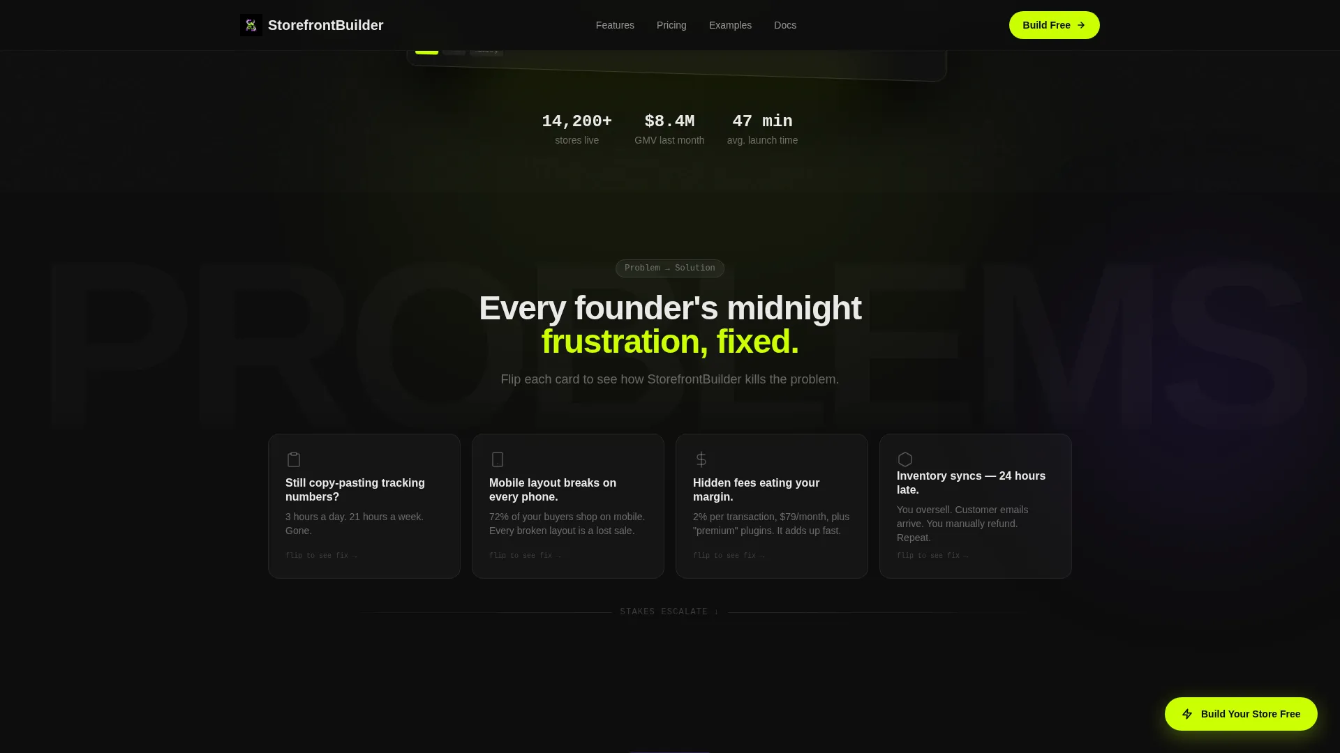
Building an online store has historically meant stitching together separate tools, copying tracking numbers manually, and fighting mobile layout bugs at midnight. This template gives that pain a name and immediately shows the solution.
- Manual inventory updates, broken mobile layouts, and hidden transaction fees all get a dedicated flip-card treatment
- Pain points are paired visually with animated solution cards so visitors understand the value before they scroll past the fold
- The escalating Problem to Solution arc moves buyers from annoyance to urgency, ending with social proof that makes the decision feel safe
What you get with this template
You get a fully structured, single-page landing page designed to drive app downloads and trial starts for a no-code eCommerce store builder. Every section is purposeful, every interaction is mapped, and the design system is ready to customize.
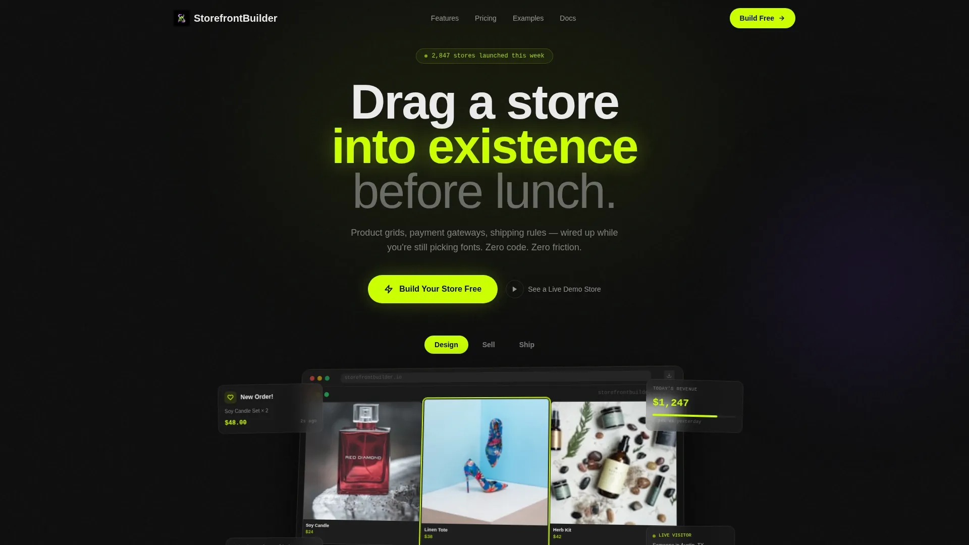
- A Feature Tab Switcher hero with a 3D-tilted browser mockup that swaps content across Design, Sell, and Ship tabs
- A modular bento-grid feature section with asymmetric cards, animated metrics, and scroll-triggered reveals
- A two-step platform selector modal that collects a phone number or email and sends an install link without requiring account creation
Feature list
This template ships with six core interactive and structural features drawn directly from its design brief.
Feature Tab Switcher Header
The header places three clickable tabs labeled "Design," "Sell," and "Ship" above a live-rendered browser mockup. Each tab instantly swaps the mockup content: a drag-and-drop grid editor, an animated checkout screen, or a real-time order dashboard. A lime cursor dot trails across the tilted mockup to make the interface feel alive.
Problem to Solution Flip Cards
Each scroll row pairs a specific pain point card with an animated solution card that flips on scroll to reveal the feature that addresses it. Pain points covered include manual inventory, broken mobile layouts, and hidden transaction fees. Stakes escalate section by section from everyday annoyance to real revenue risk.
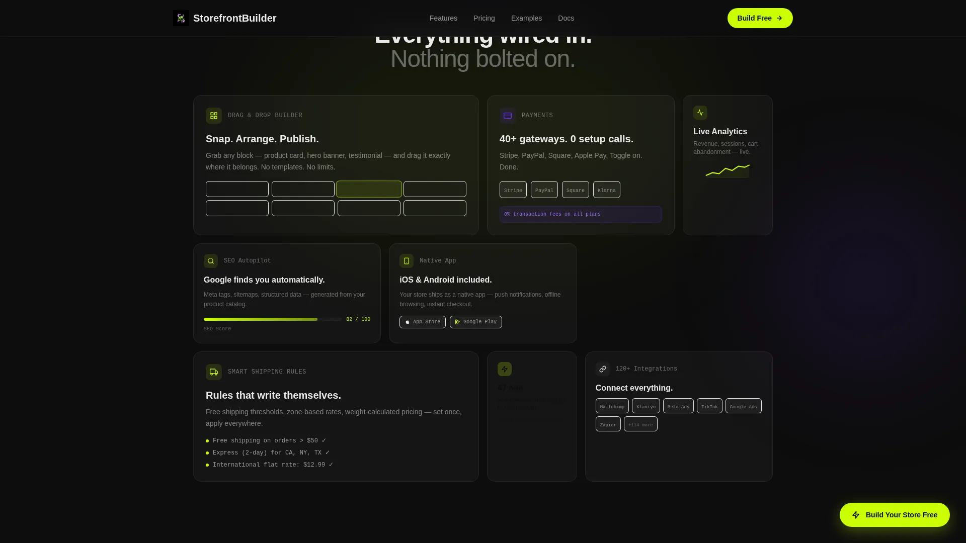
Modular Bento Grid
The feature section uses an asymmetric card grid layout with varied card sizes, embedded metrics, and scroll-triggered animations. Cards can be rearranged to highlight different capabilities without breaking the visual rhythm. This layout gives the page a product-forward, editorial feel.
Two-Step App Download Flow
The primary call to action triggers a two-step micro-flow. Step one lets the visitor select their platform: iOS, Android, or Desktop. Step two sends an install link to a phone number or email with one field and one button, and no account creation is required.
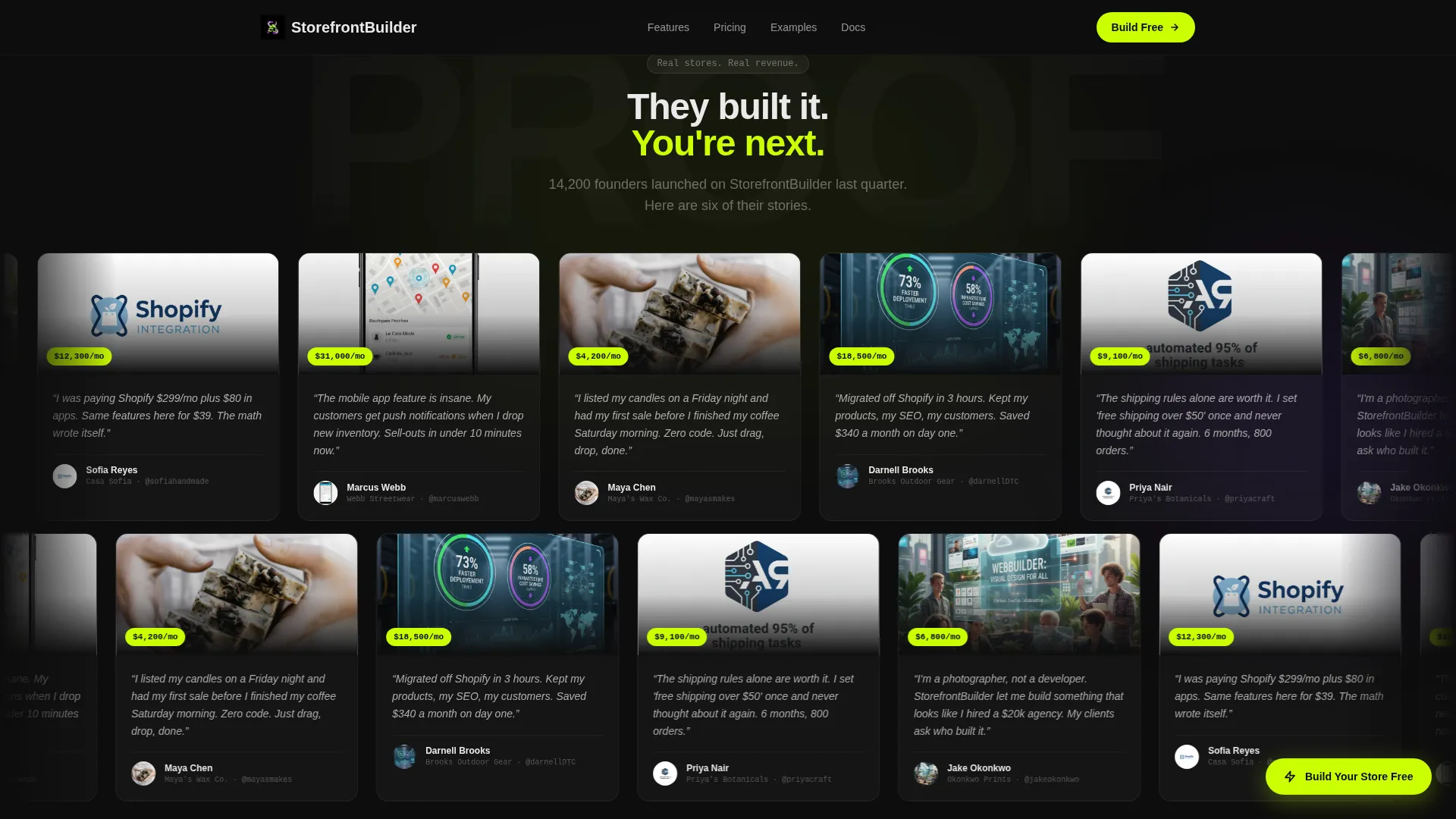
Testimonial Proof Section
A grid of real storefront screenshots sits against the void-black canvas, glowing like proof of life. Each screenshot is accompanied by founder quotes and revenue metrics to give skeptical visitors concrete social evidence.
Sticky and Floating Call-to-Action
The "Build Your Store Free" call to action appears in the hero mockup, as a sticky bottom bar on mobile, and as a floating pill on desktop. A secondary call to action, "See a Live Demo Store," links to a functioning sample shop for visitors who want to experience the builder's output before committing.
Page sections overview
| Section | Purpose |
|---|---|
| Feature Tab Switcher Hero | Introduce the builder with swappable mockup tabs and a tilted 3D browser preview |
| Problem Solution Arc | Pair pain-point flip cards with animated solution reveals across escalating scroll rows |
| Feature Bento Grid | Showcase core capabilities in an asymmetric modular card layout with metrics |
| Testimonial Proof Grid | Display real storefront screenshots and founder quotes against a dark canvas |
| App Download Flow | Guide visitors through a two-step platform selector to receive an install link |
| Footer | Close the page with a horizontal flow pattern and supporting navigation links |
Design & branding system
The Acid Digital color system powers every visual decision in this template. The overall feeling is a code editor running at full brightness at 2 a.m.: synthetic, caffeinated, and unapologetically digital.
- Void black (#0D0D0D) dominates backgrounds; electric lime (#CAFF04) drives every call to action and progress indicator; hot terminal white (#EAEAEA) carries body text
- Deep screen purple (#6B2FFA) is reserved exclusively for hover states and active selections, flaring on interaction like a cursor landing on the right line
- Typography pairs DM Sans for clean, readable body copy with JetBrains Mono for technical labels and metrics, reinforcing the builder's no-code-meets-developer aesthetic
Mobile & speed optimization
The template is built mobile-first because its primary audience, side-hustlers and early-stage founders, often launch and manage stores from their phones. Every layout decision prioritizes touch usability and fast visual loading.
- The sticky bottom bar on mobile keeps the primary call to action visible at all times without interrupting the scroll experience
- GPU-accelerated transforms and Intersection Observer-based scroll reveals keep animations smooth without blocking the main rendering thread
- Card grid layouts reflow cleanly from desktop bento asymmetry to single-column stacks on smaller screens
How this template helps you convert
This template is engineered around a single conversion goal: getting the visitor to download the app or start a free trial. Every design and copy decision supports that moment.
- The Feature Tab Switcher hero lets visitors experience three core product dimensions before they scroll, building intent early and reducing drop-off from uncertainty.
- The Problem to Solution flip-card arc escalates emotional stakes from mild annoyance to competitive threat, making the download feel like a necessary decision rather than a casual one.
- The two-step download flow removes all friction at the moment of commitment: one field, one button, no account required, with a live demo store available for anyone who still needs convincing.
Other information about this template
This template is part of a Startup Velocity theme collection built on the Acid Digital color system. It is designed for the eCommerce website builder niche, specifically targeting the no-code store builder segment within the broader eCommerce software and SaaS category.
- The Card Grid (Modular) template style means sections can be reorganized or extended without breaking the overall visual grid system
- Animations include floating cards, tab content swaps, border beam effects, flip-card reveals, and marquee-style motion throughout the scroll journey
- The template is localized for the United States market with USD pricing format and MM/DD/YYYY date display conventions built into the design
- The footer follows a horizontal flow pattern consistent with modern SaaS product page standards
Theme
Startup Velocity
Creative direction
Problem→Solution Arc
Color system
Acid Digital
Style
Card Grid (Modular)
Direction
App Download
Page Sections
Feature Tab Switcher Hero
Problem to Solution Flip Cards
Asymmetric Bento Grid
Two-step App Download Flow
Testimonial Proof Grid
Persistent Call-to-action Placement
Related questions
Do I need to know how to code to use this template?
Can I change the colors and fonts to match my brand?
How does the two-step app download flow work?
Is there a way for visitors to preview the product before downloading?
How many sections does this landing page template include?


