Salon & Spa Order Management Landing Page Template
Streamline is a dashboard-style landing page template built for salon and spa order management platforms. It combines a product screenshot header, an interactive savings calculator, and a twelve-row feature comparison grid into one high-impact single-page flow. The Void and Violet color system and Dynamic Motion micro-animations make the interface feel as premium as the product it promotes.
by Rocket studio
Quick summary
Streamline is a single-page landing page template designed for salon and spa supply order management software. It leads with a full-width dashboard screenshot, earns engagement with an embedded savings calculator, and closes the case with a scrolling comparison grid. The result is a page where visitors calculate their own value before they ever reach a call to action.
Who this template is for
This template is built for software founders, product marketers, and growth teams promoting salon and spa order management platforms. It speaks directly to buyers who already feel the pain of fragmented supply workflows and are actively comparing solutions.
- Salon owners managing multiple styling chairs and dozens of product lines
- Spa directors coordinating linen services, vendor relationships, and essential oil inventory
- Multi-location franchise managers tracking spend and reorder activity across several sites
What problem this template solves
Supply ordering in salons and spas is often held together by frantic restock texts, half-empty backbar shelves, and spreadsheets that nobody fully trusts. Platforms solving this problem need a landing page that does more than describe features. They need one that makes the visitor feel the relief before the demo call.
- Visitors arrive comparison-shopping and need evidence, not just marketing copy
- Generic software landing pages fail to mirror the specific vocabulary and workflow pain of salon buyers
- Most templates present features without letting visitors calculate personal value first
What you get with this template
You get a complete, conversion-focused landing page layout built around the salon and spa order management use case. Every section has a specific job, and the page is designed so visitors progress naturally from recognition to calculation to commitment.
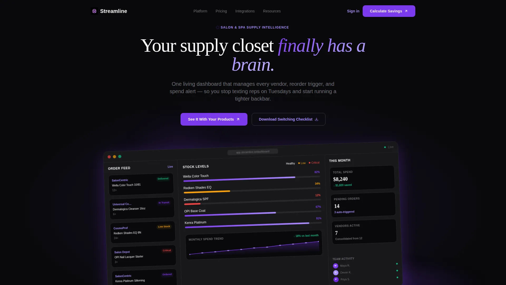
- A pixel-perfect product screenshot header with Z-axis rotation and a soft violet glow effect
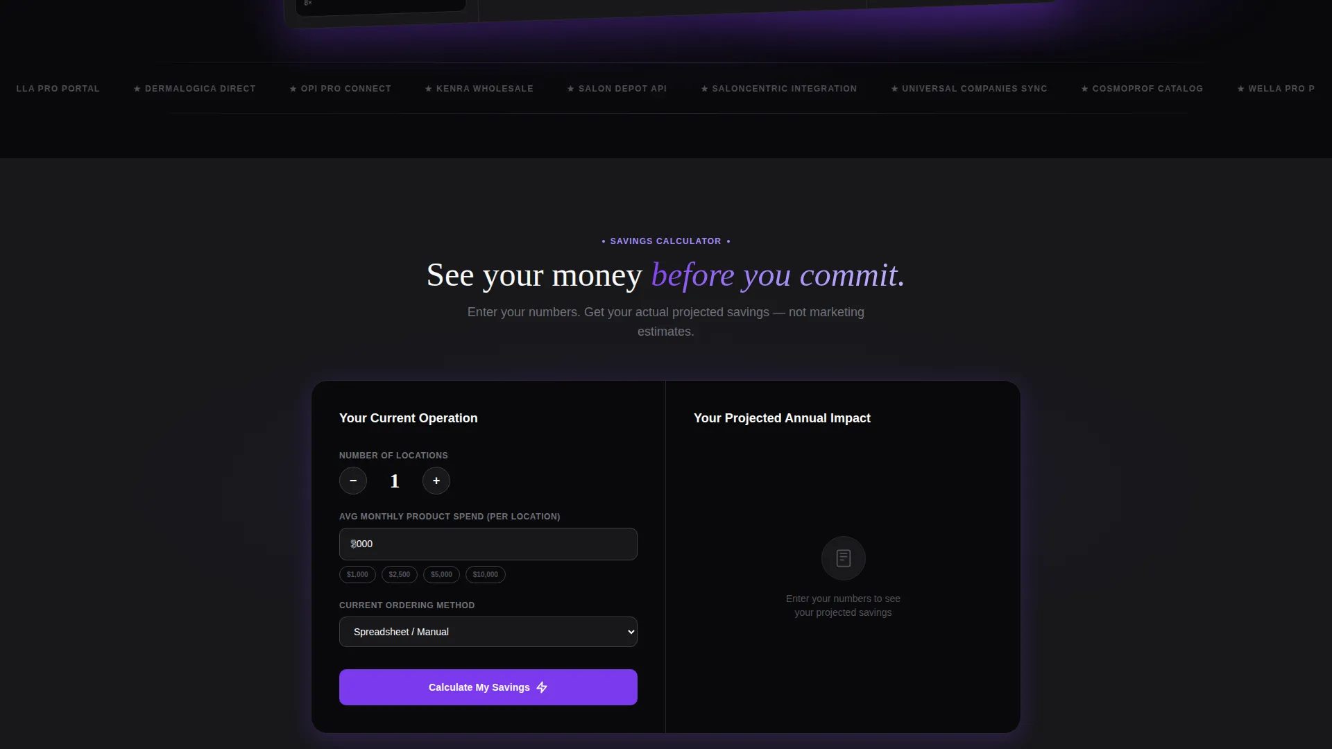
- An embedded savings calculator with instant output in large violet numerals and a cost-breakdown grid
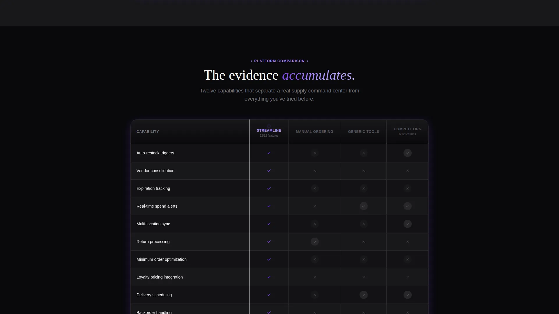
- A twelve-row animated comparison grid covering vendor consolidation, auto-restock triggers, spend alerts, and more
- A two-step demo request form and a secondary gated PDF download for lead nurturing
Feature list
This section covers the core template capabilities backed by the source brief.
Interactive Savings Calculator
The calculator sits directly below the header and accepts location count, average monthly product spend, and ordering method via dropdown. It instantly renders a projected annual savings figure alongside a cost-breakdown grid. Visitors see their own numbers before any pitch begins.
Twelve-Row Comparison Grid
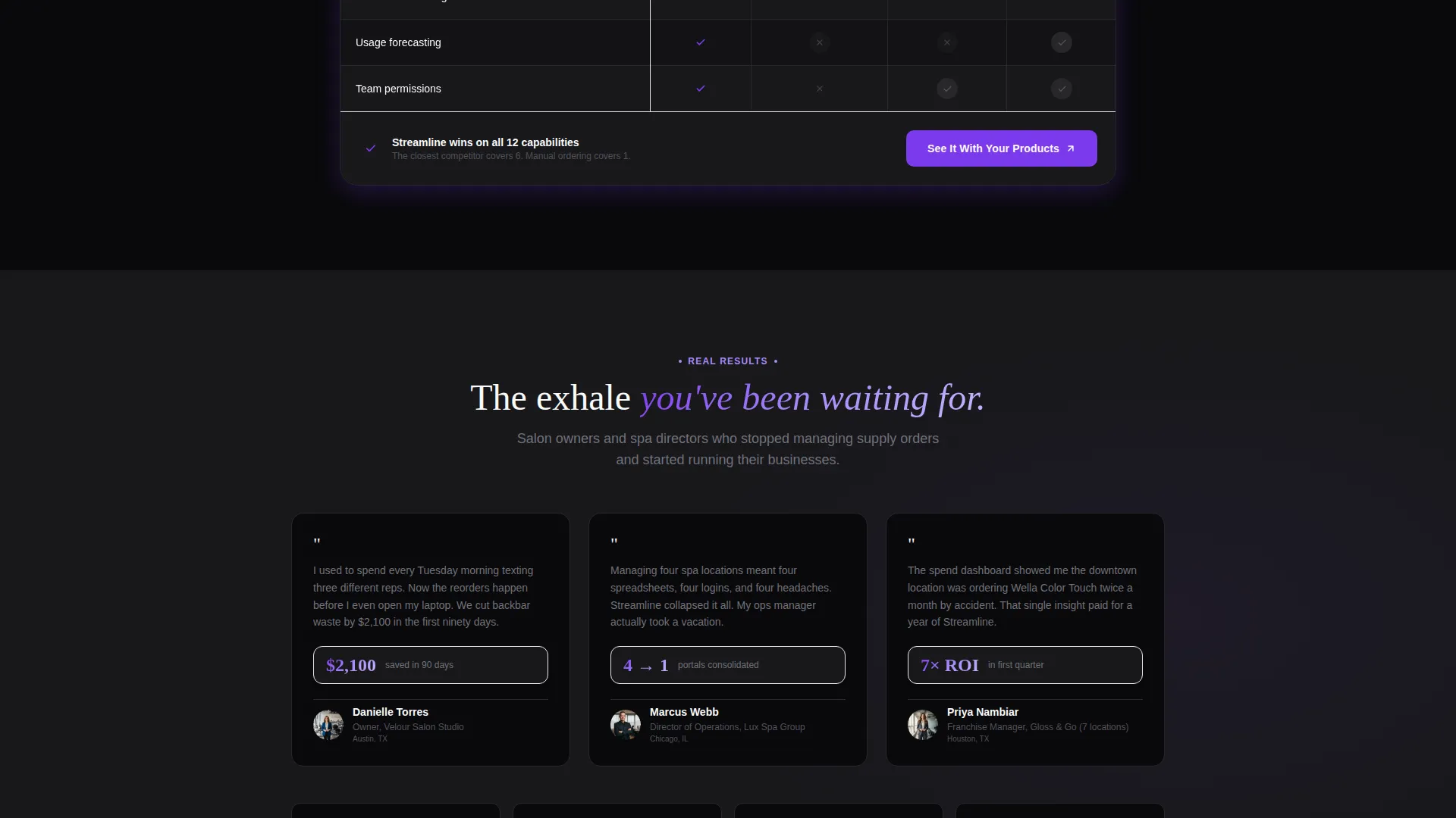
A living data grid compares the platform against manual ordering, generic inventory tools, and competitor approaches across twelve specific capability rows. Each row animates in on scroll, with checkmarks blooming in violet and absent competitor features fading to gray. The grid builds a cumulative case rather than making a single claim.
Dynamic Motion Micro-Animations
Numbers tick upward on scroll, order status pills pulse gently, and cards lift on hover with a violet shadow bloom. These micro-interactions make the interface feel alive without distracting from the content hierarchy.
Two-Step Demo Request Form
The primary call to action opens a two-step form. Step one captures salon or spa name, location count, and primary distributor. Step two asks for the visitor's single biggest ordering pain point via a targeted dropdown. This structure qualifies leads while keeping friction low.
Gated PDF Secondary Conversion Path
A secondary call to action offers a downloadable switching checklist. It captures email only, creating a nurture path for visitors who are comparison-shopping but not yet ready to book a demo.
Full-Width Dashboard Screenshot Header
The header displays a pixel-perfect, full-width capture of the platform mid-action, showing a real-time order feed, a color-coded stock-level grid, and a month-over-month spend panel with a trend line. The screenshot floats above the void background at a slight Z-axis angle with a violet glow beneath it.
Page sections overview
| Section | Purpose |
|---|---|
| Dashboard Screenshot Header | Anchors credibility with a real product view and one-line headline |
| Savings Calculator Block | Lets visitors calculate personal annual savings before scrolling further |
| Comparison Grid | Builds evidence row by row across twelve platform capability areas |
| Primary call to action Block | Drives demo signups via a two-step qualifying form |
| Floating call to action Button | Keeps the demo action accessible after the comparison grid |
| Gated PDF Download | Captures email leads who need more time before committing to a demo |
Design & branding system
The Void and Violet color system positions the interface as the luxury itself. Absolute void black dominates backgrounds and navigation rails, electric violet pulses through active states and progress indicators, phantom orchid softens secondary labels and hover states, and clinical white gives every data row room to breathe. The overall aesthetic feels like a premium screen glowing in a dark room.
- Color palette: void black (#09090B), electric violet (#7C3AED), phantom orchid (#A78BFA), and clinical white (#FAFAFA)
- Motion system: scroll-triggered number counters, pulsing status pills, hover card lifts with violet shadow bloom
- Typography and data surfaces use clinical white on void black for maximum contrast and a premium, dashboard-native feel
Mobile & speed optimization
The Dynamic Motion theme is designed with lightweight micro-animations that enhance rather than burden page performance. The layout adapts the data grid and calculator for smaller viewports, keeping the interactive tools usable without requiring a desktop screen.
- Micro-animations are triggered on scroll rather than on page load, reducing initial render weight
- The comparison grid and calculator are structured for clean reflow on mobile screen widths
- The floating call-to-action button remains pinned and accessible across all viewport sizes
How this template helps you convert
This template is built around a Calculator-First, then Comparison-Versus conversion architecture. Every section earns the next click by delivering value before asking for anything in return.
- The savings calculator lets visitors input their own data and see a projected savings figure instantly, so they arrive at the call to action already convinced by their own numbers rather than by marketing claims.
- The twelve-row animated comparison grid accumulates evidence systematically, making the platform's advantages clear without requiring the visitor to weigh abstract feature lists on their own.
- The two-path conversion structure serves both ready buyers with the demo form and earlier-stage comparison shoppers with the gated PDF, capturing leads at two distinct points of intent.
Other information about this template
This template is categorized under Technology, specifically within the Salon and Spa Software subcategory and the Salon and Spa Order Management niche. It is well-suited for teams building or marketing platforms that replace fragmented vendor portals, phone-based restock workflows, and manual spreadsheet systems. The intersection match score for this template's context alignment is 13, indicating a tight fit between template style and niche intent.
- Template style: Dashboard and Data Grid, ideal for platforms with data-rich interfaces
- Theme: Dynamic Motion, using scroll and hover animations to mirror a live software product
- The header references real-world vendor names as placeholder examples within the screenshot mockup, adding authenticity to the product preview
- The comparison grid covers twelve rows: auto-restock triggers, vendor consolidation, expiration tracking, real-time spend alerts, multi-location sync, return processing, minimum order optimization, loyalty pricing integration, delivery scheduling, backorder handling, usage forecasting, and team permissions
Theme
Dynamic Motion
Creative direction
Calculator/Tool First
Color system
Void & Violet
Style
Dashboard/Data Grid
Direction
Comparison/Versus
Page Sections
Interactive Savings Calculator
Twelve-row Animated Comparison Grid
Full-width Dashboard Screenshot Header
Dynamic Motion Micro-animations
Two-step Demo Request Form
Gated PDF Secondary Conversion Path
Related questions
Who is this landing page template designed for?
Can I customize the savings calculator inputs and outputs?
What does the two-step demo request form capture?
Is the twelve-row comparison grid editable?
Does the template include the gated PDF switching checklist?



