Golf Analytics Dashboard Landing Page Template
Stroke is a golf analytics dashboard landing page built on a modular card grid layout. It translates raw round data into granular metrics like strokes gained, proximity averages, and scramble percentages. The design uses a deep navy and electric indigo palette to create a sharp, data-forward interface that moves serious golfers, coaches, and club professionals toward signing up.
by Rocket studio
Quick summary
Stroke is a single-page golf analytics dashboard template built for precision. It organizes complex performance data into a clean card grid, giving visitors an immediate sense of what the product measures. The page is designed to earn a click without requiring a form, using stacked metric cards and two focused calls to action.
Who this template is for
This template is built for golf's most data-hungry users. It speaks to people who already understand performance measurement and want a tool that matches their level of seriousness.
- Single-digit handicappers working toward scratch who want decimal-point feedback on every round
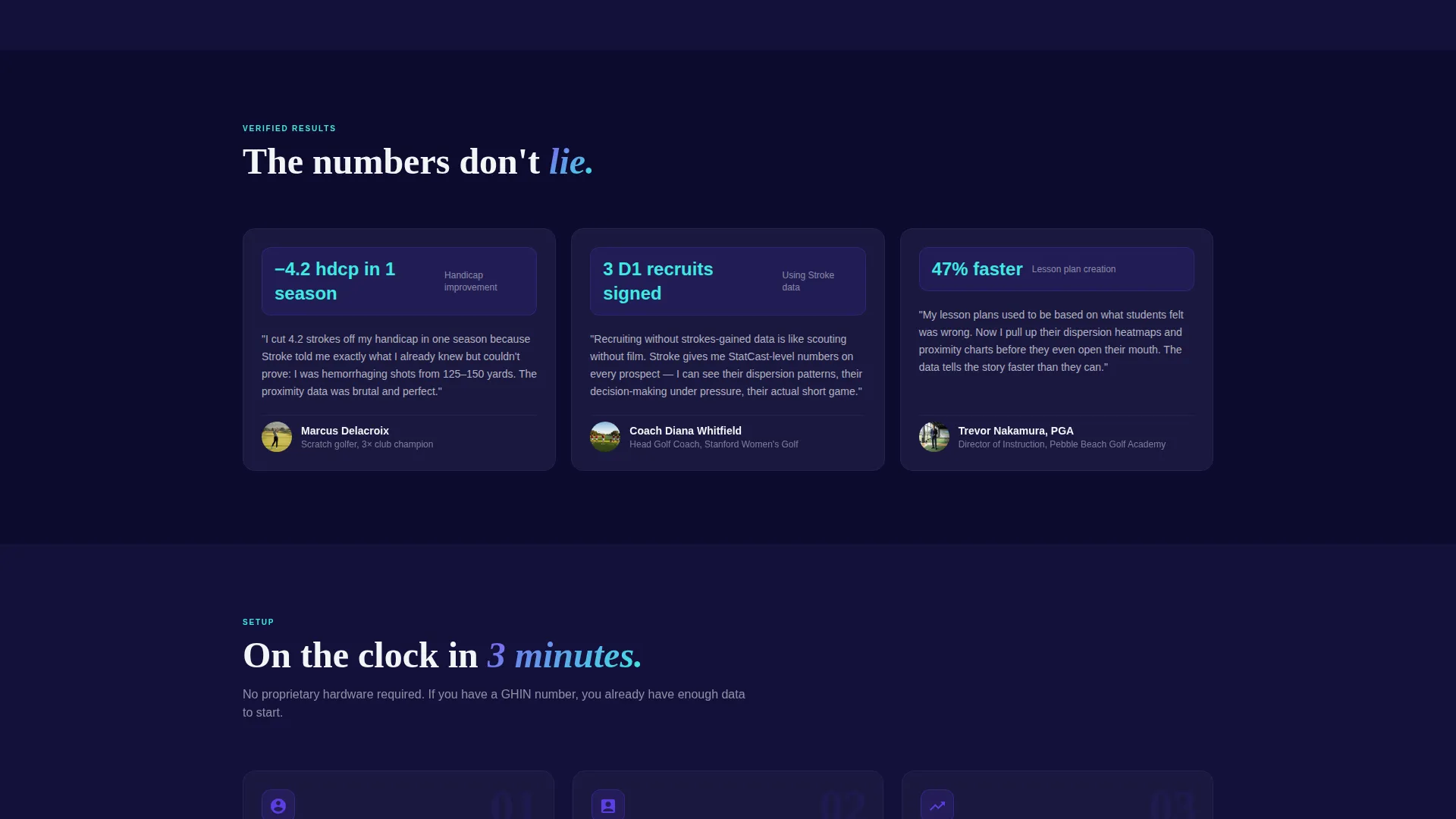
- College coaches who need recruitment-grade statistical precision to evaluate player development
- Club professionals building lesson plans around actual shot dispersion data rather than general impressions
What problem this template solves
Most golfers leave a round with vague feelings instead of clear answers. They know something was off, but they cannot name it with enough precision to fix it. This template solves the gap between feeling and fact.
- It replaces gut instinct with specific, measurable data points like proximity averages and scramble percentages by lie type
- It gives coaches and instructors a structured way to present analytical tools to a technically literate audience
- It removes friction from the sign-up decision by letting visitors explore a sample dashboard before committing
What you get with this template
You get a fully structured, single-page layout built around a modular card grid. Each section is designed to present one capability at a time, stacking evidence until the visitor is ready to act.
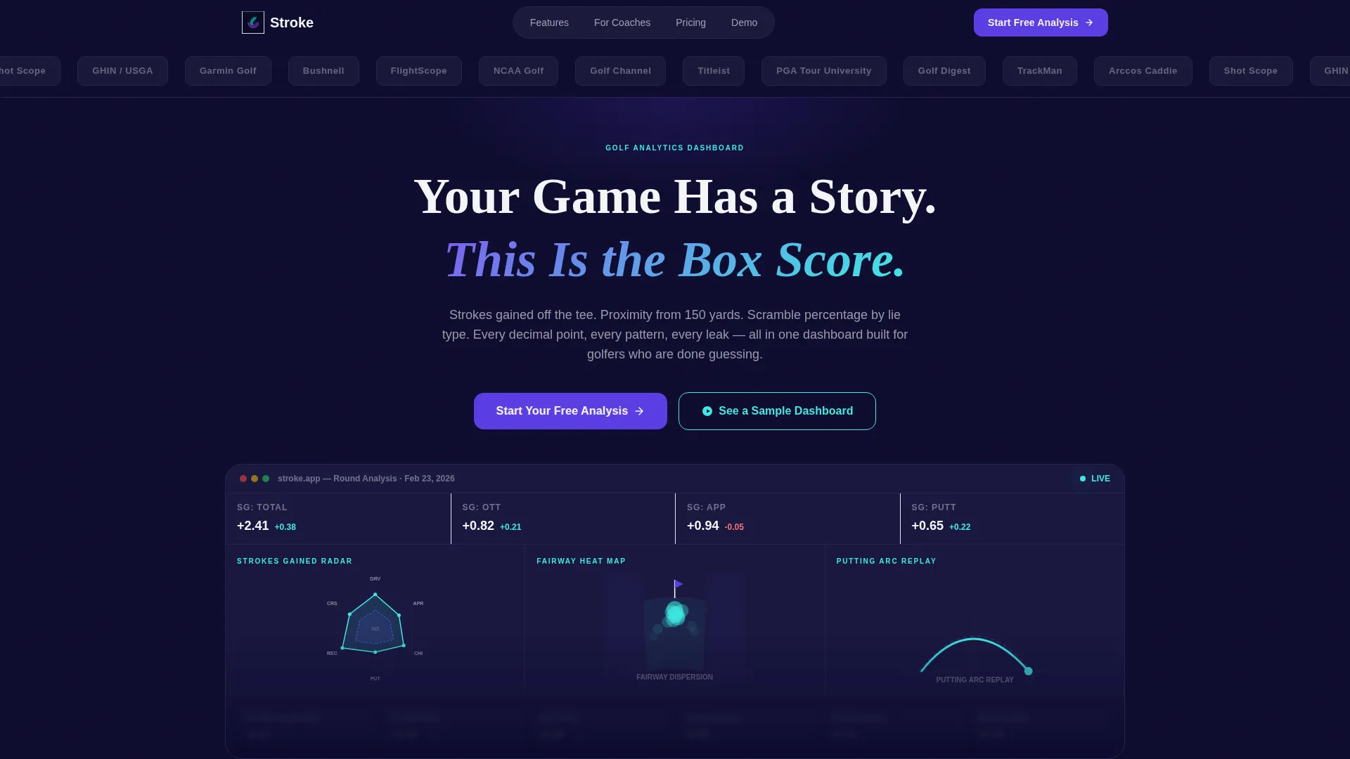
- A hero section with a logo bar, a bold headline, and a partially visible dashboard preview that creates curiosity
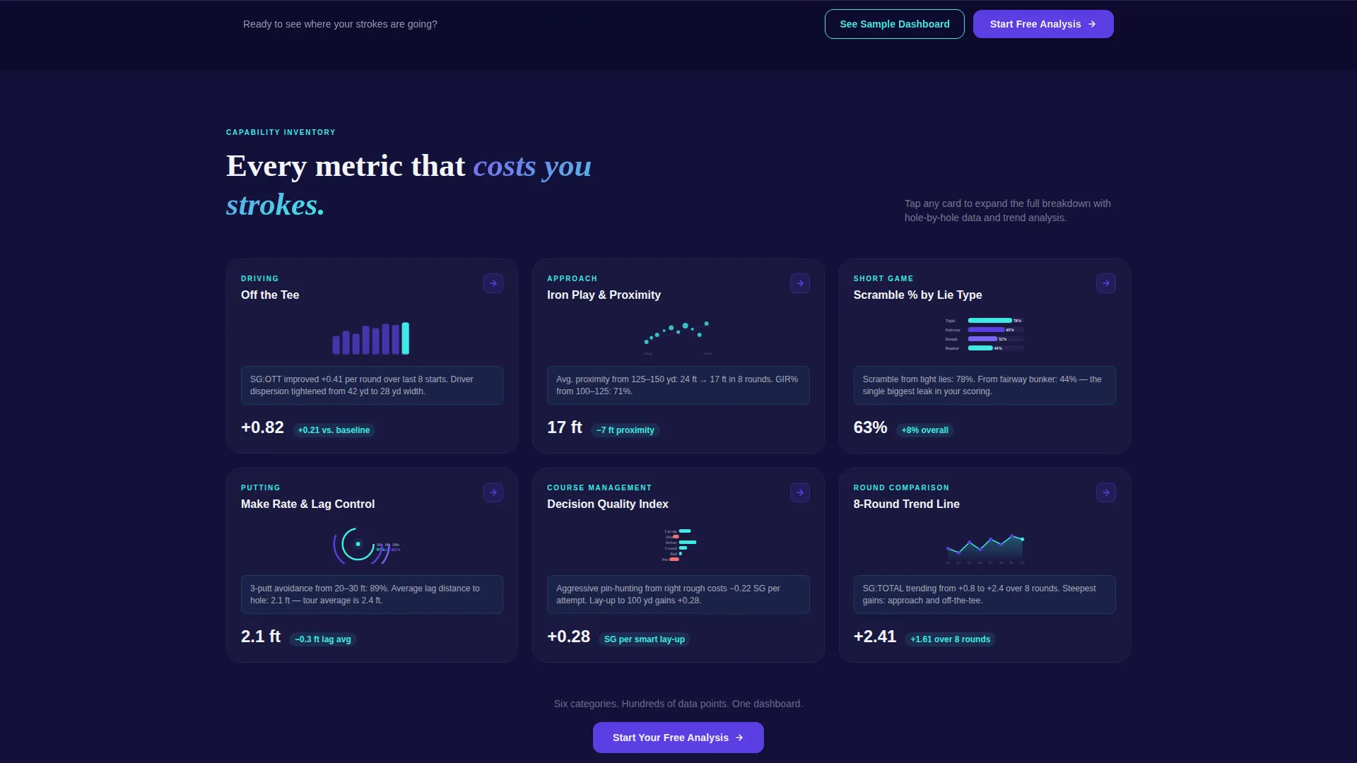
- Six metric category cards covering Driving, Approach, Short Game, Putting, Course Management, and Round Comparison
- Two conversion touchpoints: a primary call-to-action button beneath the hero and a sticky bottom bar that appears after the third card row
Feature list
This template packs several purposeful components into one focused layout. Each feature serves the goal of turning a skeptical visitor into a confident user.
Modular Metric Card Grid
Each card isolates one performance category and presents it like a product specification tile. The card shows a metric name, a miniature data visualization, a one-line stat insight, and a subtle expand icon. The grid inventories capability without forcing a narrative.
Logo Bar Header Strip
A horizontal strip of partner and recognizable affiliation logos scrolls at a deliberate pace above the main headline. This builds immediate credibility before the visitor reads a single word of body copy.
Partially Visible Dashboard Hero
The hero section shows a cropped dashboard preview including a strokes gained radar chart, a fairway heat map, and a putting arc replay. The partial reveal creates pull without giving the full product away.
Primary and Sticky Call-to-Action System
The primary call-to-action button, labeled "Start Your Free Analysis," appears first beneath the hero card. It reappears as a sticky bottom bar after the third row of metric cards, keeping the conversion prompt visible without interrupting the scroll.
Sample Dashboard Lightbox
A secondary call-to-action labeled "See a Sample Dashboard" opens a lightbox with an interactive demo round. This gives skeptical visitors a way to touch the product before making any commitment.
Spec Sheet Card Format
Every card follows a consistent spec sheet format. Metric name, miniature visualization, and a one-line insight work together to make each card feel like a data product rather than a marketing claim.
Page sections overview
| Section | Purpose |
|---|---|
| Logo Bar Strip | Establish credibility with partner and affiliation logos before the headline |
| Hero Headline | Deliver the core value statement above the dashboard preview |
| Dashboard Preview Card | Show a cropped, partially visible dashboard to create curiosity |
| Primary call to action Button | Route visitors to sign-up flow directly beneath the hero |
| Driving Metric Card | Present strokes gained off the tee with a miniature visualization |
| Approach Metric Card | Display proximity averages from key yardage ranges |
| Short Game Card | Show scramble percentage broken down by lie type |
| Putting Metric Card | Surface putting arc and consistency data |
| Course Management Card | Highlight decision-making and risk-reward pattern data |
| Round Comparison Card | Compare performance trends across recent rounds |
| Sticky call to action Bar | Re-surface the primary call to action after the third card row |
Design & branding system
The visual identity follows a Startup Velocity theme built around an Electric Indigo color system. The palette is designed to feel sharp and data-forward, like a launch screen glowing before dawn.
- Deep dashboard navy (#0D0B2E) dominates background and card surfaces, charged indigo (#5B3FE4) drives buttons and active states, data-line cyan (#3EEAE3) traces visualizations and hover accents, and clean scorecard white (#F4F5F7) handles typography and card borders
- The creative direction is Spec Sheet, meaning each card reads like a product specification tile rather than a narrative marketing block
- The overall tone is calm certainty: precise, structured, and confident without being aggressive
Mobile & speed optimization
The modular card grid is designed to reflow cleanly across screen sizes. Cards that sit side by side on desktop stack into a single column on smaller screens without losing their spec sheet readability.
- The sticky call-to-action bar is especially effective on mobile, keeping the conversion prompt anchored at the bottom of the screen throughout the scroll
- The lightbox for the sample dashboard is designed to open inline, reducing the load friction of navigating to a separate page
How this template helps you convert
The page is built around a Click-Through conversion strategy. It does not ask for information upfront. Instead, it builds evidence until the visitor initiates the action themselves.
- The logo bar and cropped dashboard preview establish trust and curiosity in the first few seconds, before the visitor has read any claims
- The card grid stacks specific, granular metrics one by one, so each scroll adds another reason the dashboard is worth trying
- The sticky call-to-action bar ensures the "Start Your Free Analysis" prompt is always one tap away, no matter how deep into the card grid the visitor has scrolled
Other information about this template
This template is part of a Golf Vertical SaaS category within the broader Technology vertical. It is designed for teams or developers building a marketing presence around a golf analytics product.
- The card grid layout is modular, meaning individual metric cards can be added, removed, or reordered without restructuring the page
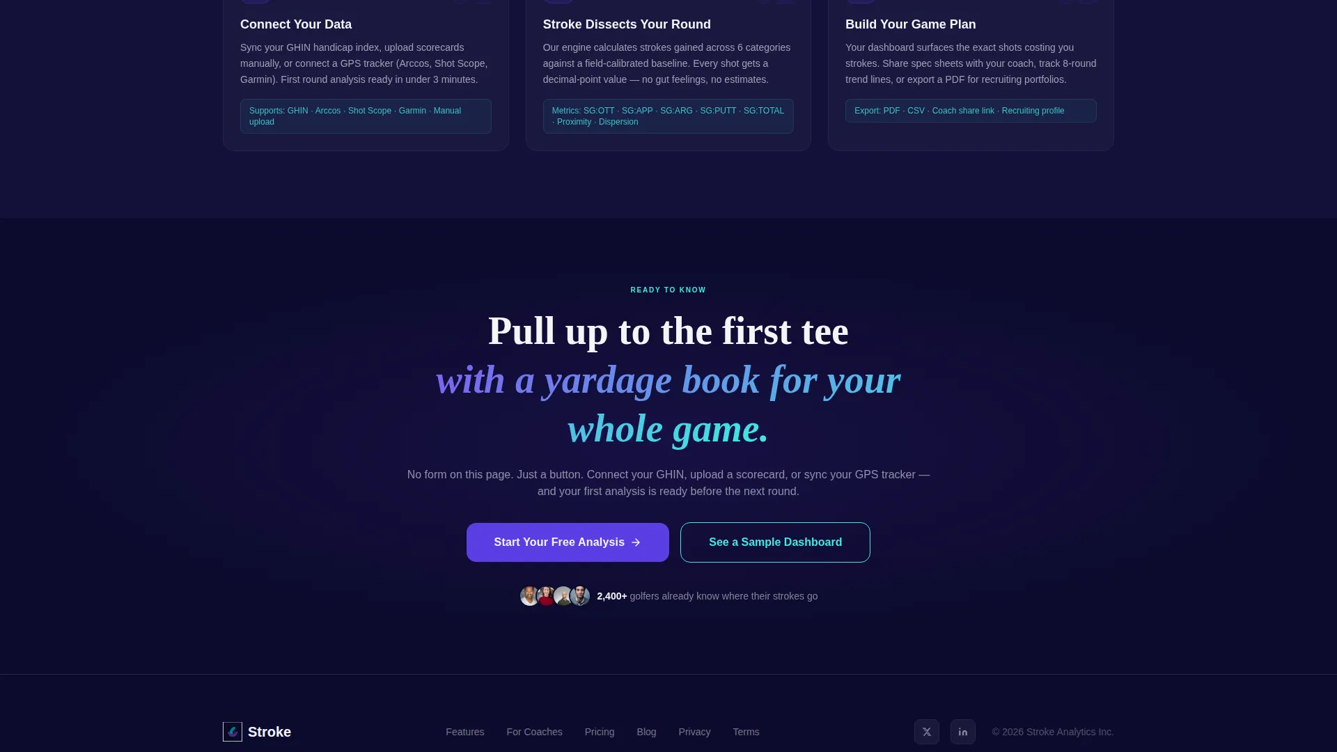
- The sign-up flow connected to the primary call-to-action button supports multiple data input methods: GPS tracker connection, scorecard upload, or sync from a handicap index system such as GHIN
- The template is built using the Startup Velocity theme, which is optimized for dark-background, data-driven interfaces typical of vertical SaaS products
- The Electric Indigo color system is consistent with modern sports analytics dashboards and is designed to feel credible to a technically literate golf audience
Theme
Startup Velocity
Creative direction
Spec Sheet
Color system
Electric Indigo
Style
Card Grid (Modular)
Direction
Click-Through
Page Sections
Modular Metric Card Grid
Logo Bar Credibility Strip
Cropped Dashboard Hero Preview
Sticky Call-to-action Bar
Sample Dashboard Lightbox
Spec Sheet Card Format
Related questions
What kind of golf data does this dashboard template highlight?
Do visitors need to create an account before seeing the dashboard?
How does the sign-up flow work from this landing page?
Can the metric cards be customized for different analytics categories?
Who is this template best suited for?



