Salon & Spa Property Management Landing Page Template
Suite is a comparison table landing page built for salon suite and spa property management companies. It guides independent beauty professionals, salon owners, and commercial real estate investors through a structured three-tier feature matrix. The dark Void and Violet design system creates an immediate sense of premium space, while a single click-through call to action drives qualified leads into a consultation booking flow.
by Rocket studio
Quick summary
Suite is a single-page, click-through landing page template designed for salon suite and spa property management companies. It uses a scrollable feature matrix to help visitors self-sort into the right service tier before clicking through to a booking qualifier. The void-black and electric-violet visual identity signals premium positioning from the first scroll.
Who this template is for
This template is built for businesses and professionals operating at the intersection of beauty real estate and property management. It speaks directly to people who already understand the industry and need a page that matches their credibility.
- Independent stylists and estheticians outgrowing booth rental and evaluating their first suite lease
- Multi-location salon owners scouting new markets and comparing buildout and leasing models
- Commercial real estate investors assessing the salon suite sector as a managed property opportunity
What problem this template solves
Most property management pages bury their service structure in walls of text. Visitors who arrive with specific questions about tenant sourcing, permits, or buildout costs leave without answers. This template fixes that by putting the comparison front and center.
- Visitors cannot easily tell which service tier fits their situation without a clear side-by-side structure
- Generic property pages fail to speak the language of beauty industry professionals who need specifics
- Without a focused call to action, interested prospects drop off before booking a consultation
What you get with this template
You get a fully structured, single-page layout built around a three-tier feature matrix comparison experience. Every section is designed to move the visitor from curiosity to click in one continuous scroll.
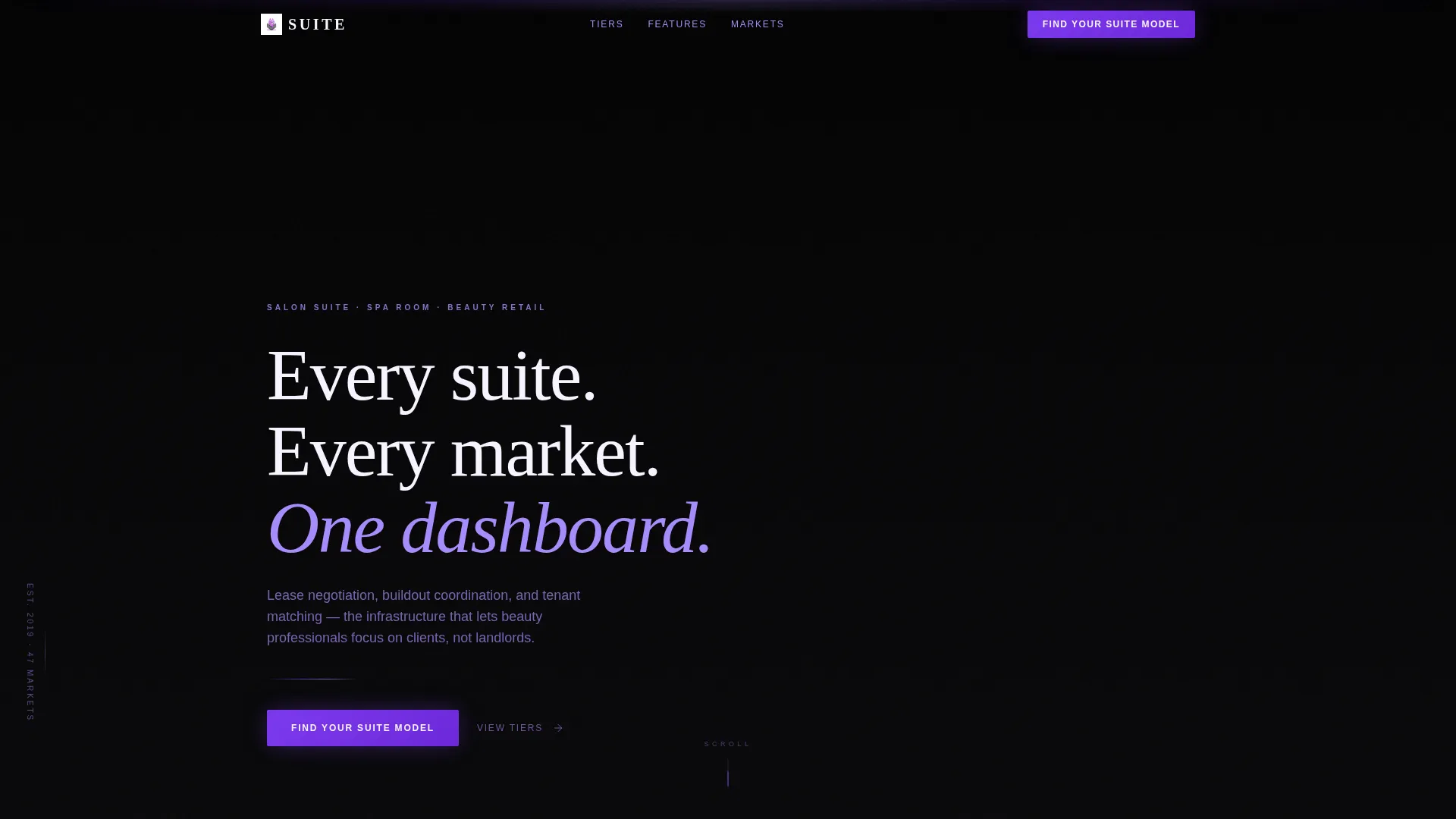
- A dark full-bleed header with a headline fade-in and a violet scroll indicator
- A sticky-header comparison table covering three service tiers with animated row reveals and breakout case-study cards
- A pinned primary call-to-action bar at the table bottom and a floating bar triggered at 60 percent scroll depth
Feature list
This template is built around a focused set of layout and interaction components drawn directly from the design brief.
Dark Full-Bleed Header with Glow Reveal
The header uses a near-black exposure photograph of an empty luxury salon suite shot at dusk. LED accent lines trace the ceiling cove in violet, and a porcelain-white headline fades up over the image. A thin violet line pulses once beneath the headline to draw the eye toward the scroll indicator.
Three-Tier Sticky Comparison Table
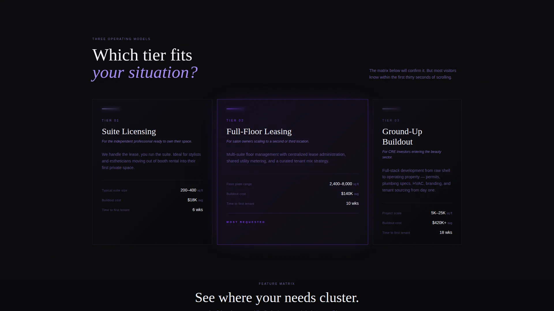
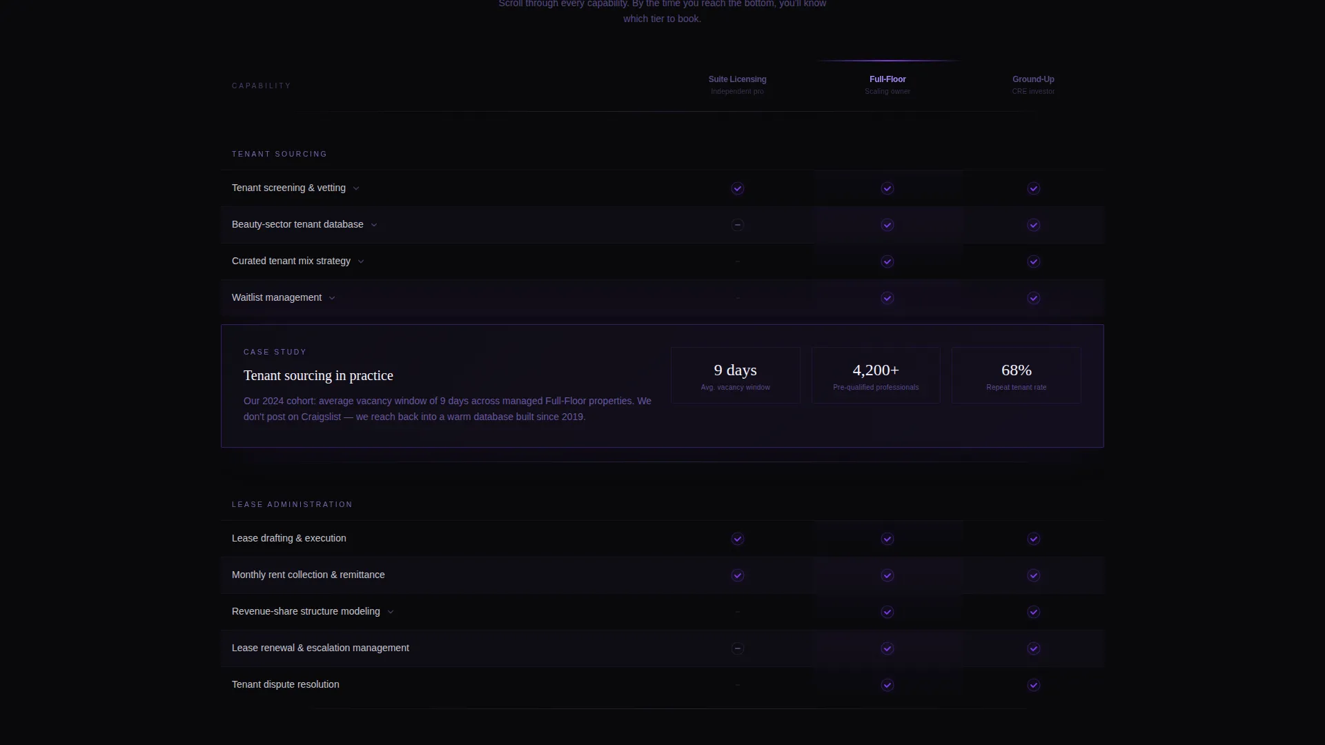
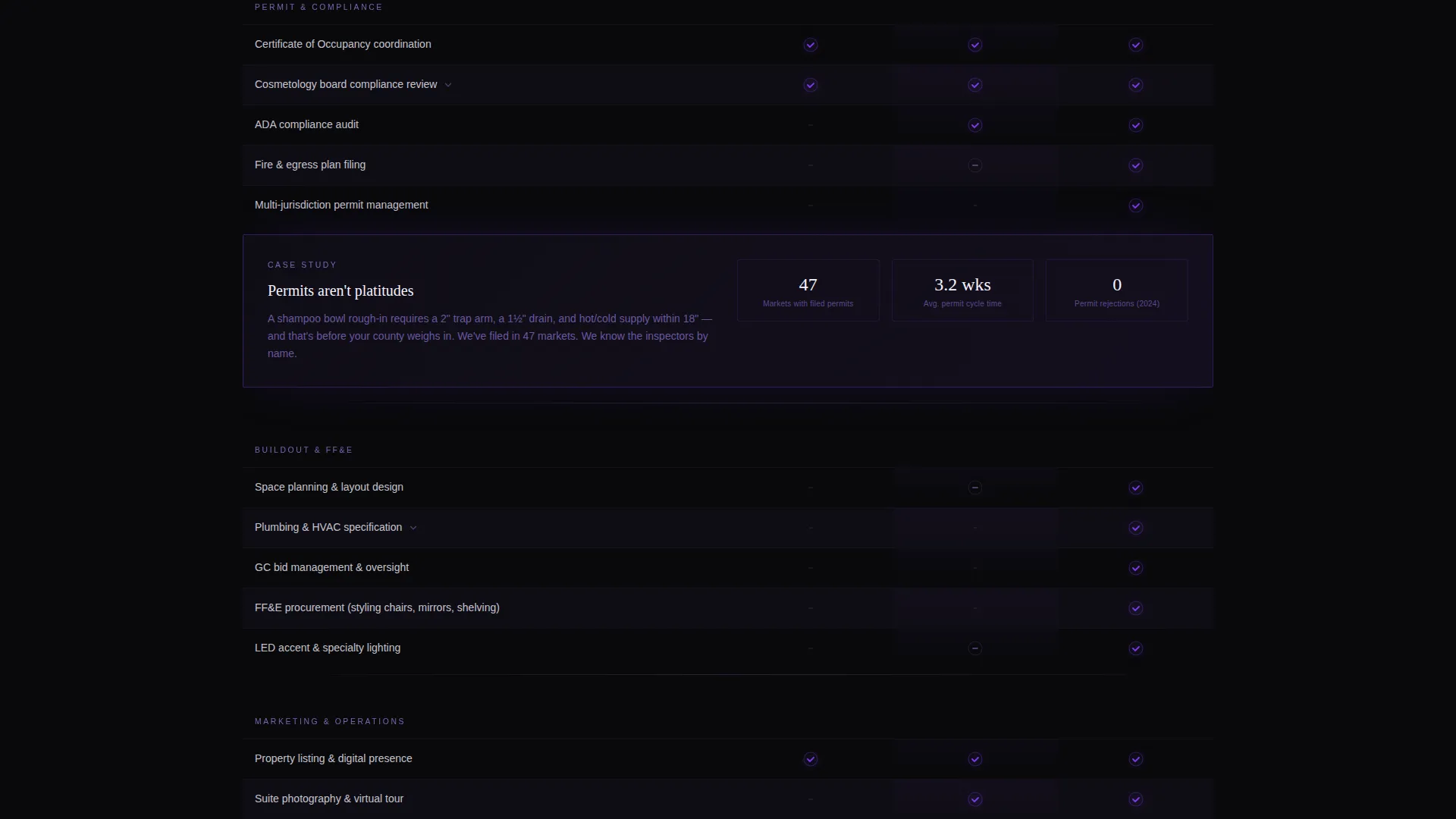
The core of the page is a feature matrix that compares Suite Licensing, Full-Floor Leasing, and Ground-Up Buildout side by side. Column headers stay sticky as the visitor scrolls through capability rows covering tenant sourcing, permit coordination, plumbing and HVAC specifications, lease administration, revenue-share structures, and marketing support.
Scroll-Triggered Row Animations
Each row cluster in the comparison table animates into view as the visitor scrolls down. Checkmarks glow violet against the void-black background, creating a progressive reveal that keeps attention focused on the content at hand.
Breakout Case-Study Cards
Selected rows expand into mini case-study cards that surface real project context such as square footage, buildout cost, and time to first tenant. These cards add credibility and help investors and salon owners benchmark quickly without leaving the page.
Dual-Placement Click-Through call to action
The primary call to action, labeled "Find Your Suite Model," appears pinned at the bottom of the comparison table. It reappears as a floating bar after the visitor reaches 60 percent scroll depth. Both placements push to a short off-page qualifier covering market, unit count, and timeline before revealing available inventory.
Void and Violet Color System
Table rows alternate between true void black and a slightly lighter near-black. Column headers carry electric violet, and hover states bloom into muted orchid. The result is a high-end booking-app aesthetic that feels intentional and premium rather than decorative.
Page sections overview
| Section | Purpose |
|---|---|
| Full-Bleed Header | Establishes premium positioning and draws visitors into the scroll |
| Headline and Indicator | Delivers the core value statement and directs attention downward |
| Sticky Table Headers | Keeps the three service tiers visible during the full matrix scroll |
| Comparison Matrix Rows | Reveals capabilities cluster by cluster as the visitor scrolls |
| Breakout Case Cards | Expands key features into project-level detail for high-intent visitors |
| Pinned call to action Bar | Anchors the primary click-through action at the end of the matrix |
| Floating call to action Bar | Re-surfaces the call to action after 60 percent scroll depth |
Design & branding system
The visual identity follows a Directory and Discovery theme built on a Void and Violet color system. Every color decision reinforces the sense of a premium, curated space rather than a generic property listing.
- True void black (#09090B) as the primary background, with alternating table rows at #0F0D15 for subtle depth
- Electric violet (#7C3AED) for column headers and active states, with muted orchid (#A78BFA) for secondary text, divider lines, and hover blooms
- Cool porcelain white (#F5F3FF) for headline and body text, giving a faint lavender glow against the dark ground
Mobile & speed optimization
The layout is structured for clean readability on smaller screens without losing the comparison table's core function. The design decisions prioritize legibility and interaction clarity at every viewport size.
- The sticky column headers and animated row reveals are designed to maintain their function as the viewport narrows
- The floating call-to-action bar is positioned to remain accessible without obscuring table content on mobile screens
How this template helps you convert
The page is built as a click-through experience with one goal: move the right visitor to the consultation booking flow before doubt sets in.
- The feature matrix lets visitors self-qualify by watching their own needs cluster into one of the three service tiers, so they arrive at the call to action already confident in their fit
- The dual-placement "Find Your Suite Model" button reduces friction by appearing at the natural end of the comparison and again as a persistent floating prompt, so no motivated visitor has to scroll back up to act
Other information about this template
This template was designed specifically for the salon and spa property management niche, where the audience ranges from hands-on beauty professionals to seasoned commercial real estate investors. It sits at the intersection of salon and spa software needs and technology-forward property marketing.
- The template style is a comparison table, making it well suited for any service business that needs to communicate tiered offerings clearly
- The Directory and Discovery theme and Feature Matrix creative direction are deliberate choices for audiences who want to evaluate before they engage
- The Click-Through landing page direction means there is no form on this page, reducing friction and keeping the visitor experience clean
- The page pairs naturally with a short off-page qualifier flow covering market selection, unit count, and timeline before inventory is revealed
Theme
Directory & Discovery
Creative direction
Feature Matrix
Color system
Void & Violet
Style
Comparison Table
Direction
Click-Through
Page Sections
Three-tier Sticky Comparison Table
Scroll-triggered Row Animations
Breakout Case-study Cards
Dual-placement Click-through Call to Action
Dark Full-bleed Glow Header
Void and Violet Color System
Related questions
Does this template include a contact form?
Who is this landing page template designed to convert?
What makes the feature matrix different from a standard pricing table?
Can the comparison table be adapted for fewer service tiers?



