Syllabus - Powerful Campus Landing Page Template
Syllabus is a dashboard-style landing page template built for education social media management platforms. It showcases an interactive preview mockup, a scrolling feature matrix, and a clear app download flow. Designed in deep midnight navy and electric cyan, it gives university marketing teams and campus communications directors an immediate sense of control and clarity.
by Rocket studio
Quick summary
Syllabus is a single-page landing page template designed for campus social media management platforms. It opens with a clickable dashboard preview, walks visitors through a structured feature matrix, and closes with a compelling app download call to action. The midnight navy and cyan color system projects the focused calm of a mission-control room.
Who this template is for
This template is built for teams and individuals who manage social media across a college or university environment. It speaks directly to the people juggling multiple accounts, tight governance rules, and demanding reporting cycles.
- University marketing managers overseeing multiple departmental social handles
- Community college communications directors who handle the full PR workload alone
- Provost offices and administrative teams that present social analytics at board meetings
What problem this template solves
Campus social media is structurally complicated. Multiple departments post independently, approval chains get ignored, and analytics live in separate spreadsheets. This template's layout addresses that reality head-on.
- Rogue department accounts and inconsistent brand voice across institutional channels
- Compliance gaps created by student workers posting without a clear approval workflow
- No single reporting view that ties multi-platform data into a board-ready analytics deck
What you get with this template
You get a fully structured, single-page landing page that demonstrates the full value of a campus social media command center. Every section is purposefully sequenced to build trust before asking for the download.
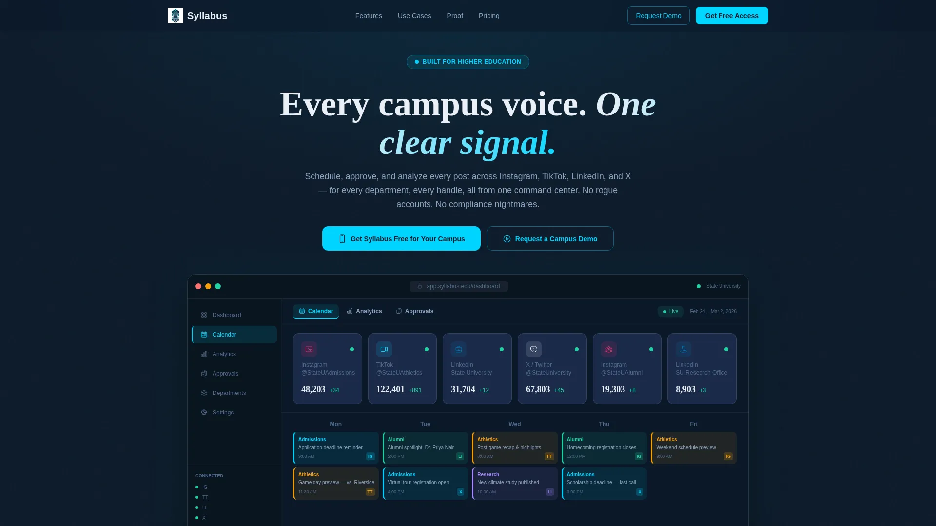
- An interactive above-the-fold dashboard preview with clickable tab states for Calendar, Analytics, and Approvals
- A scrolling feature matrix that escalates from individual use to institution-wide team workflows
- A dual call-to-action system with a sticky app download bar and a full-width end-of-page block with App Store, Google Play, and QR code
Feature list
This template delivers a precise set of section types and interactive design patterns drawn directly from the source brief.
Interactive Dashboard Preview Header
The header embeds a fully rendered, clickable dashboard mockup showing a fictional university's live social grid. Visitors see six platform tiles with animated follower counts, a color-coded content calendar for Admissions, Athletics, and Alumni, and a sentiment gauge fixed at 94% positive. Clicking tabs swaps the preview panel in real time.
Scrolling Feature Matrix
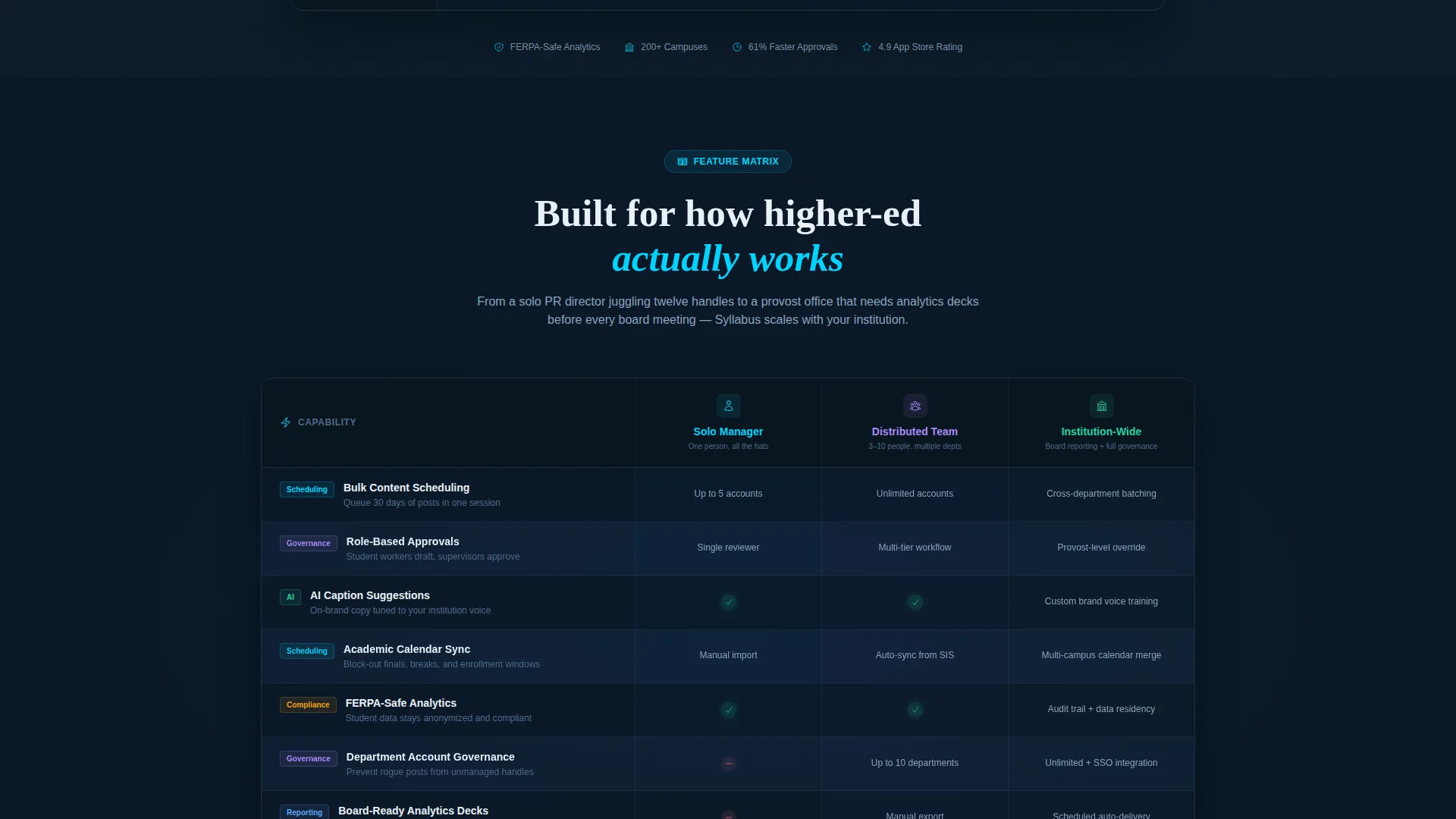
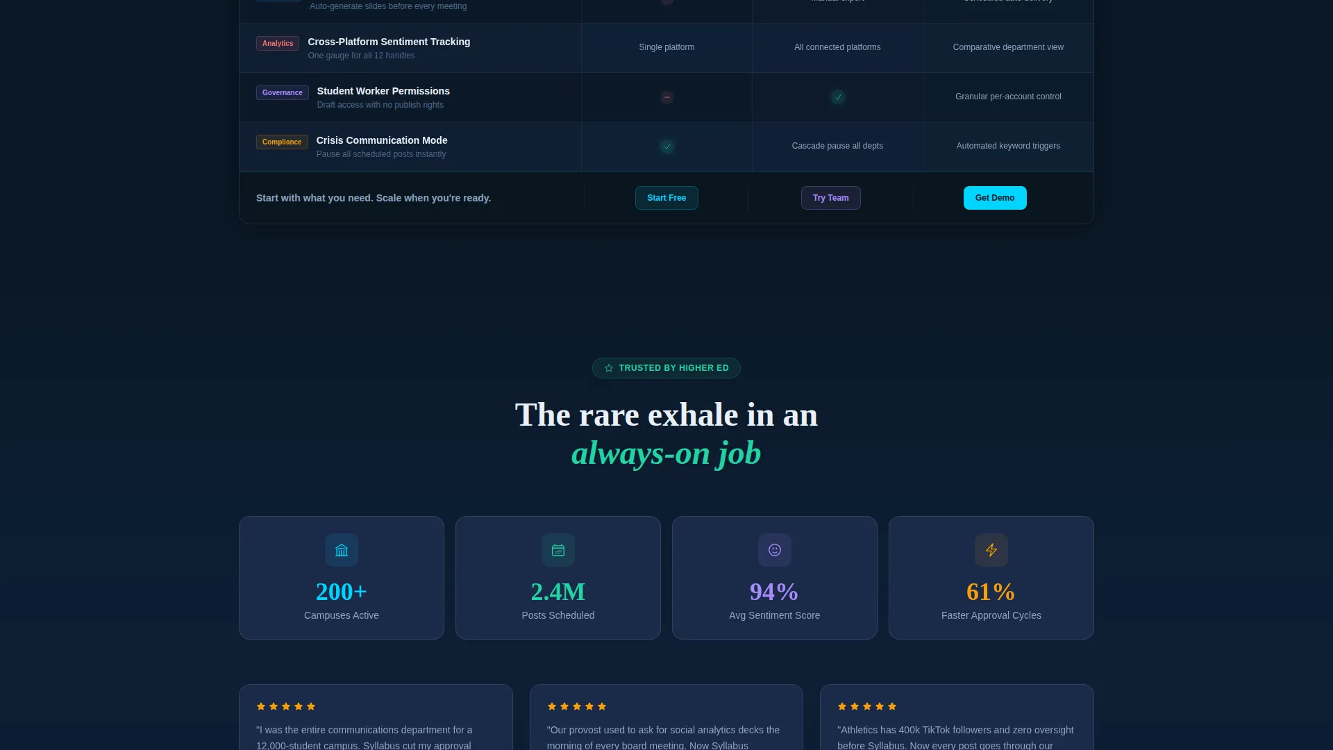
Below the header, a structured data grid maps each platform capability against real higher-education realities. Rows cover bulk scheduling, role-based approvals, AI caption suggestions, and analytics. Columns reflect multi-department governance, academic calendar sync, and student worker permission levels. Each grid cell animates on scroll entry with a cyan pulse.
Escalating Complexity Narrative
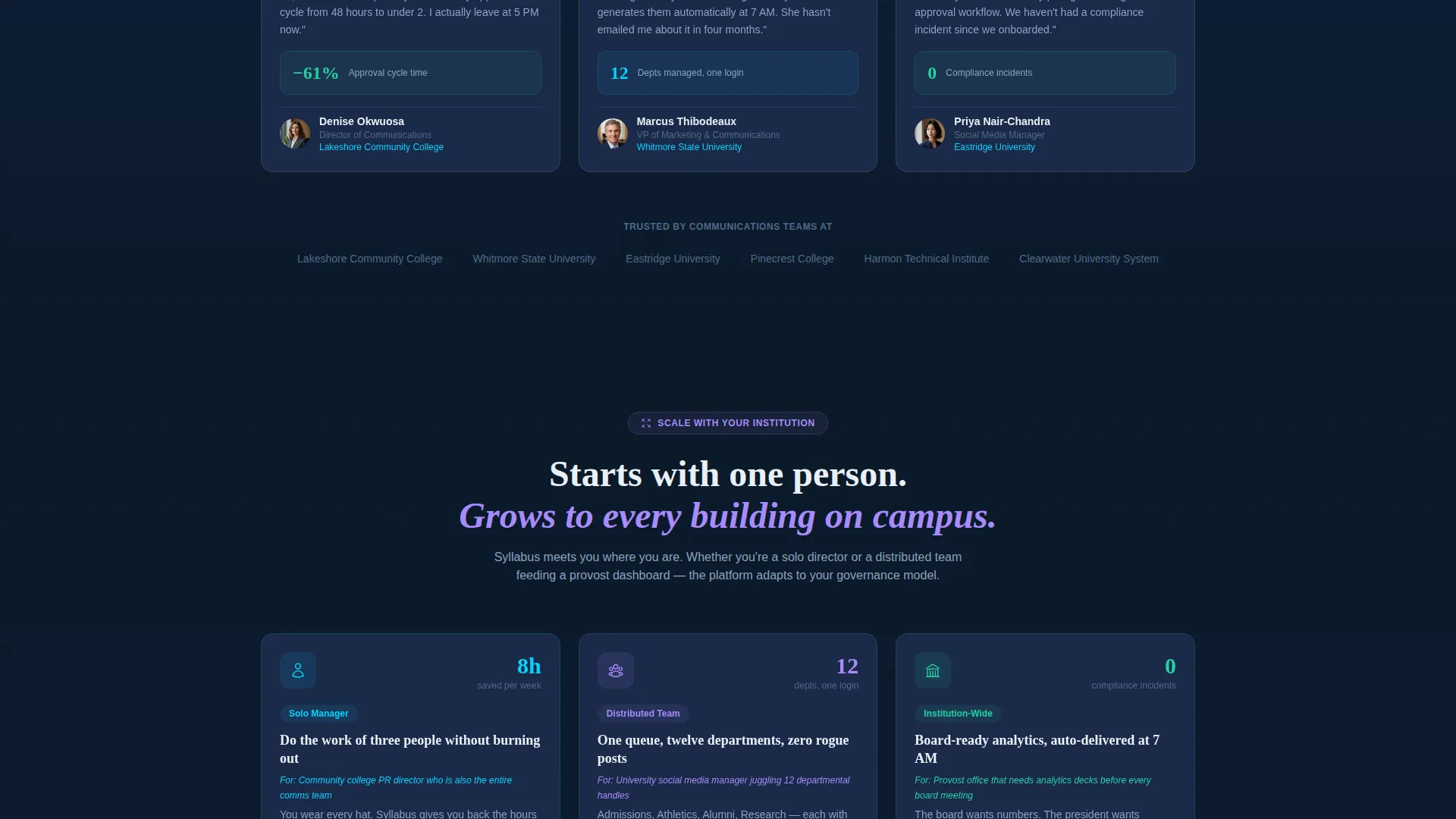
The feature matrix is not a flat list. It builds progressively from what a solo communications director can do, to what a ten-person distributed team unlocks, to institution-wide reporting for board presentations. This pacing keeps visitors engaged as the scope of the platform becomes clear.
Sticky App Download Bar
After the header scroll, a sticky bar appears at the bottom of the viewport. It carries the primary call to action and persists as visitors move through the feature matrix. This keeps the conversion path visible without interrupting the reading flow.
Dual Call-to-Action End Block
The page closes with a full-width section pairing the primary app download prompt with App Store and Google Play badges and a QR code for instant mobile install. A secondary path offers a campus demo request for decision-makers who need a guided walkthrough before committing.
Campus Demo Request Path
Alongside the download flow, the template includes a secondary conversion option aimed at institutional buyers. This route is positioned for provost offices, IT procurement leads, or administrators who need a live demonstration rather than a self-serve download.
Page sections overview
| Section | Purpose |
|---|---|
| Interactive Header Preview | Shows a live-state dashboard mockup with clickable tab switching |
| Feature Matrix Grid | Maps platform capabilities against higher-education team realities |
| Solo to Team Escalation | Builds narrative from individual use to institution-wide workflows |
| Sticky Download Bar | Keeps the app download call to action visible throughout the scroll journey |
| App Download Block | Closes the page with badges, QR code, and demo request option |
Design & branding system
The visual identity is built around the Dashboard Pro theme using a Midnight Blue color system. The palette is tight and purposeful, evoking a mission-control room with screens active and data in motion.
- Primary backgrounds use deep terminal navy (#0B1929); card surfaces float one tone lighter in steel-panel blue (#1B2A4A)
- Typography and data labels render in crisp chalk white (#EAF0F7) for strong contrast against the dark field
- Electric cyan (#00D4FF) fires only on live-state elements such as notification dots, active toggles, hover states, and the grid cell pulse animations
Mobile & speed optimization
The template is structured to translate cleanly from desktop to smaller screens. The dashboard preview and data grid are designed with the mobile visitor in mind, since app downloads often happen on the device the visitor already holds.
- The QR code and App Store and Google Play badges are prominently positioned for easy tap access on mobile viewports
- The sticky bottom bar maintains its visibility and functionality across screen sizes, keeping the download path always reachable
How this template helps you convert
Every design and sequencing decision in this template serves the goal of earning the app download before asking for it.
- The interactive header preview lets visitors experience the product interface before reading a single feature claim, building confidence through firsthand interaction.
- The escalating feature matrix meets visitors where they are, whether solo communicator or enterprise team, and shows exactly what the platform does for their specific situation.
- The dual call-to-action system closes with both a self-serve download path and a demo request option, so no visitor leaves without a clear next step regardless of their decision-making stage.
Other information about this template
This template is a strong fit for software-as-a-service platforms targeting the higher education market. It is equally relevant for startups pitching to university procurement teams and for established platforms refreshing their campus-facing marketing presence.
- The fictional university data used in the header preview makes the mockup feel realistic without requiring live API connections
- The sentiment gauge, follower count animations, and color-coded calendar all serve as visual proof points that reinforce platform credibility
- The template style is classified as Dashboard/Data Grid, making it well-suited for any data-forward product in the education technology space
- Teams customizing this template can replace the fictional university branding with their own institution colors and account names for a tailored demo experience
Theme
Dashboard Pro
Creative direction
Feature Matrix
Color system
Midnight Blue
Style
Dashboard/Data Grid
Direction
App Download
Page Sections
Interactive Dashboard Header Preview
Scrolling Feature Matrix with Animations
Escalating Narrative Structure
Sticky App Download Call-to-action Bar
Dual Conversion End Block
Related questions
Who is this landing page template designed for?
Can I customize the dashboard preview with my own data?
Does this template support both app download and demo request conversions?
What does the feature matrix section look like?
What color system does this template use?



