Synth - Intelligent AI Consulting Landing Page Template
Synth is a generative AI consulting landing page template built for firms that replace manual workflows with intelligent automation. It opens with a live ROI calculator that shows projected savings before a visitor scrolls. Modular card grids, flip-reveal case studies, and a free AI audit conversion flow make the page a complete sales engine for AI-native consultancies.
by Rocket studio
Quick summary
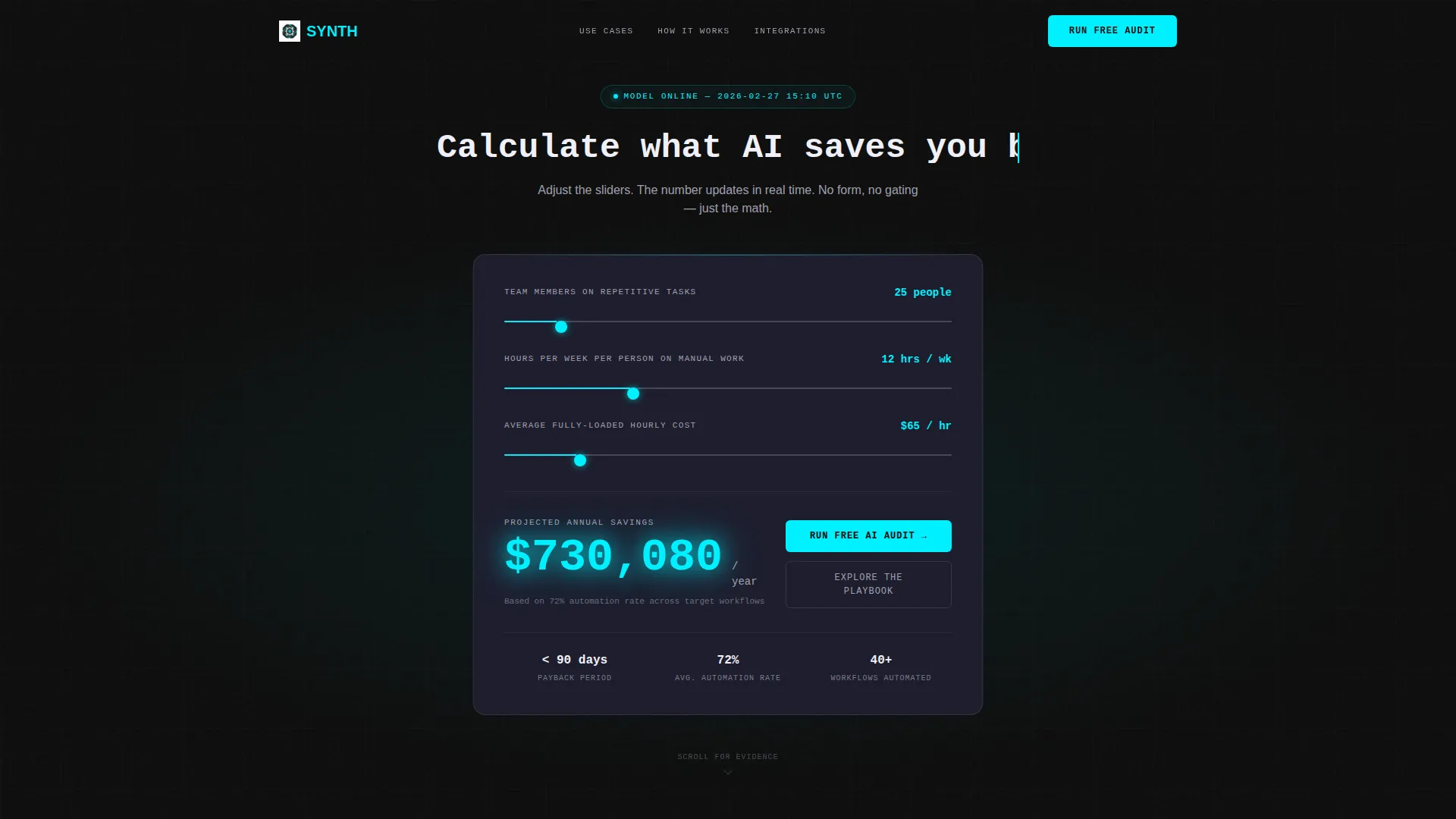
Synth is a single-page landing page template designed for generative AI consulting services. It leads with an interactive ROI calculator embedded directly in the header, then unfolds a modular card grid covering use cases, engagement phases, and integration connectors. The visual identity is dark, terminal-inspired, and built around a carbon fiber palette with reactive neon cyan accents.
Who this template is for
This template was built for consultancies that sell AI transformation to mid-market operators. It speaks directly to the buyers these firms target and matches the credibility those buyers expect.
- Generative AI consultancies offering model fine-tuning, internal copilot builds, or workflow automation
- Independent AI practitioners and agency founders pitching VP-level operators at SaaS or logistics companies
- Technology service providers who need a landing page that earns trust through evidence before asking for a meeting
What problem this template solves
Most AI consulting pages lead with claims. Visitors read a headline, skim a list of services, and leave without understanding what the work is actually worth to them. This template inverts that pattern.
- The ROI calculator in the header shows projected annual savings in real time, so visitors quantify value before they read a single service description
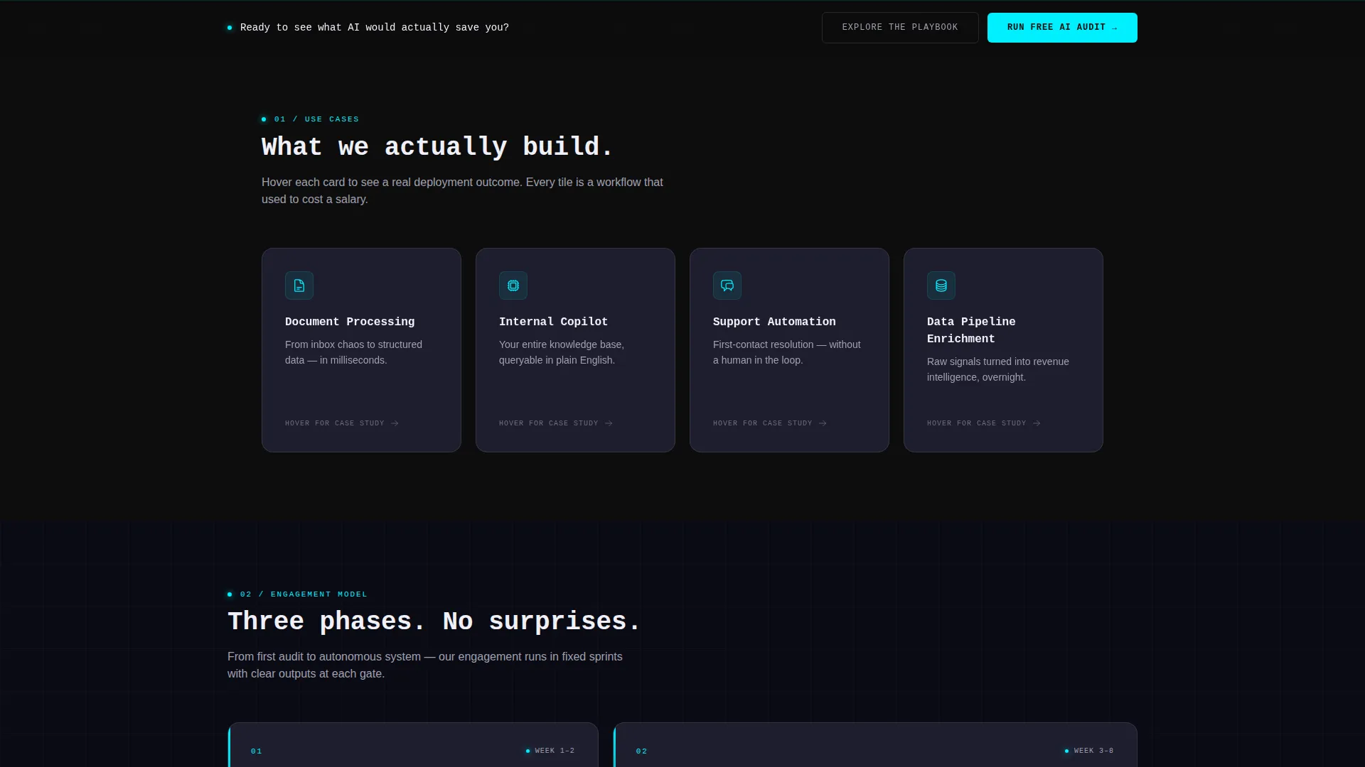
- Flip-reveal use-case cards replace vague promises with specific metrics, turning each card into a self-contained argument
- A structured conversion flow captures leads at two points: an audit offer inside the calculator and a sticky call-to-action bar that appears after scroll depth, so no ready buyer slips through
What you get with this template
The template ships as a fully structured, section-led landing page ready to customize with your real service details and client metrics. Every component has a defined role in the conversion flow.
- Interactive header calculator with three input sliders covering team size, weekly task hours, and average hourly cost, with a live animated savings output
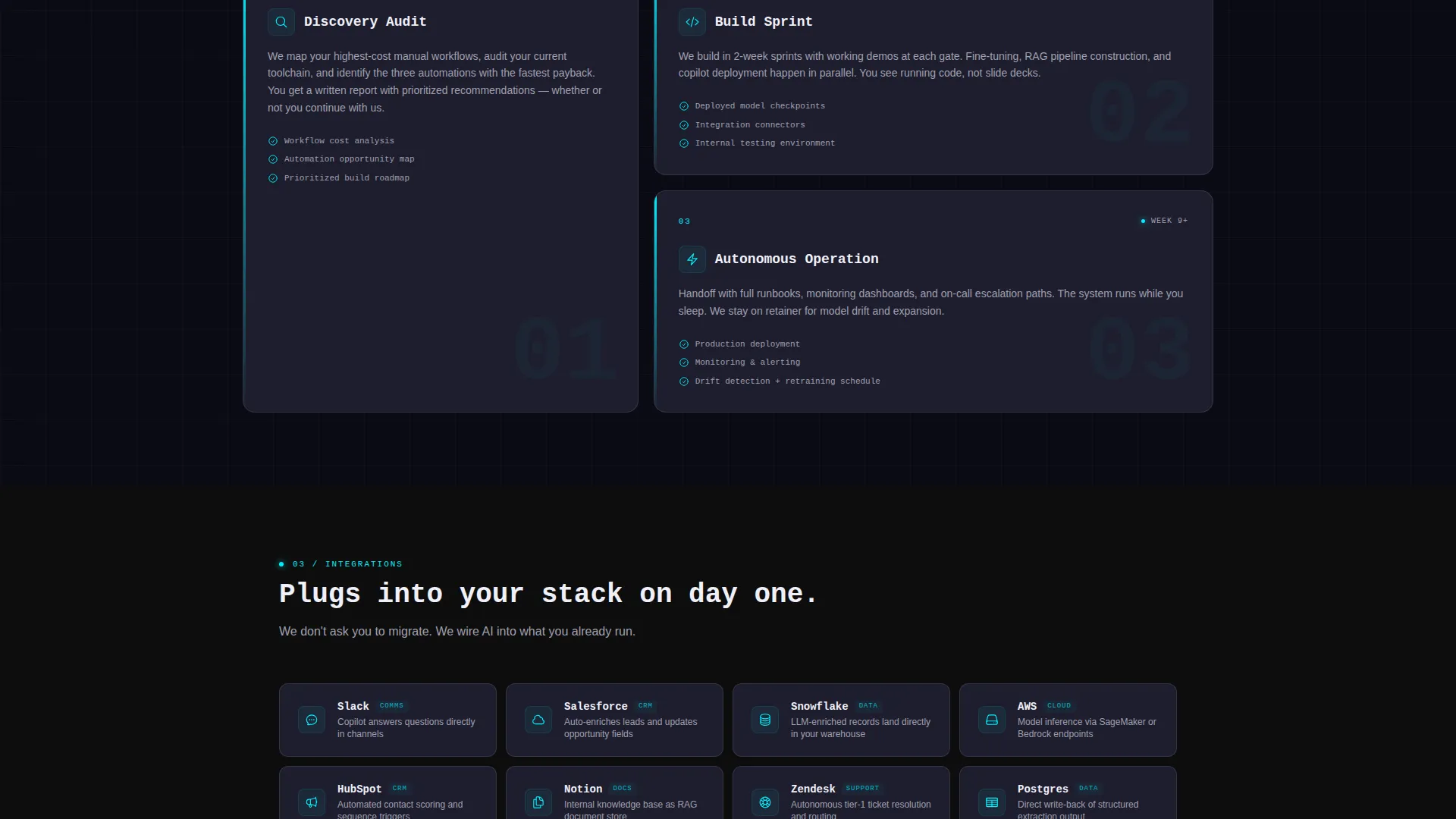
- Modular card grid sections for use cases, engagement phases, and integration connectors, each card designed as a standalone proof point
- Two-path conversion system including a free AI audit form and a gated playbook download for leads who need more time
Feature list
This section covers the functional components included in the template as described in the source brief.
Live ROI Calculator in the Header
Three input sliders let visitors enter team size, hours spent on repetitive tasks per week, and average hourly cost. The projected annual savings figure updates in real time and glows in reactive cyan. The calculator sits inside the header itself, so visitors are already interacting with the product philosophy before they scroll.
Flip-Reveal Use-Case Cards
Each use-case card covers a specific workflow: Document Processing, Internal Copilot, Customer Support Automation, and Data Pipeline Enrichment. Hovering flips the card to show a mini case study with a single oversized metric. The format replaces abstract service descriptions with concrete, scannable proof.
Three-Phase Engagement Model Cards
A dedicated card row visualizes the implementation method across three phases. This section answers the "how does the work actually happen" question that VP-level buyers always ask before committing to a consulting engagement.
Integration Connector Card Row
A final card row displays integration logos, each paired with a one-line connector description. The section signals technical compatibility to the operators evaluating whether your process fits their existing stack.
Free AI Audit Conversion Flow
The primary call to action, "Run Your Free AI Audit," appears first inside the calculator results panel and again as a sticky bottom bar triggered after forty percent scroll depth. Clicking opens a three-field form collecting work email, company name, and a workflow pain-point selection that mirrors the use-case cards.
Gated Playbook Secondary Path
A secondary conversion path offers "Explore the Playbook," linking to a gated PDF of implementation frameworks. This captures leads who are researching rather than ready to book a call, extending the funnel without adding friction to the primary flow.
Page sections overview
| Section | Purpose |
|---|---|
| Header ROI Calculator | Opens interaction before scrolling begins |
| Use-Case Card Grid | Maps services to specific workflow problems |
| Case Study Flip Cards | Delivers metric-backed proof per use case |
| Engagement Phase Cards | Shows the three-phase implementation method |
| Integration Connector Row | Confirms technical fit with existing tools |
| AI Audit call to action Panel | Primary lead capture inside calculator results |
| Sticky Audit Bar | Re-surfaces the audit offer at scroll depth |
| Playbook Download Path | Secondary lead capture for research-stage visitors |
Design & branding system
The visual identity is built around a carbon fiber color system. The palette feels like the interior of a server rack: matte dark surfaces interrupted by precise lines of electric light.
- Core colors are deep carbon black (#0D0D0D) for backgrounds, graphite mid-tone (#1E1E2E) for card surfaces, cold titanium gray (#A0A0B0) for body text and borders, and reactive neon cyan (#00F0FF) reserved exclusively for interactive states, hover glows, and the live data output
- Cards float on subtle one-pixel titanium borders against near-black backgrounds, creating depth without gradients or imagery
- The header uses a dark full-bleed void with a soft radial cyan glow at the center, and the primary headline renders in a monospaced typeface with a typing animation, reinforcing the terminal aesthetic throughout
Mobile & speed optimization
The card grid layout is modular by design, which means each card section adapts to narrower viewports without restructuring the information hierarchy. The template is built for the Dashboard Pro theme context, where layout flexibility is a core expectation.
- Card grid columns reflow for smaller screens so use-case tiles, phase cards, and integration cards remain readable without horizontal scrolling
- The sticky audit bar and the header calculator are both designed to remain functional and legible across screen sizes, keeping the primary conversion path intact on mobile
How this template helps you convert
The page is structured around a deliberate interaction sequence: interact first, then evidence, then method, then proof. Every section earns the next.
- The ROI calculator in the header creates personal relevance before any marketing copy runs. A visitor who has already seen their own projected savings number is far more likely to keep reading than one who has only seen a headline claim.
- The flip-reveal cards and phase cards build the case progressively. By the time a visitor reaches the audit call to action, they have already seen specific metrics, understood the engagement model, and confirmed integration compatibility. The ask feels logical rather than premature.
Other information about this template
This template is designed for the generative AI consulting niche, where buyers are sophisticated and skeptical. A few additional details worth noting before you customize and launch.
- The template style is Card Grid (Modular) under the Dashboard Pro theme, making individual sections easy to reorder or expand as your service offering grows
- The creative direction is Calculator/Tool First, meaning the interactive element is the hero, not a background image or testimonial
- The header concept is Dark Full-Bleed with a radial glow, using no illustrations or stock photography, which keeps the aesthetic clean and technical
- The conversion direction is Freemium/Trial, structured around delivering real value (the audit report) before any sales conversation begins
- The automated audit report is delivered to the visitor's inbox within twenty-four hours of form submission, as described in the source brief
- The color system is Carbon Fiber, and all cyan usage is intentionally restricted to interactive states so the accent color retains its signal value throughout the page

Theme
Dashboard Pro
Creative direction
Calculator/Tool First
Color system
Carbon Fiber
Style
Card Grid (Modular)
Direction
Freemium/Trial
Page Sections
Live ROI Calculator with Animated Output
Flip-reveal Use-case Card Grid
Three-phase Engagement Model
Integration Connector Card Row
Dual-path Lead Capture System
Related questions
Can I customize the ROI calculator inputs for my specific service?
What happens after a visitor submits the free AI audit form?
Does the template include two separate lead capture paths?
Who is this landing page template designed for?
Can I reorder or remove card sections from the grid?



