Productivity App Landing Page Template
Taskflow is a dark-themed, modular productivity landing page built for utility and productivity apps that replace cluttered tool stacks. It features a Feature Tab Switcher header, a scroll-driven versus table, and animated feature cards. The Void and Violet color system gives it a premium, focused feel that speaks directly to freelancers, founders, and operations leads ready to simplify.
by Rocket studio
Quick summary
Taskflow is a single-page landing page template for productivity and utility apps. It opens with a self-demonstrating Feature Tab Switcher, accelerates through a bold versus table, and closes with a clear call to action. The dark Void and Violet palette signals focus and premium quality. Every section is built to move a visitor from recognition to sign-up without friction.
Who this template is for
This template is designed for founders, operators, and creatives who are selling a productivity tool that replaces multiple subscriptions. It speaks to people whose audience already feels the pain of too many apps.
- Freelance designers managing several client timelines at once
- Startup operations leads patching together multiple tools to run their workflow
- Overwhelmed founders who need a landing page that makes the value case fast
What problem this template solves
Most productivity app landing pages bury the product behind generic headlines and stock photography. Visitors leave before they understand what the tool actually does. Taskflow solves this by leading with the product interface itself.
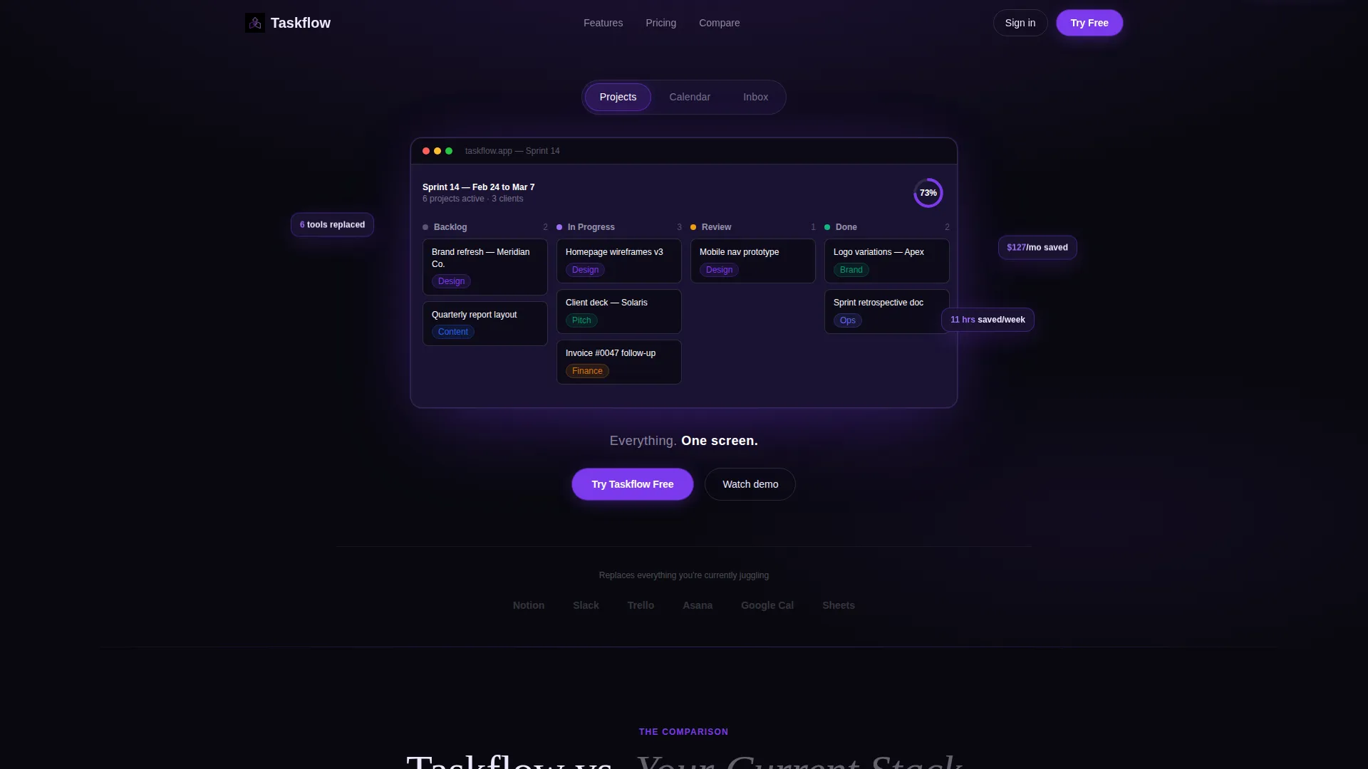
- Visitors see a live dashboard view before they read a single headline
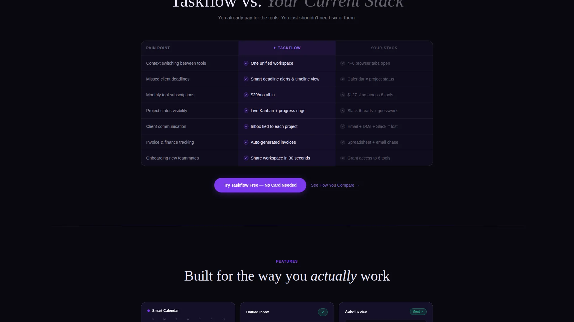
- The versus table directly addresses the cost and friction of the visitor's current stack
- The interactive quiz path gives skeptical visitors a personalized reason to convert
What you get with this template
You get a complete, ready-to-customize single-page layout built around the specific conversion flow of a productivity app. Every section is purposeful and sequenced for persuasion.
- A Feature Tab Switcher header with three labeled tabs and a crossfade device frame
- A scroll-animated versus table comparing your app against a generic multi-tool stack
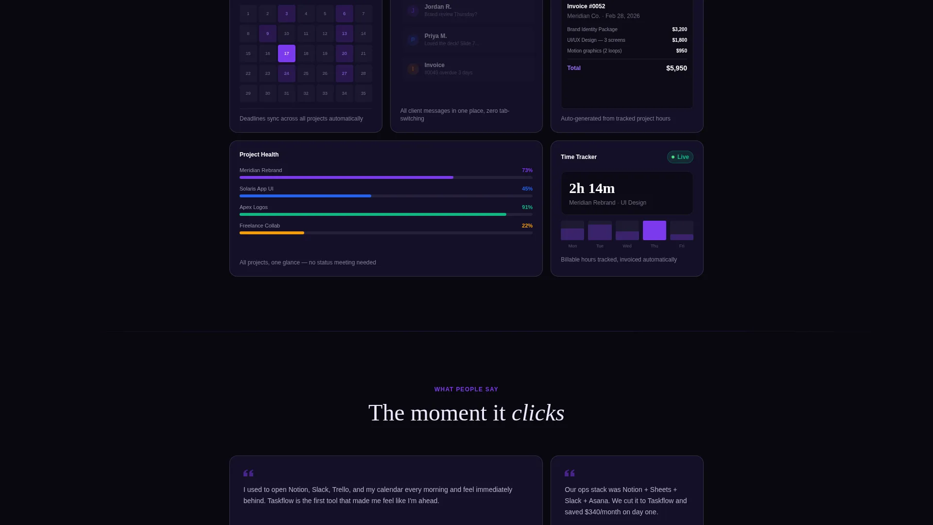
- A modular card grid with micro-animated feature tiles and a sticky call-to-action bar
Feature list
This template includes six purpose-built layout components. Each one handles a specific job in the visitor's decision journey.
Feature Tab Switcher Header
Three tabs labeled "Projects," "Calendar," and "Inbox" sit centered above a device frame. Each tab click swaps the visible dashboard screenshot with a smooth crossfade animation. The default view shows a Kanban board at 73% progress with color-tagged cards.
Scroll-Animated Versus Table
A side-by-side comparison table drops in on scroll entry. The left column represents your app; the right column represents the visitor's current stack. Each row targets a specific pain point, including context switching, missed deadlines, and tool cost, with animated checkmarks and X marks.
Modular Animated Feature Cards
Feature tiles are arranged in a responsive card grid. Each card carries a micro-animation tied to its feature, such as a calendar populating, a notification count falling to zero, or an invoice generating. The rhythm is dense and confident, designed to hold attention through the scroll.
Sticky Call-to-Action Bar
A slim top bar pins the primary call-to-action button after the visitor scrolls past the header. It stays visible without being disruptive. A second instance of the same call to action anchors directly below the versus table to catch visitors at peak persuasion.
Interactive Comparison Quiz
A secondary conversion path invites visitors to identify which tools they currently use. The quiz returns a personalized savings and time summary based on their answers. This path captures visitors who need individual justification before committing.
Void and Violet Card Grid Layout
Cards float on an absolute void black background with subtle violet edge-light. Interactive surfaces and hover states use electric violet. Text and card borders use pale holographic lilac. The visual result feels like a premium developer interface at night.
Page sections overview
| Section | Purpose |
|---|---|
| Feature Tab Switcher | Demonstrates the product interface before the visitor reads a headline |
| Single tagline row | Anchors the product promise with one short line below the device frame |
| Versus comparison table | Persuades by contrasting app value against the visitor's current tool stack |
| Animated feature grid | Communicates individual features through a dense, fast-scrolling card layout |
| Sticky call to action bar | Keeps the primary action visible throughout the scroll without interrupting flow |
| Quiz conversion path | Delivers a personalized comparison summary to hesitant or research-mode visitors |
Design & branding system
The visual identity follows a Dashboard Pro theme centered on the Void and Violet color system. The palette is built for dark-mode interfaces where every color choice carries meaning.
- Absolute void black (#09090F) as the page background, giving cards and glows maximum contrast
- Electric violet (#7C3AED) reserved exclusively for interactive surfaces, hover states, and the primary call-to-action button
- Pale holographic lilac (#EDE9FE) used for body text, card borders, and low-opacity layering on data surfaces
Mobile & speed optimization
The card grid layout is modular and reflows cleanly across screen sizes. The template is structured for responsive behavior without relying on heavy layout dependencies.
- Modular card columns collapse gracefully from desktop grid to single-column mobile stacks
- The sticky call-to-action bar remains accessible on smaller screens without overlapping key content
- Micro-animations are tied to scroll entry, so they trigger only when the relevant element enters the viewport
How this template helps you convert
The entire page is sequenced around a single conversion goal: getting the visitor to start a free trial. Each section removes one more reason to hesitate.
- The Feature Tab Switcher leads with the product itself, building credibility before any marketing copy appears.
- The versus table reframes the visitor's current situation as a cost and friction problem, then positions your app as the solution.
- The dual call-to-action placement and the interactive quiz ensure the visitor has a clear next step whether they are ready to commit or still comparing.
Other information about this template
This template is part of the Card Grid (Modular) template style family. It is suited for technology products in the utility and productivity app space. The Launch Energy creative direction keeps the pace fast and the density high, which matches the expectations of a tech-savvy audience that scans before it reads.
- The template style is Card Grid (Modular), making individual sections easy to reorder or extend
- The creative direction is Launch Energy, designed to sustain momentum across a long single-page scroll
- The header concept is a Feature Tab Switcher, a pattern familiar to SaaS and productivity app audiences
Theme
Dashboard Pro
Creative direction
Launch Energy
Color system
Void & Violet
Style
Card Grid (Modular)
Direction
Comparison/Versus
Page Sections
Feature Tab Switcher with Crossfade
Scroll-animated Versus Table
Modular Animated Feature Cards
Dual Sticky Call-to-action Placement
Interactive Comparison Quiz Path
Void and Violet Dark Design System
Related questions
Can I customize the tab labels and dashboard screenshots in the header?
Do I need to build the quiz functionality from scratch?
Is this template suitable for a dark-mode brand that is not a productivity app?
How does the versus table work on mobile screens?
Can I add more feature cards to the grid?



