Time Series Database Consulting Landing Page
Ticker is a bento grid landing page template built for time series database consulting practices. It uses a dark terminal aesthetic with electric cyan accents to present spec-sheet comparisons, service tiers, and lead capture forms. The layout guides platform engineers and SRE leads from database comparisons to a direct "Get Your Stack Assessed" conversion path.
by Rocket studio
Quick summary
Ticker is a single-page bento grid template designed for a time series database consulting service. It opens with a dark full-bleed header and moves visitors through spec-sheet comparison cells into two clear conversion paths: a stack assessment form and a downloadable benchmark report. The layout is built to earn technical trust before asking for any commitment.
Who this template is for
This template is built for technical consulting practices that work deep inside database infrastructure. It speaks directly to buyers who read documentation before they read sales copy.
- Platform engineers at fintech firms managing high-throughput ingestion pipelines
- Site reliability engineering leads at IoT companies facing cardinality explosion
- Chief technology officers at observability startups trying to control retention and storage costs
What problem this template solves
Most consulting landing pages rely on narrative copy that technical buyers skim past. Engineers want evidence, not prose. This template replaces the usual wall of text with a scannable, spec-driven layout that matches how engineers actually evaluate tools and vendors.
- Visitors can compare database options side by side without leaving the page
- The comparison cells deliver technical depth before any call to action appears
- Two lead capture paths serve buyers at different levels of readiness
What you get with this template
The template delivers a complete single-page layout structured around technical comparison and progressive disclosure. Every section serves a specific role in moving a skeptical technical buyer toward a conversion action.
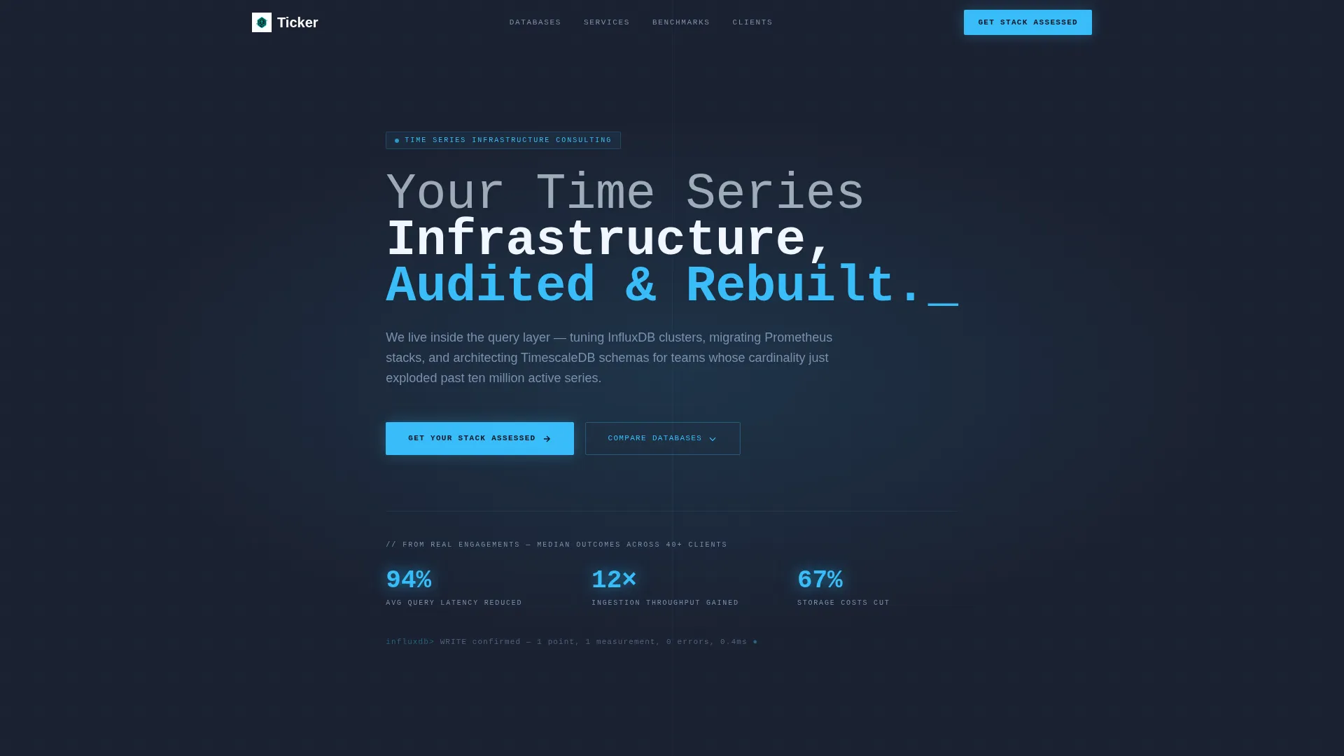
- A dark full-bleed header with a monospaced headline and three glowing micro-stat counters
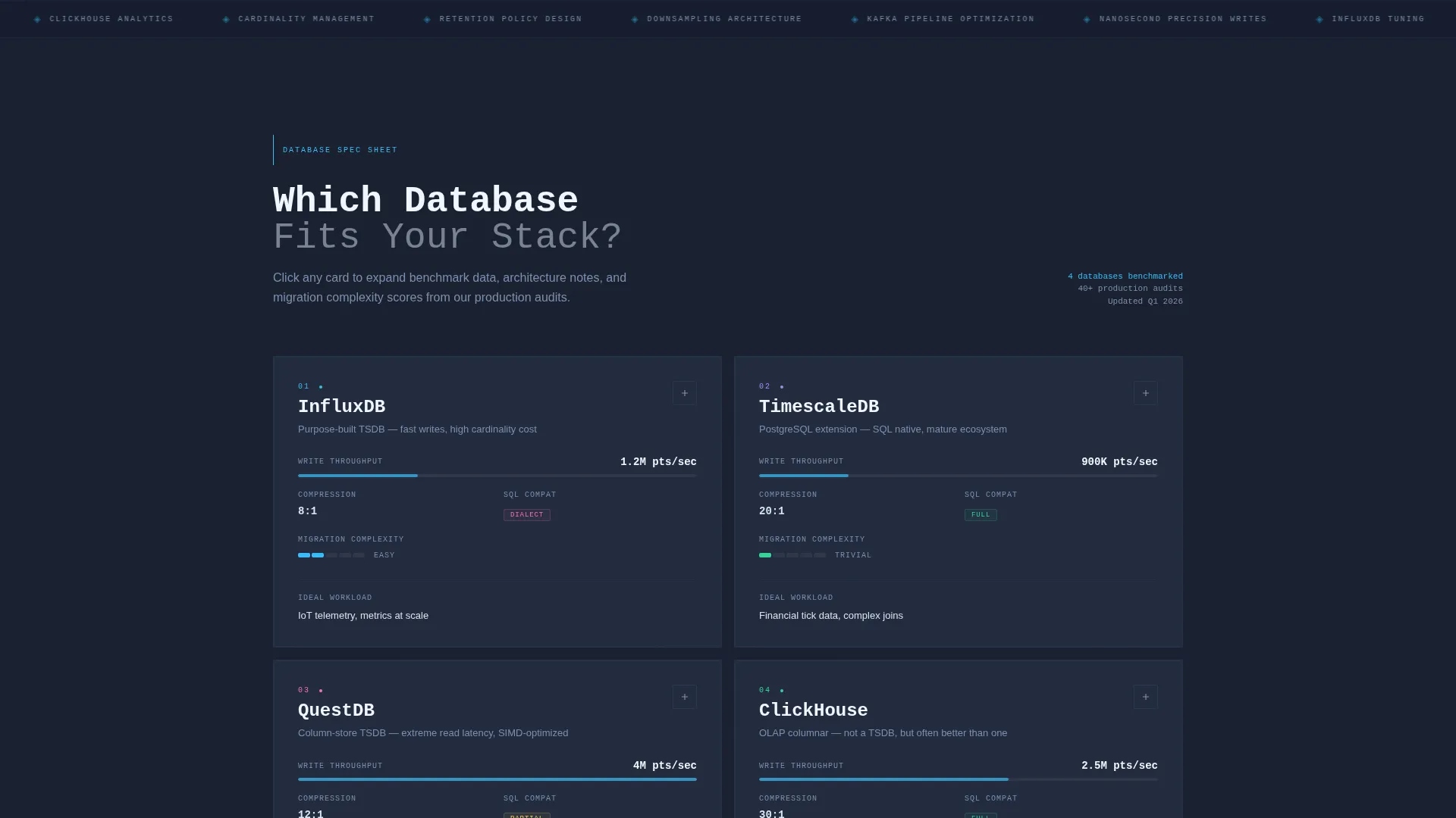
- An interactive bento grid of database comparison cells with expandable benchmark data
- Two lead capture forms: a three-field stack assessment form and an email-gated benchmark report download
Feature list
This template is built around one core idea: prove fluency before asking for the click. Every feature below serves that goal directly.
Bento Grid Comparison Layout
The page is organized as a bento grid where each cell is a discrete comparison unit. Cells cover write throughput, compression ratio, SQL compatibility, clustering model, and ideal workload in tight spec-sheet rows. The grid shifts density as the visitor scrolls, moving from broad database comparisons into focused service tiers.
Dark Full-Bleed Header with Micro-Stats
The header fills the full viewport in deep terminal slate with a soft radial cyan glow at low opacity. A large monospaced headline anchors the section. Below it, three micro-stat counters display real engagement numbers: average query latency reduced, ingestion throughput gained, and storage costs cut.
Expandable Comparison Cells
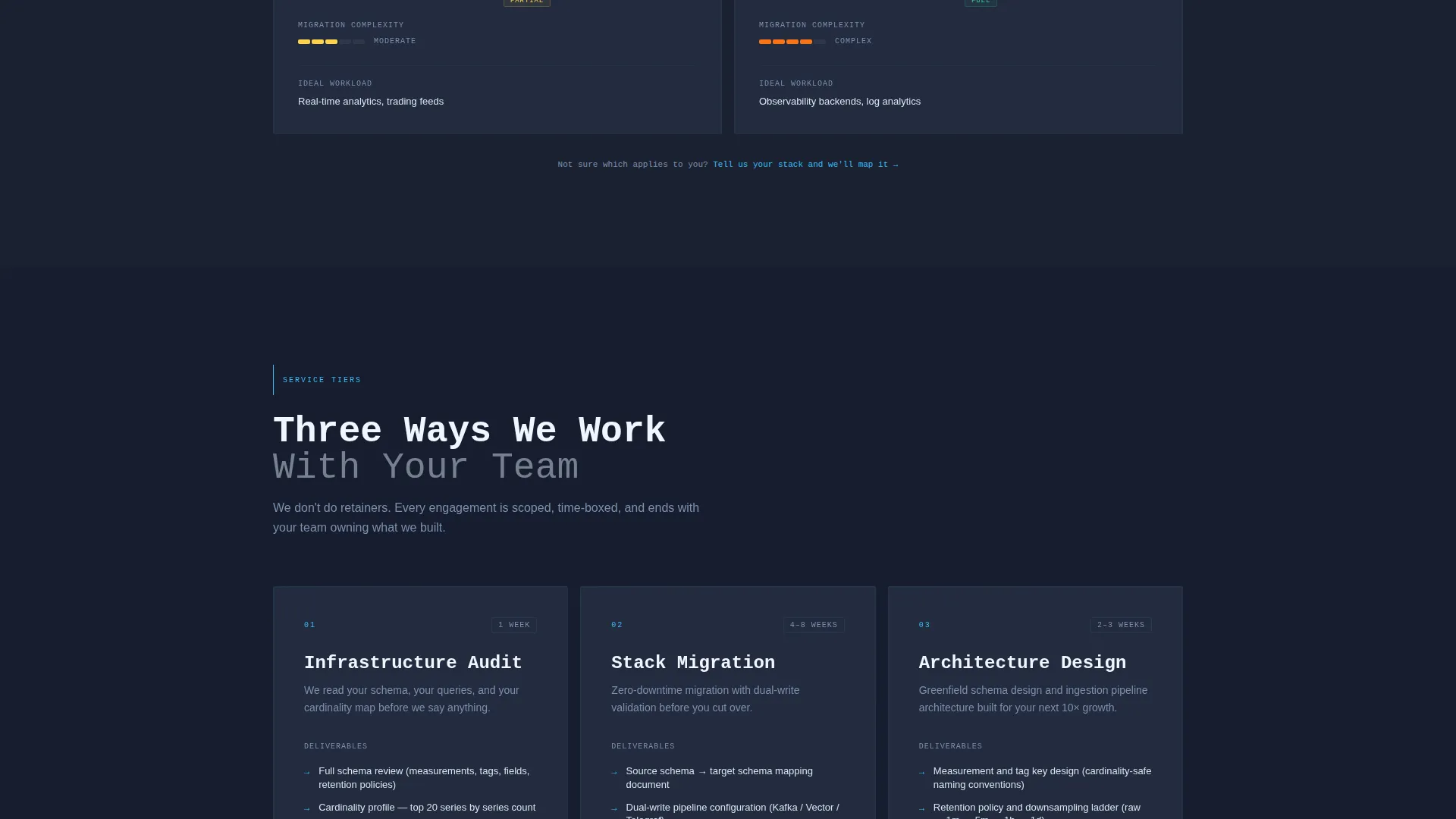
Each bento cell can expand to reveal benchmark data, architecture diagrams, and migration complexity scores. This progressive disclosure model rewards exploration without overwhelming first-time visitors. The primary call to action appears inside every expanded cell.
Dual Lead Capture Paths
The template includes two distinct conversion flows. The primary path is a three-field stack assessment form with a current database dropdown, an active series count range selector, and a work email field. The secondary path gates a downloadable benchmark report behind email only, capturing engineers who want data before committing to a call.
Persistent Call-to-Action Bar
The "Get Your Stack Assessed" button appears as a persistent element in the top navigation bar. It also repeats inside each expanded bento cell. This placement ensures the primary conversion action stays visible throughout the entire scroll journey.
Slate and Sky Color System
The visual identity uses a four-color system: deep terminal slate for the primary background, mid-graphite for card surfaces, pale sky for body text and secondary labels, and electric cyan as the single accent color. The palette is designed for extended screen time without visual fatigue.
Page sections overview
| Section | Purpose |
|---|---|
| Full-Bleed Header | Establishes tone and displays real performance micro-stats |
| Database Comparison Grid | Side-by-side spec-sheet cells for evaluating database options |
| Expandable Detail Cells | Reveals benchmark data and migration complexity on interaction |
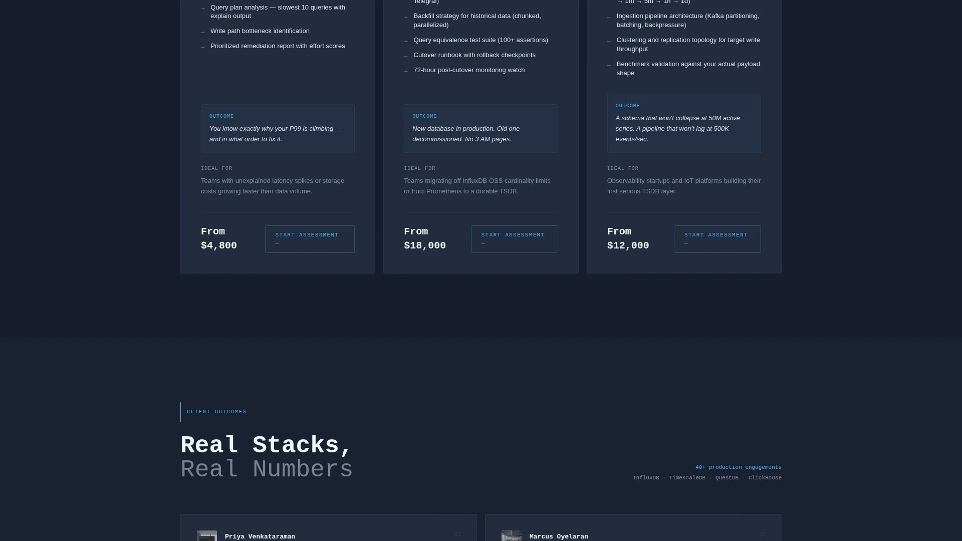
| Service Tier Cards | Shifts grid density toward focused consulting offer details |
| Stack Assessment Form | Captures qualified leads through a three-field sequential form |
| Benchmark Report Gate | Captures early-stage leads with an email-only download path |
| Persistent Top Bar | Keeps the primary call to action visible throughout the full scroll |
Design & branding system
The design system is built around the Slate and Sky color palette and a Directory and Discovery theme. The overall feel is a well-configured monitoring dashboard rendered as a consulting page.
- Deep terminal slate (#1B2131) as the primary background, mid-graphite (#3A4258) for card surfaces, pale sky (#D6E4F0) for body text, and electric cyan (#38BDF8) for glowing edges and active states
- Monospaced typography for headlines and data values, reinforcing a terminal and spec-sheet aesthetic
- Soft radial cyan glow in the header at 12% opacity, with electric cyan used for interactive states, data highlights, and card borders
Mobile & speed optimization
The bento grid layout is structured to adapt across screen sizes without losing its scannable density. Technical buyers often review consulting options on smaller screens, so the layout prioritizes readability at every breakpoint.
- Grid cells reflow responsively so comparison data remains legible on mobile viewports
- The persistent top bar and call-to-action button remain accessible at all scroll positions on smaller screens
How this template helps you convert
The conversion strategy is built on a principle of earned trust. By the time a visitor has scanned four comparison cells, they have already confirmed the consulting team understands the technical internals. The page does not ask for commitment before delivering value.
- The spec-sheet comparison grid builds credibility early, so the call to action lands with an audience that already trusts the source
- Two separate lead capture paths serve buyers at different stages, capturing both ready-to-call engineers and those who need more data first
Other information about this template
The Ticker template is suited for consulting practices working across the time series database landscape. It supports positioning across a range of database technologies that technical buyers are actively evaluating.
- The database dropdown in the stack assessment form includes options for InfluxDB, Prometheus, TimescaleDB, QuestDB, ClickHouse, and Other
- The comparison grid cells are designed to present data relevant to workloads involving Kafka-to-database pipelines, nanosecond-precision telemetry, and high-cardinality series at scale
- The template is categorized under Technology, specifically the Time Series Database Technology subcategory, with a niche focus on Time Series Database Consulting Service
- The Spec Sheet creative direction and Comparison/Versus landing page direction are baked into the layout structure, not applied as a skin on top of a generic template
Theme
Directory & Discovery
Creative direction
Spec Sheet
Color system
Slate & Sky
Style
Bento Grid
Direction
Comparison/Versus
Page Sections
Bento Grid Comparison Layout
Dark Full-bleed Header with Micro-stats
Expandable Detail Cells
Dual Lead Capture Paths
Persistent Call-to-action Bar
Slate and Sky Visual Identity
Related questions
Who is the Ticker template built for?
What conversion paths does this template include?
Can this template support multiple database comparisons on one page?
What does the header section include?
Is this a single-page or multi-page template?



