Digital Transformation Agency Landing Page Template
Transformops is a single-page digital transformation landing page template built for agencies that modernize legacy operations. It opens with a live readiness calculator, moves into department-by-department comparison tables, and closes with a three-step diagnostic form. The Tech Glass visual design and carbon fiber color system give it the precision feel that mid-market operations leaders immediately trust.
by Rocket studio
Quick summary
Transformops is a comparison table landing page template designed for digital transformation agencies. It leads with an interactive diagnostic calculator, transitions into structured before-and-after comparison tables organized by department, and ends with a freemium diagnostic form. The visual identity uses a Tech Glass aesthetic over a carbon fiber color system, built to earn trust through utility before asking for anything.
Who this template is for
This template is built for agencies and consultancies that help mid-market organizations replace fragmented legacy systems with integrated digital workflows. It speaks directly to the buyers who commission that work.
- Chief Operating Officers managing teams still dependent on spreadsheets and manual reporting
- IT directors overseeing disconnected software-as-a-service (SaaS) tool stacks that do not share data
- Operations leads who can identify a specific manual process costing the business money but lack the budget case to fix it
What problem this template solves
Most digital transformation agencies lose potential clients before the pitch. The prospect arrives skeptical, overloaded, and unable to see their own problem clearly enough to act. A static brochure page does not close that gap.
- Visitors leave without understanding the measurable cost of their current state
- Generic agency pages offer no personalized signal, so trust never builds
- The leap from "we need to change" to "let's book a call" feels too large without evidence in between
What you get with this template
This template gives you a complete, single-page conversion system that does the diagnostic work for the visitor before asking them to do anything for you. Every section is purpose-built to move a skeptical operations leader from awareness to action.
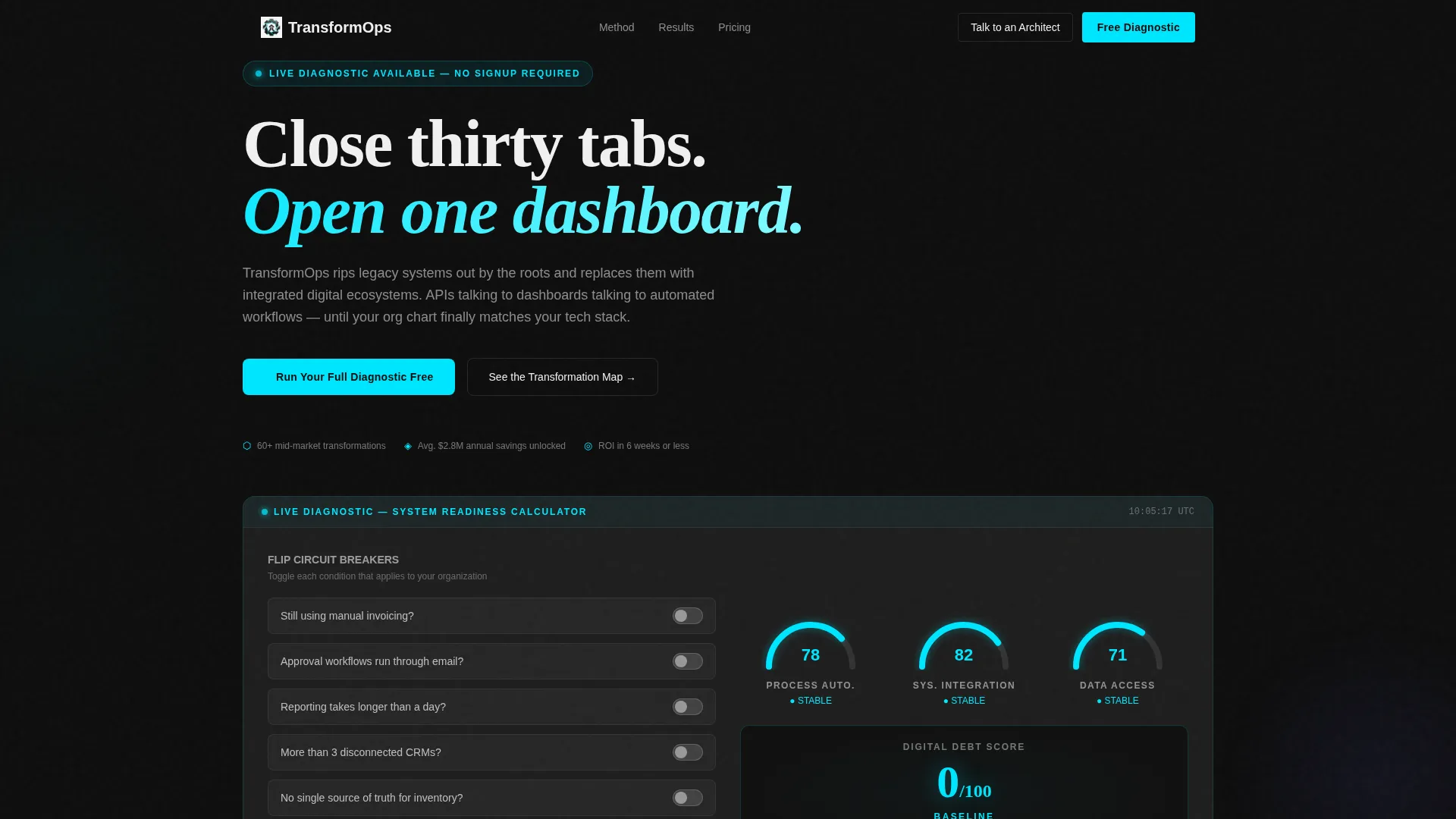
- A live readiness calculator in the header that scores Process Automation, System Integration, and Data Accessibility using toggle inputs
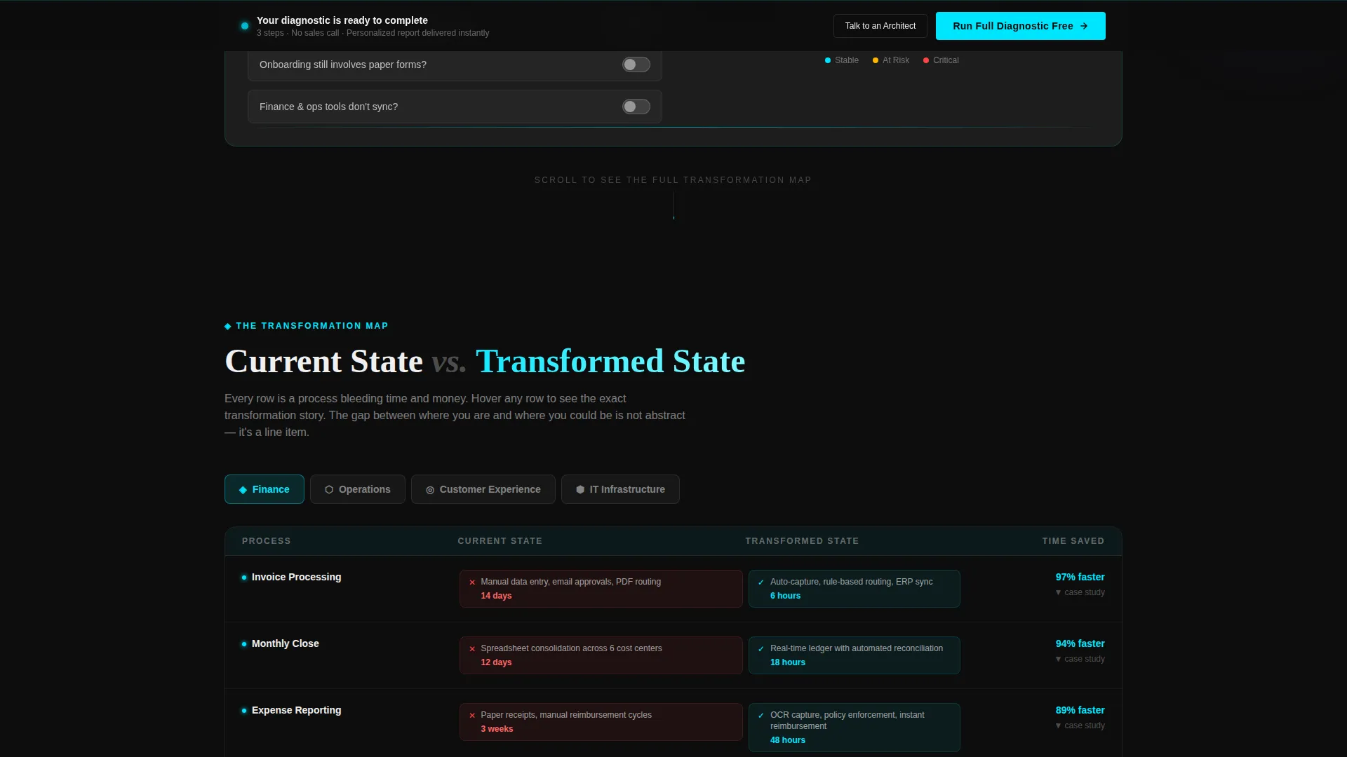
- Four department-by-department comparison tables covering Finance, Operations, Customer Experience, and IT Infrastructure, each row expandable with a micro-case study on hover
- A three-step progressive diagnostic form that delivers a personalized Digital Transformation Readiness Report to the visitor's inbox instantly, with no sales call required
Feature list
This template is built around a clear set of functional components. Each one earns its place by directly serving a skeptical, busy buyer.
Live Readiness Calculator
The header section functions as a working diagnostic panel. Three animated gauges score the visitor's organization on Process Automation, System Integration, and Data Accessibility. Toggle inputs work like circuit breakers: the visitor flips answers to quick yes-or-no questions and watches the gauges respond in real time. A central Digital Debt score updates as each input changes, with risk indicators shifting from cyan to amber when thresholds are crossed.
Department Comparison Tables
Below the calculator, four tables organize the current-state versus transformed-state contrast by department: Finance, Operations, Customer Experience, and IT Infrastructure. Each row pairs a red-flagged manual reality with a cyan-lit automated outcome and includes a specific metric, for example "Invoice processing: 14 days to 6 hours." Hovering any row expands an inline micro-case study without leaving the page.
Progressive Diagnostic Form
The primary call to action opens a three-step form. Step one captures company size and industry via dropdown. Step two presents a visual checklist of legacy pain points for the visitor to select. Step three collects name and work email. The output is a personalized readiness report delivered to the inbox instantly, with no credit card and no sales call required.
Persistent Call-to-Action Bar
After the visitor interacts with the header calculator, a bottom bar appears and stays visible through the rest of the scroll. It carries the primary call to action, "Run Your Full Diagnostic Free," ensuring the conversion path is always one click away without interrupting the reading flow.
Secondary Navigation Path
A quieter secondary call to action, "Talk to an Architect," sits in the navigation bar for visitors who have already moved past the awareness stage. It does not compete with the calculator flow but remains available for buyers ready to engage directly.
Hover-Expandable Micro-Case Studies
Each row inside the comparison tables carries an expandable state. Hovering a row surfaces a brief, specific case example that adds proof without cluttering the table layout. This keeps the scroll rhythm tight while layering evidence progressively.
Page sections overview
| Section | Purpose |
|---|---|
| Header Calculator | Score organizational readiness live |
| Finance Comparison | Contrast manual versus. automated finance |
| Operations Comparison | Show process gap with real metrics |
| Customer Experience | Map CX transformation by row |
| IT Infrastructure | Highlight integration versus disconnection |
| Diagnostic Form | Capture lead with three-step flow |
| Report Delivery | Confirm instant personalized output |
| Secondary Nav call to action | Route ready buyers to direct contact |
Design & branding system
The template uses a Tech Glass theme rendered through a carbon fiber color system. The palette is built for precision and visual credibility, not decoration.
- Core colors: deep carbon black (#0D0D0D) for backgrounds, woven graphite (#1A1A2E) for layered panels, translucent panel gray (#E0E0E0 at 12% opacity) for glass-effect surfaces, and electric cyan (#00E5FF) reserved exclusively for interactive and live elements
- Typography runs in bright panel white (#F0F0F0) against full carbon backgrounds, keeping contrast high and reading effort low
- Cyan appears only where something is active, clickable, or calculating, functioning as a status signal rather than a decorative accent
Mobile & speed optimization
The layout is designed to translate the diagnostic and comparison experience clearly across screen sizes, so visitors on any device can complete the calculator and read the tables without friction.
- The readiness calculator and toggle inputs are structured for touch interaction, keeping the diagnostic flow accessible on smaller screens
- Comparison tables are laid out to scroll and expand cleanly on mobile without breaking the row-level hover states into unusable elements
- The persistent call-to-action bar anchors to the bottom of the viewport on all screen sizes, keeping the conversion path visible throughout the session
How this template helps you convert
The page is structured so the visitor builds their own case for change before they ever see a form. The conversion logic follows a diagnostic-first sequence.
- The readiness calculator in the header creates a personalized score immediately, giving the visitor a concrete number they want to understand more fully, which primes them to keep scrolling.
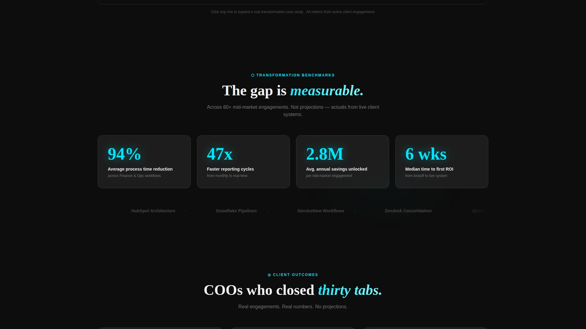
- The comparison tables translate that abstract score into department-level specifics with real metrics and expandable proof, closing the gap between "I recognize this problem" and "I believe this agency can fix it."
- The three-step diagnostic form then presents the natural next step as claiming something already built rather than starting a sales process, which reduces resistance and increases completion rate.
Other information about this template
This template is suited for agencies working in IT services and consulting, particularly those positioning around digital transformation engagements. A few additional details worth noting:
- The freemium model built into this template is designed to generate qualified leads without gating the experience behind a sales call, which shortens the top-of-funnel cycle
- The template style is a comparison table layout, one of the most effective formats for communicating transformation value to operations-focused buyers who think in before-and-after terms
- The calculator-first creative direction means the template earns attention through utility, not persuasion copy, which aligns well with the decision-making style of IT directors and COOs
- This template is categorized under Technology, specifically IT Services and Consulting, making it a strong fit for agencies entering competitive digital transformation markets
Theme
Tech Glass
Creative direction
Calculator/Tool First
Color system
Carbon Fiber
Style
Comparison Table
Direction
Freemium/Trial
Page Sections
Live Digital Readiness Calculator
Department Comparison Tables
Three-step Progressive Diagnostic Form
Persistent Conversion Bar
Hover-expandable Proof Rows
Dual Call-to-action Architecture
Related questions
Who is this template designed for?
Does the readiness calculator produce real results?
What does a visitor receive after completing the diagnostic form?
What makes the comparison tables more than a standard feature list?
Can the template support two different types of buyers at once?



