Traverse - High-Performance GraphDatabase Landing Page Template
Traverse is a high-performance graph database landing page template built for open source projects that outpace legacy systems. It uses progressive comparison tables, real benchmark figures, and a stark AI Iridescent color system to help backend engineers, data scientists, and technical decision-makers quickly understand why a graph-native query engine beats traditional relational approaches at scale.
by Rocket studio
Quick summary
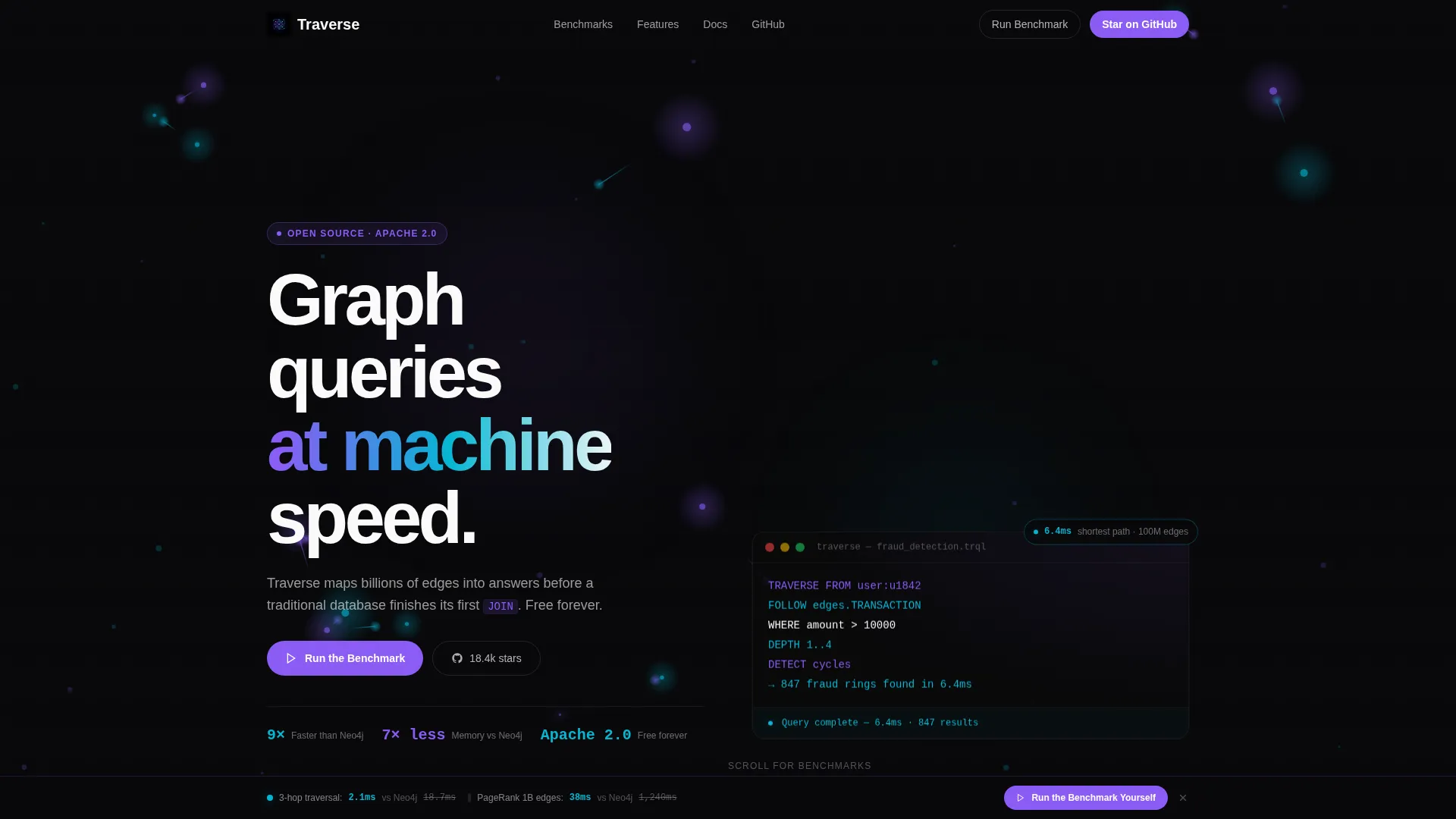
Traverse is a single-page comparison template designed for graph database open source projects. It leads with a competitor logo bar, then walks visitors through layered feature matrices and latency benchmarks. The design uses void black, holographic violet, and plasma cyan to make winning data points glow. Engineers get real numbers first and a one-click sandbox to verify them.
Who this template is for
This template is built for technical teams and open source maintainers who need to make a credible case for a graph database engine. It speaks directly to people who evaluate infrastructure with skepticism and respond to data over marketing.
- Backend engineers managing recursive queries and complex relational workloads
- Data scientists modeling graph-heavy problems like fraud detection or recommendation systems
- Chief Technology Officers weighing whether to replace a relational database with a graph-native solution
What problem this template solves
Traditional database marketing pages rely on vague claims and feature lists that do not differentiate. Engineers who are evaluating infrastructure tools need proof, not promises. This template solves that credibility gap by centering the entire layout around transparent comparison data.
- Visitors can see capability gaps between this project and competing tools at a glance
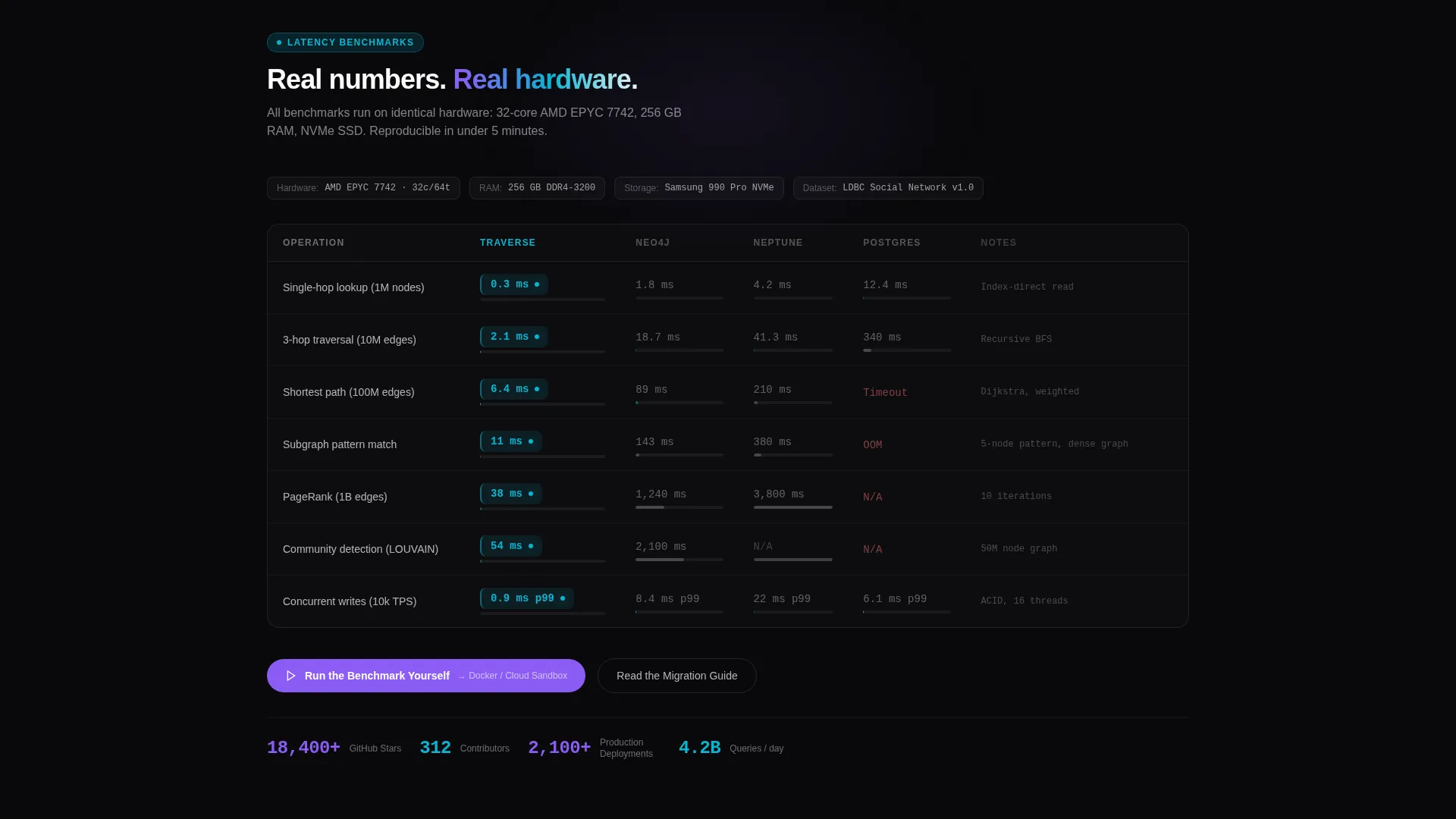
- Benchmark tables show actual millisecond figures, removing the guesswork from performance claims
- The no-form conversion path removes friction for engineers who distrust lead-capture gates
What you get with this template
You get a fully structured landing page layout ready to drop real project data into. Every section is purpose-built for a technical audience that reads fast, scrolls with intent, and clicks only when convinced.
- A competitor logo bar header that establishes context before a single word is read
- Progressive comparison tables covering capabilities, latency, memory footprint, and integrations
- Two conversion touchpoints linking to a sandbox or benchmark environment, plus a secondary migration guide path
Feature list
This template ships with a set of purpose-built layout components designed to communicate graph database performance clearly and honestly.
Competitor Logo Bar Header
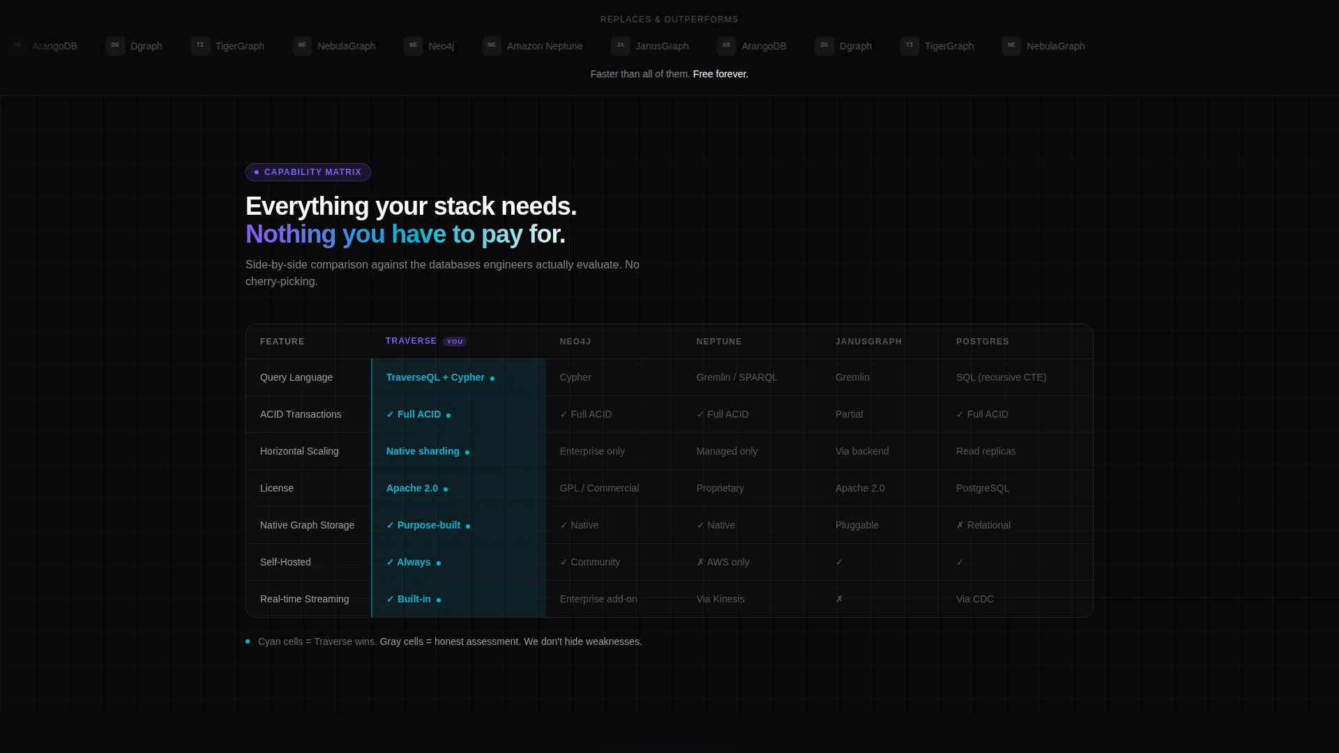
The page opens with a horizontal strip of competitor logos rendered in muted grayscale against a void-black background. A single line of signal-white text sits beneath them. This section establishes competitive stakes immediately, before any scroll.
Progressive Comparison Tables
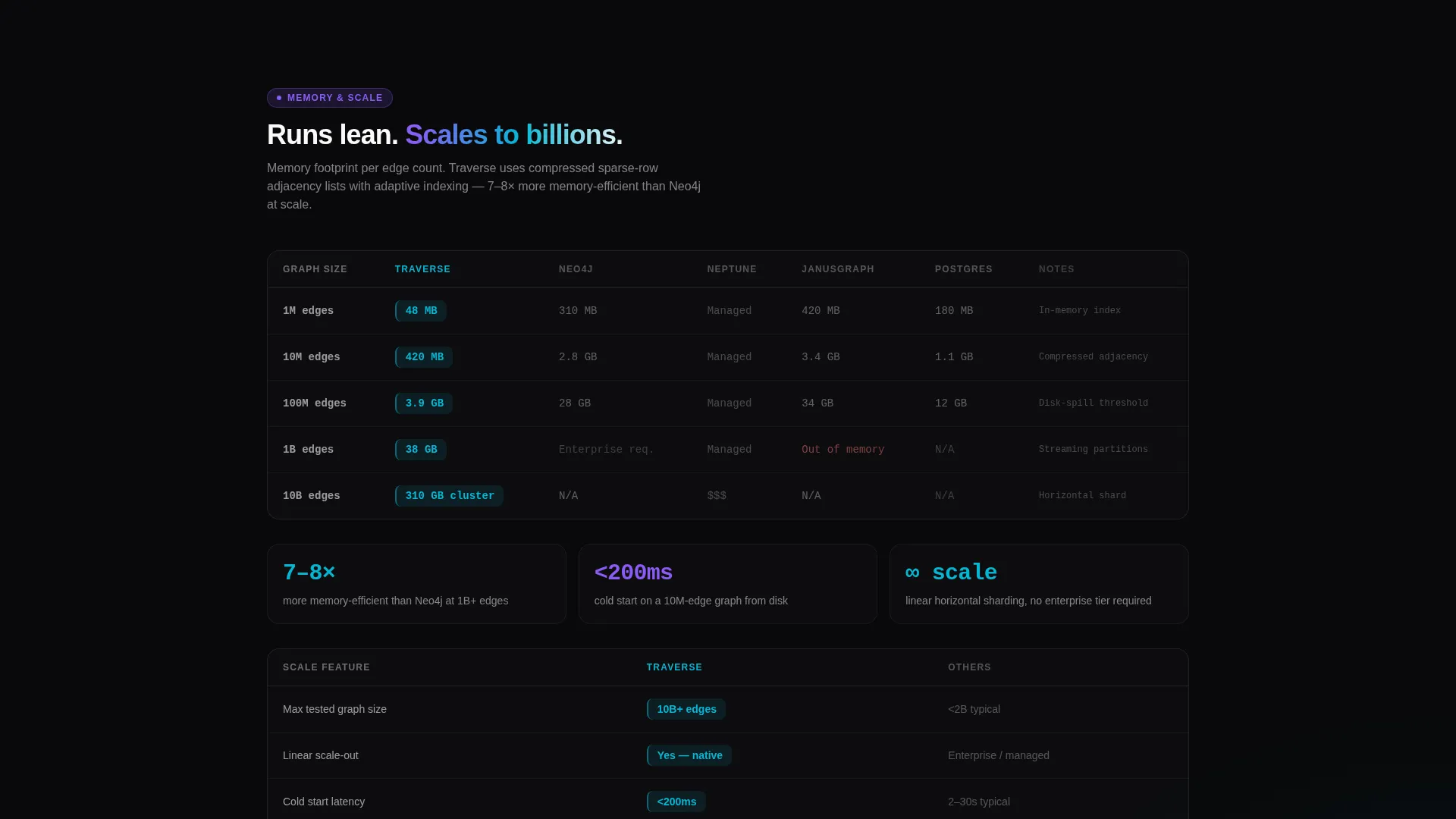
The template includes a series of comparison tables that increase in specificity as the visitor scrolls. The sequence moves from high-level capability grids to latency benchmarks, memory footprint data, and ecosystem integrations. Each table is self-contained and readable on its own.
Benchmark-Highlighted Table Cells
Winning data cells are styled in plasma cyan with a subtle glow effect. Losing or neutral cells use honest gray text. The visual contrast draws the eye to performance wins without hiding weaker comparisons.
Inline Credibility Callouts
Between comparison tables, single-sentence callouts surface GitHub star counts, contributor figures, and production deployment references. These anchor trust without interrupting the analytical reading flow.
Dual Conversion Touchpoints
A primary call-to-action button labeled "Run the Benchmark Yourself" appears after the first benchmark table. A sticky bottom bar repeats this action after the second table. A secondary link to a migration guide serves engineers who are already decided and need implementation help.
Feature Matrix Layout System
The overall creative direction follows a Feature Matrix pattern. Each scroll reveal introduces a new comparison layer, guiding the visitor from broad capability awareness down to specific technical proof points in a logical sequence.
Page sections overview
| Section | Purpose |
|---|---|
| Competitor Logo Bar | Establish competitive context instantly |
| Headline Statement | Deliver the core performance claim |
| Capability Grid Table | Compare high-level features across tools |
| Latency Benchmark Table | Show real millisecond performance figures |
| First Sandbox call to action | Convert engineers ready to test now |
| Memory Footprint Table | Compare resource efficiency per million edges |
| Ecosystem Integrations Table | Show supported tools and compatibility |
| Sticky Benchmark Bar | Repeat primary call to action after second table |
| Migration Guide Link | Serve engineers committed to switching |
Design & branding system
The visual identity follows a Startup Velocity theme built on an AI Iridescent color palette. The aesthetic is intentionally dark and electric, designed to feel like data moving through a neural network rather than a standard software product page.
- Void black (#09090B) bleeds edge to edge as the background, making every accent color feel like a light source
- Holographic violet (#8B5CF6) anchors primary action elements and active table cells throughout the page
- Plasma cyan (#06B6D4) marks benchmark wins and performance highlights; signal white (#FAFAFA) handles body text on dark surfaces
Mobile & speed optimization
The template is structured for fast loading and clean rendering across screen sizes. Comparison tables are the heaviest layout components, so the design keeps them lean and scrollable rather than stacked with extra visual layers.
- Tables are horizontally scrollable on smaller screens to preserve data readability without truncation
- The sticky bottom bar is designed to remain visible and tappable on mobile viewports
- No form fields or heavy input components are included, which keeps the interaction model lightweight on any device
How this template helps you convert
This template is built around a Comparison and Versus conversion model. The persuasion strategy is transparency: show real data, let engineers draw their own conclusions, then offer a frictionless next step.
- The competitor logo bar immediately signals that this project belongs in a serious infrastructure conversation, earning attention before the first table loads
- Progressive benchmark tables let skeptical engineers validate claims layer by layer, building confidence with each scroll rather than asking for trust upfront
- The no-form call to action path removes every barrier between interest and action, linking directly to a sandbox or GitHub repository so the terminal becomes the final proof
Other information about this template
This template is designed specifically for open source graph database projects that compete on performance transparency. It is well suited for projects that have real benchmark data to share and want to convert a technically sophisticated audience.
- The template style is a Comparison Table layout, matched to a Feature Matrix creative direction
- The header concept is a Logo Bar, which works best when the project has clear, named competitors it outperforms
- Projects like those competing with Neo4j, Amazon Neptune, JanusGraph, ArangoDB, and Dgraph will find the logo bar section immediately relevant
- The page is built for a Comparison and Versus conversion goal, not a traditional lead-generation funnel
- No form fields are included by design; the conversion is a click to a sandbox, a Docker container, or a GitHub repository
Theme
Startup Velocity
Creative direction
Feature Matrix
Color system
AI Iridescent
Style
Comparison Table
Direction
Comparison/Versus
Page Sections
Competitor Logo Bar Header
Progressive Comparison Table Sequence
Plasma Cyan Benchmark Highlights
Inline Credibility Callouts
Dual No-form Conversion Touchpoints
AI Iridescent Visual System
Related questions
Does this template include actual benchmark data?
How does the conversion flow work without any form fields?
Can I adapt the competitor logo bar if my project has no direct rivals?
What type of projects is this template best suited for?
Is the sticky bottom bar included as a separate component?



