Trek - Brutalist Travel Landing Page Template
Trek is a bold brutalist landing page template built for travel gear online stores. It organizes every product into modular comparison card clusters, exposing weight, dimensions, price, and star ratings without requiring a single click. A sticky cart, a persistent "Add to Packing List" call to action, and a full-width spec toggle make this page a research tool that converts.
by Rocket studio
Quick summary
Trek is a single-page brutalist travel gear landing page built around side-by-side product comparison. Every card cluster surfaces key specs at a glance. A sticky cart and a prominent "Add to Packing List" call to action keep the buying path short. The design feels like an airport at dawn: wide, industrial, and charged with intent.
Who this template is for
This template is built for travel gear retailers who want their store to work like a research tool. It fits founders and marketers who know their customers arrive with questions, not impulses.
- Travel product stores selling packing organizers, tech accessories, comfort gear, or security items
- Digital nomad brands whose customers compare specs before they buy
- Direct-to-consumer travel retailers who want to reduce tab-switching and keep visitors on one page
What problem this template solves
Most travel gear pages bury the specs. Visitors have to click into individual product pages, open comparison tabs, and mentally score items against each other. Trek eliminates that friction entirely.
- Spec data like weight, packed dimensions, price, and star rating is visible on every card with no extra click
- The side-by-side column layout inside each product cluster does the comparison work for the visitor
- A full-width spec table toggle lets shoppers flag two or three products and review them together in one view
What you get with this template
Trek delivers a fully structured, section-led landing page layout with a clear visual hierarchy and a conversion-first flow. Every component is defined and purposeful.
- A scrolling monochrome logo bar that anchors credibility at the top of the page
- Modular card grid clusters organized by product category, each with versus-column layouts inside
- A persistent sticky cart at the bottom of the viewport and a "Compare Checked" toggle for full-width spec tables
Feature list
Trek's layout is built from a set of deliberate components. Each one serves the comparison-first experience the brief describes.
Scrolling Logo Bar Header
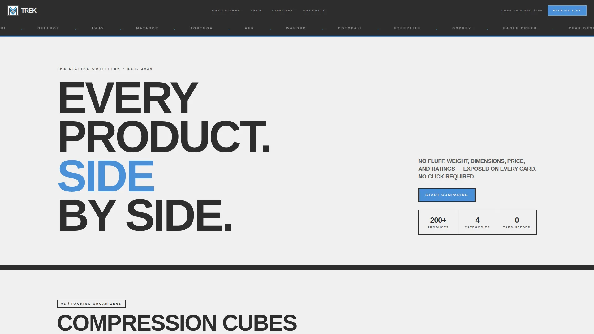
A brutalist charcoal slab sits at the very top of the page. It holds a single row of partner and brand logos in monochrome, scrolling slowly left. This establishes credibility before a visitor reads a single product card.
Oversized Viewport Headline
Below the logo bar, one enormous sans-serif headline fills the viewport: "EVERY PRODUCT. SIDE BY SIDE. NO FLUFF." There is no hero image or lifestyle photography. The headline sets the page's contract immediately.
Modular Category Card Clusters
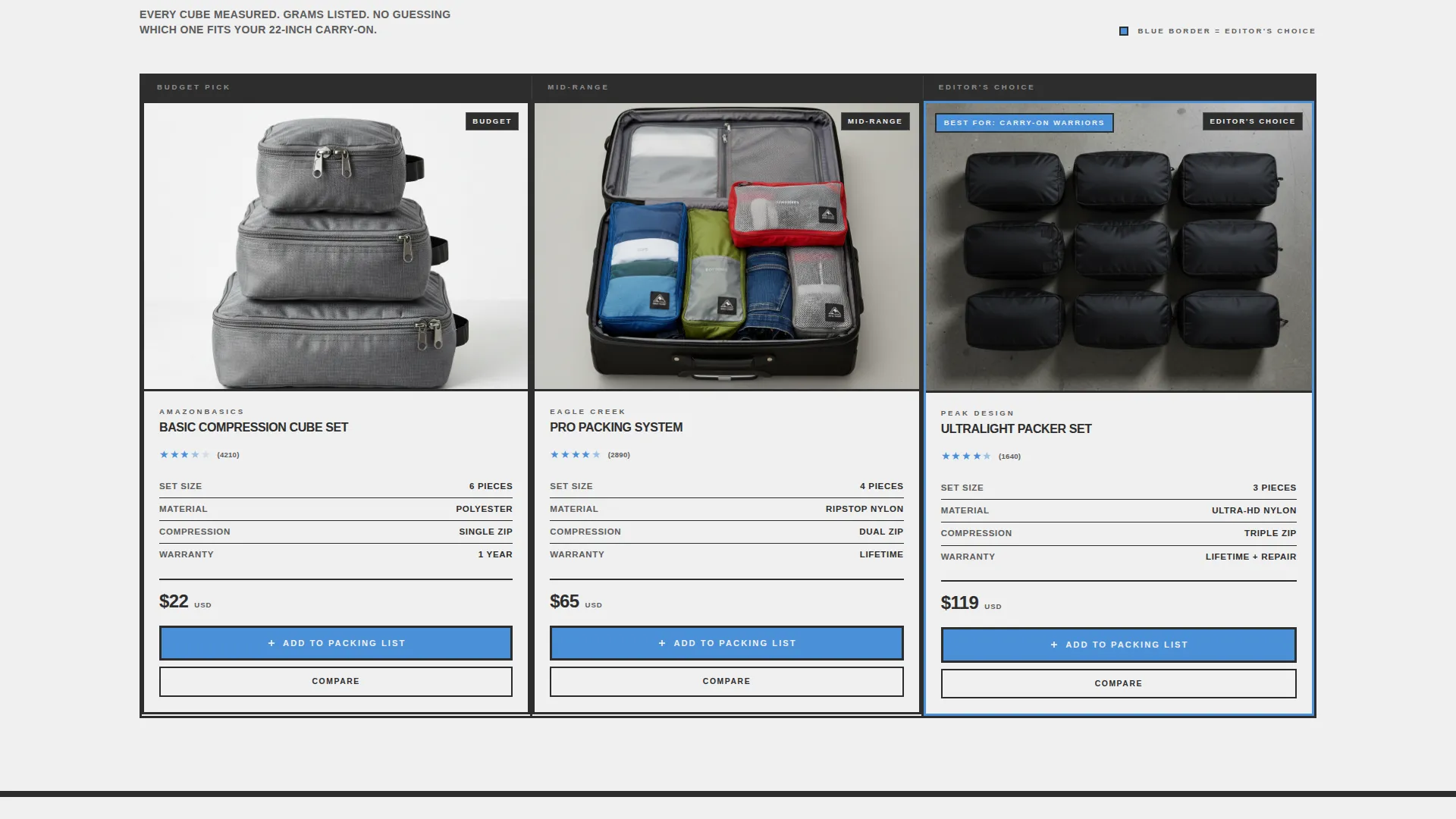
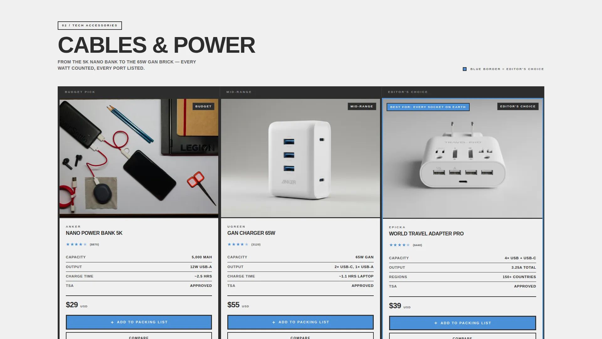
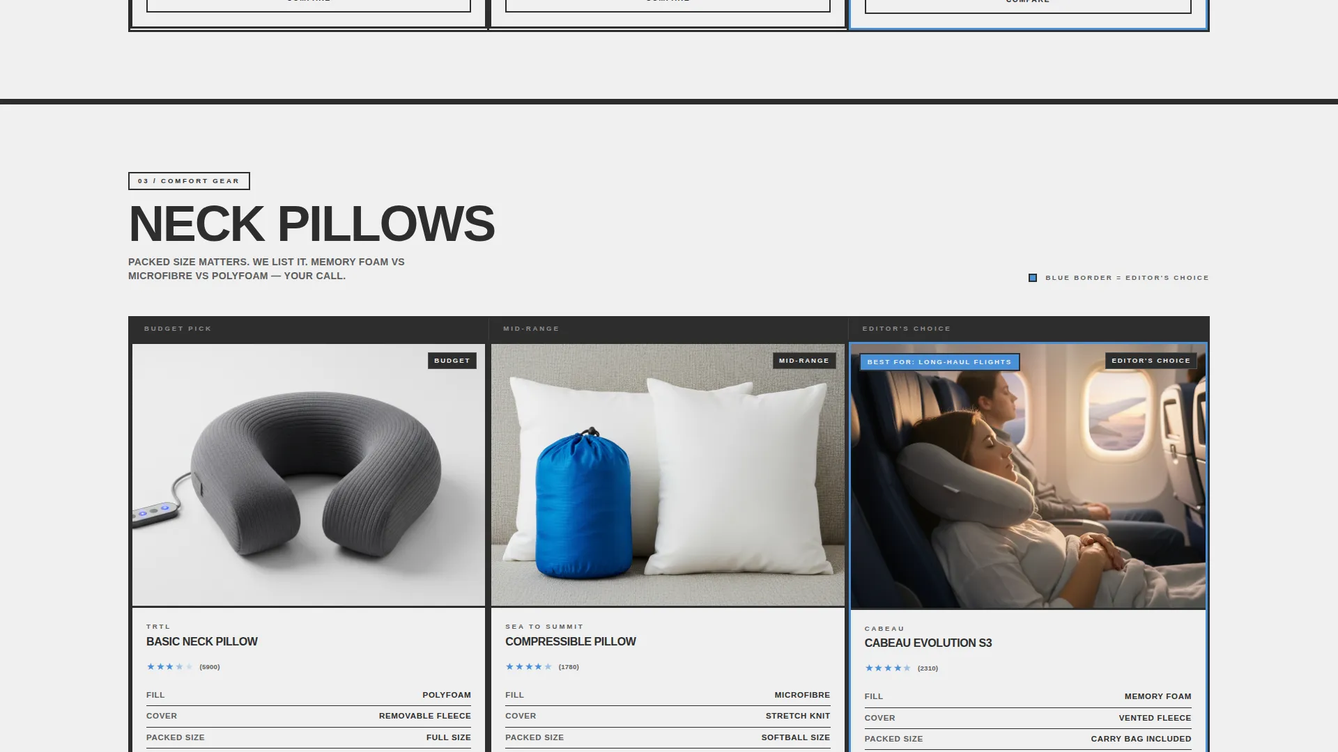
Each product category lives in its own card cluster. Inside each cluster, products are arranged in versus columns. Budget pick, mid-range option, and editor's choice progress naturally down each row, making the comparison logic obvious without any instruction.
Always-Visible Spec Cards
Weight in grams, packed dimensions, price, and star rating are printed directly on every product card. No hover state or click is required to see the numbers. Visitors can compare products just by scanning the grid.
Altitude Blue "Best For" Badge
The winning product in each cluster carries an altitude blue "Best For" tag. The blue appears nowhere else in the layout, so the eye goes straight to the recommended pick without any visual noise competing for attention.
Sticky Cart and Compare Toggle
A persistent sticky cart stays anchored at the bottom of the viewport at all times. A secondary "Compare Checked" toggle lets visitors flag products and pull up a full-width spec table covering any two or three items they have selected.
Page sections overview
| Section | Purpose |
|---|---|
| Logo Bar Header | Scrolling partner logos build immediate trust |
| Viewport Headline Block | Sets the page promise in one bold line |
| Packing Organizers Cluster | Side-by-side cards for organization gear |
| Tech Accessories Cluster | Versus columns for cables, adapters, and chargers |
| Comfort Gear Cluster | Comparison cards for travel comfort products |
| Security Items Cluster | Cards covering locks, pouches, and travel security |
| Sticky Cart Bar | Persistent bottom bar holding selected items |
| Full-Width Spec Table | Expanded comparison view for flagged products |
Design & branding system
Trek uses a Slate and Sky color system rooted in the visual language of an international airport at dawn. The palette is industrial and intentional, with each tone assigned a clear role.
- Poured-asphalt charcoal (#2D2D2D) and tarmac gray (#5C5C5C) provide the structural background and card framing, while departures-board white (#F0F0F0) carries all body text
- Altitude blue (#4A90D9) appears only on links, toggles, winning-product badges, and the primary call-to-action button, making those elements impossible to miss
- Heavy black borders frame every card, and typography is oversized and unapologetic throughout, following a Bold Brutalist theme with no decorative flourishes
Mobile & speed optimization
The modular card grid is designed to reflow cleanly on smaller screens. The column-based versus layout adapts so comparison data stays readable without horizontal scrolling.
- Each spec card keeps its data visible at mobile viewport widths, so weight, dimensions, price, and rating remain accessible on any device
- The sticky cart and "Compare Checked" toggle are positioned to stay functional and tappable on touch screens
How this template helps you convert
Trek earns the click by doing the research before the visitor asks for it. By the time a shopper reaches a call-to-action button, they have already seen the full spec picture.
- The always-visible spec data on every card removes the need to open additional tabs or product pages, keeping attention focused on this page and reducing drop-off
- The altitude blue "Best For" badge shortens decision time by clearly signaling the recommended product in each category, making the "Add to Packing List" action feel like a confident choice rather than a guess
Other information about this template
Trek is a single-page landing page template, not a multi-page storefront. It is built to function as a high-intent destination page for a travel gear brand, not as a full e-commerce website scaffold.
- The template style is Card Grid (Modular), meaning each category section can be expanded or condensed by adding or removing card clusters as the product catalog requires
- The creative direction is Feature Matrix, which means every card is structured around scannable data points rather than lifestyle imagery or editorial copy
- The landing page direction is Comparison/Versus, making this template a strong fit for any travel product category where customers are known to research before buying
- The header concept is Logo Bar, which is purpose-built for brands that have partnerships, press mentions, or stockist relationships worth showing at the top of the page
Theme
Bold Brutalist
Creative direction
Feature Matrix
Color system
Slate & Sky
Style
Card Grid (Modular)
Direction
Comparison/Versus
Page Sections
Scrolling Monochrome Logo Bar
Always-visible Spec Cards
Modular Category Card Clusters
Altitude Blue Best for Badge
Sticky Cart with Add to Packing List Call to Action
Full-width Compare Spec Table
Related questions
Can I change the product categories in the card clusters?
Does the template include the sticky cart bar?
Is the full-width Compare Checked spec table included?
Who is this landing page template best suited for?
Can I update the color palette to match my own brand?



